Home » Logo Maker » The Psychology of Logo Shapes
Do you ever look at a logo and instantly feel something unnameable?
That’s because logos are packed with meaning, all designed to make us have a positive experience when we look at them.
It’s probably no secret that a successful brand begins with a strong logo design. But, while it may seem simple to make a logo, there are several factors that accompany a design that actually does well with your audience – including the shapes that you use.
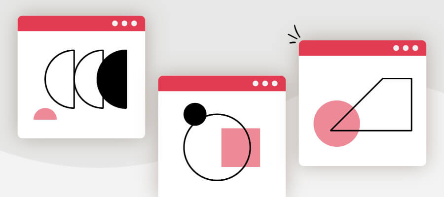
Shapes are the building blocks of any design. Our brains are wired to pick out shapes and memorize them easily as a way of learning new things. That’s why memorable and bold shapes are easier to recall, and they leave a lasting impact.
Like any element of logo design, it all comes back to patterns. We’re used to constantly seeing patterns in our environment – whether as combinations of colors and fonts, or other design elements paired with shapes – and assigning meaning to them based on things we’ve experienced in the past.
So, in your logo design, different shapes can help forge a clearer emotional and psychological connection between your brand and consumers. It’s important to understand what each shape says about your brand and how you can effectively incorporate them into your design.
On that note, let’s dive into what each main shape symbolizes, what it’s associated with, and which brands or industries would most benefit from using them!
Though they’re not the most popular shape, circles are a symbol of stability and collaboration. Logos that use rings are designed to be welcoming, positive, and focused on a message of unity. Notice how the Pfizer logo is reminiscent of a medicine tablet or pill – symbolizing wholeness and healing.
Circle logos can also be a sign of continuity and perseverance, because the imagery is commonly associated with time, planets (or the sun), and more.
They can help convey a sense of femininity—as do many other curved shapes—and give an air of mystery. Because they tend to be less common in everyday life, using a circle is also a great way to draw attention.
You’ll see circle logos across different industries, from car companies (Mercedes-Benz) to clothing brands (Target). Think about using a circle in your design if your brand is centered around togetherness and/or harmony, like NGOs that want to unite their audience or brands that offer an all-in-one solution to a problem your customers are having.
A blunter design, squares and rectangles deliver a combination of boldness and balance.
Rectangles are often seen as a sign of reliability and robustness, considering they are associated with objects like homes, safes, and boxes where things are kept safe. Additionally, the straight lines and angles represent a sense of order and professionalism, and they’re excellent for inspiring a sense of strength and stability.
Companies like Microsoft and Dropbox, for instance, use square logos to impart a sense of order and confidence in their brands. Microsoft’s new square design focuses on pushing the company’s approach as a more dynamic and “edgy” design, while in Dropbox’s case, it is used to convey a sense of security and trust when combined with its blue color palette – a place you can drop all your files and know that they’ll be protected.
So, consider using squares or rectangles if your brand is connected to finance, news, or dealing with sensitive information (like psychology or casework). Cleaning services and organization brands would also do well with square/rectangle logos, as they will help you to relay the sense of order that you are promising to create for your customers.
Much like their square counterparts, triangles stand out for their combination of straight lines and sharp angles. They also convey some of the same emotions and ideas.
However, where squares are all about order and stability, triangles transmit power, strength, energy, and more. In addition, triangles are considered edgy, and are many times employed in logos for “alternative” lifestyle products and more adventurous companies.
Note that the meaning of triangle logos can change drastically depending on the way they’re placed. Upwards-facing triangles, like the CAT and Qantas logos, symbolize stability and momentum. Triangles that point downwards, on the other hand, represent more feminine characteristics, while those placed on their side – like the YouTube logo – display movement and action.
Interestingly, triangle logos are increasingly popular in two very disparate fields: Science and religion. Their association with power and masculinity makes them strong choices for these 2 sectors, as well as industries like law and male-oriented consumer demographics.
You also could consider using a triangle logo if you’re in alternative medicine, extreme sports, or if you want your brand to convey an air of mystery.
Did anyone ever tell you not to wear patterns with horizontal lines because they’d make you look wide? Well (unrealistic beauty standards aside), in logo design, horizontal lines expand horizons.
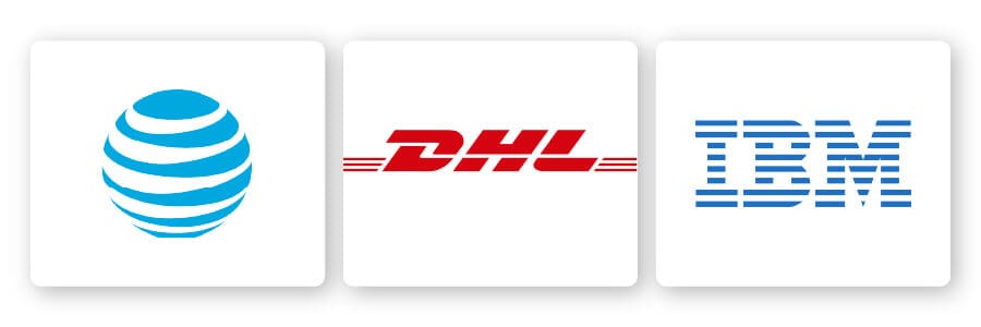
Like the horizon itself or the sight of firm land, horizontal lines are a grounding influence on a brand. For most people, these lines represent a sense of stability and calm, as the IBM logo does with its strikethrough lettering.
Brands that want to appeal to their audience’s feminine side will often use horizontal lines as part of their designs, incorporating a softening effect on otherwise bold and angular marks.
See how the AT&T logo incorporates horizontal lines within a circle, to further soften the look and make it appear more tranquil? The overall image gives off the sense of a globe that communicates interconnectedness.
Horizontal lines can also represent dynamism and movement. For example, delivery companies may add horizontal lines to their logos to convey a sense of motion and speed, like DHL does.
By using layers of horizontal lines, companies can create a sense of calm and tranquility, as well as an image of community. So, think about using horizontal lines if you’re in the shipping or delivery industry – or if you deal with communications of some sort.
Where horizontal lines tend to be related to calm, tranquility, and femininity, vertical lines communicate strength, stability, and forward-thinking. We associate them with the space between the earth and the heavens: Infinite possibility.
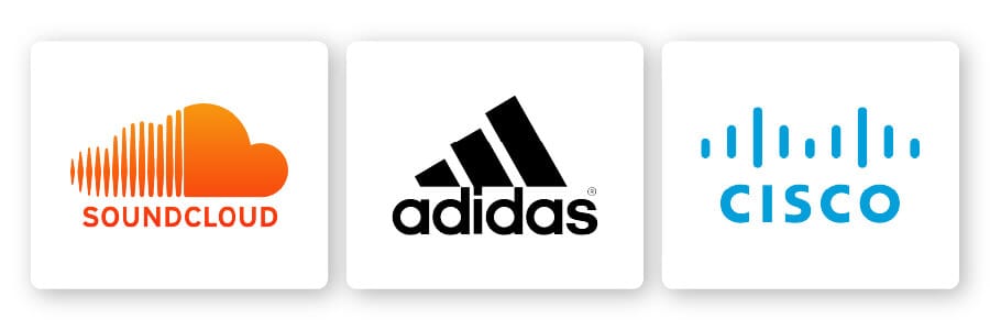
Logos that use vertical lines prominently are bold and display a sense of strength and durability, mixed in with a more “aggressive” approach. They’re also a great way to exhibit an image of efficiency and reliability, which is well represented in the Adidas logo.
Vertical lines are also versatile, as they can remind us of everything from the walls of a building to the edges of a rocket, and even form larger images when layered properly.
Businesses that want to seem innovative and bold – like SoundCloud and Cisco – use straight lines as a way of framing their designs with stable elements.
That’s why tech companies and “disruptors” could do really well with vertical lines; they will show your audience that you’re not afraid to make bold choices and think out of the box. However, it’s important to be careful when using vertical lines, as too many can make a brand seem domineering and overly aggressive.
Unlike other shapes that have defined edges and characteristics, organic-shaped logos are meant to imitate the naturally occurring geometry of the real world. These organic designs are not as defined as geometric shapes, but they do draw upon different figures and images to create a more unique logo icon.
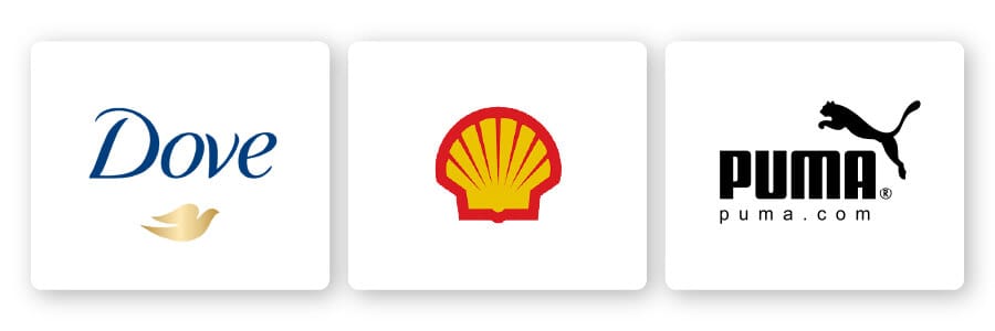
Because they’re usually created for a specific brand, organic shapes are more flexible in what they convey, and they can accomplish this more directly than a square or a circle might. In many cases, these logos are meant to communicate a sense of comfort and familiarity, as well as more intimate knowledge of a company’s identity. Puma, Dove, and Shell, for instance, all use a logo icon that directly represents their brand name.
Organic shapes can work well for brands whose names can be directly portrayed by something in the real world – regardless of the industry you’re in – because it will help you to create brand recognition over time.
However, seeing as these logos are more specialized, it’s important to consider exactly what you want them to say, to avoid creating a shape that loses some of its impact and ultimately harms your brand.
Abstract shapes are a fun category, mainly because they defy the rules of “normal” shapes. Unlike the others we’ve seen on this list, abstract logos actually incorporate “recognizable” shapes to form a logo with layers of meaning – whether through using symmetrical lines, geometric shapes, or loosely interpreted, real-world objects.
In general, abstract logos are used to represent ideas or feelings rather than specific items or products (though you can use abstract versions of a real-world object to create a multi-layered meaning in your design).
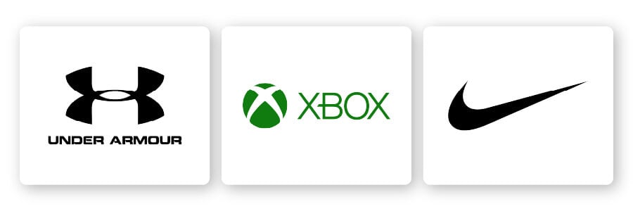
For example, the Nike swoosh logo inspires motivation and speed, while the Under Armour logo uses inverted ‘U’ shapes to convey a sense of power. Though the Nike logo could also stand as a check mark, the abstract aspect is what gives it that extra layer of meaning.
Because of their versatility and uniqueness, abstract logos are used in a number of different industries – from technology and finance to music, clothing and retail. These designs are meant to intrigue your audience and inspire them to feel something, but without causing them to do too much mental work to understand what you’re trying to say.
Before using an abstract shape in your logo design, make sure it’s communicating the message you want to actually get across and that it can’t be confused with a meaning that contradicts or works against your brand.
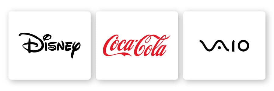
Curves are an excellent way to add a feeling of motion and rhythm to a logo design, as we often associate them with careening waves. In fact, brands like Vaio use curves to literally symbolize waves (in this case, analog waves).
Unlike straight horizontal or vertical lines, curves are all about movement, happiness, and positive emotion. They’re more appropriate in logos and brands that are less concerned about appealing to the business world and more focused on building a personal link with their audience.
2 of the most famous logos in the world – Coca Cola and Disney – use curves to convey their joyful brand personas, helping them to connect to their audience on a personal level.
Lastly, like we mentioned above, curves tend to be viewed as feminine – making them an ideal addition to a logo aimed at a female demographic. Or, if your brand is in a family-friendly space like entertainment or food and beverage, you’d be well-suited to a curved logo – reflecting feelings of happiness and joy with your design.
They may be an uncommon design element, but spirals provide a unique twist (see what we did there?) and can make a logo more interesting. Spirals are a useful visual tool, as they can feel hypnotic and calming.
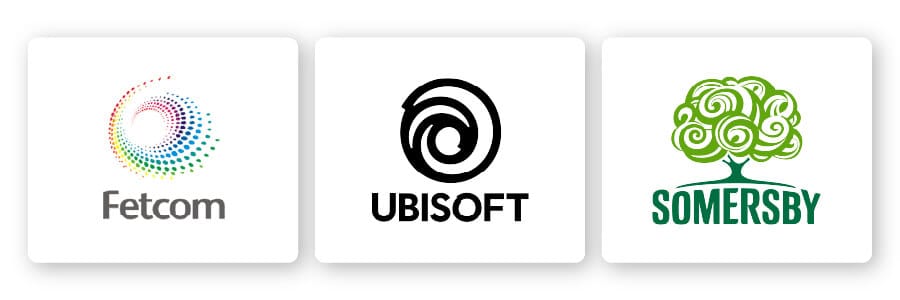
In many cases, this shape is used to represent a flow—of energy, time, love—as well as a slowly building strategy. For example, the Fetcom logo almost looks like a spiraling galaxy, creating the sense that everything is in motion and interconnected.
Perhaps more importantly, spirals are a great strategy for showing off your business’s creativity, penchant for being different, and thinking outside the box. So, brands that want to communicate their growth and evolution can also use spirals to symbolize their ever-changing nature.
Wellness brands, spas, healers, and interestingly, tech companies could all benefit from a spiral logo design. The Ubisoft logo uses spirals to indicate the worlds they’ve created within their games, while Somersby went with the concept of a “living tree” – a tree made up of flowing spirals that would separate them from other cider companies.
In this vein, you may also want to consider spirals if you’re in a creative industry or space.
Now that you understand what all of the different shapes mean, it’s time to actually put them to good use! What’s the best way for you to incorporate shapes into your logo? Well, it all goes back to logo shape psychology, and the message that you want to convey with your design.
Before you begin creating your new logo, the first step should be to consider your brand’s values and most relevant characteristics.
Once you have these written down, it’s important to consider not just the shapes that represent these attributes best, but also how shapes can be combined to create something greater than its parts. While shapes can stand as the overall frame of your logo, you can also use them as just part of your design, within your icon, or even incorporated within your font.
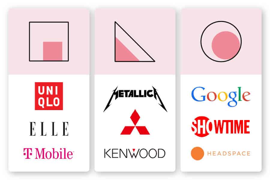
Circles: See how the Showtime logo draws attention to the first half of the design by placing a circle over the first half of the lettering?
You can use circles to highlight a specific part of your design that you want to draw attention to. Alternatively, you can combine circular imagery within your typeface, like Google does, if you want to create a wholesome, interconnected feeling in your design; or, consider a circle as your entire icon, like Headspace, to instill an overall sense of calm in your audience.
Rectangles: The most reliable shape, rectangles can be interspersed within your logo design as T Mobile does, to show dependability from beginning to end. You can also mimic Uniqlo and frame your entire logo within a square, which shows your audience that they can expect quality from the things that you offer.
Triangles: Like we mentioned above, triangles convey different things depending on which direction they’re facing. Consider using a triangle as an accent to one of the letters in your logo, like Kenwood does. Or, you can also use triangle-inspired lettering like Metallica does in their logo, to give your design an edgy look without having to commit to the complete design.
Remember, above all else, you want your logo to convey a specific message. While different shapes may communicate specific values, it is always more important to have a logo design that flows properly. So, make sure not to just throw together differing shapes, even if they are individually useful, because it may harm you more than building a logo that fits together harmoniously.
The best logos are those that manage to create a timeless design that is more than the sum of its parts. Combining all the aspects of a good logo—colors, fonts, and shapes—can deliver a final design that will convey your brand’s personality and values, while also leaving a noteworthy impression on anyone that views it.
Choosing the right shapes to form your logo design is a vital step during the creative process, as it lays the foundation for your brand’s messaging. Determine how these shapes will fit into your logo, and you’ll ultimately help your brand maximize its potential impact!

Products
Resources
@2024 Copyright Tailor Brands