When you think about the logos of major brands, you probably just take the colors they use as a given. Of COURSE the YouTube play button is red and white and McDonald’s arches are a happy yellow – it just makes sense.
That’s because color psychology plays a monumental role in branding; colors influence our perception and make us feel a certain way, even if we don’t always realize it on a conscious level.
Still, it may not seem like much thought went into the logo color combinations mentioned above – aren’t they just the logical choice for what those particular brands do?
Not so fast. You can bet that a hundred cups of coffee and millions of dollars went into the original logo designs of some of these powerful brands – with much of the focus likely having been on the color combinations.
So what does this mean for your own logo?
No matter how you choose to design your logo, be it with a logo creator or other tool, your logo’s personality is rooted in its colors – are you a bold seagreen-fuschia, or maybe a soft yellow-white? By learning your way around color combinations, you can create a logo design that tells your audience exactly who you are.
You can check out this video to get a sense of how color psychology affects people in the real world and what it means for you when you’re ready to design your own logo:
Now that you’re familiar with how color psychology works, let’s take a look at some of the best logo color combinations!
First rule of thumb: Don’t overdo it – less is more.
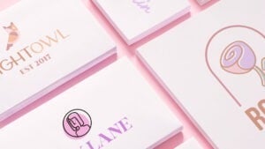
With logo color combinations, it’s better to limit your creative explorations than go color-crazy. In this vein, we recommend sticking with two- or three- color combinations – or, of course, a single logo color.
Let’s start with the basics:
Two-color logos are an industry standard. They often use contrasting shades, which creates an eye-catching effect.
Here are some of our favorite two-color combinations.
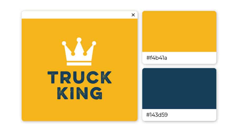
Yellow is the ultimate attention-grabber, and it sets up a youthful backdrop for the authoritative navy. This logo’s color combination is playful yet confident, giving the impression that the company behind the symbol is one to be trusted.
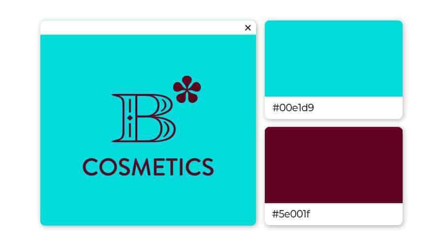
This berry-teal color combo can have two different effects, depending on how it’s used. Put teal on a berry background for your logo to pop; lay the darker blue over the teal to comfort and calm.
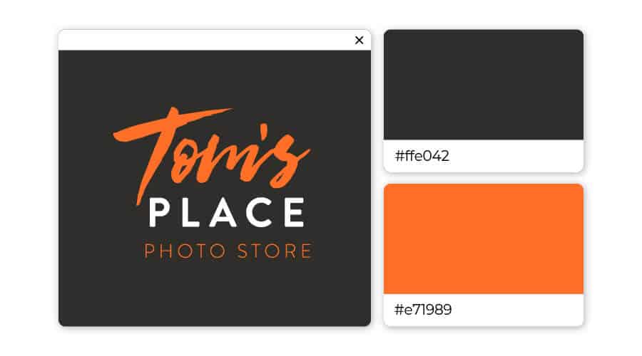
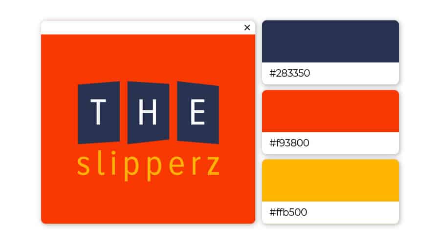
Enthusiastic orange interacts nicely with powerful black, creating an overall feeling of mystery and thrill. This logo color combination is particularly well-suited for activities that promise an adrenaline rush, like extreme sports, escape rooms or nightclubs.
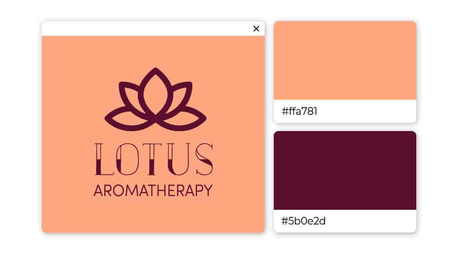
This unique pair of plum and peach is not often seen together, but it adds an element of charm to any logo! You may want to think about using this color combination if your brand is in the fashion industry, home decor, or alternative medicine.
Nothing says reliable like a combination of light-blue and mulberry purple (bordering on brown). Consider using this pair to brand for cosmetics or high-end retail.
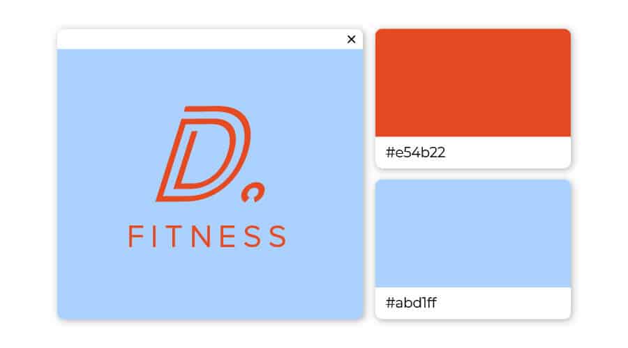
Opposites attract – and so do these complementary colors! The security of blue grounds the impulsive sides of orange, invoking a simultaneous feeling of excitement and trust. Always ready to entertain, this navy-and-rust pair promises a good time.
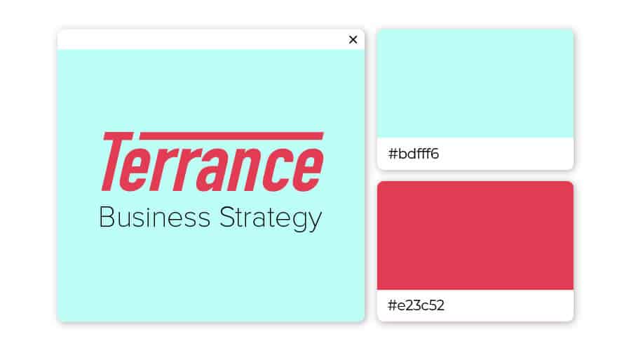
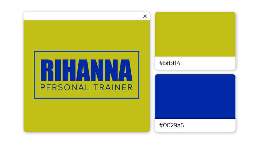
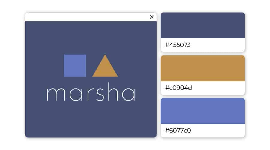
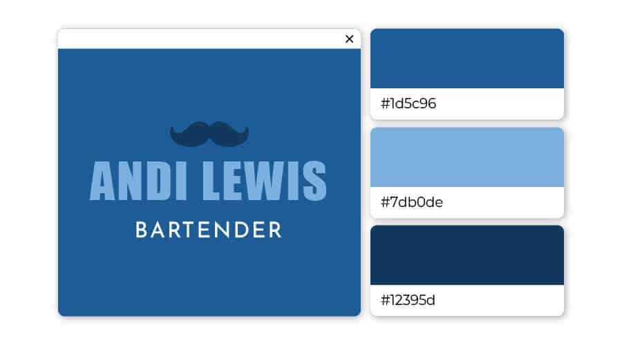
These two shades of blue emits reassurance and calm. You should use it for your logo if you want to be taken seriously and yet inviting.
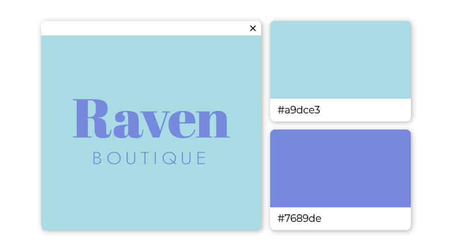
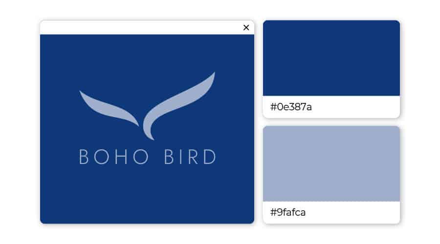
Two different shades of blue work beautifully together, creating an open and inviting impression. The color palette is well-suited for services like spas, boutiques, and consulting.
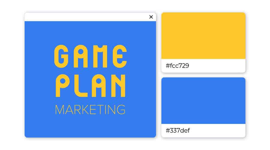
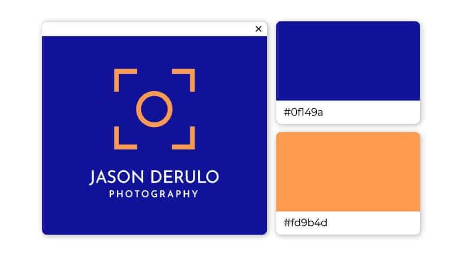
If you want a logo that customers associate with optimism, then you have to go with yellow. It has the advantage of being both light and bold at the same time. And when paired with royal blue, you have the ultimate combination.

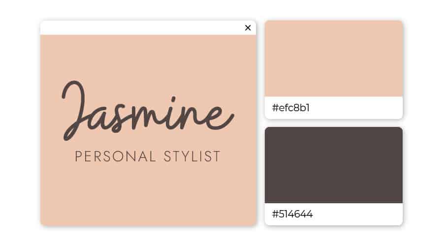
Although brown is one of the least-utilized logo colors, if you choose it you’ll be sure to stand out. The tones of desert sand and emperor gray work well together for fashion or interior design brands.
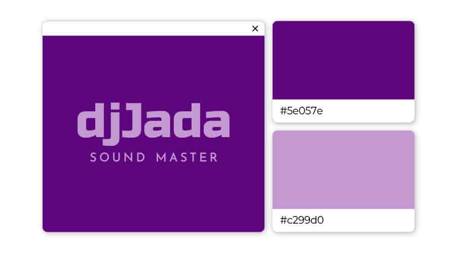
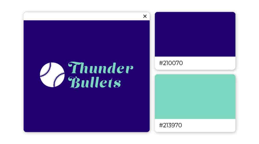
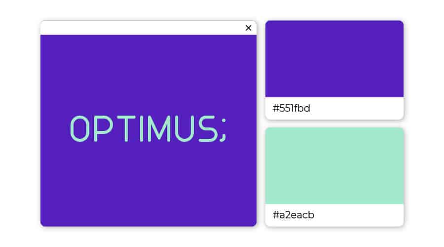
Intuitive and powerful, indigo is a dramatic color relating to the world of the arts. It sets up a unique backdrop for the softer shade of purple.
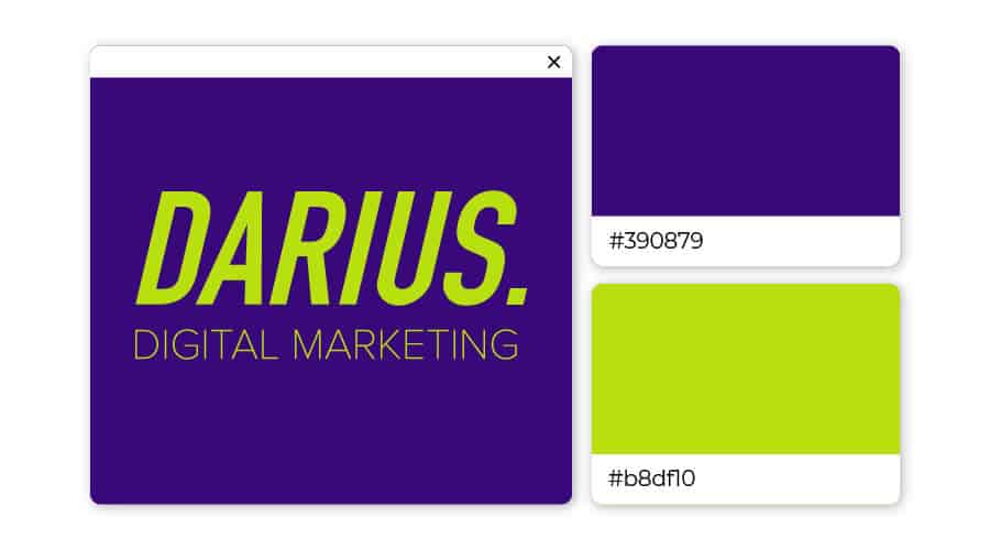
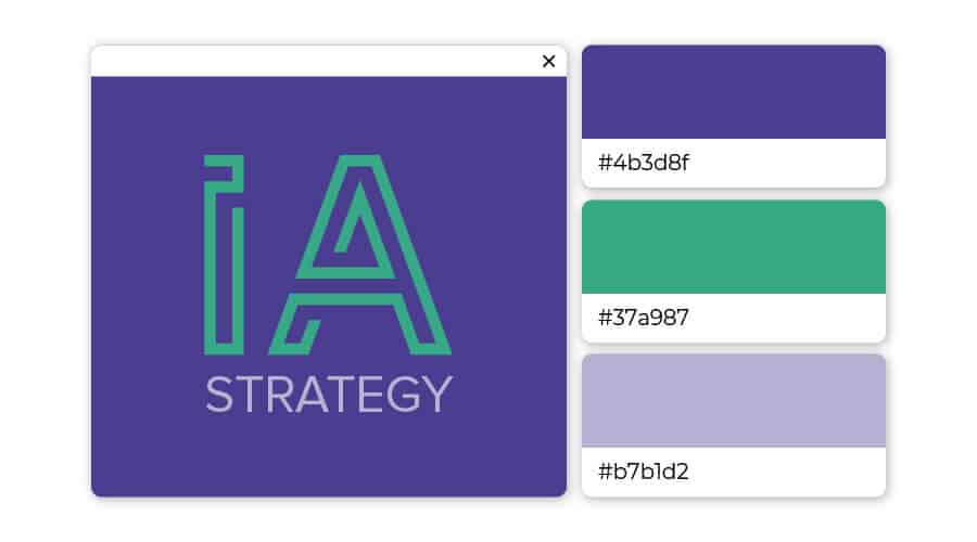
Imaginative purple meshes beautifully with water leaf turquoise, creating an overall feeling of endless possibilities. These colors are great for any business related to communication, including teachers, trainers, and media communication.
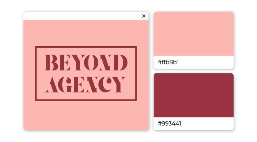
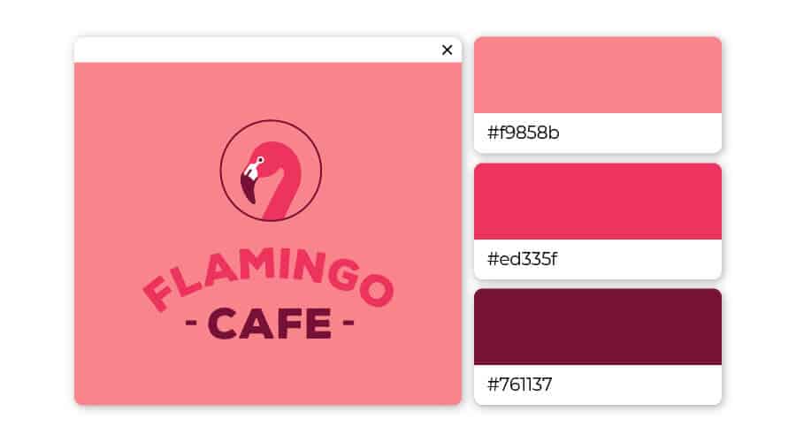
Soft, charming pink wins hearts over immediately. When paired with burgundy’s intensity and individuality, you have a real winner!
Choosing either of these colors would suggest a desire to stand out, yet somehow remain subtle about it. Both are warm colors that encourage us to express our emotions and be more outgoing
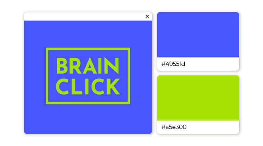
If you need a logo to exude creativity and confidence, look no further. This high energy color pairing is giving off strong power vibes.
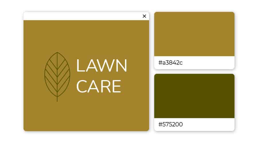
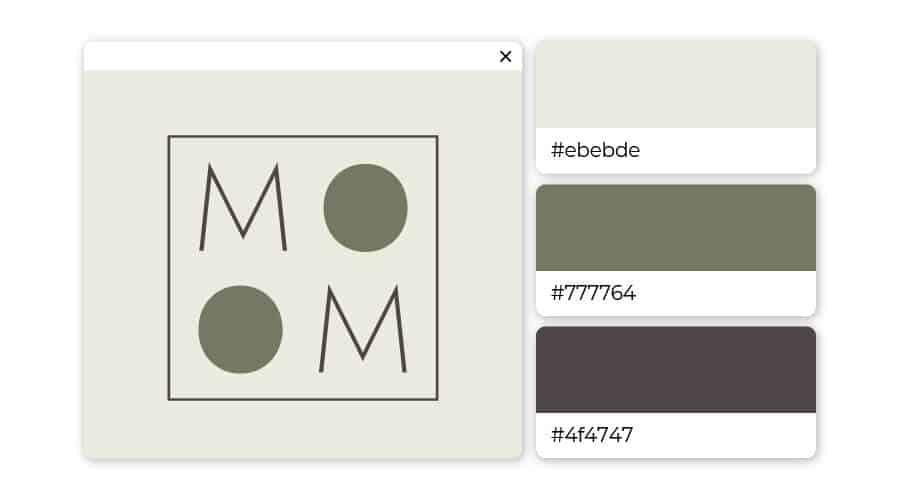
The earth tones brown and green always pair well together. Here the almost yellow-brown harmonizes naturally with a deep olive green.
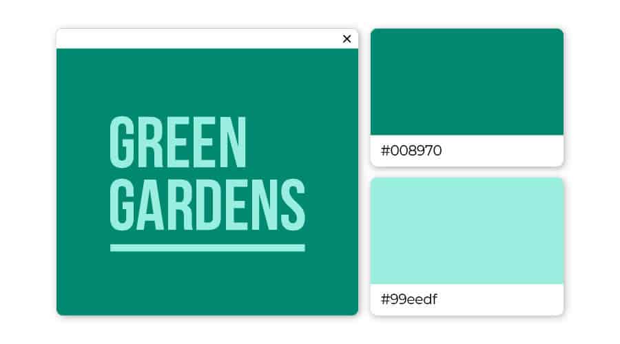
Associated with clarity of mind and creativity, turquoise is a color that encourages reflection and openness. Deep jungle green is a color pervasive in the natural world that says renew, refresh, and regenerate.
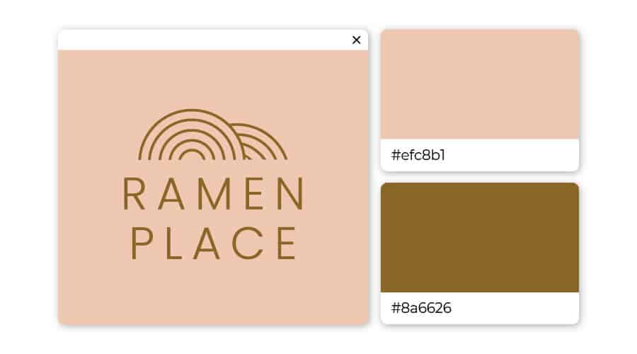
The cozy vibes of curling up with a warm cup of Ramen noodles is practically jumping off of this logo. Cozy, versatile, and elegant desert sand strikes a balance between light and warmth. A tendency to passivity and neutrality, grizzly brown provides a state of tranquility and relaxation.
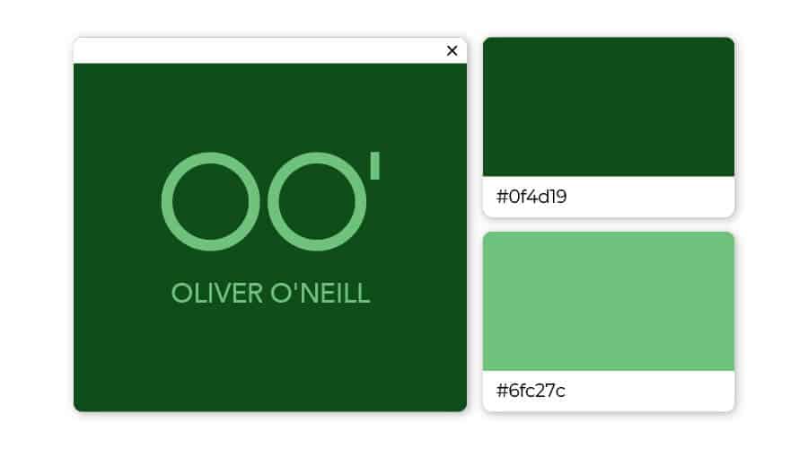
Just by its name alone, you know that the color forest green is reminiscent of nature. This versatile hue is associated with growth, and paired with a lighter seafoam green keeps it cool and fresh.
All preconceived notions aside, these two complimentary shades look amazing together. Punchy orange and cool blue creates a perfectly balanced and stylish look.
Blue and peach make a dynamic color scheme. This mix of cool and warm tones works well in contemporary and traditional contexts.
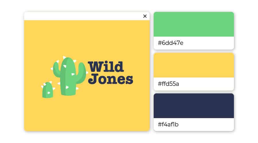
This complex hue of green is completely unexpected, youthful, and fresh, which is exactly what draws the eye. The vivid sapphire blue provokes a deep calm and a sense of stability. Pairing these two colors creatively can be a strong statement.
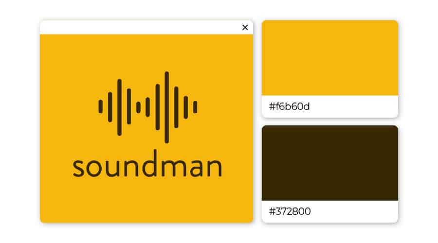
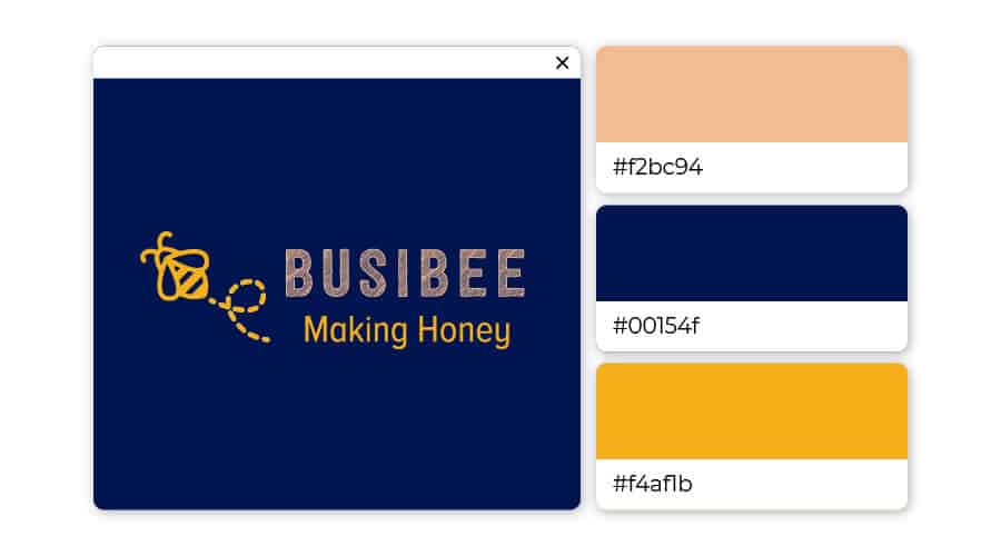
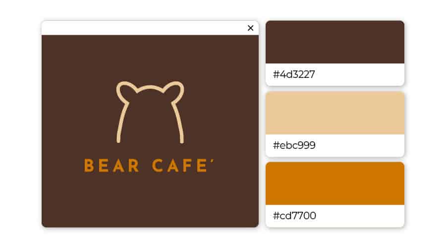
If you need a logo that screams spontaneity and reliability, you definitely want to us this cool color combination. The ultimate tag-team, marigold yellow grabs attention while the dark brown holds it.
When used in professional settings, royal blue encourages focus while still remaining reassuring. For a dramatic and striking look, pairing these two colors together result in a bright, vivid, trendy vibe that demands attention.
These logo color combinations can be a little harder to pin down, because the options are many but not all choices are good ones.
In general, two contrasting colors with one complimentary color can be the way to go – but there are exceptions to that rule, too!
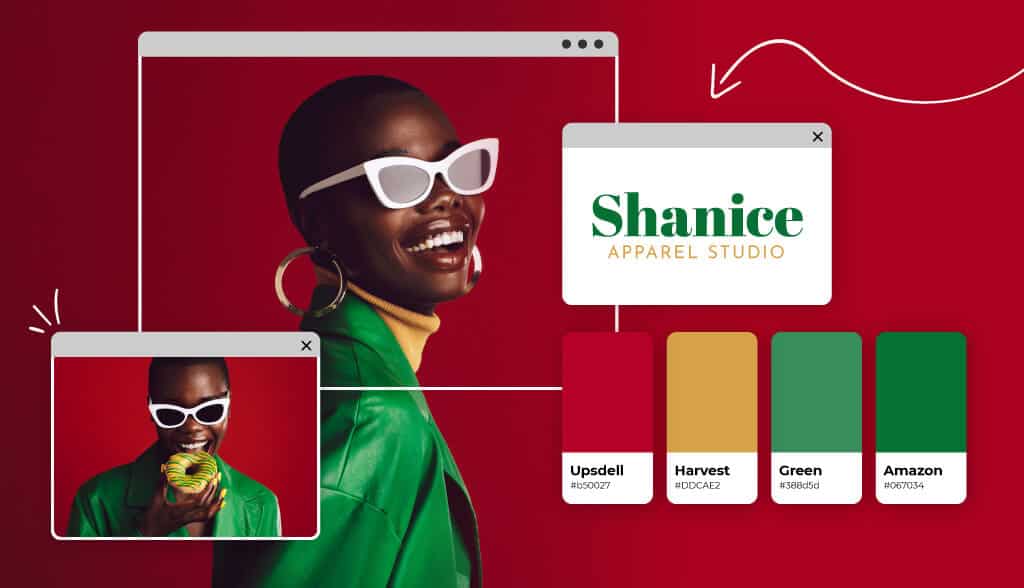
To give you a feel of what does and doesn’t work, here are a few of our favorite three-color combinations:
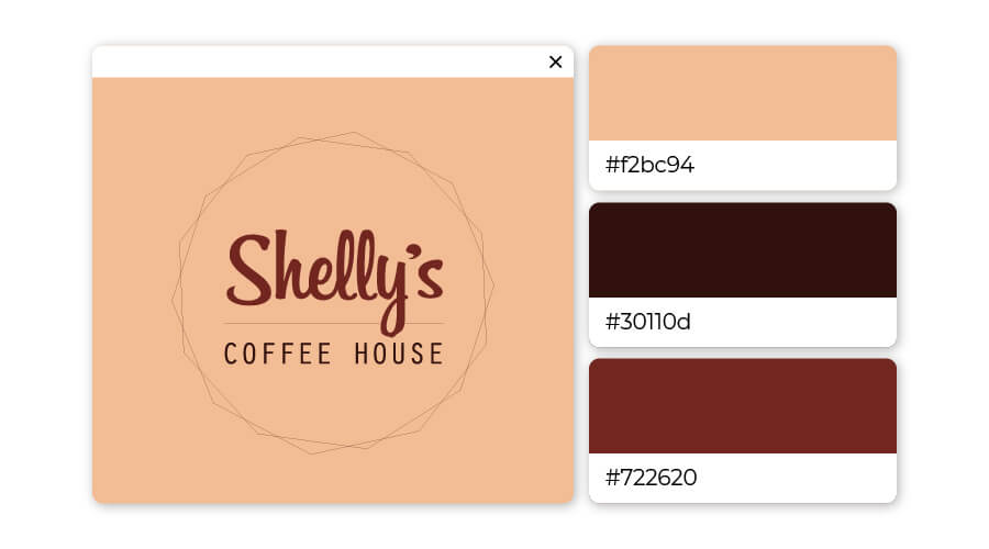
The smell of coffee is practically radiating off of this logo. Browns ooze dependability, while a cream background keeps the logo from feeling dull. This could be a solid color combination to use if you’re in the food industry or want to be perceived as family-friendly.
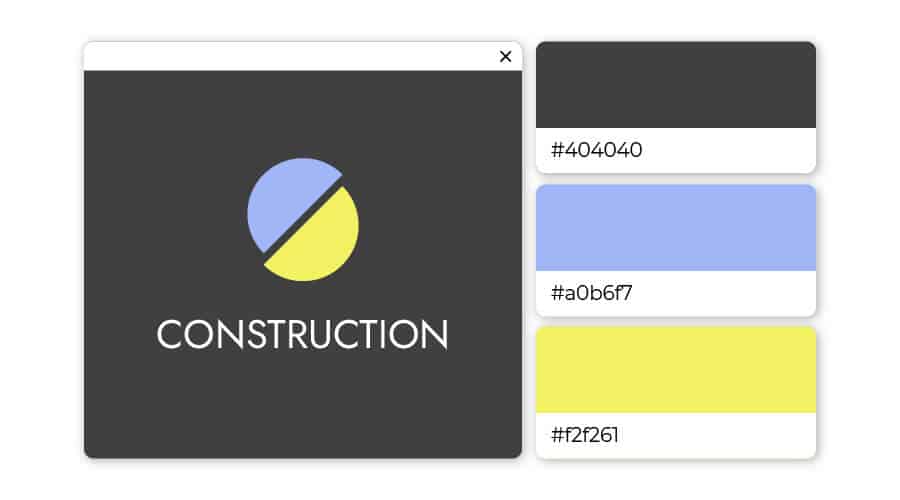
This one takes two primary colors and throws their secondary into the mix – a perfect match! The butter-yellow majority with a touch of lime keeps the logo playful and youthful, while the azure lettering brings an heir of wisdom to the table.
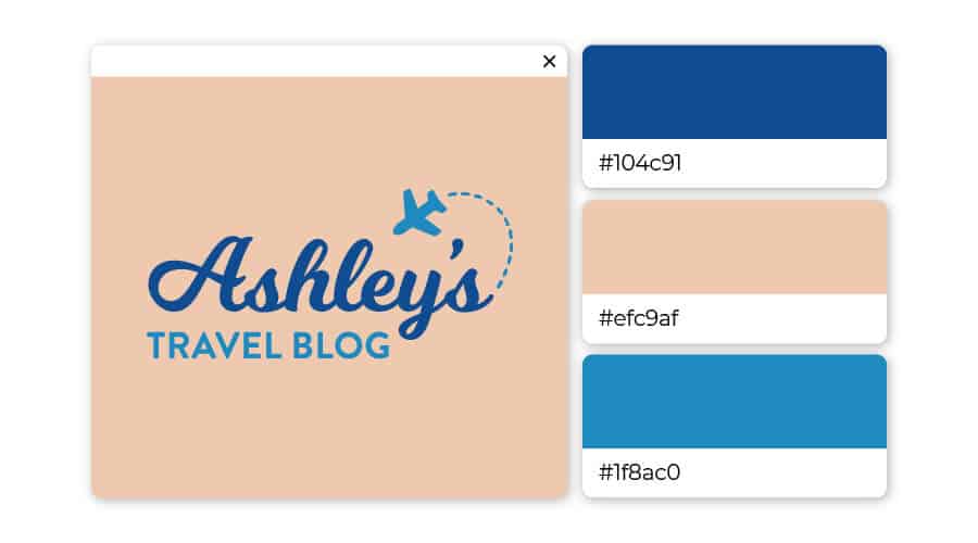
Keeping it in the family! These two blues complement each other and reaffirm the trustworthiness of the brand. Combine them with the beige backdrop, and you get the reassurance that it’s safe to explore and pursue. This logo color combination is great for brands in the travel niche, life coaching, and healthcare.
Contrast meets contrast meets contrast in this triadic, three-color combination. Various shades of each primary color merge into a logo that pops off the page and leaves funk it its wake.
If you were looking for a logo that screams “approachable,” the pink color family is your best bet. These shades are different enough to add some aesthetic flare to the logo, while sufficiently similar to maintain the look of innocence. Throw maroon into the mix, and you mitigate the risk of exhibiting naivete – giving off just the right amount of professionalism.
Have you been able to tell that we love blue yet? It’s not for nothing – blue is the most used color in logos of the top 100 brands worldwide (see IKEA, AT&T, Walmart, and NASA for reference).
Here, the wheat-beige acts as a subtle bridge between the two primary colors, reducing the seriousness of blue and accenting the lively side of yellow to create a balanced, professional feel.
This isn’t your typical shade of blue; gigas is a saturated light cold blue that shows creativity and intelligence. It’s a popular color that when combined with green and light purple shouts creativity and respect.
As you can probably tell at this point, blue is a default color for designers. The combination of two shades of blue and a brown (bordering on yellow) is a professional looking, humble color scheme.
Orange is an incredibly (and surprisingly) complimentary color to brown. Add a brush or tan and you have a trendy, hipster-inspired look that the modern crowd will flock to.
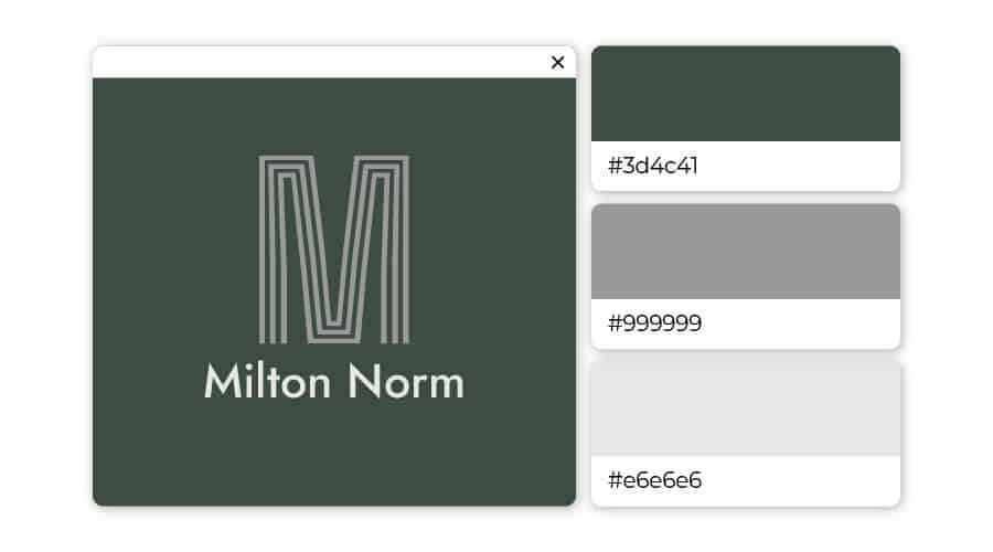
Green is the color of balance and harmony, whereas gray conveys a seriousness that demands attention. Utilize this color scheme to express the right amount of professionalism while still remaining welcoming.
Let your logo speak for itself using two shades of blue and a dash of purple. Here, the light stone blue and deeper blue balance each other, while the purple adds a unique touch that will separate your brand from the crowd.
Ranging from deep red (with hints of brown) to blush pink, this trio is different enough to add a unique touch to the logo, while expressing a sense of softness.
This trio is fitting for a brand that wants to convey a thought-provoking, serene sense to their customers. These three different shades of gray are befitting art galleries, museums, and upscale hotels.
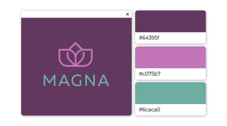
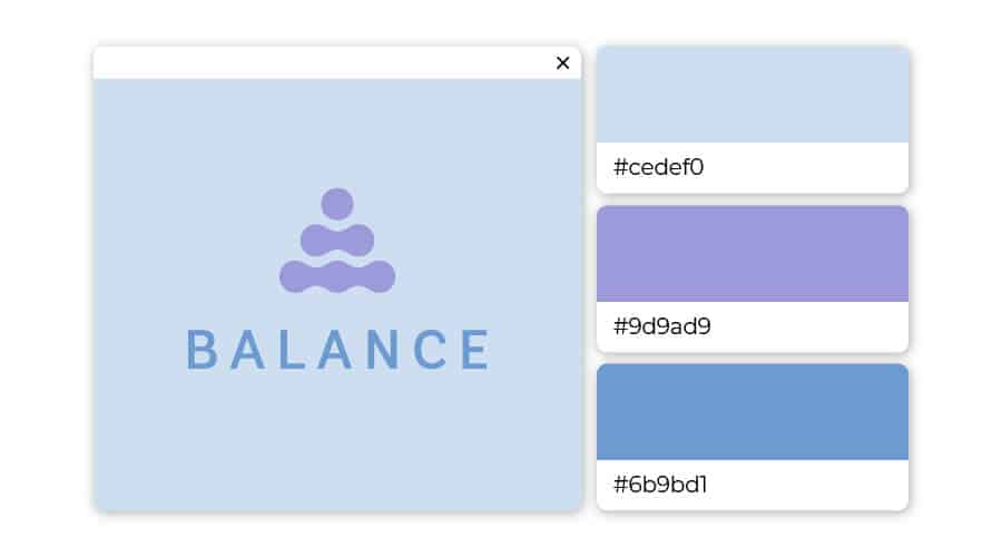
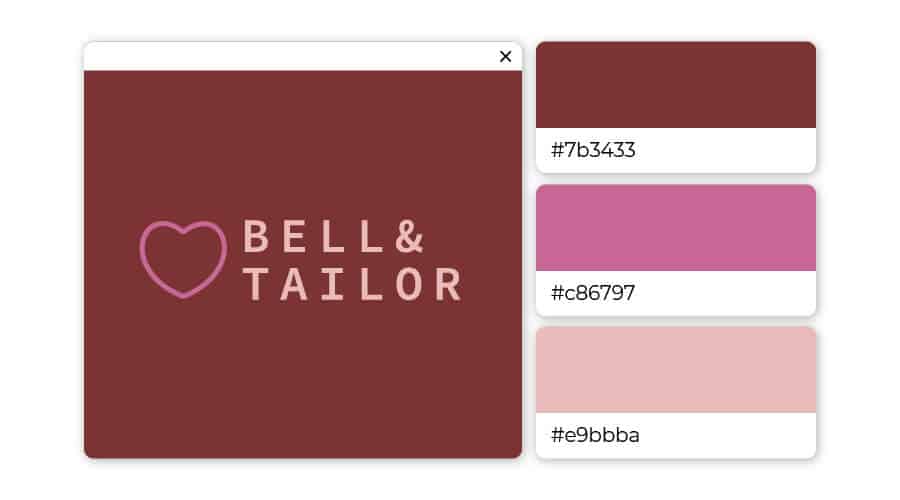
Nothing says relaxation like a combination of deep purple, a surprising pop of pink-purple, and a soft seafoam green. Consider using this trio to brand for yoga studios, spas, and wellness centers.
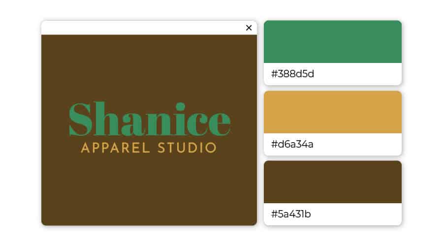
The brown backdrop perfectly complements the green and yellow font. This trio works for any business in design, boutiques, flower shops, and the like.
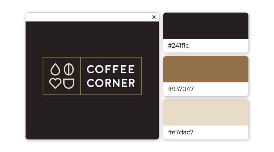
This design is giving off a cozy, curl up with a steaming cup of coffee vibe. Though these colors on their own might be plain and boring, together they create an inviting, warm feeling.
The lighter colors pop off the solid gray backdrop creating a sense that this is a business that can be trusted, but is also modern. Types of businesses that use gray are estate agents, tech websites, and architecture companies.
When choosing a logo color scheme, it’s hard to go wrong with blue. Wide-ranging shades of blue pair well with nearly every color, but who knew it would look this classy to put them all together?
Colors are an important aspect of your brand’s identity. After choosing the type of logo you want to use, you should take some time to consider what each color will say about your company.
Think about the emotions you are trying to elicit, and how you want your consumers to respond to your brand. By choosing the right color combination, you can help your brand leave a lasting impact that shapes a more powerful connection with your audience.

Carly Miller is a freelance content writer specializing in all things branding related. When she’s not writing, you’ll find her traveling, playing with her dog, or reading a good book.