If you’re a small business owner looking to make more of an impact with your brand, then you need a logo to help communicate your values and character.
And, if you’re looking to get your hands dirty and make it yourself, we’re here to help you every step of the way!
Adobe Illustrator is the first choice of software for many designers. In fact, it’s the go-to design software for anyone looking to create a logo in any style and for any industry.
A logo identifies a business. It needs to be simple, appropriate, recognizable, and memorable. Adobe Illustrator uses vector graphics, which means you can resize and edit your logo without losing any quality.
Just like how Microsoft Word became the industry standard writing tool, Adobe Illustrator is easy to use for beginners and has plenty of depth available for professionals who may need to get more mileage from it.
In this post, we’re going to show you how to create a logo step-by-step, so by the end, you’ll feel like a logo design pro.
Before you even attempt to produce a logo, it’s best to create your a logo design brief. It will help keep you focused and allow you to create a logo with a clear message.
Start by asking yourself these questions which are fundamental to the logo design process.
Try to be as honest as possible with yourself here; it will help you during the design stages. If you’re struggling to answer any of these questions, check out your competition’s logos, and fill out the questions as if you were them. Use this process to kick-start your brain into gear!
For the purpose of this post, I’m going to create a logo for my new business, Joe’s Pizza. Check out my design brief:
What does my business do?
I cook and serve pizza made from scratch with the highest quality ingredients.
Who is my target audience?
Anyone who likes pizza—but my business is aimed at families.
Does my brand have meaning?
Unlike large pizza chains, I focus on high-quality pizza and service.
Does my brand have an important history?
My family has made pizza for generations.
What are my brand’s values?
I believe in providing the ultimate pizza experience.
Which visual trends appeal to my clients?
Because my business is geared toward families, my logo should also appeal to younger audiences (round letters, happy faces, colorful, etc.)
This stage isn’t a must, but it can help you create a logo that really nails down what makes your brand great. The idea is to write all the essential words associated with your business, even if you don’t think they make any sense. Here’s my list:
If I ever get stuck trying to think creatively, I can now look back at this list for some ideas!
The first step is to set up your workspace. Then, open up Illustrator. Click on the Letter Document, and once it’s open, click on File, then Save. You’ll want to save often in case something unexpected happens, and to avoid losing all of your hard work!
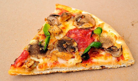
Because I’m not artistically gifted, I’ve used this picture of a pizza as a reference guide. Create your first layer by clicking on the Layer Tab, and rename it to “logo.” Layers are handy in Adobe Illustrator because they allow you to align, separate, stack items, and generally organize everything easily.
Remember to keep saving!
There are lots of tools to choose from in Adobe Illustrator. Let’s start by drawing a rectangle, which we’ll use as the pizza crust. From the Tool Panel on the left, choose the Rectangle Tool, then click and drag it to create a rectangle. You can always resize everything later, and you can always
edit shapes.
Each corner of our new shape has a Corner Radius Widget which we can click and drag to create rounded edges – perfect for a pizza crust!
By dragging it towards the center of the pizza crust, all of the edges will become rounded.
To select a different shape, click and hold down on the Rectangle Tool on the left to open up a bunch of varying drawing shapes. From here, select the polygon tool. This tool allows us to create many-sided forms.
Click below the rectangle and start dragging to create a shape. When you’re happy with the orientation, hold the Shift key to keep it in place, and when you’re satisfied with the size, release the mouse button.
To change the number of sides the shape has, click, and drag on the side. I’m going to give my shape 3 sides, and I’m also going to rotate it. To do this, you can place the mouse pointer just outside of one of the shape’s corners until the Rotate icon appears. Then, drag the shape around.
The goal here is to add the triangle to the pizza crust, in order to create a pizza slice.
To hide the top line of the triangle, click on the Properties Tab on the right, select Arrange, and then Send Backward. The triangle is now behind the pizza crust, creating the illusion that it’s one item.
Using the Rectangle and Ellipse Tool, we can create more shapes that we can use as toppings for our pizza. To create more intricate, free-form shapes, we’re going to use the Curvature Tool. It works by creating points that a curved line then follows. Let’s use it to make a mushroom.
Now it’s time to add color to our pizza logo. First, we need to choose the Selection Tool so we can click on a shape. Let’s choose the large triangle.
On the right side, you’ll see “Appearance Settings” for the selected item. We can choose to give it a fill color and different stroke sizes, and set the opacity level.
Clicking on the Fill Color allows us to choose from a selection of pre-made colors. Or, we can create a new one by clicking on the color mixer. Let’s create a unique cheese-looking color for our pizza, and also for our toppings.
In this part, we’re going to resize and transform the different shapes in our logo. With Adobe Illustrator, it’s easy to change the position, size, and orientation of each of our toppings. To create copies of an element, click on it with the Selection Tool, hold the ALT key, and drag the new shape onto the page.
Notice how the pepperoni slices are overlapping the edge of the pizza? We can fix that quickly.
Click on the Select tab at the top of the screen, and then click on the All option. This selects every single item on the page. Then, choose the shape builder tool from the left-hand sidebar, and while holding ALT, click on the parts that are on the outside of the pizza.
The final result is a pizza that looks like it was expertly cut.
To easily make changes to the entire logo design, click on the Group button in the Properties tab. You’ll now see Group at the top of the column, letting you know all the items are grouped. Now you can change the orientation of the entire pizza without having to do it piece by piece.
To help make the icons pop, we can increase the Stroke of each item. Click on an object and then increase the stroke to 2pt. See how the logo really pops now?
Using the Typekit, we can easily add and change the appearance of our text for the logo. To get started, click on the Type tool from the panel on the left, and either click on the page or drag to create a typing box.
The first thing you can do is click and drag on the text to replace it with your own. To increase the font size, head back over to the Properties panel where you’ll now see font options, including the size. Let’s set ours to 62 for the moment.
Now to change the font itself, select the font family field from the properties tab. To help with your selection, you can click on the Filter button to narrow down the font you want, such as serif, sans-serif, slab serif, script, gothic, and monospaced or decorative.
Because Joe’s Pizza is a family-made brand that creates pizza from scratch, to create a personal feel with the audience, we can choose a script font that’s easy to read.
We can also choose a color for our font. Red is a great choice for any brand selling food, as it evokes a sense of passion, excitement, and most importantly—hunger! With the text in place, we’re pretty much done with our logo.
Now you have your logo icon and text; you can freely change the layout of each element and shrink or enlarge items. When you’re happy with your final result, you can save it, and because it’s in EPS format, you can use it on your website, business cards, or even use it to print on items like cups, napkins, and pens.
Before creating your first logo, remember these essential logo design tips to use with Adobe Illustrator:
Use the right colors: Colors play a critical role in backing up your brand’s message. Warm colors like green are used to represent peacefulness and harmony. You can use purple to show off your creative side, or as a sign of royalty. Red is a bold, eye-grabbing color, whereas blue is used to promote truthfulness and show intelligence.
Font style matters: The font you use in your brand speaks volumes about your personality and style. Serif fonts, with their extra lines, come across as professional and mature. Modern sans-serif fonts are cleaner and work well with tech companies in the digital sphere. If you’re trying to create a personable brand, script fonts that mimic handwriting can help you appear more approachable and creative.
Creating your own logo is a challenging journey, but it can be fun as well! And with the above steps, you have enough knowledge to design your own logo from start to finish.
Don’t be afraid to be bold and try new exciting designs and combinations of font styles and colors. Creating a logo is a fun experience and doesn’t have to be too hard!
And, if you’re finding Illustrator too challenging to use, you can always try our logo creator. It will design the perfect logo for your brand in under 5 minutes.


Now the Content Lead at Tailor Brands, Kira Goldring began her marketing career as a 17-year-old handing out flyers on the streets of NYC. She currently covers all things branding, marketing and small business, but she could talk your ear off about investment strategies or gripping literature without missing a beat. Say hi on IG - @kiragoldring