Design a Stunning Photography Logo
Home » Logo Maker » Ideas » Photography Logos
If you’re starting a photography business, then you need to design a photography logo that speaks to your audience.
A logo is the most outward expression of a photography studio’s vision and personality. Therefore, it’s vital to make a logo that shows who you are and distinguishes you from the competition.
Luckily, that’s where our logo maker can help! It enables you to easily create a professional logo for
your photography business – no design skills required.
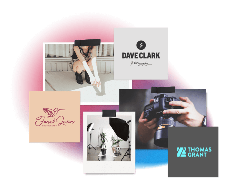
Need some design inspiration?
Check out some of the cool ideas below.

Create your photography logo
in two minutes, simply by entering your business name and tagline (if relevant) and clicking Design.

Tell us a little about your photography business, select a logo type, and choose the fonts you love, so we can create the perfect logo for your brand!

Make adjustments and tweaks with our logo editor to bring your vision to life. You can play with fonts, colors, and logo layout – no design skills necessary!
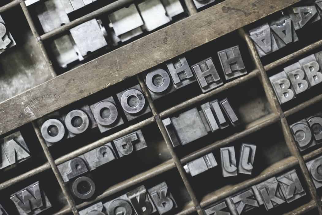
Icons play a large role in photography logos, but they aren’t a must. You should consider using an icon if you specialize in a specific type of photography, such as a spire for architectural photography or a veil for wedding photography.
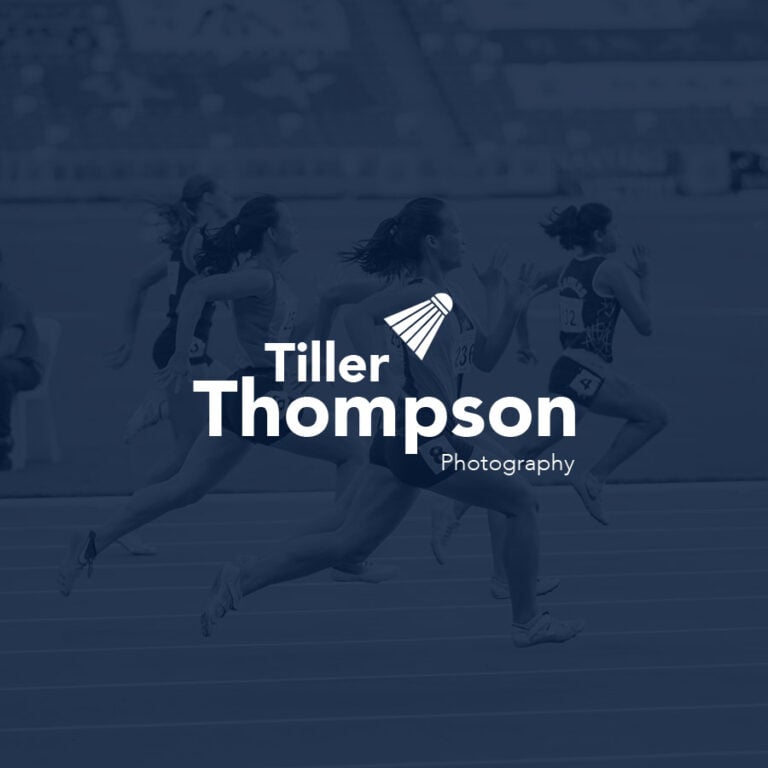
Sports photographers can easily tell their audience what they’re about through equipment – like a basketball or mitt – or a person in motion, like a jogger, while natural-light photographers would do well with a symbol from nature, life a leaf or a flower.
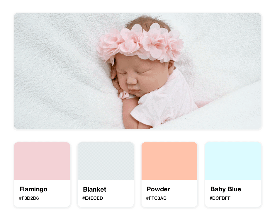
In addition to icons of specific objects, shapes can also do a lot of work for your logo; for example, newborn photographers should consider choosing an abstract symbol that conveys “youth”, which would likely contain circles to symbolize the cycle of life. (However, you can also choose a more obviously baby-related icon, like a rattle or a crib.) The same goes for fashion photographers; rather than commit to an article of clothing, choose an abstract symbol or interesting shape that speaks to your style rather than restricting your brand to one article of clothing.
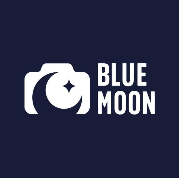
You can always step outside your comfort zone and choose an icon that speaks to the name or focus of your craft. Although it may seem like overkill, a studio called “Blue Moon Photography Studio” should think about using a moon as their icon, in order to reinforce their brand name and have it stick in the minds of potential customers.
Lastly, you can’t go wrong with a more generic symbol of a camera or a tripod – as long as you balance it with a unique typeface or a striking color palette. And, if you’re just starting out, or if you manage a studio that puts out a range of work and photoshoots, then you may want to avoid the icon route altogether so as not to box yourself in to any one type of photography.
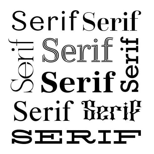
As a general rule, you should never use more than two fonts in your logo – one for your business name and one for your tagline. That said, your typeface will inject personality into your logo, and using only one or two means you have to nail the look and feel from the get-go.
If you specialize in avant-garde photography,
for example, you may want to add a little flare to your font,
such as playful serifs at the ends of your letters
(but make sure the font you choose is clean and legible).
An elegant vibe – like for wedding photographers or pregnancy shoots
would be well-represented by a cursive font with thin letters.
Creative photography studios and fashion photographers often use serifs, for a sophisticated vibe. However, you can also try going with a custom font if you want to emphasize your creative side; just check that it can easily be resized without becoming blurry or illegible.
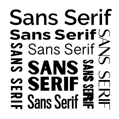
And, if you’re a studio or a generalist photographer, you’ll want your customers to be able to picture themselves as the subject behind the camera regardless
of who they are.
So, if this is you, stick with a more traditional type like a sans-serif – one that uses block lettering and thin weights.
Like with typefaces, colors carry
specific connotations, as people are inclined to associate them with particular emotions and feelings. Therefore, the colors you choose should be relevant to the type of photography in which you specialize.
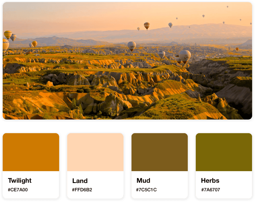
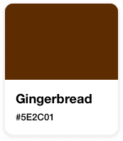
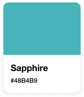
For instance, outdoor and landscape photographers would do well to use earth tones, like greens and browns; portrait photographers should consider a classic black and white, so that your customers have room to imagine their own personality coming out under the camera lens.
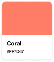
Newborn and pregnancy photographers should think about using softer, muted tones, like light pinks, blues, and yellows, while sports and action photographers might want to focus on colors that convey excitement – reds or oranges – with brown for an added outdoor feel.
It’s always a good idea to look at what other photographers in your area and niche are
doing and to gain inspiration from them – and then to find the color palette that will set you apart and help you make a name for
your own photography brand.
While your layout isn’t as crucial as the other design elements are to creating the right logo, it is an important thing for photographers like yourself to be aware of. Because you’re going to watermark your photos to claim your work as your own, choose a layout that can easily be scaled down and looks good on digital media.

What does that mean practically?
Every element should be proportionate to the others; for instance, make sure your icon size doesn’t overwhelm the typeface, so that your name (or business name)
is clearly visible on each photograph. There should also be a healthy amount of space between your icon and type, but don’t make them so far apart that they take the eye a long time to scan.
Also, the best layouts for photography logos tend to sport an icon on top of the typeface rather than placing it to the right or the left. The same goes for a logo with a tagline; try putting your business name above the tagline, and make sure the business name is sized larger so it stands out.
High quality logo files
Website & Domain

Powerful design tools