Non-Profit Logo Maker
Create a stunning non-profit logo design, and get your organization in shape!
Create a stunning non-profit logo design, and get your organization in shape!
Home » Logo Maker » Ideas » Non profit Logos
Your non-profit organization is dedicated to a cause that gives back to the public and the greater good. To raise awareness for your cause, you’ll have to promote yourself. One of the most effective ways to do this is by creating a distinctive non-profit logo that people will easily recognize and associate with your organization.
To design a memorable and impactful logo for your non-profit organization, take a look at examples of successful logos in your sector.
Keep scrolling for some design best practices. Follow these points to create a logo that truly stands out.


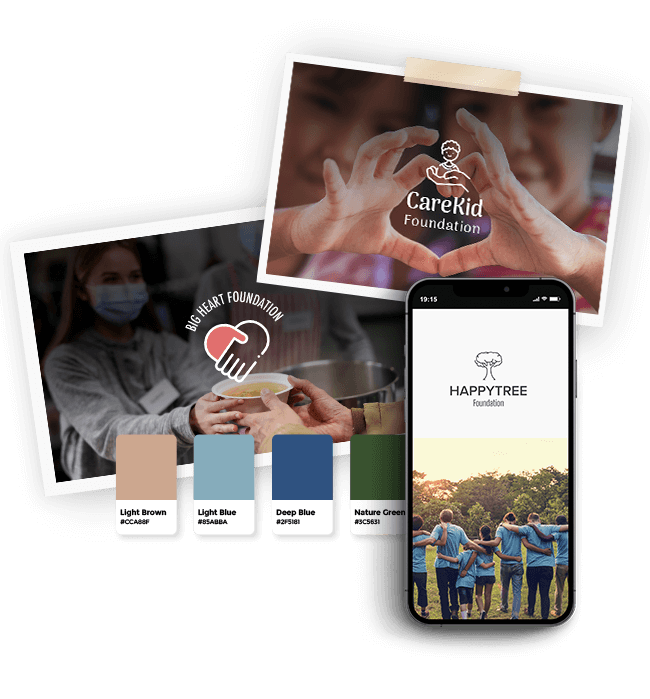
Create your non-profit logo in 2 minutes, simply by entering your business name and tagline (if relevant) and clicking ‘Design’.

Tell us a little about your non-profit, select a logotype, and choose the fonts you love, so we can create the perfect logo for your brand!

Customize and make tweaks with our logo editor to bring your vision to life. You can play with fonts, colors, and logo layout – no design skills necessary!
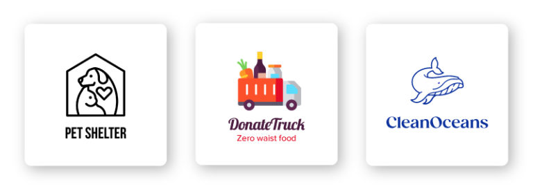
Icons come in various forms including abstract, geometric, pictorial, crests, emblems, interactive, and custom. Each has its own significance and function.
Non-profit logos commonly use icons to express the organization’s mission. Common examples include imagery of hands or people to represent helping, along with objects like ribbons or animals.
To stand out, a unique symbol that differentiates your non-profit from competitors may be more effective.
When choosing an icon, it is important to ensure that it aligns with your non-profit’s values, doesn’t overpower the overall design, and complements other elements.
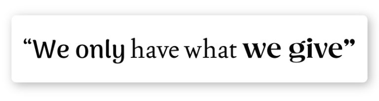
Typography is all about making your text look good and easy to read. The font you choose will determine how the text looks in your logo.
The font you decide to use for your non-profit’s logo plays a crucial role in conveying your organization’s personality and values to your target audience. It should align with your brand identity and reinforce the message being communicated.
Many non-profit logos use a variety of typefaces, with a popular choice being an all-caps sans-serif for a clean design. A classic serif can also be effective in adding personality to the logo.
Remember that the font can be adjusted and experimented with using a logo editor until the perfect one for the business is found.
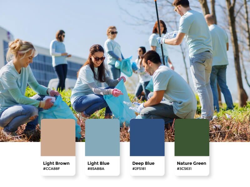
Colors can have a big impact on how we perceive things and how we feel, even if we don’t always realize it. That’s why picking the right colors for your non-profit’s logo is a big deal.
Light colors like blues and greens are often used in non-profit logos because they remind people of important issues like the environment. But, you could also try something different, like a black, white, and accent color combo, to make your non-profit stand out and draw attention to your specific cause.
As long as you choose a color palette that’s eye-catching and fits your brand, you’ll be on the right track. Just make sure the colors you go with for your non-profit logo accentuate the characteristics that you want your target audience to associate with your brand.

Your logo should look great no matter where it’s being displayed. This means that your choice of icon, color, font, and layout should be easily reproducible and scalable. Design a logo that can be easily replicated and resized for use on business cards, merchandise, and marketing materials.
Non-profit logos often place the icon to the left of the organization’s name. The idea is to have a layout that preserves your logo’s appearance even when it is scaled.
High quality logo files

Website & Domain

Powerful design tools
Products
Resources
@2024 Copyright Tailor Brands