Your logo needs to check a lot of boxes. It has to be impactful, eye-catching and unique, and express your brand’s personality, all while remaining future-proof.
Flat design is a style that can do that for you.
Let’s take a deep dive into flat design and why it might be a great option for your logo.
Plus, take a look at some stellar flat logos designed by us for a bit of creative inspiration.
Flat design is a minimalist approach that’s two-dimensional. It strips away complex design elements, such as texture, gradient, and dimension, which are often used to make an image more lifelike.
In place of those complex design elements, flat designs make use of straightforward typography, striking shapes, and bright colors. We’ll get into that later on.
If this is confusing to you, don’t worry about it; it’ll become clearer when we take a look at some examples.
Flat design’s roots are set in the Swiss Style and Bauhaus movement of the 1900s. Swiss Style saw a return to design basics; Bauhaus strove to combine aesthetic with function.
In the same way both Swiss Style and the Bauhaus movement influenced art and architecture, flat design influenced web design in the digital age.
The beginning of the digital age leaned heavily on realistic 3D designs by copying real-life properties (this is called skeuomorphism).
Skeuomorphic designs were made to mimic real-life experiences, which was important to introduce users unfamiliar with technology to new concepts. Think about how when you delete a file, it goes into the trash can icon on your computer screen.
Flat design saw a rise in popularity thanks to the release of Windows 8 and iOS 7. Now, even the biggest companies across various industries have embraced flat logo designs. From car manufacturers like BMW and Volkswagen to entertainment titans such as Warner Brothers, flat logos are everywhere.
Just look at Airbnb. Initially, the Airbnb logo featured the words “AirBed and Breakfast” in blue bubble letters. (Not what you’d call flat design-friendly.) Since 2014, the text has shrunk to “Airbnb” in a stylized font. Adopting a flat design for their logo took it from blah to branded bliss.
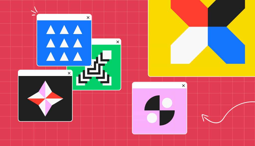
While flat design turns down the figurative visual noise dial to achieve a minimalist look, it also utilizes a few different elements to evoke a crisp, contemporary design.
Let’s run through the flat design principles with examples made from our own logo generator:
It’s important to keep scalability in mind as you design your logo.
It needs to look good on everything from a business card to a storefront window to a mobile app icon. Thanks to their simplistic design, flat logos are easy to scale up and down between media of all sizes.
Flat design works best when the fonts and typography are straightforward and simple. Sans serif fonts are the most popular, as they are clean and easy to read.
As you can see from the Oswald, JJM Housing, and Moon logos, simple, crisp typography can leave a lasting impression.
The most common shapes found in flat designs are clean and geometric. Usually circles, ovals, and rectangles are used, as you can see in the Sky Construction logo.
Most flat designs shapes generally tend to be straight lines with squared-off edges, which the Sound logo demonstrates.
Logos are meant to communicate with your target audience and build brand recognition, among other things. But that doesn’t mean your logo needs to be busy with text to do that.
To stick with the simplicity typical of flat designs, the text should be kept to a minimum. Just take a look at Up Academy’s two-word logo that proves you can say a lot with just a few words.
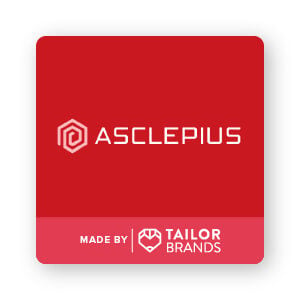
Flat design does away with visual elements like shading, gradient colors, and texture in favor of bold, solid colors. The most popular color choices are bright and vibrant, like the Asclepius logo’s use of red.
But, that’s not to say you shouldn’t use multiple colors within your logo, Modern Elementary case in point.
Just because a logo is simple doesn’t mean it’s bland.
The simplicity inherent to flat design is not to be mistaken as boring. Quite the opposite, flat design creates a logo that’s bold, eye-catching, and timeless.
These are some of our favorite flat design logos:
A flat logo might be just the thing that gives your business the boost it needs.
By focusing on the core essentials, you can create a stellar logo that’s both captivating and classic.
As we’ve seen, flat design’s clean, modern vibe has proven to work across all industries.
So do away with the clutter and complexity of other types of logo designs and embrace the flat logo!
The information provided on this page is for information, educational, and/or editorial purposes only. It is not intended to indicate any affiliation between Tailor Brands and any other brand or logo identified on this page.

Carly Miller is a freelance content writer specializing in all things branding related. When she’s not writing, you’ll find her traveling, playing with her dog, or reading a good book.