If your primary logo isn’t versatile enough for multi-platform use, you have the same problem as a friend of mine.
She’s got a thriving brick-and-mortar business, and now she’s moving online.
Her problem, and possibly yours too, is her logo doesn’t work in different media.
Sure, it looks great on her website, but it’s unscalable and unusable for her site’s URL, mobile website header, social media avatar, and small print pieces.
Here’s the thing: She can’t change her logo as it’s already on her physical advertising, stationery, and merchandise.
Ouch, sound familiar?
Fortunately, there’s a simple solution.
Much to her delight, all she, and possibly you require, are logo variations.
If you’re in a similar situation or want to avoid it in the future, I’m going to tell you how.
I’ll demystify the designer jargon and simply explain the 5 logo variations your brand needs and where to use them.
Your company logo should depict the name and purpose of your business, making it recognizable.
Logo variation is the art of rearranging your primary logo, so it works in numerous placements – providing your brand with flexible and consistently recognizable visuals that promote your brand in different forms while sending a cohesive message.
Logos come in various formats, sizes, shapes, and colors, but there are 5 variations you need. If you’re using a logo designer, they should provide you with these variations, so your brand looks consistent throughout your branding strategies.
Visualize the Disney and 20th Century Fox logos; they’re both excellent examples of logo variations and how to ensure your beloved logo is usable where ever you need it.
Brand recognition is the first advantage of logo variation, because the more you use your logo in different settings while retaining some of your brand’s core design elements (name, tagline, icon, colors, or fonts), the quicker consumers will come to recognize you.
But there’s more!
Logo variations elevate your brand by giving it a consistent look across all your offline, online, and media platforms, conveying the message to viewers that you’re reliable and trustworthy. And, the scalability of logo variations is infinitely flexible; with suitable designs, your original header logo can become your social media profile pic, website favicon, clothing label, and wordmark.
You can see how it all works by looking at our logo creator; it breaks logos down and place them on numerous merchandise and online platforms.
To sum up:
Why do brands need logo variations? Because they’re versatile, create cohesion and recognition, elevate your brand to a higher level, and instill trust in the viewer.
Now let’s answer the question: What types of logo variations should a business have?
When you search online for logo variations, you’ll see posts talking about the 3 or 4 different types of logo variations. We like to go the extra mile for our readers; we have 5!
Starting with your horizontal logo:
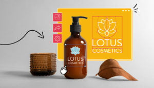
A horizontal logo is often the primary logo you use to market your brand, from which all your variations stem.
If you’ve got a website, this is the logo that works perfectly in your header. Combination logotypes are the most common, i.e. your name, tagline, and icon. They’re also the most effective way of promoting your business’s message, especially when you’re new.
Due to the quantity of information included, primary logos need space to retain their visual clarity. Because of this, they are restricted in their use – hence the need for variations!
Best placement: Desktop website header and large print materials.
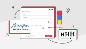
Vertical or stacked (also known as a secondary logo) is a stripped-back, scaled-down, stacked version of your primary logo. This is the perfect solution for when your primary logo isn’t suitable due to space restrictions.
Stacked logos often include only your icon and company name, removing any tagline to increase versatility.
Best placement: Mobile website header, clothing tags, business cards, and invoices.
If you have an icon in your primary logo, you can use it as a standalone visual extension to promote your brand. For example, Nike’s swoosh and Ferrari’s prancing horse are globally identifiable brand icons.
Icons provide you with an incredibly versatile little branding visual; while small, they often capture the essence of your brand and give you a multi-functional image – often becoming more recognizable than your original horizontal primary logo.
And almost every online brand has an icon for their website’s favicon (the branded icons on the left side of search engine listings) or their social media avatar (the little picture in your profile).
Another very common use for this variation is app logos, and you can also use them on business cards to repeat patterns and add extra branding to graphics like Instagram posts and images, YouTube videos, or story graphics.
Best placements: Website URL, website footer, apps, social media avatar and profile images, small print pieces.
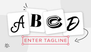
Text-based/wordmark logos contain only your company name, often in a distinctive, customized, or handwritten font (think Disney and Coca-Cola).
And, they can be lots of fun! Look at Google’s wordmark – anything but boring.
A wordmark’s secret is the simplicity of design, ensuring immediate recognition, having a clear message, and being easy to remember. It’s why many of the best-known brands use them, like Nasa, IBM, and my favorite, Marvel.
And you don’t need a distinct name to use one; Johnson & Johnson, for example, is pretty average, but their signature font gives theh logo personality.
A wordmark is excellent for new brands, those with short or distinct names if you love a bit of color, and when using numerous mediums.
Best placements: Website listing, advertising materials – digital and non, merchandize.
A reversed-out logo is a version of your logo designed to remain identifiable when laid on any background. It’s a strategy where you put your logo outline on an underlying paper, allowing the background color to form your logo.
This is a logo version that tests your logo’s depth of design. Still, the reward is a versatility that enables you to use your logo on photographs, posters, flyers, and brochures without a color clash.
A one-color logo revision, on the other hand, is just what it sounds like. It can be in any color, and as it’s singular, it avoids the usual contrast issues and can be printed in greyscale without numerous revisions. One-color logos are clear and precise, making them instantly readable and identifiable.
Nike, Starbucks, Intel, Canon, Sony, Adidas, Channel, and Coca Cola, to mention only a few, all use this final powerful logo variation.
Best Placement: Pretty much anywhere you need them.
The takeaway is, if you already have a combination style horizontal logo, you also have 4 logo variations waiting to work for your brand!
However, if you don’t have a logo yet or your variations are giving you a little trouble, it’s pretty easy to fix that; you can use a logo creator to design one, and they also provide instant variations. When you begin designing your logo, make sure that the logo make you use provides all the variations you need, so you can kick off your brand with a bang!

Carly Miller is a freelance content writer specializing in all things branding related. When she’s not writing, you’ll find her traveling, playing with her dog, or reading a good book.
Products
Resources
@2024 Copyright Tailor Brands