That sounds like a lot of pressure, but don’t worry! We’ll walk you through it, step-by-step. By the end of this guide, you’ll be able to make a logo that speaks to your target audience, builds trust, and acts as an ambassador for your brand.
Check out this video for top logo-creating tips; then, continue on for an in-depth look at how to make a logo!
#1. Understand Your Target Audience
Think of your logo as the suit you’ll be wearing to a cocktail party of investors, coworkers, and customers alike. That suit better be pressed and polished, but it also needs to appeal to the people at the party if you want to make a good first impression. You wouldn’t wear a tux to a pool party, just as you wouldn’t wear swim trunks to a wedding (and if you do, you probably won’t last long before you’re kicked out of either one).
Let’s say your investors are laid-back and your customers shy; an intimidating suit won’t make people interact with you no matter how good you look.
Analogy aside, as your logo is one of the first touchpoints that people will have with your brand, you’ll want to ensure that it resonates with the right people. Your logo is meant to forge connections with your audience, but to do that, you need to have some idea of what your audience does and doesn’t like. So, before you start making your logo, you should have a clear understanding of your target audience.
For example, someone looking for a lawyer probably wouldn’t go to a firm that uses lots of bright colors and funky fonts. Likewise, a logo for a kids-oriented brand likely would fall flat with a dark, minimalistic logo design. In this vein, consider who your business is meant to help before you move on to the next step.
#2. Write the Story
Every logo tells a story: The story of your business, your values, and your brand as a whole. Good logos are able to both convey a story and elicit an emotional response from their audience, whether it’s joyful and carefree or trusting and secure.
But why is your company’s story important?
Because consumers are tired of being sold to. Distrust in companies has skyrocketed in the last few years, and people are more likely to buy from companies they believe in – companies they can relate to. In this respect, your audience is much more likely to connect with the story of your brand than they are with your product or service alone.
Let’s look at how a few different brands tell their stories:


Moondust Art Studio conveys creativity and thinking outside of the box, which is the perfect headspace for artists. To the right, we have Smart City Construction that looks trustworthy, stable, and like its buildings are cutting-edge – exactly how you’d want your city to be renovated.
Finally, the colors, name and icon in River House gives us the comfortable, homey feeling that any real estate company would want you have before purchasing your first house.
Like these brands, it’s your job to carefully craft your story into your logo. To do that, you need to first know what your story is!
To get to the heart of your story, ask yourself the following questions:
– Why did you start your business?
– What are the things you believe in as a company?
– Who are you trying to help?
– What makes you special?
– Which three adjectives would you use to describe your brand?
Answering these questions will not only help you get your story straight, but also help you determine your brand identity; i.e. the way your brand shows itself to the world through design elements – first and foremost, your logo.
#3. Get Inspired
Are you starting to have a vague idea of how your logo will take shape?
If the answer is “no,” don’t worry – this is your time to brainstorm.
Before you put pencil to paper, try to get the creative juices flowing. If you’re having a general creativity block, there are a lot of ways to find inspiration around you. Check out this video for a few suggestions:
As you get in touch with your creative side, you can start directing your energy towards your logo design itself. There’s a huge list of sites out there that are purely dedicated to helping you find logo design inspiration, including sites like Behance and Dribble (or social media platforms like Pinterest and Instagram).
While you peruse different designs, remember to keep your story and values in mind. Once you feel like you have a good idea of the kinds of designs you can use, it’s time for your own brainstorming session.
We are generally our own worst critics, so don’t be afraid to bring others into this process; the people that know you best, like friends and family, may be able to offer ideas that you haven’t yet thought of.
Put every idea on paper, no matter how lame you think it is. No idea is a bad one, and you may be surprised by the reaction you get from your brainstorming team.
#4. Stake out the Competition
Your competitors are an inspirational gold mine, in that you can get a feel for the kinds of logos your audience gravitates to (and the kinds they will probably stay away from).
However, while it’s ok to take some ideas – don’t copy. Aside from the fact that it’s ethically irresponsible (let’s be optimists and assume that everyone in the world is against plagiarism), creating a logo that’s identical to your competitors will put your brand at a disadvantage.
Remember, you want to design a logo that will fit in with your niche while standing out from the crowd.


Let’s take the above education logos as an example. Each logo has its own unique spin, yet all of them have a distinctly academic feel.
However, the way each logo gets its message across is different: Sophia Williams uses an icon of a book, Emma makes a math pun, and Up Academy emphasizes growth with its letter formatting.
During your research, create a file of the designs you gravitate towards and then try to identify why you like them. Maybe it’s specific colors, fonts, or shapes that grab you; more than likely, it’ll be a mixture of all of the above.
Then, think about how you can express your brand message in an individual way, while still appealing to the same audience as your competitors.
#5. Decide on a Type of Logo
Did you know that there are actually nine types of logos?
Don’t worry – it’s not as overwhelming as it sounds. Each type of logo can be broken down into one of three categories: Image-based, letter-based, or combination marks.
Your niche, business name, and design preferences will all influence what kind of logo you choose.
Here is a brief overview of all three:
Image-based logos


These logos are easily memorable, as they are based off of a single image that resonates in people’s minds. Ideally, the image (or icon) chosen represents the name of a business or the products/services that the business provides.
You should consider using this type of logo if you want to be associated with a specific product you offer or value you hold. Note that it will take some time before people learn to connect your business name with your logo, so it may be awhile before you build brand recognition.
Think: McDonald’s, Twitter, Apple.
Text-based logos


In contrast to the above, these logos do away with an icon or image, instead putting more focus on typography and colors. You can choose to use your whole business name, or, if it’s too long, go with a monogram of one to three letters.
Note that fonts do a lot of the work with text-based logos, because your audience’s eye is drawn to the business name, and as a result, the letters themselves.
Think: Coca-Cola, FedEx, Uber.
Combination marks
If you want the best of both worlds, combination marks might be the answer you’re looking for. Like the name suggests, these logos incorporate both images and letters into their design. The main advantage here is that your logo will be versatile, and it gives you a lot of elements to work with in terms of conveying your brand message.
Note that you’ll want to make sure all of the elements come together to tell a cohesive story, rather than simply creating an unappealing, cluttered design.
Think: Taco Bell, CVS, Toblerone.
#6. Experiment with Typography


Remember that brand story thing we discussed earlier?
Well, fonts are a huge component of telling your story (unless you choose an image-based logo only, in which case this won’t apply).
Every font has its own personality, and they can be broken down into several “families.” The most popular fonts for logos are serifs, sans serifs, slab serifs, and scripts.
Serif fonts

Serif fonts get their name from the extended fine lines – or “feet” – at the end of letter strokes.
These fonts are elegant, luxurious, and sophisticated, and they tell stories of affluence and reliability. They’re probably the most well-known and widely used fonts in logo design.
Famous brands that use serifs are Tiffany & Co, Giorgio Armani, Burberry.
Sans serif fonts

Sans serif fonts are contemporary.
Unlike their serif cousins, their characters don’t have stylized strokes. Instead, they offer a simple, clean finish. These fonts are readable, clean, and bold, and they tell stories of clarity and innovation.
Famous brands that use sans serif fonts in their logo are Google, Facebook, and Microsoft.
Slab serif fonts

Slab serif fonts are modern rule-breakers, as they’re a departure from the classic styles of the above two font families.
Although boasting serifs as well, they have large, block-like finishes rather than the traditional serif feet. These fonts are bold, loud, and confident, and they tell stories of dependability and creativity.
Famous brands that use slab serif in their logo are Sony, Honda, and Volvo.
Script fonts
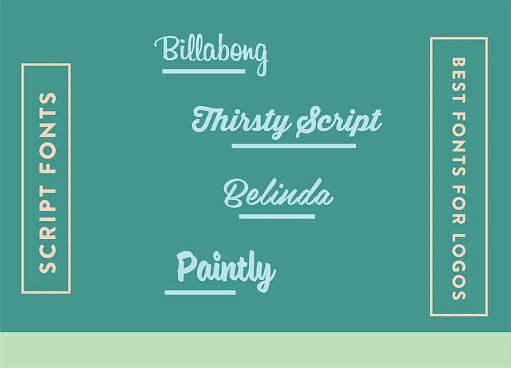
Script fonts, as the name suggests, have a handwritten, festive look.
Characterized by swirls and loops, they are designed to look like calligraphy. These fonts are personal, free, and feminine, and they tell stories of elegance and emotion.
Famous brands that use script fonts are Coca-Cola, Ford, Instagram, and Pinterest.
#7. Choose Colors
Like fonts, colors have their own personality and convey different meanings. Each color has its own “emotional baggage,” in that it makes your audience feel something specific.
That’s why your logo colors contribute to your story, as they say something about the personality and identity of your brand. They invoke subconscious associations in people’s minds, and they can even influence your audience to behave in a specific way as a result.
Let’s look at the psychology behind each color:
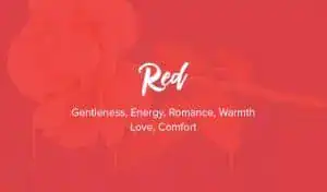


Red: Gentleness, energy, romance, warmth, love, comfort, passion.
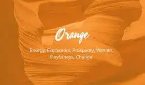
Orange: Energy, excitement, prosperity, warmth, playfulness, change.
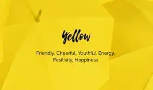
Yellow: Friendly, cheerful, youthful, energetic, positivity, happiness.
Green: Nature, health, wealth, tranquility, harmony, fertility.
Blue: Wisdom, loyalty, spirituality, mystery, sophistication, respectability.
Purple: Spirituality, luxury, authenticity, truthfulness, quality, introspection.
Brown: Nature, reliability, seriousness, confidence, security, friendship.
Black: Power, strength, intelligence, glamour, luxury, modernity.
White: Hygiene, purity, innocence, cleanliness, clarity, youth.

When choosing your colors, don’t just think about what looks nice; be mindful of the associations your audience will have with each color, and make sure the colors are appropriate for what your business does.
Note that most logos aren’t monochromatic, and yours doesn’t have to be either! Colors can work just as nicely when combined as they do on their own. However, don’t overdo it with too many colors; two or three colors are enough for a logo, and any more than that will likely confuse the message of your design.


#8. Create Multiple Iterations
Once you think you’ve nailed your final design, create multiple variations.
Play with fonts from the same family, find several similar icons, and test out different colors. For example, if you’ve decided on a combination mark as your logo of choice, tweak the positioning of each element; put an icon on top of your business name, then move it to the left – which do you think looks better? What about when you make the icon bigger?
Try and come up with at least five versions of your logo, and then ask friends and family for feedback; they’ll tell you if there’s a clear winner.
Finally, ask yourself if your winning logo checks all the boxes of your brand’s story. Is it memorable and unique? Is your message getting through?
When you’re ready for the ultimate logo test, it’s time to….
#9. Put Your Logo Everywhere
When you start using your logo, it’s going to appear anywhere your business does. From the internet to business cards, your logo design needs to look professional and clear – and what better way to test this out than by seeing how it looks in real time?
Add your logo to an unpublished website. Print it on business documents, and see how it looks in a letterhead. You can even put it on your social media pages and get a sense if the public likes what they see.
However, if you’re hesitant to start printing things, that’s okay; you can always use a software that lets you generate mockups to check how your logo looks on branded merchandise.


Keep in mind that your logo will have to tell the same powerful story on any and all branding materials, so make sure you like the way it looks before you fully commit.
FAQ
Creating a logo for free is easy; you just have to use an online logo generator to get started. Enter your business name, some information about your company, and your design preferences, and the computer will do the rest! You should have a brand new logo in under 5 minutes.
Your Instagram logo should be the same as your brand logo, but in a PNG file that’s sized according to the dimensions of your profile image (180 X 180 pixels and at least 110 x 110 pixels ). It’s important to put your logo right where your profile picture is, so that your followers will easily be able to identify you. And, you’ll want to make sure that your Instagram logo looks good on all devices, so check it out on both mobile and desktop before committing to the design.
When creating a YouTube logo, you’ll want to make a logo that resonates with your current and future channel subscribers, so you’ll have to do some research. First, find out which colors, fonts and icons are commonly used in your industry, to get an idea of what your audience likes to see. Then, create a logo that conforms to industry best practices while incorporating your own unique spin. Please note that the ideal size of a YouTube profile picture / channel icon is 800 x 800 pixels.
A good logo has five basic characteristics: Timeless, simple, memorable, attention-grabbing, and appropriate for your industry. While there are always exceptions to the rule, most good logos use only two to three colors and one typeface. And, good logos are printable at any size without having the design compromised.
Open your logo with your design tool, add a “transparent layer,” select the background and make it transparent, and then save the file as a PNG! If your logo background looks like it has gray and white checkers, don’t worry; when you actually use your logo, it will appear colorless.
Over to You
Making a logo takes time, but once you settle on a final design, you have laid the foundation for all your future branding requirement – business cards, presentations, brand books, and of course, your website.
Remember, your logo is more than just colors, fonts and shapes. Your final design shouldn’t just look cool – it should also speak to you and the brand image you want to cultivate.