Image-Based Logos
Icon-based logos use images in order to send a message about the brand they’re representing. Let’s check out the 4 different types:
1. Brand Marks
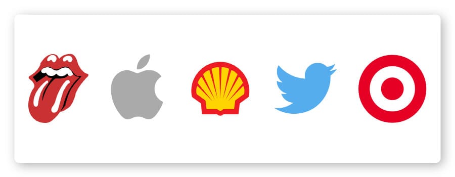
Brand marks – or pictorial marks – are logos that are made up of a graphic symbol or icon, one that (usually) represents a real-world object. We’re talking a logo icon that’s simple and straightforward, like the outline of a tree or a coffee mug. This object could tell the story of what your company does – think Youtube’s play button – or maybe play with your company name.
Advantages of a brand mark:
Brand marks are clean-cut and easy to remember. If you offer a specific service, an image representing that will send a quick, clear message to your audience.
Also, the simplicity of the design will translate well when resizing your logo across branding materials like business cards or letterheads.
When to use a brand mark:
Is there one thing your business does really, really well? The Twitter brand mark is well-suited because it’s a bird, which instantly reminds people that the company tweets. If your business already has some traction, and/or if you specialize in one product or one service that can easily be represented by an image, then a brand mark could be a great choice for you.
Or, if, like Apple, your business name represents a real-world object, then you could also use a brand mark of that same object.
What to consider before using a brand mark:
Tread cautiously if you’re a new business or don’t yet have many followers. While a brand mark is often the hallmark of companies that could be considered iconic, you need to first be established enough to be recognized. Otherwise, your logo may not communicate enough about you to your audience, and they’ll lose interest in your brand.
Also, bear in mind that if you’re planning on expanding your product line to a few diverse objects, your logo may misrepresent what you do.
Inspiration: The Rolling Stones, Apple, Twitter, Target, Royal Dutch Shell
2. Abstract Logo Marks
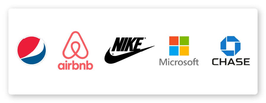
Abstract logos are your conceptual, think-about-the-big-picture logos.
Like brand marks, an abstract logo consists of just a symbol – but one that is tailor-made for you. This type of image doesn’t necessarily mimic an object that exists in real life; rather, it’s a unique logo that’s designed to express something specific about your brand.
Advantages of abstract logos:
There’s room to play with these designs, because you can create a logo that really communicates your values or something about your brand that you’d like to emphasize.
Because an abstract logo isn’t restricted to a real-world object or image, there’s a lot of wiggle room to say what you want about your company.
When to use an abstract logo:
If you’re a business that does several distinct things, a well-thought out abstract mark may be the perfect logo for you! Abstract designs are great for communicating brand values or something else that you want to distinguish about your business.
The Chase logo, for example, is able to represent forward motion, while simultaneously symbolizing the different parts of the bank itself.
You can also do well with a simple abstract logo if you’re planning on doing the bulk of your branding online, because simple designs will translate well regardless of the logo size.
What to consider before using an abstract logo:
You’ll want to make sure that you refine the logo design until you’re sure you’re conveying the intended message to the world. Attention to detail is crucial with abstract logo marks, and you don’t want your message to be misconstrued with a logo design that’s too vague or hard to understand. Notice how the Nike logo is easily recreatable from memory?
Also, a logo with excessive detail in the design may not look the way you want when printed at different resolutions; therefore, consult with a logo designer that understands how fonts, colors and shapes interact.
Inspiration: Airbnb, Pepsi, Microsoft, Nike, Chase
3. Mascots
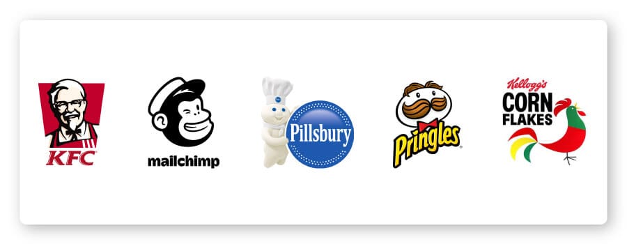
Arguably the most family-friendly type of logo, mascots are images of a character or person that act as a visual representation of your business. Think of them as your brand’s “spokesperson” – much of your advertising will be centered around them.
Advantages of mascot logos:
Mascots give their audience that warm-and-fuzzy feeling, which leads to creating a distinctly memorable brand. Also, nothing appeals to kids more than a physical, tangible character that they can relate to.
And, while you may empathize with the guy standing outside a seafood restaurant waving the arms of a 6’2 lobster costume as he sweats desperately in the August heat, your kids are likely to go crazy over him and beg you to eat there.
Just some food for thought. (See what we did there?)
When to use mascot logos:
These are a great choice for brands trying to cater to children. Many food businesses or restaurants use mascots – like KFC and Kellogg’s – as do brands that want to make a complex idea seem more accessible, like Mailchimp’s marketing automation platform.
So, if you offer something a little more “dry” or difficult to understand, like a SAAS (software as a service) or plumbing services, a mascot could be a great way to humanize your brand and make it more appealing to your audience.
What to consider before using a mascot logo:
Realize that Mascots may not send the right message if your company’s focus is global innovation or disrupting the pencil industry – or, of course, marketing a product that isn’t child-friendly.
Case in point: Camel cigarettes ran a ten-year advertising campaign based on their mascot, Joe Camel (also known as Old Joe). However, they had to pull the campaign in 1997 while facing a lawsuit that accused the company of using Old Joe to target children – evidenced by a $470 million increase in cigarette sales to teenagers since the campaign started.
Moral of the story: If you’re a company selling cigarettes – don’t try to promote to kids. Just don’t.
Companies like Pillsbury, on the other hand, are perfectly represented by their wholesome, doughy – I mean, well-rounded – mascots (pictured above).
Inspiration: KFC, Pillsbury, Kellogg’s, Mailchimp, Pringles
4. Combination Marks
The name is pretty self-explanatory, but combination logos incorporate – combine – both images and words into their design.
Combination mark logos include any combination of images and words that you choose; you can pair a letterform with a mascot, a monogram with an abstract image – whichever combination speaks to you the most. (We’ll talk more about some of these other logo types below.)
Advantages of combination marks:
One word: Versatility.
With both symbols and letters at your disposal, you can use your logo to craft a clear brand message that sticks.
The combination also allows for easy rebranding – your company name, for example, combined with an image (abstract or otherwise) will be associated as one, so that eventually your customers will only see the symbol and still immediately think of your brand.
(Nike did just that with their infamous “swoosh”; while their traditional logo is their name combined with the swoosh image, their clothing is often branded with just the swoosh – and is instantly recognized.)
When to use a combination mark:
You’ll definitely want to consider this type of logo if you’re just starting out. Combination marks will give your audience multiple visual cues when they come in contact with your business, which helps them to remember you – and what you do – over time.
They’re also a great option if you want to trademark your logo, as pairing symbols with text will help you to create a distinct image.
What to consider before using a combination mark:
Versatile shouldn’t mean excessive. Conceptualize how you want your name and symbol to work together, and keep your logo design clean and on-message.
Inspiration: Pizza Hut, Puma, Mastercard, CVS, Toblerone.
5. Emblem Logos
Even the name has that impressive, traditional feel. Emblems have stood the test of time, from family crests to the royal stamps of powerful monarchs. These logos consist of a typeface that sits within a border – usually a seal or a crest. Think universities and government organizations.
Advantages of emblem logos:
Emblems are memorable, and they lend an air of professionalism, traditionalism and importance to your brand. They also give the impression that your company has been around forever, and it isn’t going anywhere any time soon.
When to use an emblem logo:
This logo type is great for brands who want to seem reputable or tell their audience that they uphold traditional values. Emblems look particularly good (read: prestigious) when they’re engraved, so it may be a good option for you if you run an organization with uniforms or garments of some kind.
What to consider before using an emblem:
Once again, think about scalability as you design your emblem, since these logos tend to have more detailed designs that may not look as nice when resized.
Also, emblems don’t afford you the same flexibility as standard combination marks do, so be absolutely sure about your design before sending your logo into the world.
Inspiration: Starbucks, Stella Artois, Perrier, BMW, Harvard
6. Dynamic Marks
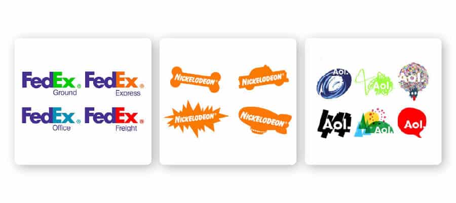
You could say dynamic marks are the new-age logo. Unlike other logos, this type of logo adapts itself to the context in which it’s used. This means that rather than having one standard font-color-text combination in your logo, these elements can change – whether on the internet or on different branding materials.
Advantages of dynamic marks:
You can be as creative as you want! Because there are so many mediums through which to build your brand (think responsive web pages or mobile sites, blogs, digital media, merchandise, ads – the list doesn’t end) you can modify your logo to fit any scenario or make a slew of impressions on potential customers.
Also, dynamic logos keep things interesting; your audience will be waiting on the edge of their digital seats to see what you come up with next.
When to use a dynamic mark:
This is a great option for brands in entertainment, media, or creative industries. If your business will have a number of different branches, like FedEx, then a dynamic mark with a changing color could be a great way to differentiate those parts to your customers.
What to consider before using a dynamic mark:
You don’t want to lose the associative power of your logo. Some of your followers may connect your brand with your colors, others may remember the shape of your icon; if these details are constantly changing, your logo may not cause the same effect as a stagnant logo would. Be mindful of the changes you make, and once again, make sure to keep your logo on message.
Inspiration: Nickelodeon, AOL, FedEx
Name-Based Logos
The following logo types don’t use images or icons in their designs, and they primarily use a strong typeface and color palette in order to make their mark. Let’s take a look!
7. Wordmark Logos (Logotypes)
Wordmark logos consist of text only – company names, monograms or initials.
Essentially, logotypes are just a business name set in some kind of particular typeface (font).
Advantages of wordmark logos:
No one has to do any guessing when they see a wordmark – it’s quite clear what company the logo represents. Because the design is all in the lettering, logotypes are one of the most versatile logo options that are easily transferable onto any marketing material.
When to use a wordmark logo:
If your business name is catchy, this is the perfect way to highlight that and use it to your branding advantage. High-end fashion brands like Tiffany and Co. use wordmarks a lot, as do food brands and tech companies that want to be seen as innovative.
The power of wordmarks are all in their fonts, which means that you can choose a font whose style is highly reflective of your brand’s personality – and your audience’s eyes will be drawn right to your logo.
What to consider before using a wordmark logo:
Does your business’s name say anything about what you do? If you’re not well-known, or if your business is named after a person rather than a concept, it may be difficult to create the kind of brand recognition you’d want a logo to help foster without using an image.
Inspiration: Subway, Uber, Coca Cola, ToysRUs, Tiffany and Co.
8. Lettermarks (Monograms)
Think abbreviations. Lettermarks, or monogram logos, are typography-based logos that take the abbreviated initials of a company and spruce up their design a bit. Boom! You have a no-fuss, no-frills logo.
Advantages of lettermark logos:
Likely more than ever before, the world loves abbreviations (maybe we have the current technological era to thank for that?). From our interpersonal communication style – LOL, BTW, OMG – to name a few – to our luxury car companies (BMW), acronyms are throwing themselves all over the modern era.
Also, they’re to the point: Lettermarks turn your lengthy business name into an identifiable brand identity
When to use a lettermark logo:
It’s relatively easy to get this logo up and running – after all, there’s not much detail to think about – so monograms could be a great option if you’re a new/small business who needs to get their name out there.
Lettermarks are also a good choice for you if you have a long business name – like the New York Yankees – which is difficult to print on small objects or read at a small scale. Finally, because monograms are often associated with personalization and wealth, they can be a good option for brands that are trying to appeal to a high-end crowd or offer homemade/handcrafted items.
What to consider before using a lettermark logo:
Know your fonts. The simplicity of the logo should work to your advantage, but make sure you’re not stuck with a boring, forgettable logo design; the appeal lies in the details.
Also, you may want to consider embossing your business’s full name under your logo on branding materials (like business cards or a landing page) so that people can build an association between your monogram logo and your company name.
Inspiration: HP, LG, Louis Vuitton, New York Yankees, IBM
9. Letterforms
Last but not least, letterforms are the minimalist cousins of monograms; they’re just one-letter logos. Of course, these logos should be bold and beautiful (read: designed well), since it is difficult for a letter alone to convey a clear message. Think Favicons (“shortcut” or website icons).
Advantages of letterform logos:
Letterforms are easily scalable. When your logo is just one letter, you can stick it anywhere and have it look equally as good. And, a successfully-designed letterform will subconsciously invoke the full name of your brand in people’s minds.
When to use letterform logos:
If you have a long and complicated business name, then letterforms are a good way to make your logo “snackable” while still hinting at your business name. You can play with the typeface to have your letterform stand in for something you offer, like the Beats logo does to symbolize speakers.
What to consider before using a letterform:
Because these logos are just one letter, the design is crucial; if the logo isn’t memorable, it’s pointless. This could mean it has a funky font, dramatic backdrop or interesting color scheme- anything that makes the letter pop off the page and resonate.
And, make sure the font you use is legible. If your logo is just one letter, you want people to be able to read it.
Inspiration: Beats, McDonald’s, WordPress, Yahoo, E! Online
Over to You
Now that you know about the types of logos that are out there, it’s time to craft your own! Don’t worry – Tailor Brands logo designers tools have you covered.
You don’t need logo designers when you can use our logo maker. It’s powered by AI, and uses thousands of data points to select the most appropriate fonts for your industry. It also reviews current industry trends fonts to ensure the fonts you use in your logo are aligned to what’s current and fresh.
