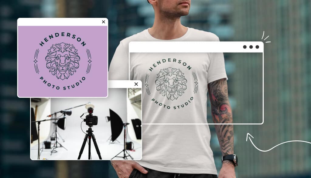
What makes the emblem logo so unique is that it’s not necessarily reserved for the super elite but still gives off that elite feeling. And chances are, you’ve seen emblems dozens of times (think Superman’s logo).
For your business, showcasing the heart of your company means going back to tradition. If that’s the case, then choosing an emblem logo might be the way to go. In a world that is constantly evolving, there’s something to be said for tradition.
What is an Emblem?
Before we delve further into this specific logo type, it might be helpful to review the main logo categories: Wordmark, brandmark, monogram, combination, and emblem.
A combination logo combines both text and an image. Similarly, emblem logos take the concept of a combination mark and incorporate it within a frame or border. The imagery used is typically symbolic and fuses seamlessly with the text. Think of a badge, seal, or crest.
Often associated with brands that have a long history, it’s no wonder an emblem can convey a sense of prestige and power.
Who Uses Emblem Logos?
Businesses choose emblem logos to create a vintage vibe, while appearing well-established and prestigious. This type of logo is an excellent choice for modern businesses that want to convey confidence, trustworthiness, heritage, and tradition.
Take the Warner Brothers logo as an example. Over nearly 100 years, the major film corporation’s classic, time-tested design features a shield with a ribbon against a blue background and bold golden abbreviations. The Warner Bros logo is instantly recognizable leading audiences to immediately respect the films it has produced.
Let’s take a look at some of the world’s most prominent emblem logos:
Sport Teams
When designed well, an athletic team’s logo can rally the fan-base and intimidate rival teams. These three do that well.
NFL
Emblem logos make your consumers feel like they are connected to a community of like-minded people. The emblem for the NFL does this well. The iconic logo has remained relatively unchanged ever since the league was formed in the 1920s. The shield, capitalized letters, and the little oval ball, has become the defining elements of the emblem that’s become an international symbol of the sport. The shield shape communicates the league’s commitment to excellence and glory, while the colors proudly represent American identity.
Manchester United
It’s no doubt that their crest and logo have played a big part in making Manchester United one of the biggest establishments in sports history. Though the logo has gone through various modifications over the years, it has essentially gone unchanged in the past 23 years. Other clubs have gone for simplified logos in modern times, but United’s crest has stayed the same- rooted in history and legacy.
Liverpool Football Club
It is fitting that the Liverpool Football Club logo looks as fierce and regal as Manchester’s given that the two clubs have a long-standing rivalry. The color red was picked purposefully to express power and danger. Their slogan “You’ll Never Walk Alone” hones in on the club’s tight-knit community and dedicated fanbase.
Universities
Harvard

Nothing says prestige like the latin mottos on an emblematic crest. Veritas, which is Latin for “truth,” was adopted as Harvard’s motto in 1643, and is now inscribed in its crest.
Yale

The Yale University coat of arms is the primary emblem, featuring a dark azure blue color that has officially been called Yale Blue. Encased in the shield is an open book with Hebrew words while Latin words Lux et Veritas surround the shield. These words translate to “light and truth,” which assures academic integrity and respect.
Princeton
The historic Princeton logo features a shield showcasing contrasting colors. Placing orange and black side by side creates a visual appeal while also commanding attention. The shield depicts an open Bible, and a ribbon below bearing the university’s motto which translates to “under God’s power she flourishes.”
Automobile Manufacturers
Harley Davidson
Although this world-famous motorcycle manufacturer has a logo that evolved over time, the design has remained an emblem throughout its century of existence.
Ferrari
The emblem’s yellow background symbolizes the color of the Italian city Modena, Italy. The two letters accompanying the horse- S and F- stand for Scuderia Ferrari, the name of the brand’s racing division. Stripes on the top of the logo in red, white, and green represent the Italian national colors.
Porsche
As the cars were made in Stuttgart, Germany, the city’s coat of arms was chosen as Porsche’s centerpiece. The black horse and black and red stripes all come together to represent power and status.
Diners and Cafes
The Diner of Dallas
This beloved local restaurant’s logo practically oozes the all-American feel diners have come to embody. The Diner of Dallas’ logo promises home cooked meals, retro feels, and decades of experience perfecting their sweet apple pie.
Starbucks
While the coffee corporation underwent a logo rebrand in 2011, their emblem logo, which they featured for decades, is still among their audience’s favorites.
Steak n Shake
Steak n Shake is an inspiring example of a small local restaurant turning into a huge international success story. The founder had a completely unheard of menu item, a steakburger, when he began, one that even his customers didn’t trust. He gained his customer’s trust in his product by grinding steaks into hamburger meat publicly in his restaurant. The corporation’s slogan “Famous for Steakburgers” is featured in the logo, proving a logo based on your own unique history is a good place to start.
Emblem Logo Design Tips
It’s not as easy to create a strong emblem as it seems. Here are a few design tips to keep in mind before you start designing.
Colors: Stick with 2 colors (or 3, tops,) and aim for only one “brighter” color if you’re going to have one at all. Because emblems give off a timeless feel, you’ll want a lasting color palette. Think whites, greys, blacks, maroons, blues, etc. but remember to take the meaning of logo colors into account before you decide on the right palette.
Fonts: If you’re going for an old-school feel, serifs are your move. But, if you want something that speaks to a more modern crowd, consider a sans serif typeface with thick weights (like you see in the Starbucks logo). Try to go for a simple font, so as not to overwhelm the otherwise-busy design. And, make sure that the typeface you choose looks good no matter the size.
Icons. Remember, in an emblem logo, your emblem is the icon. However, you may want to consider taking it a step further by incorporating an image or shape within the frame, so as to say something about your brand. For instance, the Harvard logo above incorporates little books within the shield to symbolize its scholarly achievements.
Remember, when designing an emblem, you’ll want to use elements that support what it stands for – longevity, traditionalism, uniqueness, timelessness, etc.
What to Consider Before Creating an Emblem Logo
One roadblock you may want to consider with an emblem logo is scalability.
Logos are about getting your business’s name out into the world and giving your audience a positive, visual image to associate with your brand. As such, you’ll want to put your logo everywhere for it to be effective, whether that’s in the corner of your website or printed on a bumper sticker.
However, because of the detailed design that is often typical of an emblem, the logo can become illegible when resized. And, while there are some tools to help you work around this – like a Vector file for offline printing – preserving the design can prove challenging.
Think about your overall brand strategy and where you intend on showing off your logo. As a general rule, emblems tend to look best on:
- Merchandise, like apparel, coffee mugs (again, think Starbucks) or product packaging
- Ads, especially billboards and signage
- The front of a building
- Desktop computers, whether on websites or social media ads
Over to You
Like any logo you choose, an emblem is supposed to tell the story of your brand.
Emblems are a great way for a business to evoke a feeling of heritage and nostalgia. The traditional shapes and symbols make these logos great for communicating personal values.
So, when you’re ready to make a logo, first think about your business’s backstory and all the core values you want to convey in the design. This will help you infuse your design with the emotions and values that your audience will connect with.
If you’re unsure about how to start, try browsing through logo design inspiration sites to look at how others have used emblem logos to convey their brand messages. Then, see if you can use an emblem to communicate your own brand values in a similar way.
Happy branding!
