Benefits of Single-Letter Logo Design
Here are 5 reasons a single-letter logo could be the right choice for your brand:
Simple and minimalist
Rather than distract with additional imagery, the single-letter logo keeps things cleaner and more direct. You can still add design elements, but you’ll start with a simple concept. There is often a lot of power packed into minimalist logo designs—most often because they’re easy to remember.
Scalable
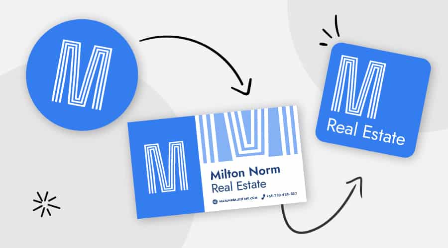
In the current age of apps, having a simplified icon is a huge benefit. Users who are looking for an app on the screen need something easy to identify with a brand quickly. A single-letter logo is also perfect for favicons and small print, forcing you to think smaller and less complex.
Modern look
Brands that want to appear traditional typically use emblems or their entire brand name in a logotype design. Modern apps and companies, however, use icons and single-letter logos. You can achieve an edgy or innovative look with just one letter and a creative approach to your logo layout.
Easy to identify
When you find the right one-letter design, it will help customers immediately think of your brand as soon as they see it. With one letter, the name of your company is often easy to remember. This makes it especially crucial to do your research and make sure your one-letter design is distinctly different from other brands—even if they are in another industry.
5 Things to Consider When Designing a Letterform Logo
You might think a single-letter logo is the easy way out; maybe you’re hoping to just create a big letter in the right colors and be done with it. But, you will spend just as much time perfecting the letterform logo as you would any other kind of logo.
When it comes to just one letter, the design is extremely important. You still need to create a memorable, unique logo. Here are some tips to consider for a DIY logo:
Color choice
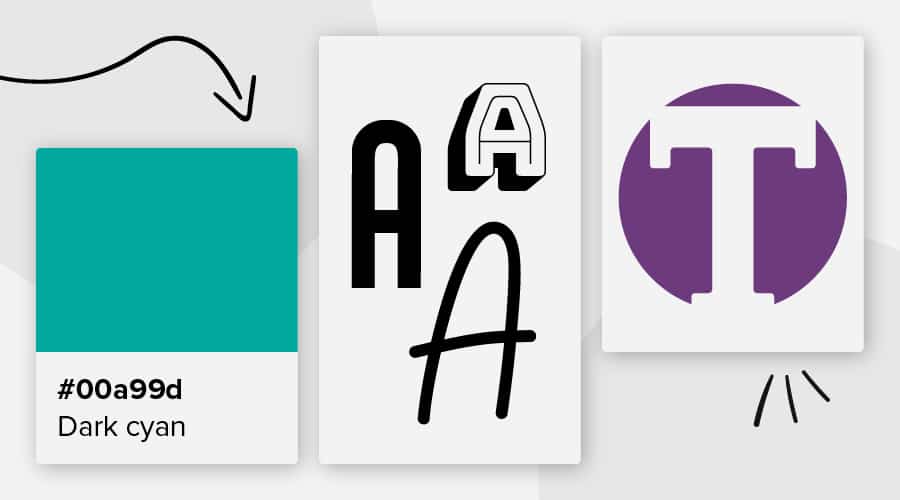
Colors are packed with meaning, and you can use them to help differentiate your brand. Even if you have the same letter as another brand, you can use color and style to make your own logo distinctly different. McDonald’s, Monster and Motorola all use an “M” for their logo, but they are decidedly different in style and color; there is no brand confusion.
Bright and energetic colors can be motivating and attention-grabbing. Subtle and subdued colors may give a more natural or caring feel to your logo. And, monochromatic designs are easy to reproduce, while gradients can look more modern and innovative.
Background and negative space use
You will have space behind and around your letter that is also part of the design. While some brands choose to leave their background white, others make use of that background space with additional color, texture or detail.
When planning out your background, consider how the negative space can be used to add intrigue to your design. Some brands use it to create meaningful shapes, while others try to offer eye-catching composition (like the Adobe logo). You can even use negative space to create an extra hidden meaning within your logo.
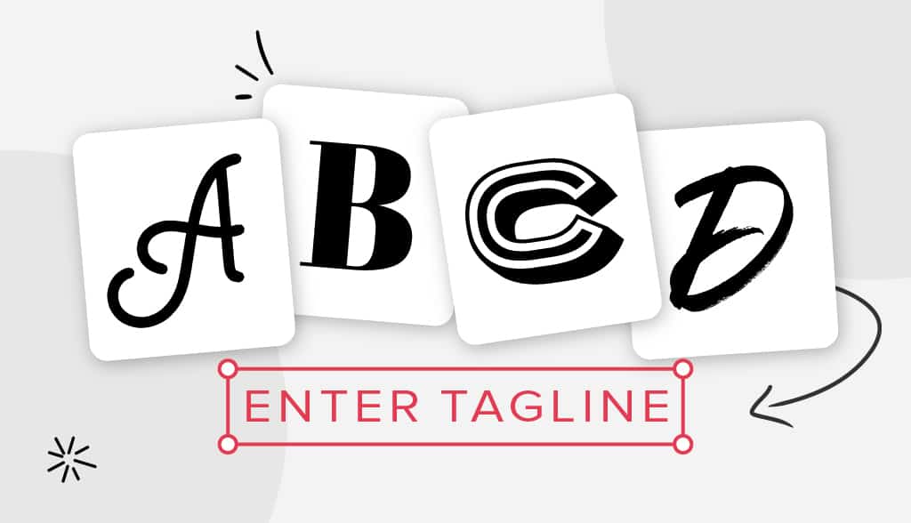
Font family and weight
Fonts can hold a lot of meaning as well:
▪︎ Script fonts tend to look creative and refined
▪︎ Sans serifs look more modern and straightforward
▪︎ Block fonts and slab serifs tend to be edgier with an in-your-face approach
▪︎ Bubble fonts and other decorative fonts are fun and allow for a lot of creativity
▪︎ Classic serif fonts are serious and timeless, showing dependability
Within each font family, you’ll also have a range of line weights (thicknesses) and styles. The right font needs to be easily readable while showcasing your brand aesthetic.
Hidden meanings
A great example of hidden meaning is in the Pinterest icon. The script “P” makes up an abstract pushpin to illustrate the idea of pinning things on the platform. You can use your letter logo to display hidden meanings that are typically not noticeable at first, though might be subconsciously grasped.
Clear imagery
You can also use very clear imagery to set your brand tone or depict what you offer. Some brands will use illustrations within the letters, while others use the letters to create a recognizable shape.
18 Inspiring Letterforms
This is certainly not an exhaustive list, but here are some brands using highly successful single-letter logos:
Adobe
Not only does Adobe use just one letter, it does it without actually using a font. The brand’s logo consists of a handful of shapes creating the slightly abstract “A” with negative space.
Airbnb
According to Airbnb, the “A” shaped logo encapsulates imagery for people (stick figure head and arms), place (upside-down teardrop location marker) and love (upside-down heart).
Audio Now
Audio now is a bit of a twofer; you get both the A and the N combined into the “N” logo. It’s a simple concept, but effective. The little twist on the left side of the “N” shows movement in the logo but also helps distinguish the “A” side.
Beats
The very simple “b” shape emulates the shape of the headphones themselves. The logo also looks like a speaker or music note to help your brain connect meaning to the brand without even knowing exactly what they are about.
Bentley
This monogram uses some outside imagery in the surrounding space to create an emblem. The wings symbolize speed and freedom for the luxury car brand.
Bluetooth
Combining the Nordic letters for “H” and “B” to stand for the initials of Harald Bluetooth, the Bluetooth logo takes on the edgy shape of a recognizable “B” on a sensibly chosen blue background.
One of the most instantly recognizable logos of all time is the straightforward Facebook “f.”
E Channel
The genius behind this logo is using the symbol of excitement (!) in an energetic red color to encapsulate the “E.”
History Channel
The timeless gold and classic serif font used for the “H” symbolize times past, while the monumental 3D design resting on the red line looks as if something is popping right up out of a history book.
Honda
The “H” of the logo looks nothing like the typeface it is often paired with. And, the logo in the badge shape has a futuristic and dependable feel.
Internet Explorer
A simple sweeping halo around a lower case “e” provides an extremely clear picture of movement around the globe, for a brand that has connected people over the internet since 1995.
Kellogg’s
Though it’s often paired with the rest of the typeface for the full brand name, Kellogg’s “K” stands on its own in a font that has hardly changed since the early 1900’s.
Monster
The “M” for Monster was created with 3 downward claw marks in a vibrant green gradient, which clearly shows energy coming from within.
Gmail
This is a great example of a brand using its one letter uniquely. The “M” for mail directly symbolizes a recognizable envelope shape in colors that tie it to Google—making it related but different from the colorful “G” favicon used for Google’s search engine page.
Unilever
With 25 unique shapes that represent sustainable living, the larger “U” for Unilever is meaningful and detailed for a single-letter logo.
Venmo
While extremely simple in concept, the small bend in the “v” shows movement with a dependable blue background.
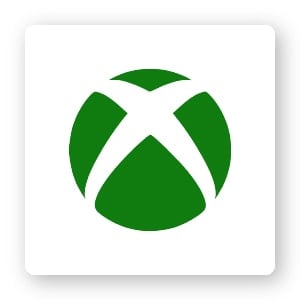
Xbox
The “X” for this brand logo also makes the perfect round button for the power button on the controller.
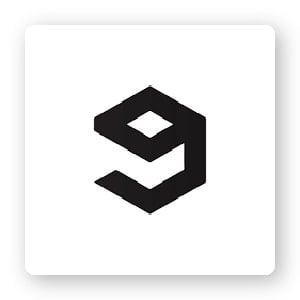
9GAG
Looking like both a ‘9’ and a ‘g’, the 9GAG logo also takes an abstract form of a box to represent the Hong Kong-based social media platform.
Over to You
There are so many other one-letter logos to look at for inspiration, including T-Mobile, Skype, Yahoo, WordPress, McDonald’s, Champion and Motorola. You can find one-letter logos among universities (like Purdue, Ohio State and Vanderbilt), as well as many professional sports teams (like the Green Bay Packers or the Los Angeles Angels).
Browse through the above logos for inspiration, remember to consider color, shape, font and negative space, and start thinking about what your own one-letter logo will look like!
You can create your own single-letter logo with our logo maker to find the right fit for your brand. Try it now for free!
