
Meet monogram logos – the teller of those powerful stories.
Simple yet sentimental, these logos convey a brand’s entire narrative with just a few strokes of the digital pen. They emphasize the name of the company they represent, forming a strong connection with the brand without mincing words.
What is a Monogram Logo?
Also known as “lettermarks,” monograms are a type of logo that are made up of only typography. These logos generally range from two to three letters (one-letter logos are considered letterforms) and are made up of your business’s initials. Because of their strong emphasis on letters, monograms can differ in the message they give off based on the type of font you use to create one.
Monograms reached the height of their popularity in the 19th century, and they haven’t lost their edge since. They’ve been used for everything spanning personalized wedding invitations to marking ownership over artistic work. Above all, monograms stand as a symbol of luxury, royalty, professionalism and class.
When to Choose a Monogram Logo
When you design a business logo for your business, it should always be done with your audience in mind. You want it to be something visually appealing, while also speaking to the values behind your business – because the audience you’re going to attract connects with those values.
Monograms are memorable, and they generally have a clean, crisp, and (often) classy look. Consider using a monogram logo:
1. When you’re in the luxury business.
Luxury or service branding is about making your customers feel like they’re being pampered in style, and nothing says posh like a logo that feels personalized.
Think monogrammed towels, customized pillows, initialed fountain pens – all of these items are associated with a high-end clientele. Your monogram logo will remind people of that feeling they get when they see their own initials emblazoned on, well, anything – like you’ve gone the extra mile to take care of them.
Louis Vuitton’s logo is a good example of this, as it carries history and poise (and has been around for centuries). The luxury fashion brand is a family-owned company, and the monogram attests to those traditional values, while adding a personal touch.

2. When you have a wordy business name
Because monogram logos are usually based on just 2 or 3 letters, this may be your move if the name of your company is more than one word or difficult to pronounce. Where a long business name might put people off, the initials of your name will cause intrigue and ask your audience to inquire more about your business.
Additionally, it’s important for business owners to have a logo that’s easy to read at a glance, because your audience won’t spend tons of time staring at your logo (and therefore, they likely won’t remember who you are). A long business name automatically negates the effect of being able to quickly look at your logo and understand what you do.
Bang and Olufsen may be a mouthful of a name, but the Danish electronic company gets around that with a monogram logo that’s easy to remember. The ‘B&O’ mark is snackable and more suited to product labels than if the logo had been a wordmark of the entire business name.

3. When you’ve gone international
It can be difficult to create a logo that appeals to a multinational audience, as you’ll be catering to a diverse group of people; from language barriers to varying cultural references, the obstacles are many. So, when in doubt – less is more!
Initials keep your logo versatile, and you’ll give people the ability to recognize you around the world, without equating your company with a specific language or population. Look no further than H&M for how it’s done; the international clothing company uses a clear, vivid monogram to speak to a wider audience, rather than potentially alienating part of their customer base with a “clever” – i.e. potentially misunderstood – logo.

4. When you run a family business
Because of the emphasis monograms place on joining initials, they are often associated with family. Picture bridal shower gifts and wedding paraphernalia; have you ever wondered why people get newly married couples monogrammed towels and bathrobes?
It’s because we’ve come to associate the monogram as representing the physical and emotional uniting of names – i.e. as a symbol of bringing a family together. In this vein, monogram logos are a great way to emphasize the family values behind a business and use that to bring about an emotional connection with your customers.
Gucci takes this idea literally, with a logo that uses interlocking G’s to represent the founder – aka father’s – name (Guccio Gucci). The bold typeface also conveys a sense of traditionalism and timelessness, which helps to emphasize that the brand has been in the Gucci family for generations.

5. When you don’t want to limit yourself
This might seem counterintuitive, as monograms by definition get rid of the pictorial element in your logo – limiting you to letters only. However, images can often guide your audience to think about a specific object.
Sometimes this works in a brand’s favor, like when they want to emphasize a specific product they sell, but it can also limit a brand that’s seeking a broader reach.
So if you’re starting a business that specializes in real estate consultation, but you might want to expand to other types of consultation down the line, then using a monogram logo now could work in your favor later.
Monogram Logo Design Tips
Now that you’ve gotten the lay of the monogram logo land, here are a few tips for creating one of your own (separated by logo design element)!
1. Explore different typefaces
Like we mentioned above, the heart and soul of a good monogram logo lies in its typeface – so you’ll want to find the right one to showcase what your brand is all about.
For a timeless, traditional feel, you can opt for a serif typeface (fonts that have little “feet” on the ends of the letters). But, if your brand message is centered around innovation, creativity or modernism, you’ll probably want to use a sans-serif typeface to express that to your audience.


Notice how the New York Yankees use a unique font and actually layer the “NY” letters on top of each other? This helps them emphasize their claim on New York while using a strong, unique typeface that says they shouldn’t be messed with.
This could also be a good strategy for you if your logo letters face different directions; that said, take care not to overlay letters that will “collide” into each other and make your logo difficult to read.
On the other hand, the Michael Schumacher logo is a great example of how to put a personal touch in a monogram, mainly by imitating a signature style. If you’re looking to send a message like this with your logo, try experimenting with different script typefaces, as most cursive fonts will mimic a handwritten signature in addition to portraying an elegant and sophisticated brand.
2. Choose colors that represent your brand
The colors you use in a monogram logo will also play a big part in delivering your logo’s message. Different colors are associated with different meanings, and you can combine them to try and gear your audience to feel something specific about your brand.

For example, the CNN logo uses a bright red-and-white palette; the red tells their audience that they’re a passionate and bold network, while the white adds a softer element of truthfulness and innocence (important qualities in a news channel!).
When choosing your logo colors, first think about the 3 main things you want your audience to feel. Blue symbolizes reliability, trustworthiness and stability; green stands for health, wealth, and nature; etc. Try to focus on 1-3 colors that get your main messages across.
You can also take a bolder approach and use a bright, multicolored palette like the PlayStation logo, Palettes like this one usually appeal to a younger audience, giving off an energetic, playful, and youthful vibe. However, when you use this many colors, you run the risk of confusing your logo’s message and cluttering your design.
Plus, your logo is more likely to clash with different kinds of backgrounds, so it’s important to get an idea of how and where you’re going to use your logo – and ask yourself whether it will help reinforce your brand’s message – before you commit to a monogram logo with 4+ colors.
3. Experiment with layout
This is a part of monogram logo design that’s often overlooked, but your logo layout can actually change the way that the design is perceived.
While most logos take a traditional rectangular shape, you can play with your monogram’s layout to communicate something extra to your audience.
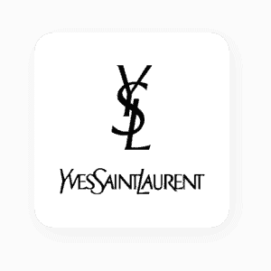

For example, the Yves Saint Laurent fashion logo contains letters that are vertically stacked on top of one another, giving the impression of a linked chain. Similarly, Grant Associates – a workforce development organization – stacks their logo’s letters in a way which is resonant with holding hands; it’s a great method to show connectivity and make their audience feel personally involved in their brand mission of fighting the climate crisis.
You can also try flipping or mirroring your logo’s letters, surrounding them with a frame, stacking your monogram or even interlocking the letters (we saw above with the Gucci logo).
4. Play with negative space
Now that you’ve thought about your logo’s major elements, it’s time to play around with the space between them – also known as the “negative space”. You can actually arrange your logo elements in such a way that the empty space doubles as its own image or message.
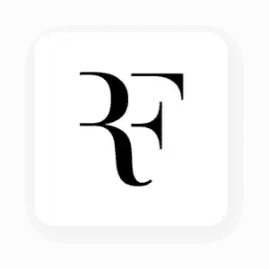

For example, you can use negative space to create a character feature, like you see in professional tennis player Roger Federer’s logo. He technically features the initials of his name, though our brains are actually filling in the parts of the letters that are missing. The same thing applies to the Om Productions logo, leaving plenty of space for our minds to fill in the blanks with new, layered meanings.
This brings us to:
5. Create a hidden meaning
Don’t think that using only 2-3 letters in your logo means that there’s a limit to your creativity.
Many monogram logos actually have hidden meanings, and you should consider whether that’s something that would add to your logo before you start creating yours.
For example, the LG logo is technically a monogram, but they play with spacing and letter sizing to create a human face. And, have you ever noticed how FedEx contains an arrow between the ‘e’ and the ‘x’? This helps to symbolize motion, and intimates to their audience that their packages will be delivered quickly.
Look at the typeface, color, and layout you chose, to determine whether or not they’re telling the story of your brand. If there’s a message that’s missing from your logo, try to rearrange the letters in a way that creates space for new meanings and symbolism to take place!
Over to You
Your business has a story to tell, and a monogram logo may be your best spokesperson. If you go with a monogram, remember that your logo’s font will do the heavy lifting for you, so try to pick a font that has the same message as your brand.