Whether you’re thinking about creating your owncompany logoor even if you’re looking for logo design inspiration, it’s worth examining some of these famous brand logos and seeing what you can learn from them.
So, let’s get to it!
How to Create a Logo with a Hidden Meaning
Logos with hidden meanings might sound abstract and difficult to understand or replicate for your own logo design, but they follow a few rules.
Negative space


Negative space is the blank or empty space that is left around an illustrated object and ultimately helps define it. In other words, it’s the “unused” space in a picture or design.
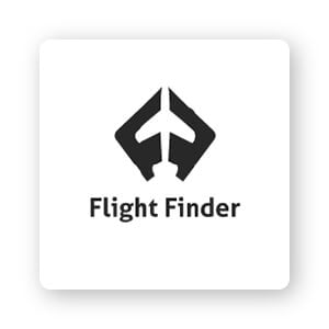
Negative space can take advantage of the business’s subject matter to add more meaning, or create an optical illusion of sorts in combination with the text or logo mark. This is exactly what Flight Finder did for their logo: 2 ‘F’s that are arranged together to form the shape of a plane between them.
Logos that use negative space are a fun and easy way to engage consumers and drive them toward your brand. It forces them to stop and look twice to wrap their head around the full image, just like the logo for The Guild of Food Writers. Take a look—see a spoon inside the tip of an old-school pen? Clever, right?
Most importantly, using negative space in your logo makes it stand out. The Spartan Golf Club logo is a perfect example of this. At first glance, it appears to be a golfer in mid-swing. But look again from a different angle and you’ll see a Spartan warrior’s helmet. Now that’s an awesome way to put a unique twist on what could have been a standard design.
Typography
Typography is an often overlooked design element that, when used smartly, can take your logo to the next level. (If you don’t know what I’m talking about, typography is the large umbrella term all fonts fall under.)
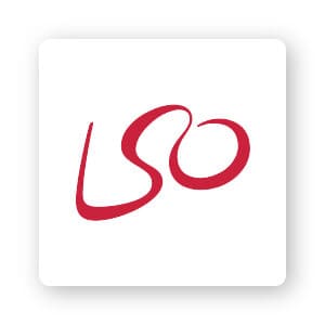
Experiment with the way you arrange the letters in your logo to add an extra layer of depth to your design. Just look at the London Symphony Orchestra logo. The first thing you’ll notice is the letters LSO (an acronym of its name), but if you look a little closer, you’ll be able to notice a conductor holding a baton in his hand.
But the typeface you use can even be more subtle than that, to build a deeper meaning in your logo. Razor company Gillette is a great example of this. The precise cut in the letters ‘G’ and ‘i’ appear as though they’ve been shaved off with a sharp razor. Subtle? Yes. Effective? Completely!
Lastly, typography can play on the actual brand purpose itself. Pinterest got its name from the physical act of pinning things to a corkboard. To hone in on that concept, the ‘P’ in the logo represents an actual pushpin, perfectly tying the whole business concept together in a simple and creative logo.
Icons


An icon is the main focal point of your logo, representing who you are as a business and what you do.
Utilizing an icon logo can pack more punch than just your business name alone. It can attract people’s attention and elicit emotional reactions associated with your brand. Or, an icon logo can allow a customer to see themselves using the product or service. Check this out. The Beats by Dre icon is a simple letter ‘b’ enclosed in a circle. But, as you might’ve guessed, that circle isn’t just a circle–it represents a human head, and the ‘b’ represents the headphones. This personal touch reaches their target audience in a powerful and unique way.
Another company that employs that same concept of reaching out to its customers is Evernote. The app is to help you remember and organize your notes, and it’s for that reason they chose an elephant icon. As the saying goes, “An elephant never forgets.”
Other times, an icon emphasizes who you are as a business. To understand what I mean, let’s look at Greenlabs. As a digital marketing and web solutions company, they want to convey to their customers that they are an intelligent team who are there to help you grow your marketing. So it’s fitting that the crown of the tree should be a brain.
Colors
You probably already know that humans have a strong response to certain colors. Blue is calming, red is passionate, and so on. This is why logo colors can convey a lot about your brand personality.
Design magazine Speckyboy’s mission is to serve as a hub for designers. With that in mind, their logo is a pair of eyes within glasses keeping an eye out on all new design trends. The blue tells their target audience that they’re the official authority on all things design.
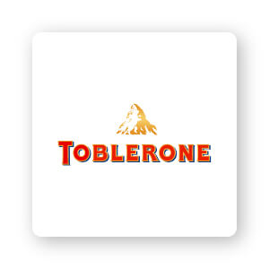
The famous chocolate company Toblerone is one of my favorites because there are so many hidden nuggets of creativity. The mountain is painted a yellow-gold color to symbolize the unique honey flavor in their chocolate. And also, spot the bear inside the mountain? It represents Bern, Switzerland, which is the city in which Toblerone is produced.
When choosing a color for your logo, a good rule of thumb is to always keep your target audience in mind. What is it you want to express to them? Well, South African analytics consultancy Eighty 20’s logo picked blue and gray to convey trustworthiness and professionalism. Spot on for their company values.
More of Our Favorite Logos with Hidden Meanings
1. Tailor Brands
As a company with a logo creator tool, it would only be right if we created a custom icon logo. The icon itself consists of symbols that capture our brand: A heart, a pencil, and a diamond.
2. Cisco
As a large network equipment company hailing from San Francisco, the dashes in the logo represent magnetic waves and pay homage to the pillars of the Golden Gate Bridge.
3. Yoga Australia
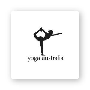
Yoga Australia’s logo’s use of negative space is spot on. In the space between the figure’s arm and leg, it’s holding onto the outline of the continent of Australia.
4. Continental

Automotive manufacturer Continental’s logo is subtle, yet effective. The ‘C’ and the ‘O’ form the shape of a tire, which they are best known for.
5. Tour De France

Did you know that the logo of the Le Tour de France has 2 hidden messages? The first is a hidden cyclist which is formed by the letters ‘R’ and ‘U’. The cyclist is riding a bicycle, the letters ‘O’ forming the wheels.
Playing on colors as I talked about earlier, the ‘O’ is colored yellow, which is the same color as the sweater given to the winner of the event.
6. Roxy
Roxy’s logo has a lot going on, but it works for them. What looks like a stylized heart is actually 2 copies of their parent company, Quicksilver’s, emblem positioned next to each other. Cool, huh? The logo includes a cresting wave and a snow-capped mountain. The mountain and waves symbolize excellence and authenticity, as well as surfing and snowboarding—the 2 sports they’re best known to cater to.
7. Dominos Pizza
Now on every other street corner, the 3 dots symbolize the 3 restaurants where the pizza magic all began. The restaurant founder originally planned to add a new dot each time a new chain opened, but (fortunately) the business grew too quickly to make that possible.
8. Levi’s
What could possibly be hidden about this logo, you ask? I’ll tell you: Underneath the simplistic shape is an example of effectively used negative space. The space here mimics the shape of classic Levi’s pockets, formed in the shape of a batwing on every pair of pants they produce.
9. The Bronx Zoo
It’s a bird, it’s a giraffe, it’s a – New York City skyline! One of the largest zoos in the world, the Bronx Zoo can be found in uptown Manhattan, and that’s the subtle focal point of its logo. Between the legs of the animals that are housed in the zoo, the outline of the Big Apple stands proudly, inviting zoo-goers to explore the city as much as to see its animals. (Click for other inspirational animal logos.)
10. FedEx
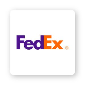
Another good example of using negative space effectively, the delivery service sneaked an arrow in between the “e” and “x” of the logo – alluding to the speed at which its packages will be delivered.
11. Hyundai
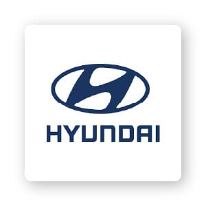
Embedded within a widely-recognized symbol on cars around the road is a secret surprise. The “H” that everyone assumes stands for “Hyundai” also symbolizes 2 individuals meeting in the middle with a firm handshake – ostensibly representing the satisfying bond between brand and customer.
12. Hershey’s Kisses

Chocolate, chocolate everywhere; the average sugar-lover can’t wait to unwrap that Hershey’s Kisses foil and see what’s inside – so the logo gives us a sneak peek! Embedded in the lettering, between the “K” and the “I,” is an extra, sideways-facing chocolate kiss. If only every pack came with an extra kiss, too!
13. Goodwill
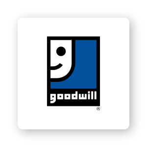
The nonprofit is all about making people happy, as evidenced by the smiley face in the lowercase “G” of their logo. For the feeble-eyed among us, the organization magnified the smile to claim a substantial part of the design.
14. Vaio
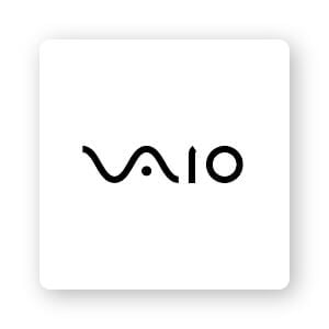
This (former) SONY computer brand was clever with its abstract logo design, but the average onlooker would probably miss the reference. The ‘V’ and ‘a’ together represent an analog wave, while the ‘i’ and ‘o’ are reminiscent of digital signals (through the binary numbers 1 and 0).
15. Amazon

The e-commerce/cloud-computing giant is represented by a simple logo with a single splash of color in the arrow. Yet, the arrow holds the bulk of the logo’s message; it symbolizes that Amazon carries it all—from ‘a’ to ‘z’—and brings a smile to its customers’ faces for that reason!
16. LG
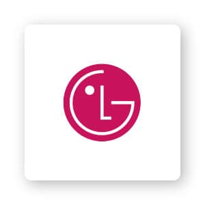
The phone company’s logo incorporates a strategically placed ‘L’ and ‘G’, but what you may not realize is that it also makes up a face—ultimately humanizing the brand. See that little dot in the left-hand corner of the logo? That would be the face’s eye!
17. NBC
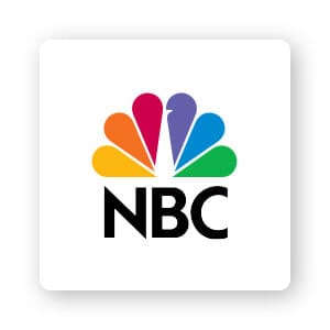
Why so many colors in this peacock-shaped logo? Well, the logo was created at the same time as color televisions, and NBC wanted to emphasize their stake in the market. The 6 feathers represent each division of the network, and the peacock overall was to remind customers that the network was “proud as a peacock” of their color programming.
18. Baskin Robbins
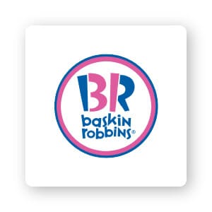
Is that a ‘BR’ you see, or the number 31? The answer is – both! This iconic ice cream chain has evolved into a powerful brand over the years and is recognizable by name, but that doesn’t stop them from reminding their customers of their original promise in their logo: 31 incredible flavors, one for every day of the month
19. Tostitos
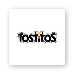
Everyone comes together over tortilla chips–at least that’s the idea behind Tostitos’s logo. The ‘T’s in the wordmark are actually people, and they are happily dipping the same tortilla chip into the pot of salsa being featured by the ‘i’. The chips are supposedly so unifying that they don’t even mind sharing!
Over to You
As you work on creating your own logo, you may decide to incorporate hidden meanings.
Which of the above logos did you feel worked effectively? What kind of message do you want to send your audience?
When you begin designing your logo, consider the tips we’ve covered and these examples, and think about how they help bring your logo to life. If you need more inspiration for your logo checkout our logo ideas for different types of businesses.
