More importantly, abstract logos are able to infuse layers of meaning into an image, making yours a memorable, conversation-starting logo.
In fact, at Tailor Brands, we believe in the power of abstract logos so much that we’ve created one for ourselves!
Below, we’ll check out the various types of abstract logos and how it really brings the business it represents to life. But first:
What is an Abstract Logo?
An abstract logo is a thought-provoking, conceptual image that makes the viewer feel strong emotions and connections to.
This type of logo is a unique image that’s designed to express something specific about your business.
What makes an abstract logo even more appealing for business owners is its versatility. From symmetrical patterns to line art, there are different kinds of abstract logos, so you can pick the best one for your business.
Maybe it sounds kind of far out, but actually, a lot of the logos you see everyday are abstract.
I’ve collected different types of abstract logos across all different industries to show you how they might work for your own business.
Abstract Logo Design Tips
Before we dive in, there are a few things to keep in mind when designing your abstract logo.
Decide on an icon
As its name suggests, an abstract icon conveys multiple concepts and various emotions in a single symbol. It is the central focal point of your abstract logo. The icon you use in your abstract logo will represent all the different aspects of your business, such as the products you offer, personality, and values.
Choose colors that reflect your brand message
Most people don’t realize just how much the right color palette can help add depth and dimension to their logo. There is a whole psychology behind colors, and it’s an important consideration when you begin to build a brand identity.
The colors used in abstract logos can shape your customers’ perception of an otherwise ambiguous shape. The right color combination can add even more depth and dimension to your abstract logo, and it should be a key consideration to keep in mind when designing your own.
Select typography that complements your icon
The typeface you choose will depend on the complexity or simplicity of your logo. Ultimately, you want a typeface that will balance out the logo. An intricate symbol pairs well with a minimal font, whereas a simple logo looks great next to a more complex font.
Experiment with layout
It’s worth thinking about a few logo variations depending on where you plan on using your abstract logo. You might want to use the icon only on a small-scale application like a watermark or social media profile picture. But for a letterhead and your website, you might want to use the icon and text variation of your logo.
Different Types of Abstract Logos
Now that you know what goes into creating an abstract logo, let’s take a look at the different kinds of abstract designs you can use to effectively represent your business.
Symmetrical abstract logos
Think of symmetry as your older, wiser cousin. He’s the one who keeps you centered when you’re itching to be rebellious, and the one that calms you when you’re feeling a little too emotional.
Symmetrical logos are a mirror image of one half of the design so both sides are identical.
While some abstract logos tend to stretch the boundaries of design, symmetry grounds the logo in patterns that are recognizable to the human eye.
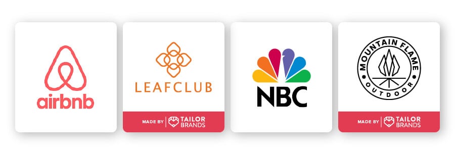
A symmetrical abstract logo is well suited for a florist or a health and wellness center– a business that is centered by nature. Leafclub is a great example of this approach as you can see below, with the symmetrical patterns forming the shape of a flower.
Mountain Flame also does this well, taking the concept of a fire and stretching the creative idea of the design while still remaining true to the outdoorsy brand.
But a symmetrical abstract logo doesn’t have to be reserved just for more holistic, natural purposes. Big name brands such as Airbnb and NBC use symmetrical abstract logos, too. Airbnb has an interesting design that consists of 3 symbols: A location icon, an upside-down heart, and a person’s hand reaching out.
NBC’s logo, meanwhile, is composed of 6 peacock feathers representing the network’s 6 divisions: Yellow for news, red for entertainment, blue for network, orange for sports, green for productions, and purple for stations.
Abstract logos with geometric shapes
Geometric shapes have a reputation for being associated with mathematics, but when combined with abstract shapes, they highlight a level of depth to your logo that only the minimalism of geometry can provide.
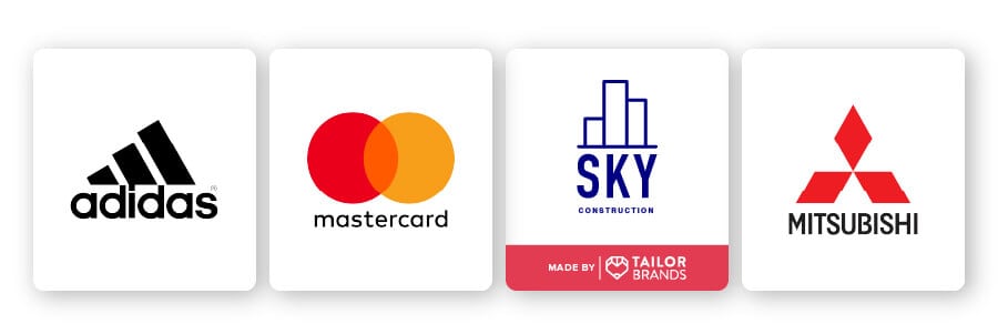
Geometric shapes capture feeling and emotions. Squares are stable and abide by the rules. Circles evoke a feeling of comfort; just take a look at the MasterCard logo. Made up of two circles (reminiscent of two coins), this design makes potential customers feel that they can trust the business behind the logo (as well as easily recognize them).
Other geometric shapes such as bold vertical lines convey a sense of strength and durability. They’re also a great way to project an image of efficiency and reliability, which is well presented in the Adidas logo.
The Mitsubishi logo is another interesting example of an abstract logo that uses geometric shapes. The word ‘hishi’ has been used in Japan to stand for a diamond shape. The founder chose the 3-diamond mark for his company; he came up with the concept of the shape by adopting the qualities of the crest of his first employer and his family’s crest.
And sometimes, geometric shapes can be combined to form a whole picture. Take Sky Construction, for example. The construction company simply took 3 rectangles to create skyscrapers. As you can see, there is no limit to how you can use geometric shapes in an abstract logo design.
Dynamic abstract logos

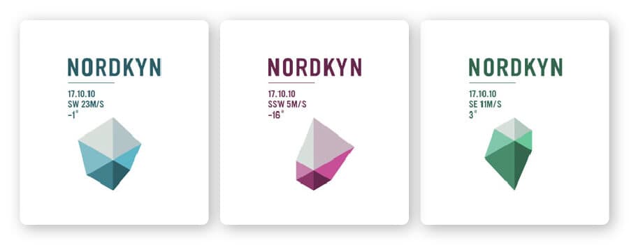
A dynamic logo is adaptable and can change depending on the context in which it’s placed. These dynamic logos take the same abstract shape and tweak it to fit different contexts, whether by changing the colors used, layout, or orientation of the symbol.
You might have noticed how Nickelodeon uses a different icon for each show on its network, but keeps the energetic orange and playful font consistent throughout. This allows the channel to express their fun side while remaining instantly recognizable with every version of the logo.
Or take the people of Nordkyn, Norway, who took the concept of their natural surroundings and created a dynamic logo with it. Based on live meteorological data, the logo changes according to wind and temperature just as the area itself changes with the weather. Impressive, right?
For those who are super creative or just have commitment issues, a dynamic abstract logo is the answer to your logo prayers.
Abstract logos with deeper meaning
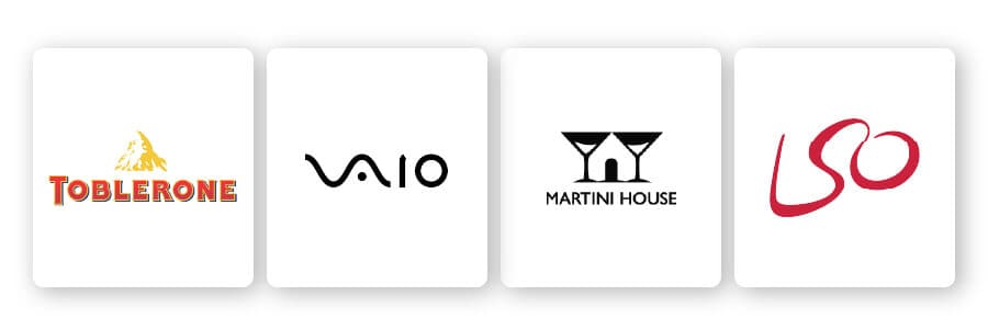
As I mentioned, abstract logos are open to interpretation, and they often beg the viewer to take a second (or third) look to figure out the deeper meaning. From using negative space to shading techniques that trick the eye, these logos are complex, clever, and send a wink to your target audience.
Negative space is a design technique that cleverly uses the white space within an image to create a whole new image. A classic example is the Toblerone logo, in which the shape of a bear is hidden inside the mountain icon.
There’s also the Martini House, which plays with negative space to create a house within two martini glasses. This is an example of a strong abstract logo with deeper meaning in that the hidden element– the house– has a strong conceptual connection to the business itself, which makes this logo very memorable.
The London Symphony Orchestra is another great example of a hidden meaning in logo design. The first thing you’ll notice are the letters LSO, an acronym for its name, but if you look a little closer you’ll be able to notice a conductor holding a baton in his hand.
Line art logos
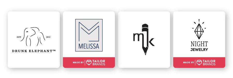
Whoever said simplicity is the ultimate sophistication was onto something.
As its name suggests, line art takes distinct straight or curved lines placed against a plain background to represent a two-dimensional (or sometimes three-dimensional) object. Most line art is usually monochromatic (that’s just colors of a single hue).
Line art works best to portray industries like freelancing, architecture, boutiques, tattoo artists, and skincare lines like Drunk Elephant. Designed for Millenial and Gen Z audiences, the simple drawing of an elephant reflects the clean and minimalistic vibe of the whole brand.
MK is another well done line art abstract logo, which uses abstract line work to capture the image of a pencil. (This is also an example of a combination logo, because it captures a deeper meaning. I’ll talk more about this below.)
I especially like Night Jewelry’s logo, which uses abstract line work to depict a sparkling diamond.
Illustrative abstract logos
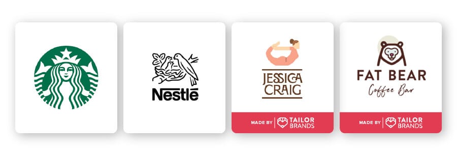
Not all abstract logos are, well, abstract. In illustrative abstract logos, you can still recognize certain objects. An illustrative abstract logo is a way to interpret objects with a fresh, creative perspective.
In these examples, notice how you can clearly recognize a woman doing yoga, a bear, a mermaid, and a nest of birds.
Let’s take a deeper look at the Starbucks logo. The intricately designed mermaid was meant to reflect the nautical character Starbucks was named after. But, the crowned maiden is drawn within a web of lines that also form a crown and two mermaid tails. This abstract illustration has worked so well that it is now synonymous with coffee.
Combination abstract logos
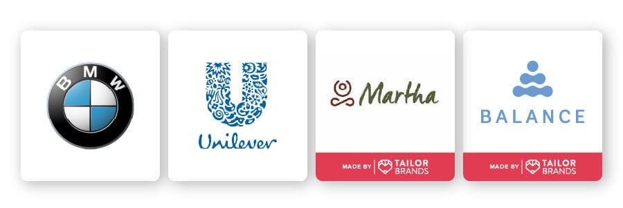
Can’t decide between a symmetrical or a geometric abstract logo? Why not get yourself a logo that can do both!
Consider incorporating multiple abstract design techniques to create a logo that perfectly captures your business personality and message.
Take, for example, the Balance logo. The icon loosely looks like rock stacking– the spiritual act of balancing stones, symbolizing patience and balance. That’s illustrative design at work, creating a logo with visual impact.
But, it also holds a deeper meaning; look a little closer and you can see the outline of a person sitting cross-legged as if they are in peaceful meditation.
The Martha logo combines dynamic and abstract line art. The icon portrays a feeling of peace and calm rather than a real, literal object.
And, the logo is flexible enough to play around with depending on how the business owner wants it to be used. If Martha wants to launch a new yoga line meant for pregnant women, the icon itself could appear on the clothes.
What’s good about a combination abstract logo is that it can be used for almost any industry. Just look at BMW and Unilever! BMW’s logo takes symmetrical and geometric abstract design, and Unilever’s logo consists of geometric shapes that hold a deeper meaning.
The Benefits of an Abstract Logo Design
Creating an incredible abstract logo is by no means easy. To make a good logo, it needs to check a lot of boxes. But, the hard work of designing the perfect logo pays off with the benefits you’ll gain.
So, if you are thinking about creating a logo, there are a number of reasons why you should consider an abstract logo design:
Unique – An abstract logo allows for unbound creative freedom. There are literally no limits set on abstract art, so your logo can truly capture the unique ideas, personality, and values that your business is all about.
Memorable – This level of creativity allows for your business to carve out a place in a monotonous market filled with the same images and buzzwords. An abstract logo is, by definition, refreshing, interesting, and sure to catch people’s attention.
Versatile – Abstract logos are one of a kind, bringing versatility and a fresh perspective to the market. Plus, no matter what direction your business takes, an abstract logo will remain relevant.
Scalable – Another advantage of abstract logos is that they can be used in whatever proportion needed. If you need it to fit something as small as a button or as large as a billboard, an abstract logo will be able to scale to size.
Easy to create – Don’t get me wrong, designing a logo is not necessarily easy. But, creating an abstract logo can be simple because there are no rules– just your imagination.
Over to You
Sometimes a traditional logo just doesn’t work for the particular message you want your logo to get across. Abstract logos are a great option for businesses that want to communicate the uniqueness of their brand and engage their audience in a fun way.
The thing is, because your options are limitless when creating an abstract logo, you might run into trouble getting started. That’s where our logo creator can step in to help you create your very own abstract logo.
The key is not to overthink it; create a few variations,ask people you trust for feedback, and try to enjoy the artistic process!
