What is Symbolism?
For thousands of years, humans have used pictures to express concepts and communicate. Egyptian hieroglyphics are an ancient language consisting entirely of small symbols to represent different words or ideas. Caves have simple symbols etched on the walls that are thousands of years old and depict animals, hunting scenes and more.
In today’s world, symbols are everywhere. From the color and shape to the subject matter, symbols typically communicate an idea quickly. Some of the most common symbols include:
- Street signs (like stop signs)
- Emojis
- Restroom symbols
- Religious and political symbols (cross, donkey, elephant)
- Handicap parking signs
Symbols in our everyday life help us know what to expect. The same thing holds true when it comes to symbolism in graphic design.

How Symbolism is Used in Graphic Design
There are many different kinds of symbols that can communicate a concept as soon as someone first sees it. In graphic design, symbolism can be used to help communicate characteristics, services, products and more. Brands can use symbolism to communicate aspects of their company in both direct and subliminal ways.
How to Leverage Symbolism When Designing Your Logo
Logos are supposed to be representations of an entire brand. They are small graphics that are memorable and easy to understand.
Using symbolism in logo design can help convey elements of your brand quickly and effectively to your target audience. These symbols can include your choice in shapes, colors, icons and more.
Define Your Brand: The best way to determine the right direction for your logo symbols is to start by defining the concept of your brand. You need to know what you are trying to accomplish and what sets you apart from the competition. Defining your brand will include your brand characteristics, pillars and voice.
Know Your Audience: Understanding the people viewing your logo is crucial. Different groups, races, cultures and religions may have different perspectives about what certain symbols mean. It’s important to know what you are communicating to the people you are trying to attract with your logo.
Understand Logo History: Sometimes, logos can look too similar to other brands, which can cause brand confusion and create symbolism you don’t intend. Pandora and PayPal had very similar “P” logos (blocky, blue and no cut out center) for a while, despite being very different companies. Pandora later shifted away from the blue P to add red lines that resemble soundwaves for symbolism more consistent with their brand. Pinterest, Target, Beats by Dre and Bebo all still have very similar logos that can be easily confused.

How Logo Symbolism Changes with Style
If you are designing a logo for the first time, you can make a list of the colors, fonts and objects that encompass your brand characteristics. Then, narrow those options down by choosing the ones that will resonate with your audience and look different from other brands.
You can further enhance the angle of your symbolism by the style you choose.
As you will see below, an owl symbolizes intuition and wisdom. A blocky owl in a bold color is going to convey a much different style (modern, techy, artsy—think HootSuite or Trip Advisor) than a realistic owl (traditional, earthy, down-to-earth—think Rice University or Manifest Building). While both logo styles will convey the idea of excellence and insight, they will appeal to different target audiences and imply different characteristics about the brand.
So, choosing your symbol isn’t as simple as just picking an object. Symbolism is going to also include the style and color palette you use. The ideal logo is going to look very simple, but have a lot of thought put behind what feelings it subconsciously sparks at first glance.
Example of Symbolism for Logo Design
When it comes to using symbolism, there are several areas to consider. Here are examples of specific types of symbols and what they mean.
Animal Symbolism
Animals are highly popular symbols for logos. They can add an element of personalization without overly slotting your brand to only appeal to a specific target audience. Here are some of the most popular animals used in logos and what they imply.


Butterfly – Representing change and transformation, a butterfly can be used in a logo design that shows flexibility or creativity. The butterfly can represent beauty and peace as well. In a logo, a butterfly symbol can be detailed or extremely simple in nature.
Owl – The owl represents intuition and wisdom. Logos that feature an owl may be showcasing the expertise of their brand or knowledge of their organization. Owls can take on comical looks in logos or they can be realistic for a more serious brand approach.
Swan – The beauty and elegance of a swan is something no one questions. Beautiful creatures like swans can make great jewelry logos. Swans can also depict maturing or growth because they reference the Ugly Duckling story. Swan silhouettes are naturally very elegant and can offer a simplistic sophistication to your logo.
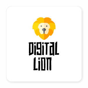
Lion – As the king of the jungle, the image of the lion represents strength, courage, justice and power. Logos that use the lion may represent the tenacity of a brand or their power within their industry. A lion can take on a very edgy look or have a much more cartoon approach depending on the brand’s nature.
Floral Symbolism
Plants and flowers can convey life, hope and growth. Specific plants can provide additional meaning for your logo. Here are some of the most popular plants used for their symbolism in logo design.


Olive branch – Throughout history, the olive branch has been a symbol of peace and hope. It has been used in the Bible and ancient Greek culture to symbolize these meanings. “Extending the olive branch” is the term often associated with this image. In logo design, the olive branch can form a wreath-like encompassing border/frame or be included with other imagery (like a dove).
Red rose – Typically, the red rose is the flower of love and passion. Since red is the color of romance, changing the color of the rose in a logo can change the meaning. Yellow often signifies friendship, while white might represent purity or innocence. A rose is seen as a beautiful thing that isn’t to be trifled with (because of thorns); it is a very delicate flower, but not completely helpless. A rose also offers a classic form of timeless beauty that works well for fashion brands. Tulips and peonies can offer similar meanings as symbols in your logo design.
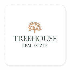
Trees – For brands that want to signify life, growth, prosperity and value, a tree symbol may be ideal for the logo. Trees are a great resource that we see as an important part of our environment. A brand might use a tree to signify growth (like a wealth management firm) or nature (like a camping supply company). Fir and pine trees often represent nature, while deciduous trees can be used for their imagery of branches (like Ancestry.com).
Within the kinds of trees, you will have different meanings. Acacia trees represent renewal and fortitude, while oak trees represent growth and strength. Willow trees can symbolize sadness or grief, while fruit trees may symbolize productivity. Choosing to showcase a number of trees (forest) or a tree that displays its roots can further change the symbolistic meaning of your logo.
Daisy – More simple flowers, like daisies, zinnias, cosmos or hydrangea can be used to symbolize friendliness, goodness and harmony. Flowers are popular in florist logos for obvious reasons, but they are also used in healthcare, beauty and wellness brands.
Lotus – Representing purity, enlightenment and self-regeneration, the lotus is popular for many industries. A lotus flower is highly popular for mental healthcare facilities, yoga studios, rehabilitation centers and spa logos.
Four-leaf clover – Known as a symbol of good luck, the four-leaf clover is a popular symbol for Irish and Celtic brands in particular. Baileys Irish Cream uses two “B”s to create a kind of four-leaf clover shape for their logo. Red clover flowers and even three-leaf clovers can be used to symbolize other meanings in logos. The 4-H clover symbol was chosen to represent common agriculture in the Midwest, since the clover is a common plant in grassy pastures and fields.
Geometric Symbolism
For more modern brands, geometric shapes are often popular. Avoiding subject matter and sticking with shapes can help simplify your logo. Shapes themselves are often filled with symbolism that causes subconscious feelings toward your brand because of where those shapes are used in other places throughout nature and society.


Circles – A circle will represent unity, wholeness and longevity.
Triangles – Triangle logos can be used to show power or delicate balance. Point-up triangles represent a strong foundation or stability, masculine elements. The point-down triangle represents feminine elements.
Squares – The solid, dependable and predictable nature of a square can show stability. Square logos can be used to stand apart from highly popular circular logos and still contain the entire image.
Hearts – The symbol of the heart represents love, compassion, care and philanthropy. Brands and organizations can incorporate hearts into their logos to signal that there is an element of selflessness or compassion involved.
Celestial Symbolism
Long before humans were on the earth, there were celestial elements. Man has naturally assigned meaning to those celestial symbols in most cultures throughout all time periods. Here are some examples of what meanings are currently associated with the most popular celestial symbols.


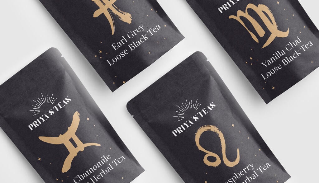
Star – The five-pointed star represents perfection, good luck and fame. A star can be used to also display navigation or wayfaring. An upside-down star (the pentagram) are often used to represent magic, occult groups and mystics. The six-pointed start is often connected to religion (like the Jewish Star of David).
Sun – Our closest star gives us life, power, energy and warmth. The symbol of the sun in logo design can represent clarity and power for brands that want to shine a light into the world. The sun is a necessary part of our existence and brands can use this to represent their own place in the market.
Moon – The moon provides balance and renewal. It also signifies mystery and nature. The moon can bring a unique element of mystique to any logo. It can also be used to symbolize sleep, nature and appeal.
Color Symbolism
Colors add a lot of meaning to whatever fonts, shapes or images you choose to use in your logo design. The meaning of color in logo design can also change based on how dark, bold, light or muted the color is.


Red – Eye-catching and vibrant, red logos can display passion, anger, and excitement. Red can be bright and energizing, or it can be muted and gritty. Red is often used to speed up decisions by increasing our natural feelings of energy and passion—that’s why red is used in many fast-food restaurants or to push deals and sales.
Blue – Representing wisdom, loyalty, sophistication, blue logos are a popular choice for many brands. Blues come in a range of shades and tints that can shift from pale pastels to deep navy. Blue can also take on a number of hues when you mix more purple (periwinkle) or more green (teal) that can change the meaning. While a periwinkle color might show quirkiness, teal can a calming color that represents renewal.
Green – To express nature, health and growth, green logos can offer a refreshing approach to branding. Greens can be extremely vibrant to showcase vitality or much more muted to symbolize nature. Green can also represent security—especially in regards to wealth. Green is a popular color for natural brands, healthy foods, supplement companies and financial advisors.
Yellow – The friendly, cheerful, youthful and energetic vibes of yellow in logos can be eye-catching and surprising. Because yellow isn’t as contrasting against a white background, you may choose to use a darker color to help it be more visible. Sonic, Lays and McDonald’s all pair yellow with red. IKEA uses yellow with blue, while Best Buy, Post-It and Sprint all use black to make their yellow color pop.
Black and white – Black and white logos are easily printed and can stand out in the right setting. White and black can both symbolize power, trust, security and straightforwardness. Adidas and Nike logos are typically printed in either black or white. Chanel is another logo that uses simple black on a white background to showcase formidable simplicity.
Over to You
If you are creating a logo, finding the right symbolism without getting too complex will really help connect your look to your brand’s approach. The more you can use your logo to quickly communicate your mission and values, the easier it will be to connect with your target audience. Symbols can help you communicate in powerful ways.
Do you need help creating your logo?
Our logo design tool will turn your brainstorming session on logo symbolism into a real design you can be proud of. Best of all, it’s free to get started.
