Research from the past two decades has shown that excellent website design leads to more than just high conversion rates. It also impacts SEO, drives customer satisfaction, builds brand authority, and inspires consumer trust, helping your business secure its position as the go-to in your niche.
Nevertheless, despite knowing how important web design is, many businesses still make monumental mistakes. And the worst thing is, these blunders would have been easily avoidable with just a bit of research, testing, and creative thought.
In this article, you’ll find an overview of the six most common design mistakes business websites make, along with actionable tips on how to avoid them (or correct them if you find yourself guilty of a web design faux pas).
Recent data from KPMG International shows that 55% of people search online for reviews, and 47% visit a company website when deciding how to spend their money. And that means you need an online presence. The visibility of your business, its brand identity, and brand awareness are vital.
If you’re ready to improve your online presence, here are a few places to start.
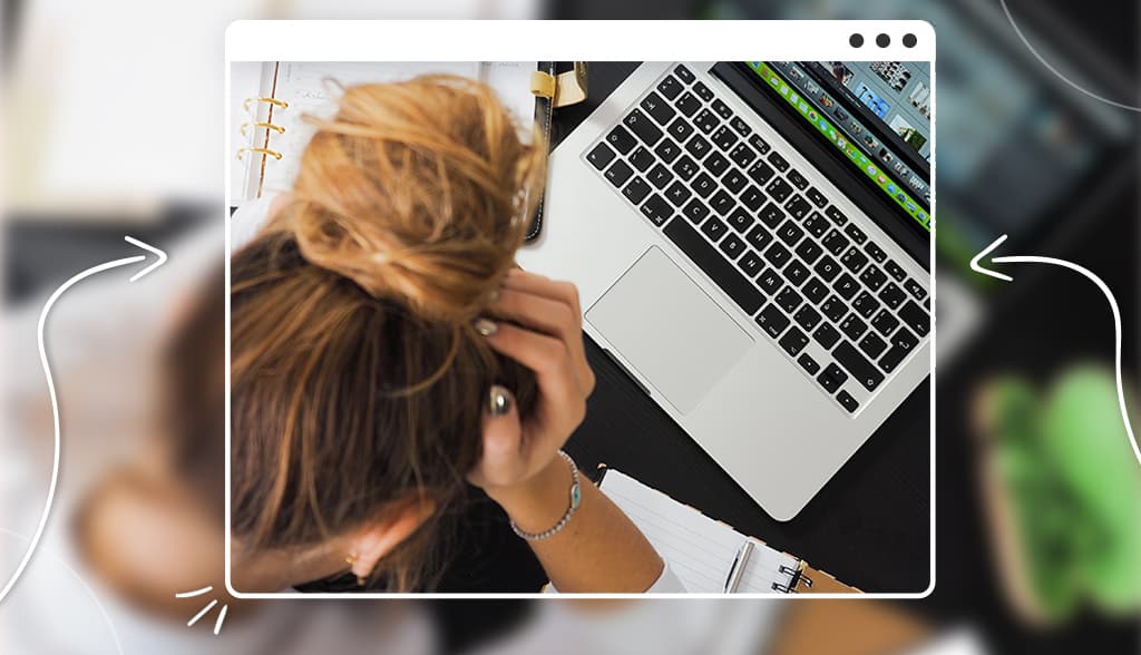
One of the easiest design mistakes to avoid on your business website is using your logo incorrectly.
You’d be surprised how many people create a logo, take a screenshot of it, and stick it somewhere on their site where no one will see it. (If you’re nervously looking back and forth between your website and this post, don’t be too hard on yourself; you’re not alone!)
Why does this matter so much? To put it simply, your logo is a trust symbol. Potential customers will look for it as a sign that you’re an accredited business and they can trust that you’re reliable. If it doesn’t look professional in their opinion, they’re going to leave your website faster than you can say “sale!”
And, your logo will help your customers remember your brand when they need your products/services – but it needs to be memorable in order to do that.
So, I’ll cut right to the chase. The logo on your website should be:
Now, if your logo doesn’t fit with that list, or if you don’t have a business logo at all, stop what you’re doing and create one here:

Source: apple.com
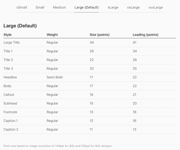
Now, you may be thinking that adjusting font size on websites is easy enough. After all, by using this simple hack, brands could ensure that their value propositions get heard and that their target audiences fully understand their offer. But the truth is, finding a website that uses a 17pt or 18pt font size is next to impossible.
Trello gets close with a 16pt body font size. As you can see from the example, this brand’s typography design solution works quite well for explaining novel concepts like boards, timelines, cards, and integrations. Moreover, the text is formatted in a way that helps readers understand the product’s features without having to re-read the text several times or rely too heavily on the provided imagery.
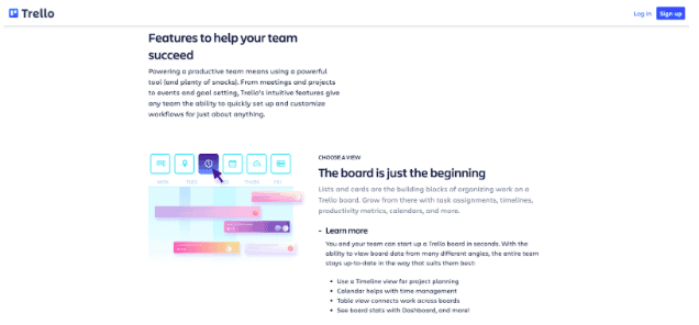
Source: trello.com
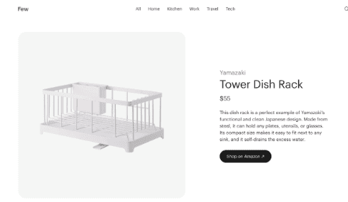
The curation website Few also does well, thanks to its minimalistic approach to design. While Few includes much less text on its product pages – emphasizing the images instead – it still achieves the desired effect with the font size. Moreover, note how well this brand implements visual hierarchy to communicate information most likely to be sought by web visitors. The product name, brand name, and retail price utilize a larger font, making it super-easy for consumers to find the purchase decision-impacting info they’re after.
But the truth is, these examples are currently the exception, not the rule in terms of user-oriented design. Fortunately, however, font size is an easy website design mistake to fix. And, on some platforms, business owners can even make the changes by themselves.
Another design mistake that often worms its way onto business websites is poor readability due to a lack of versatile design elements. This is particularly true for business blogs and gated resources.
Recent research about long-form content is partially to blame. Reports stating that long-form blog posts perform better in terms of SEO and social shares have inspired businesses to invest in producing articles well above the average of 1.000 to 2.000 words. Unfortunately, however, this focus on word count has led many brands to create web pages with designs that harm readability.
On the whole, the advice for writing content that performs well is to try and achieve a high readability score. But the fact is, this isn’t only done through copywriting. Web design also plays a significant role in increasing readability due to the way people consume content online.
Research from the NN Group has shown that most people don’t read website content – they scan it for keywords instead. So, when looking to make a text more user-friendly, try to implement design tricks that will engage your readers:
– Choose fonts that are easier to read. Verdana, Georgia, and Lucida Grande are highly recommended due to their legibility.
– Properly format text with heading styles to separate ideas within the body of the text.
– Consider additional text formatting, like using bold and italics to draw web visitors’ attention to noteworthy thoughts and concepts within the article.
– Use “chunking.” That is, break the text into smaller parts. You can further aid readability by using bullet points where possible.
– Include visuals to break up walls of text. Use images, illustrations, even animation and videos to communicate concepts.
An excellent example of a piece of long-form content that applies all of these tricks comes from Rain or Shine Golf. In its 4660-word article about golf simulators (equivalent to 15 pages of a book), the brand uses many of the readability tactics we mention. Note how each article section starts with a heading, a short introduction to the type of product it discusses, and images followed by key info and a CTA button. Moreover, see how the article includes anchor links, making it easier for readers to jump to the section they’re interested in without having to sift through a mountain of text.
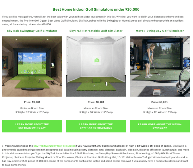
Source: rainorshinegolf.com
Calls to action are the element that drives conversions on your website. Yet the truth is, many businesses don’t pay enough attention to CTAs. In fact, less than a decade ago, 70% of small business websites didn’t even have a CTA on their homepage. And though things have changed since then, it’s not a bad idea to go over the best practices for designing CTA buttons that convert.
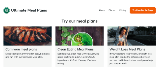
Prioritize visibility: Consumers spend most of their on-page time viewing content that’s above the fold. That’s why it’s essential to have an attention-grabbing CTA button in the hero section of a website. For even better results, create a static CTA that’s visible even when web visitors scroll through the website. Check out how Ultimate Meal Plans does it.
Use size, color, contrast, and shape to further boost prominence. A CTA button needs to be immediately noticeable, and these design elements can help you achieve that. For the best results, learn about color theory. As for size and shape, you can play around. But, the main thing you have to pay attention to is that the CTA is large enough to be seen (but not too big) and stands out from the background without being visually disruptive.
Keep the copy to the point. Ideally, your CTAs should be shorter than four words. However, that shouldn’t stop you from communicating the value in your offer. Grammarly does brilliantly with less than that, simply because it includes a pictogram of a diamond, which expertly depicts the worth of paying for the full version of the software.
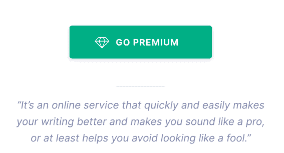
Source: grammarly.com
Test. Finally, the key to nailing CTA buttons is to see how they perform in the real world. A/B testing allows designers to gauge audience reactions to a particular design, giving them valuable data they can base their decisions on. To ensure that testing provides actionable info, always make incremental changes, and only one at a time. That way, you can have clear insights into the exact design decisions that are driving better or worse results.
Despite the exciting possibilities for showing off products in 2022 – 3D images, video, AR, and VR being just a few – many businesses still make the design mistake of utilizing stale product imagery on their websites.
And that’s a big problem, especially when we consider that product images heavily impact consumers’ purchasing decisions.
One study from 2001 discovered that product imagery viewed in the evaluation stage of the buyer’s journey positively impacted perceived quality and performance expectation. Another research project from 2015 found that viewing product images led to a simulation of ownership, which, in turn, influenced purchasing behavior. And, of course, there’s the fact that the human brain processes visuals (and the emotions they can communicate) tens of thousands of times faster than words. All of this makes stunning product photography a mighty weapon in any seller’s arsenal.
But what constitutes better-than-average product photography?
Well, in 2014, a group of researchers found that consumers preferred product photos with:
– Large key objects.
– Low levels of entropy (disorder).
– A warmer color.
– A higher contrast.
– A higher depth-of-field.
– More social presences.
Essentially, this means that people like seeing product photos that:
– show the items up-close
– are well-organized into cohesive wholes
– are of high quality
– show people using or enjoying the products
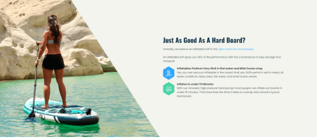
A company that does all this, and more, with its product photography is Gili Sports. The lifestyle brand combines traditional product photos with exciting user-generated content showing its goods in stunning locations. But what stands out in GILI’s approach is that its strategic use of imagery effectively builds excitement about owning a GILI inflatable stand-up paddleboard, driving consumers to make buying decisions by evoking positive emotions about the idea of engaging in the sport.
If you think about the very purpose of a business website, you’ll find that its main objective is to convince visitors into becoming customers. And the only way to do this is by highlighting the unique value proposition offered by your brand. Unfortunately, however, many web designs become so caught up in fancy effects and intricate details that they forget to do this one essential thing.
Nonetheless, despite being quite common, this design mistake is easy to avoid (or fix).To ensure that your web visitors understand what it is that your brand offers, place your unique value proposition in the space they’re most likely to notice immediately after landing on your homepage. According to eye-tracking studies, this is most likely the upper-left corner of your homepage. For a great example, take a look at how One Ocean Beauty does it.

For even better results, implement some of the design tricks we mentioned (like using a large font size or optimizing your CTAs). For an excellent example of how you can do this, check out the Affinda homepage. Notice how it gets straight to the point about what it is that the brand offers its potential clients.

Lastly, consider whether your design allows for enough negative space between the elements on your homepage.
In design, negative space (or white space) is vital. It helps designers:
– Highlight key marketing/branding messages.
– Attract web visitor attention to high-value visuals on a webpage.
– Prevent web users from becoming overwhelmed or distracted.
– Contribute to the overall aesthetic appeal of a website and positively influence consumer opinion about a brand.
Considering these benefits of implementing white space into web design, it’s not a bad idea to look for opportunities to pare things down and go in a more minimalist direction.
The example below from Real Thread shows how effectively negative space can structure a site, ensuring maximum visibility for elements like key user benefits, CTA buttons, and social proof.
When adding negative space to your site, make sure you don’t take things too far. A study from 2012 found that more than 50% of white space on a website negatively impacted users’ aesthetic impression and experience, so try not to overdo white space and aim for balance instead.
The design mistakes described in this article manage to make it onto many business websites. But, the great thing is that they’re easily avoidable.
So, as you look for ways to improve the aesthetic appeal and UX of your brand’s site, consider these 6 oversights and see whether you can make some improvements. Chances are, the fixes will be super easy. But what’s guaranteed is a much better-looking design that’ll stand a better chance of driving the results you’re after.
This portion of our website is for informational purposes only. Tailor Brands is not a law firm, and none of the information on this website constitutes or is intended to convey legal advice. All statements, opinions, recommendations, and conclusions are solely the expression of the author and provided on an as-is basis. Accordingly, Tailor Brands is not responsible for the information and/or its accuracy or completeness. It also does not indicate any affiliation between Tailor Brands and any other brands, services or logos.
Products
Resources
@2024 Copyright Tailor Brands