Apple is one of the most successful companies on the planet, with more money than multiple countries combined. The brand is so powerful that the mere mention of its name causes fans to open their wallets.
But it wasn’t always this way.
For years, Apple struggled to survive the cutthroat industry of computing. At one point, they were thought to be doomed until Steve Jobs made a miraculous return and revamped the company.
A massive part of their success lies in their incredible branding—starting with their logo.
In this post, we’ll look at how Apple’s logo transformed throughout the years into one of the world’s most iconic symbols.
But first…
Initially, Apple was founded by 3 people: Steve Jobs, Steve Wozniak, and Ronald Wayne. Wayne quit after only 12 days and sold his share of the company for $800. Today, his shares are worth $60 billion!
Apple was so strapped for cash at the beginning that Jobs and Wozniak sold their Volkswagen van and a scientific calculator to raise enough money to buy parts for their first order.
It’s hard to believe that this struggling business turned into the mammoth brand we know today. Yet, since 2007, Apple has sold over 1.3 billion iPhones. They have nearly $300 billion in cash reserves and more money than the U.S Treasury.
Let’s take a look at how it all started.
There are many wonderful theories about where Apple got its name from. Heard any of these before?
There are plenty of other theories and ideas floating around, but the truth is, Steve Jobs liked the fruit and decided to name his company after it. Jobs even publicly expressed regret that there’s no hidden meaning or more profound connotation to the name. He just really enjoyed apples.
In fact, the popular Macintosh computer got its name from the McIntosh apple, keeping the apple theme through and through.
Like we said earlier, Apple is one of the biggest and most popular brands in the world—but it wasn’t always that way.
Let’s not forget that Apple started in a small Californian garage in 1976. It took years for , which helped increase customer loyalty and brand awareness.
And you can see, their branding is in nearly every aspect of their business—from their retail stores’ design and layout to the beautiful unboxing experience that comes with every new product purchase.
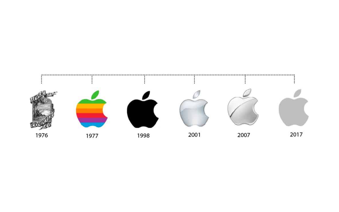
And their most iconic branding feature by far is their logo. So, let’s explore the evolution of Apple’s logo from 1976 to the present day.
You’d be forgiven for thinking that the first Apple logo represents a different company. It’s not the smooth, sleek design we’re familiar with today. In fact, it looks like something you’d expect to see slapped on a bottle of craft beer.
The job of creating the company’s first logo fell to Ronald Wayne, who decided to use Isaac Newton’s image sitting below a tree – the same Isaac Newton who discovered gravity when an apple fell out of a tree onto his head.
As we know, Ronald Wayne didn’t last long at Apple, and neither did his logo.
After only a year, Steve Jobs announced the logo as “old-fashioned” and thought it was too challenging to use on a smaller scale. Jobs also believed in the importance of modern computer design and wanted a logo to reinforce this idea and impress customers.
After all, a logo represents what a brand is. An old-style logo will cause people to think your brand is outdated, too.
To help create a new logo, Jobs hired Rob Janoff, a graphic designer tasked with creating a logo that would blend the name “Apple” with a modern-looking design.
And so, the famous Apple logo was born. Janoff’s design was quite simple, a 2D apple with a bite taken out of it and a rainbow spectrum splashed across it. The bite mark was included so people wouldn’t confuse it with a cherry. And, it’s also a geeky play on words (“byte” is a computer term).
From here, the logo went through small but meaningful iterations. The same year the Macintosh was launch, Landor Associates removed the company’s name from the logo—turning it into the icon that would become, well, iconic for decades to come.
Steve Jobs left Apple in 1985 after being pushed out by the company’s executives, but he returned in 1997, as the company was losing money at a rapid pace and faced the very real threat of going bust.
In addition to revamping the company’s entire brand image, one of his big challenges was rebooting the logo; it was a universally recognized symbol and needed to be leveraged if the company was to survive.
He removed the rainbow colors and replaced it with solid black, to complement the creation of their new, sleek, silver computer models. This new logo would be used on their latest ground-breaking product, the iMac, and would set the scene for a triumphant return.
Today Apple fully embraces flat, minimalist logo design with a logo that comes in 3 colors: White, black, and silver. It’s a simple-yet-powerful logo, which perfectly resonates with the Apple brand.
It’s one of the easiest symbols to recognize in the world, along with the likes of McDonald’s golden arches, and Nike’s swoosh.
What is it about Apple’s logo that makes it so effective?
For starters, the logo represents the company’s name, which helps to boost brand recognition. Every time consumers hear the name “Apple,” it gets reinforced in their minds by the visual cue of the logo design, and vice versa.
Over time, the pairing of the logo and brand name makes it easier for the public to recognize the Apple logo and immediately connect it to the representation of the company.
Next is the intelligent evolution of the design. As you can see above, the Apple logo started as a detailed drawing, but throughout the years, it has transformed into a flat, simple, and elegant design that perfectly represents the brand.
And finally, Apple’s overall branding efforts reinforce a specific set of emotions and powerful associations, which are invoked when you see the logo. It’s sleek, it’s stylish, it’s modern, and you, as the customer, will achieve that same level of cool when you use their products. See how that works?
Whether it’s one of their fun commercials or sophisticated retail stores that provide a unique shopping experience, all of Apple’s branding helps to tell the same story—consistently pushing these associations.
How did they do it?
Their branding focuses on how your experience with Apple makes you feel by unleashing your imagination, embracing innovation, enabling you to chase your hopes and dreams and aspire to great things.
It’s Apple’s ability to create an emotional connection between customers and the brand that has helped make them into such a powerful force, and their logo is a huge part of the experience.
Apple’s logo works so well because it hits many of the vital brand design boxes. It has a simple, sleek design, and it’s instantly recognizable thanks to its shape.
Its color scheme and flat 2D design makes it incredibly easy to use across any marketing medium you can think of, whether on a billboard or small screen, like a mobile phone.
And, it perfectly fits Apple’s unique brand personality of focusing on the customer experience and ensuring technology is accessible and straightforward to use.

This portion of our website is for informational or educational purposes only. Tailor Brands is not a law firm, and the information on this website does not constitute legal advice. All statements, opinions, recommendations, and conclusions are solely the expression of the author and provided on an as-is basis. Accordingly, Tailor Brands is not responsible for the information and/or its accuracy or completeness. It also does not indicate any affiliation between Tailor Brands and any other brands, services or logos on this page.
Products
Resources
©2025 Copyright Tailor Brands