5 Types of Beer Logos That Will Make You Say "Cheers!"

If you’re one of the people who have taken an interest in home brewing this year, you’re not alone.

With so many people stuck at home these days, it’s been a great (using this term loosely!) time to experiment and try your hand at filling kegs. 

Even before this wild year, brewing beers became a $250 billion industry, and as many as one out of every ten beers sold originated from a craft brewery.

So, when designing your beer logo, it’s really important to come up with something that showcases your personality and sets you apart from other breweries and beer makers nearby. 

Your logo needs to grab your audience’s attention and stand out from the other craft beers on the shelf if you want to get noticed. 

Types of Beer Logos

To help you nail down your perfect beer logo, we’ve uncorked some of the most popular beer logo trends, along with a few design tips to use. Here are the main types of beer logos to consider:

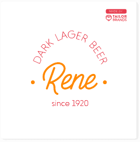
1. Vintage beer logos

Vintage and retro logo designs can be characterized by their “old-style” fonts, geometric shapes and frames, as well as light, subtle shades that were commonly used in the past.

With a vintage logo, you’re sending the message that your brand is long-lasting and trusted. You may also be able to evoke feelings of nostalgia, which is a powerful emotion. 

Using a vintage logo is a perfect way to show your respect for tradition and the values your brand stands for, while allowing you to convey your beer brand as laid-back and inviting, or fun-loving.

2. Emblems and badges

You might have noticed that emblems and badges are used all the time on beer bottle logos. Know why? Because they look so cool!

But- there’s also a practical reason. When designing a beer logo, you’re constrained by the shape and size of the bottle. Using an emblem allows you to place multiple design elements, such as an icon, brand name, and even tagline vertically, so that it fits easily onto a bottle.

Bottles and cans are also curved, which further restricts your logo design. Having your logo encased within an emblem keeps everything together and stops it from becoming distorted. 

There’s also an element of tradition here. Most people link  craft beer with emblem logos, which will help boost your brand recognition

3. Modern beer logos

Not all beer brands want to promote themselves as traditional or vintage. Like many businesses, bringing a modern flair to logo design helps set them apart, showing how fashionable
and up-to-date they are.

Modern logos can be characterized by strong and bold colors, and simple fonts that lack any kind of flair (usually seen with vintage logos).

Modern typefaces are typically no-nonsense, sans-serif fonts with clean lines and strokes.

And, modern beer logos are one of the most readable logos and are great to use with digital advertising.

4. Logos with barrels

Barrels are a key part of any stout beer, as they’re used for the aging process. You don’t have much time to get your brand’s main selling point across to your audience, so including a key item in your logo that perfectly describes who you are and what your product is, can help make an impact

You can go with a big barrel, small barrel, or even use the barrel as a border for your logo. Most beers use the same equipment, such as fermenters and kegs. Consider using any piece of common brewery equipment!

5. Monogram beer logos

A monogram logo consists of your brand’s initials, which is handy if your name is a bit of a mouthful or long.

Monogram logos are simple, and great to use on bottles because they don’t take up a lot of space. Because your initials are the main focus of this type of logo, it’s important to really nail the font and color scheme used.

They should be simple, yet stand out. Don’t combine too many dark colors, like blacks, greys, and dark reds, as it will be hard to notice.

Tips for Designing Your Own Beer Logo

Check out the competition: Examine your competitors to identify successful trends and gain inspiration to kickstart your creative flow.

Decide which kind of brand you are: Many beer brands inject lots of humor into their logo, while others portray themselves as a serious, professional brewery. Be sure to stay true to who you are and what your brand message is.

Don’t forget where your logo will be placed: Your logo will most likely be used on round surfaces, like bottles and cans, or even blown up and put on a barrel. So, make sure that your logo is easy to see and read, and won’t become distorted on a curved surface.

Make sure the tone matches your target audience: Does the vibe of your logo match up with who your audience is? Are you targeting young, hip customers, or more mature folk? If you have specific personas in mind, be sure to refine your logo to resonate with them.

Don’t shy away from experimenting: Lots of companies change their logos. Sometimes it’s because design trends change; sometimes it’s because their audiences change. When you’re creating your first logo, it’s the perfect time to try new ideas, such as color schemes you would typically ignore, or fonts that you would never consider. 

Over to You

Brewing the perfect beer logo for your business is an exciting adventure. It’s all about trying new designs and exploring ideas until you create your final form. 

If you’re feeling up to the challenge of crafting your beer logo, why not try our logo maker? It only takes 5 minutes to create the perfect beer logo for your brewery.

Disclaimer

The information provided on this page is for information, educational, and/or editorial purposes only. It is not intended to indicate any affiliation between Tailor Brands and any other brand or logo identified on this page.

Now the Content Lead at Tailor Brands, Kira Goldring began her marketing career as a 17-year-old handing out flyers on the streets of NYC. She currently covers all things branding, marketing and small business, but she could talk your ear off about investment strategies or gripping literature without missing a beat. Say hi on IG - @kiragoldring