Every business and person (including you!) has a brand, whether you know it or not. Whenever someone thinks of you, they invoke memories and impressions that decide how they feel about you.
These impressions may be from direct contact they’ve had with you—face-to-face, over the phone—or they may be via comments from other people, such as word-of-mouth or online posts and reviews.
If someone has never met you or heard of you, they’ll make a first impression based upon what you’re wearing, how you talk, and how you handle yourself.
You also have some control over how people think of you. If you want people to know you’re kind, show them through acts of kindness. If you want them to think you’re generous, buy them lunch. If you want them to think you’re professional, wear a tie.
The image that people have of you will influence how they feel about you, and whether they like you or can’t stand to be around you.
So why would it be any different with your business?
What is a Brand?
If we boil branding down to its very core, it’s the promise you make to your customers through visual and written cues. When you brand your business, you’re essentially working to ensure that the image your customers have when they think of you is aligned with the brand image you want them to have.
You can help build your brand by making an initial promise that shows who you are, what your morals are, and which benefits you can bring to the table.
Think about when you meet someone new and you try to make a specific impression—an initial “promise” of who you are and what you’re like. Then, you help to reinforce that promise every time you come in contact with them.
Similarly, you can help to push your brand promise every time your audience comes in contact with your brand, whether through web searches, social media like Facebook and Instagram, media advertising, reviews, email communication, or any other medium.
Every encounter someone has with your brand will affect how they perceive you. So, you’ll want to reinforce your brand promise at every opportunity—which is why you should set out to build your brand in the first place.
Building a brand from the ground up is not easy. It takes plenty of passion, focus, and persistence—but it’s well worth it.
Apple, Starbucks, and Nike didn’t get to where they are by being lazy and relying on their product alone; they created an incredible brand, each with a promise of what you can expect when you purchase from them (a promise that they deliver on).
In the following sections, we’re going to break down how you can build a brand from the ground up in 8 steps.
How to Build a Brand in 8 Steps
Before charging ahead and shooting off marketing campaigns left, right, and center, remember that you can’t achieve brand awareness overnight. It takes time, energy, and plenty of thought.
One of the most common misconceptions about brand awareness is thinking you can best use it to gain new customers and convert them. When you do this, inevitably, your audience will become focused on the product and not your brand!
You want to create a positive, lasting impression on your audience that extends beyond your product line. Here’s how:
1. Identify the Purpose of Your Brand

Having a purpose can mean the difference between success and failure, or the difference between turning a large profit and barely scraping by.
When asking yourself this question, you need to go beyond simple answers like “I want to sell my product,” or “I want to make money.”
Huge brands like Apple and Nike have a clear and strong purpose behind their branding:
- Apple sells computers, phones, and tablets, but its purpose is to empower creativity and self-expression.
- Nike’s purpose is to “unite the world through sport to create a healthy planet, active communities and an equal playing field for all.”
A crucial part of branding is communication, and without a clear purpose, you won’t be able to communicate with your audience on a level they relate to. Do you think Nike would be so successful if they didn’t have such a strong brand purpose?
Uncovering your brand purpose
Answer these 3 key questions to uncover the true purpose of your brand. The last question is the most important one, so take your time!
1. What does your brand do?
2. How does your brand do it?
3. Why does your brand do it?
Once you’ve answered these questions, you’ll have defined your brand’s purpose, which will help you showcase that special thing that makes you unique and what customers can expect when they interact with you.
2. Research Your Target Audience and Competitors
Why do you want to bother researching your target audience and competitors? To find out who is ready to buy what you’re selling!
This is one of the most essential ingredients of your branding recipe, and if you overlook it, you may end up burning your brand-building efforts.
Why do these matter so much?
Because, your products or services aren’t for everyone. It may be a hard pill to swallow, but it’s the truth.
And that’s okay! Good branding means being able to communicate well with your target audience, so you can create an emotional connection with them—but to do that, you first have to know who they are.
A successful brand knows exactly who their target audience is and performs plenty of competitor research, so they know how to best communicate why they should be the go-to.
EasyJet, one of the UK’s largest air carriers, didn’t set out to conquer the market by promoting themselves as a luxury airline. They did the complete opposite.
They promoted their flights “as cheap as a pair of jeans.” They realized their target market doesn’t care about fancy in-flight meals and top service; they just want to get from A to B as cheaply and quickly as possible.
So, remember, your brand isn’t for everyone—and that’s not a bad thing! Identify who your target audience is by performing market research (conduct Facebook polls, send out surveys, do keyword research to see what people are searching for online, etc.) and looking at your competitors to identify what works well and what doesn’t.
3. Create Your Brand Personality

For your brand to stand out in a good way, it needs to have its own personality (a life of its own). By giving your brand a set of human traits and characteristics, you’re creating a personality that your customers can relate to and interact with.
The first step is to come up with your brand positioning statement. You don’t have to advertise this anywhere, but it will help you create a killer personality and tagline for your brand.
Create yours by following this template:
We offer [product or service] for [your target market] to [value proposition]. Unlike [the alternative], we [describe here your key differentiator].
Try to get as specific as possible when identifying “your target market”, like saying “post-partum women who want to eat healthy and work full time” or “first-time suburban homeowners between the ages of 30-50, who are looking for easy-to-use lawncare solutions.”
Now that you’ve created your brand positioning statement, it’s time to whip up your brand personality. As long as you followed the previous steps, you’ll know who your target audience is, which in turn helps you to define a personality that will resonate with them.
While there are hundreds, if not thousands of different and unique personalities you can choose from, here are 5 we wanted to highlight:
- Excitable – This personality is animated, youthful and spirited
- Sincere – Believes in the brand’s message, and speaks the truth in a thoughtful and kind way
- Rugged – Tough, but not a bully; imagine this brand as athletic and comfortable outdoors
- Competent – Speaks with the knowledge that they’re successful and accomplished; doesn’t hesitate to show leadership
- Sophisticated – Esteemed, elegant and is well-spoken, but not rude or pretentious
Your brand personality will come across in all of your brand’s communication, marketing, and messages, so make sure it’s one your audience will notice and pay attention to.
4. Choose Your Business Name
It’s safe to say that your business name can pretty much be whatever you want it to be (within reason), but you should give people a hint about what you offer or do and pique people’s interest.
Why do we say that? Take a look at this list of brand names:
- Amazon – No not the rainforest…the popular online shopping website
- Apple – No, not the fruit! The hi-tech computer and smartphone company
- Puma – No, not the animal! The popular sportswear brand
Even though, on the surface, these company names have absolutely nothing to do with the products they sell, their branding is so successful that their business name IS the product, and vice versa.
And, each of these names has symbolic connotations that say something about their offer (Pumas are agile and quick, which you’ll be if you wear their clothes; Amazon is the largest river, and the company is the largest provider of, well, everything; etc.)
As a small business owner, you probably won’t have the gigantic marketing and branding budgets available to the above companies. Instead, try and brainstorm a brand name that lets your audience know what you do and get them interested.
Here are some different approaches you can use to generate your business name:
- Combine two words: Quicksilver, Costco, WordPress, GameStop
- Repurpose a non-related word, like Lemonade, the name of a digital insurance company
- Slightly change the spelling, such as Tumblr and Dunkin’ Donuts
- Use an acronym: If your brand name is made up of more than two or more names, combine them, like HBO
- Use a related word: The creators behind Tinder wanted a word that describes the fiery spark created between two people
- Use Tools: If your still stuck for inspiration you can try using a business name generator
Before finalizing your new business name, try it out for size by asking close friends or family, or even a focus group to see what they think about it.
5. Come Up with a Tagline
Having a cool, catchy slogan isn’t a must. But, it can be useful to help get your point across in as few words as possible. You can paste it on your home page, social media pages, and even advertising space such as online ads and billboards.
In extremely competitive industries, your tagline will undoubtedly help separate your brand from the crowd. You can use humor or highlight your competitive advantage.
- Dollar Shave Club “Shave time. Shave money” is a clever tagline which showcases the convenience and low cost of the brand.
- EasyJet “cheap as a pair of jeans” instantly highlights the low cost of their flights.
- Kit Kat’s “have a break, have a Kit Kat” was launched over 60 years ago, and it still makes an impact today.
A great tagline will communicate to your audience why they should choose your brand over anyone else.
6. Create a Brand Story and Voice
Having a brand story lets you answer important questions that define who you are as a business, and doing so allows you to connect with your audience on a deeper level and create trust.
Research has shown that people respond to stories on a biological level. Our brains react to the descriptive power of words, and we begin to identify with the brand and build a relationship with them, engaging with them as we would a person.
Brand stories also help your brand stand out from the massive advertising overload consumers are facing from marketers.
The key questions you should answer in your brand story are:
- Why did you start your business?
- What motivates you?
- Who is it for?
It should be short, compelling, conversational, and written in a way that sounds human. It should not be a long blog post or filled with jargon and buzzwords.
And, remember the brand voice you created earlier? Be sure to use that voice with your story to help bring it to life.
7. Design a Look for Your Brand
In today’s digital world, your brand look is just as important as everything else we’ve discussed up until this point.
And, your visual branding needs to work hand-in-hand with everything else if you want your brand to succeed.
Colors
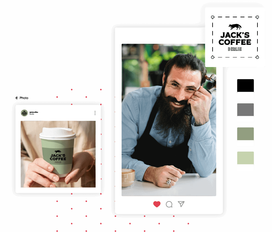
Your brand colors do more than just look pretty. Colors convey emotions and feelings. When done correctly, a color palette will back up your branding and help to reinforce it.
With a unique color scheme, you’ll also have a better job of standing out from the crowd. Instagram’s logo is made up of a purple and orange gradient with a white icon in the middle. Though gradients are a risky design choice, the unique color scheme helps it to stand out from the crowd and catch your eye.
Fonts
Fonts are often overlooked, but they can inject a huge amount of character into your brand.
- Sans-serif fonts – Usually used by modern companies, such as hi-tech brands like Facebook, Twitter, Uber and Spotify. These fonts have simple curves, no extra lines or flair, and are easy to read at a glance.
- Serif fonts – You can easily tell when you see a serif font due to the extra lines and feet (serifs) the font has on the ends of the letters, like Times New Roman. Using this font conveys a feeling of professionalism, sophistication, and smartness.
- Script fonts – These fonts mimic handwriting and vary from simple curvy fonts, to extravagant curls and flourishes. Script fonts are an excellent choice for a company specializing in boutique services or extravagance.
Images
Staying consistent is a key part of branding. You need to keep all your branding elements such as personality, messaging, and style the same; otherwise, the impression (or promise) that you’re attempting to build starts to fall apart.
When using images across your website, social media, and ads, keep to the same style. Don’t deviate wildly, or you may end up breaking your branding progress.
Logo
Your logo is the most ‘iconic’ part of your branding and your most identifiable visual element.
It needs to be unique, scalable to different sizes, and identify your brand at the quickest of glances.
As a new brand on the block, it’s best to stay away from using a logo icon by itself. For the best results, pair an icon with your name to create a wordmark. This will help reinforce your brand name with the traits associated with the icon every time a potential customer looks at your logo.

8. Build out and Promote Your Brand
The final piece of the branding puzzle Is building out your brand by promoting it. You can’t expect to set up all of the above points, sit back, and watch your brand grow.
You need to do your very best to get your brand in front of your target audience; otherwise, your competition will beat you to the punch.
- Run promotions and ads, such as PPC campaigns, billboards, radio adverts, and gathering email addresses.
- Create social media accounts and post relevant content; start conversations and get involved in relevant communities.
- Set up a website to link to from your ads and social media.
- Work on boosting your profile in Google through SEO (search engine optimization), so users will find your website when searching the web.
Whichever method or methods you decide to use, include your brand voice and personality and remain consistent with your images and messages.
Over to You
Without a clear branding plan and guidelines, you’ll never gain the recognition you need for your business to succeed.
Try to create trust, boost your credibility, and make your brand the one that people remember and turn to.
Want to look like a pro from the start? You can create your entire brand from the ground up with Tailor Brands! Head to our logo generator to get started.
