Fitness Logo Maker
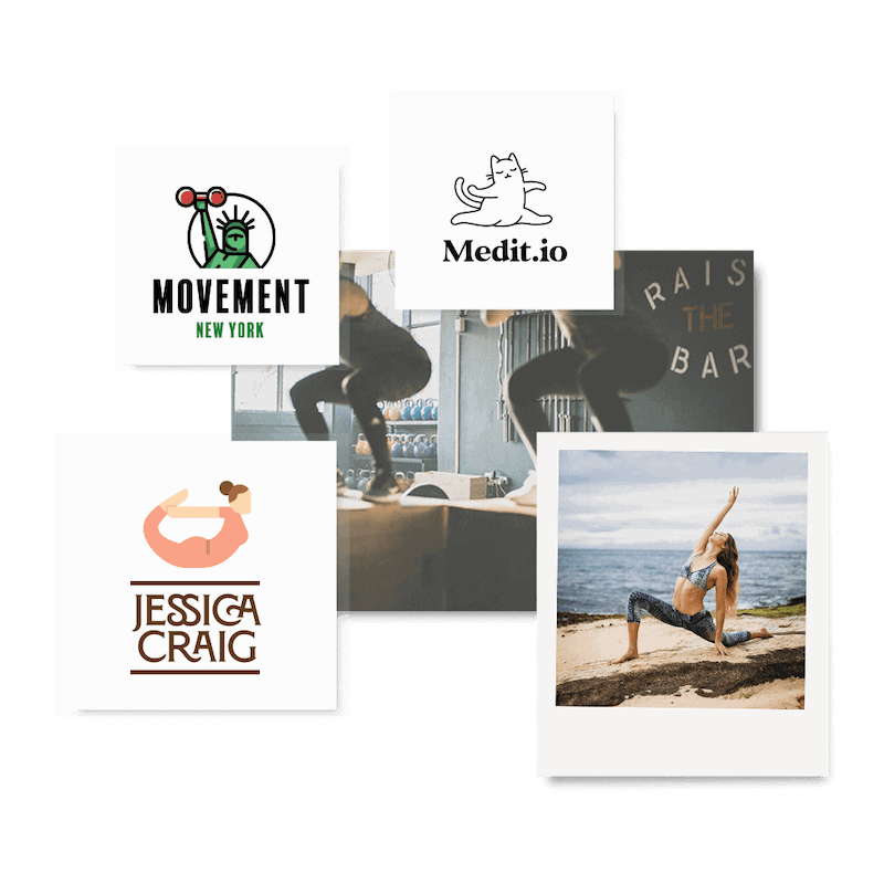
Create a stunning fitness logo design, and get your business in shape!
Home » Logo Maker » Ideas » Fitness Logos
If you’re ready to kick off your fitness brand, then you need to have a fitness logo. Don’t worry – the Tailor Brands logo maker will help you get that out of the way before you can say “one more rep”.
For many, fitness is more than just a way to stay healthy – it’s an entire lifestyle.You’re no exception to this; in fact, helping others reach their health goals is such an important part of your life that you’ve decided to start a fitness business, but you’ll need a strong fitness brand in order to speak to your customers.
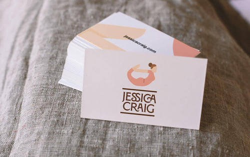
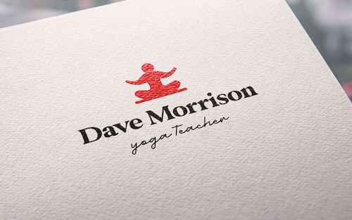
Building a fitness brand takes muscle, and you may need to exercise some creativity to get your business out there. Not to worry; anyone from personal trainer to CrossFit gym owner can get their brand in shape with a strong fitness logo!
Making a logo with Tailor Brands is simple and quick. Just enter your business name, pick the type of logo you want to make, choose the styles you love, and our logo maker will do the rest.
Once that’s done, you have the option of tweaking your design to get it just right.
Scroll down for some inspiration that will help you create a logo that speaks to your audience; then, check out our tips that will help you nail your fitness logo design.
How to make your own fitness logo

Create your fitness logo in two minutes, simply by entering your fitness brand name and tagline (if relevant) and clicking Design.

Tell us a little about your fitness business, select a logo type, and choose the fonts you love, so we can create the perfect logo for your brand!

Customize and make tweaks with our logo editor to bring your vision to life. You can play with fonts, colors, and logo layout – no design skills necessary!
Design your custom-made logo instantly
Fitness Logo Ideas
Fitness Logo Design Tips
1. Choose the right icons
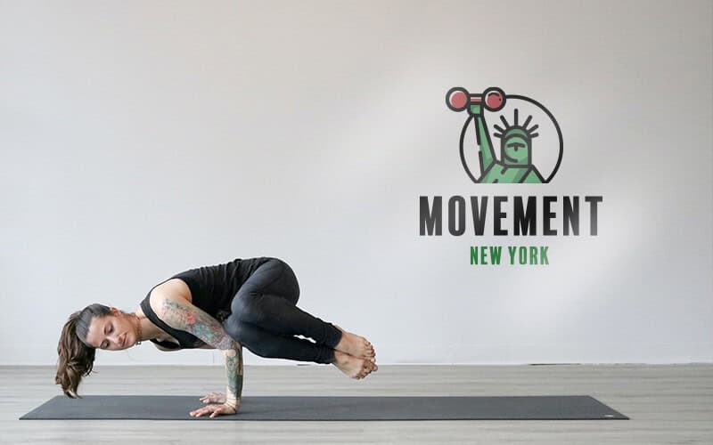
Using an icon in your fitness logo will give you a chance to point out something your customers want – and then promise it to them. For instance, kickboxing gyms tend to use icons of men with huge muscles, so as to tell potential customers that that’s what their future will look like if they join the class.
When choosing an icon, you want to be able to plan for the future of your fitness business. For example, if you think your studio will always be committed to yoga, then having an icon of a person in the middle of a pose will suit your clientele. However, if one day down the line you want to expand to include spin classes, your icon will no longer work for you, so try to focus on icons that keep your logo versatile.
To do this, you can use abstract shapes to convey motion, like a swish geared toward a specific direction, or shapes like arrows or a circle that appear to be spinning. An aerial acrobatics class could go with a series of lines that indicate ropes but can double as symbolizing the holistic approach of a health coach.
Also, fitness logos often include “fun” (read: animated) icons, from images of workout equipment to people in various states of motion. That said, it’s important to distinguish your fitness logo from competitors. One way to do that is to use an icon that emphasizes an extra perk you offer your clients; if your fitness regimen includes nutrition, you may want to consider using a leaf or vegetable icon; if your gym has the best running playlists, a music note or thumping bass may be the way to go.
2. Pick the perfect fonts
Your fitness logo’s typography will tell your audience about your brand’s personality and the type of vibe they can expect from you. So, it’s important to choose a font based on your values – even more than picking a design that simply looks good.
Most fitness logos will benefit from a bold and modern typeface, as they’re full of energy and catch the eye. For example, a vintage-looking slab serif – like Bobber – would be perfect for a cycling studio, or any other fitness brand that’s quirky or caters to hipsters.
An all-caps serif will speak more to upscale clients, so consider using this if you’re a personal trainer in an affluent neighborhood, or if you run a fitness club. Thick letters and clear print will appeal to bodybuilders, as the design of the lettering emphasizes power and strength; if you want to draw attention to the high-intensity workouts you offer, this is probably the direction you should go in.
3. Find the Best Colors
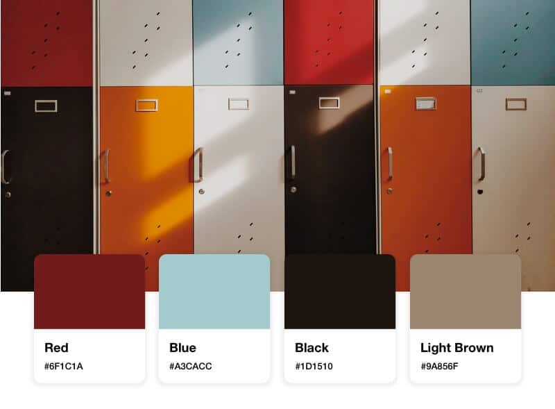
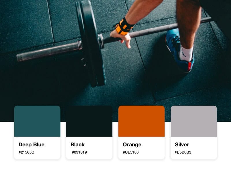
Colors have their own psychology, in that they each convey a different set of traits and emotions to the onlooker. That’s why it’s important to be intentional about your color choice for your fitness logo, and to think about your audience before you forge ahead with a palette.
4. Layout
Design your custom-made logo instantly
Your logo comes with:
High quality logo files
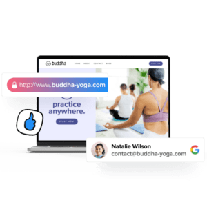
Website & Domain
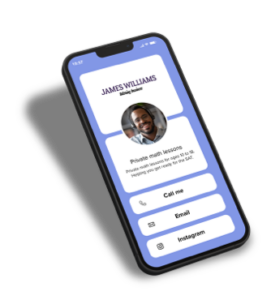
Powerful design tools
- Author: Shai Shmarel
- Published Date:
Disclaimer
This portion of our website is for informational or educational purposes only. Tailor Brands is not a law firm, and the information on this website does not constitute legal advice. All statements, opinions, recommendations, and conclusions are solely the expression of the author and provided on an as-is basis. Accordingly, Tailor Brands is not responsible for the information and/or its accuracy or completeness. It also does not indicate any affiliation between Tailor Brands and any other brands, services or logos on this page.