

Podcasting is big business, and it took many people by surprise just how popular it quickly became. It turns out that people love to listen to funny comedy shows, exciting interviews, or learn from guides and entertaining history lessons.
With so many podcasts out there, you need to make sure that people notice your brand, which is why you need a robust and bold logo that stops people in their tracks and gets them to click on your podcast.
This is where we come to your aid – with our logo generator you can experiment with creations to get some logo ideas and inspiration so you’ll know how to design a podcast logo that stands out from the crowd and instantly delivers the message to your audience.
How to make your own podcast logo

Create your Podcast logo in two minutes, simply by entering your podcast name and tagline (if relevant) and clicking Design.

Tell us a little about your podcast theme, then choose a logo type and the fonts you love, so we can create the best logo for your brand!

Use our logo editor to customize your podcast logo. You can play with fonts, colors, and logo layout – no design skills necessary!
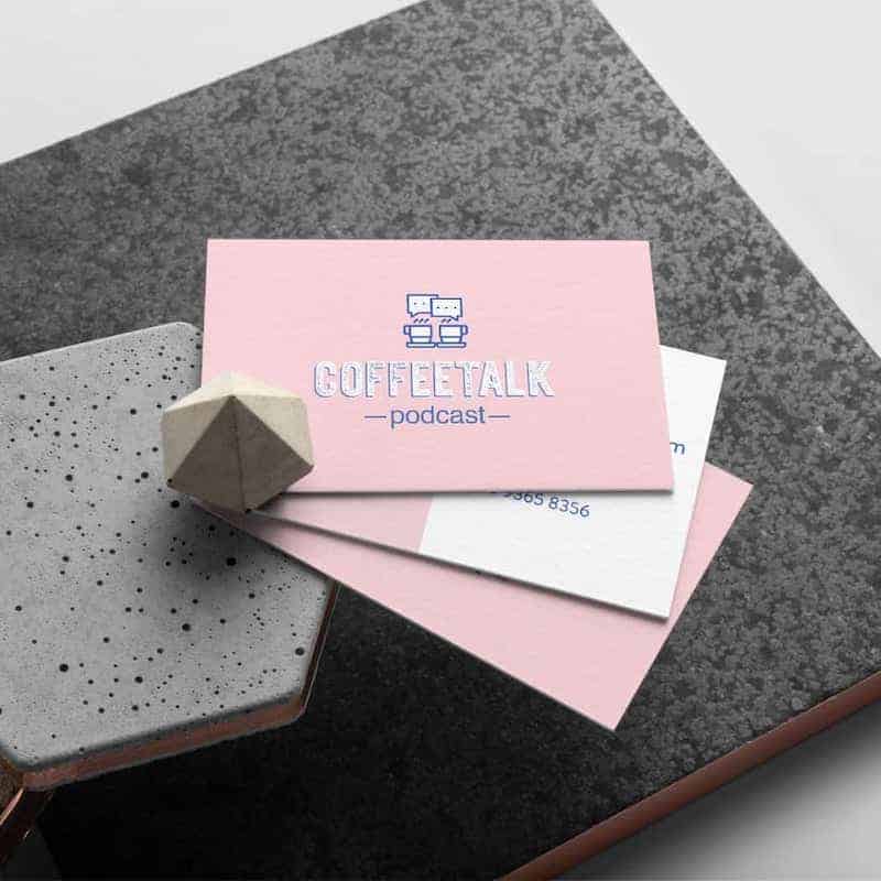
Podcast logos for inspiration


Podcast Logo Design Tips
1. Pick the right icon
You don’t have to use an image, but we recommend that you do. Why? Because an icon can instantly broadcast an idea, message or emotion, without the need for a block of text.
This is useful as your logo needs to work at a small size, and if you try and pack too much into your logo, it’ll turn out to be a complicated mess, which no one can understand.
Ideally, you want your icon to announce the topic of your podcast. Whether it be sports, politics, or a comedy show, it needs to make it crystal clear what your podcast is all about.
Self-Help Podcasts are all about inspiring, motivating, and creating empathy with its listeners. If you have a self-help podcast, use positive icons, such as rainbows, stars, a plus sign or thumbs up. You can even use a brain icon to show how you’re helping to improve your listener’s state of mind.
Business Podcasts that talk about management techniques or the stock market need to convey trust, leadership, and credibility and will often use symmetrical shapes because they show you’re in control and perfectly aligned.
Because podcasts are entirely audio-based, if you can incorporate a microphone into your logo as well, then you’ll make it clear to anyone that you’re a podcaster, and what your topics are.
2. Pick the perfect fonts
Podcast logo fonts can vary wildly, and they’re a significant selling point of your brand. Different fonts say various things about your podcast’s mood, style, and emotions. Which is why you need to use the perfect typography to lure in your listeners.


So right now, think about what the style of your podcast is. Is it Relaxed, formal, funny, serious, educational? The font you select says a lot about who you are. If you’re a serious podcast, tackling tough issues and reporting on important events, then you may want to choose a bold, blocky font that means business.

Where-as if you’re a creative podcast, encouraging your listeners to think outside the box and explore new ideas, then a font that mimics handwriting shows off your creative side, while still remaining stylish.
The best way to find your perfect font is to experiment and try different styles and see which one works best for you. When you do pick one, always remember that it must be legible. If no one can read your font because it’s too small, or too curvy, then try again.
3. Find the best colors
The colors you use affects the mood of your podcast and says a lot about the type of podcaster you are, so choose carefully. As a rule of thumb, don’t use more than three colors if you want to make the most significant impact. But using one or two is also fine. Sometimes using just one may have the biggest effect.
Black is an excellent choice for business podcasts. It shows that you’re serious and mature. But consider combining it with another color or otherwise it may seem too dark and dull by itself.
Shades of orange are excellent choices for educational and self-help podcasts, producing feelings of energy, passion, positive thinking. Consider combining it with a credible or authoritative color as well.
If you want to attract attention, then use the color yellow in your logo. It’s a bright color that catches people’s notice and draws them in. Also, a good choice if your podcast announces warnings and PSA’s.
Blues are an excellent color to use if you want people to trust your podcast. It’s a color that has good energy and represents intelligence.
Green is the perfect choice to use if your podcast focuses on health, science, or sports. It represents nature, fitness, well-being, and a healthy environment.
Experiment with combining colors together to create the perfect mix of emotion and tone that speaks to your audience with the message you want them to see.
