We’re so used to seeing our favorite logos around the web that we almost never consider where they came from.
But, like all things that have been perfected with trial and error, logos too have a past.
Just like clothing and haircuts come in and out of style, some logo designs went the way of the beehive – and rightfully so.
Let’s take a look at some of the most famous brands and how their logos evolved over time.
1. Microsoft
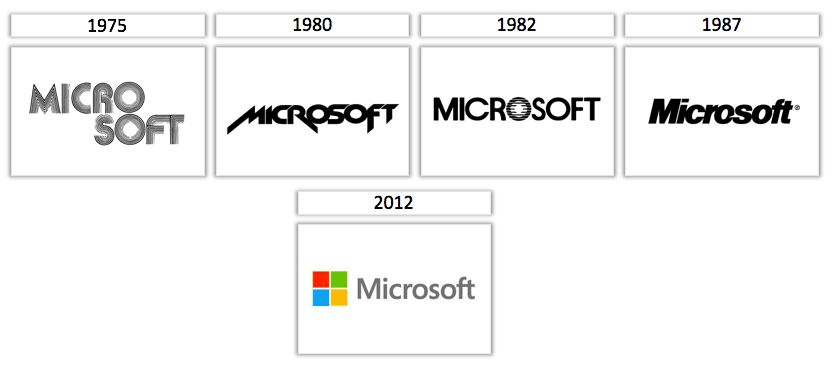
Since its founding in 1975, the Microsoft logo has taken on several personas – most of which being text-based. Over time, the software company’s look took a turn towards the tight and edgy, until they finally opted for a logo with a splash of color and an icon representing their most famous product (Windows).
2. Apple
Simple = better, at least in Apple’s case. The tech conglomerate moved from an elaborate, detailed emblem to a simple, single-colored icon of an apple with a bite taken out of it. Their current logo is sleek, to the point, and easy to remember – all the things a logo should be.

3. Baskin-Robbins
From vintage and bubbly to using letters that double as numbers, Baskin-Robbins’ logos have always emphasized the 31 flavors they offer customers – one for every day of the month.
Their current look is modern and subtle, with a word mark logo that takes a more subtle approach to their flavor-of-the-day branding strategy – can you spot how?

4. Levi’s
Levi’s is notable for their timeless and sturdy jeans, and their logo boasts similar qualities. The most current version of their logo has lasted over 50 years, and we have the feeling it’s not changing anytime soon.

5. Toyota
As it was originally called, “Toyoda” has had three very different logos over its 84-year lifespan. The company called for a logo design competition just three years after its founding, leading to a red logo featuring Japanese characters that make up the word “Toyota”.
In the late ‘80’s, however, the Toyota emblem we all know and love was introduced to the public, and it has remained their trademark logo ever since.

6. AT&T
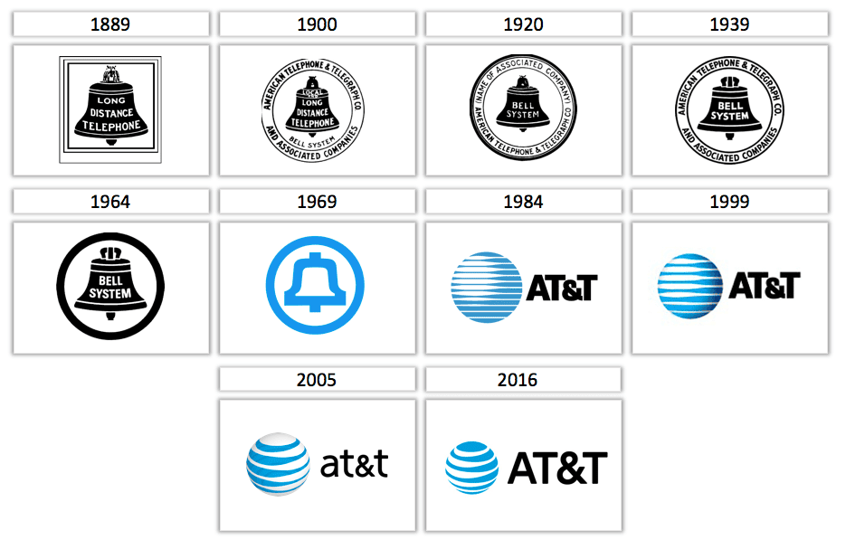
From 1889 until 2005, AT&T’s logo underwent several big changes – mirroring the evolution of technology over the century.
In recent years, the company went through another rebranding period, adding smoother curves, brighter blues, and wider stripes to their logo – capturing the feeling of movement and growth in their new design.
7. Visa
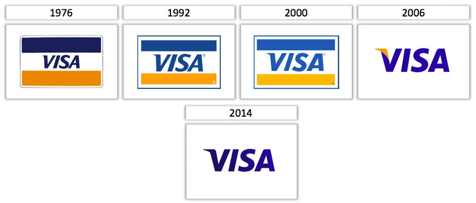
Visa’s brand has always been consistent with its roots – preserving the basic color scheme and using similar-looking fonts. As the brand became more widely recognized, they were able to drop the credit card stripes from their logo and let their name stand alone in a sturdy, blue typeface.
8. Kodak
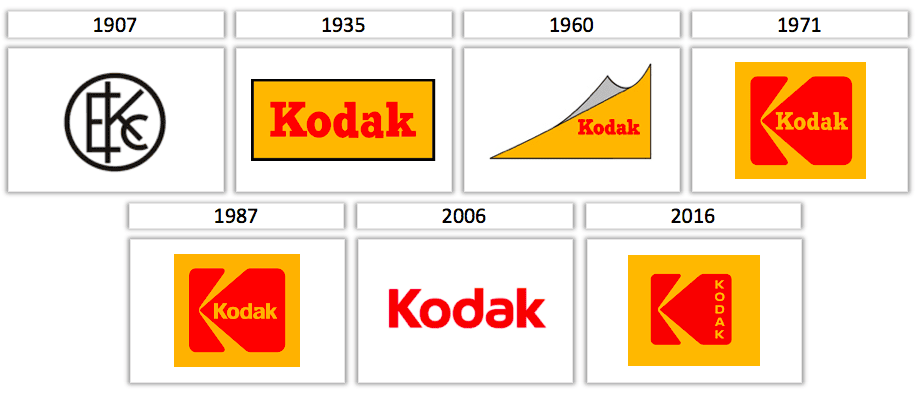
Kodak’s original logo may be hardly recognizable, but the remaining iterations played with the brand’s red and yellow color scheme on a number of different shapes and orientations.
9. Burger King
The hamburger franchise moved from mascot-oriented fun to an explicit image of a bun, which they’ve tweaked over the years in font and color in order to give the burger logo a more “global” feel.

10. Walmart
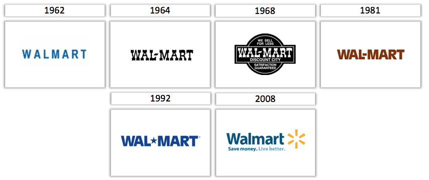
The first decade of Walmart’s existence saw small changes in the brand’s logo – but not insignificant ones. In the most recent design revision, the company added their notable tagline to the logo, promoting the value they bring to their customers at first glance.
11. Nike
Another logo that remained relatively consistent over time, Nike’s infamous “swoosh” was always here to stay. However, as the company brand grew, that symbol became so famous on its own that the sportswear company was able to drop their name from the logo entirely.

12. Adidas
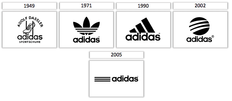
After moving away from its initial design, this brand’s logo has essentially preserved the same font, three stripes and (lack of) colors – simply changing its icon over the years. The strict black and white palette Adidas has used in every version makes for a striking and universally recognized logo design.
How Much Will Your Logo Change?
Logos morph over time – and that’s ok. As your business grows and develops, you may need to update your brand’s visual elements, and this usually starts with a logo design.
