Without Microsoft, the tech industry would be unrecognizable. The company has paved the way for personal use computers and consumer-based software. Along with Google, Apple and Amazon, Microsoft has been part of the movement that launched a cyber revolution and the start of the Information Age.
A Brief History of Microsoft
From the very start of the computer era, Microsoft was right there. Founded in 1975—a whole year before Apple—Bill Gates and Paul Allen started working on their own computer software. Microsoft released Altair BASIC and the MITS Altair 8800 pre-assembled computer kit. This iconic American company has since been a leader in the tech industry.
Microsoft now encompasses many other brands, including Linkedin, Skype, GitHub and Xbox. It has grown to become a behemoth with the second-largest tech market share of $1.6 trillion and annual revenue of $143 billion. The company employs over 163,000 people. Apple holds a slightly larger market share with $2.17 trillion and $274 billion in annual revenue. Microsoft was the third company to ever hit a trillion dollars in market capitalization—trailing just behind Apple and Amazon.
While Apple is better known for its branding, Microsoft has been right there offering more compatible systems, cutting-edge features and cheaper price tags. Bill Gates became the world’s youngest billionaire at the age of 31 in 1987, just one year after the company went public.
The Evolution of Microsoft Logo
It isn’t surprising that a company that grew so drastically and took center stage in front of the world would have some identity changes. We can learn a lot about branding and marketing by looking at the history of the Microsoft logo.
The company started with humble roots, a few basic resources and some available garage space. As the company grew, its identity has shifted some as well.
1. 1975–1979
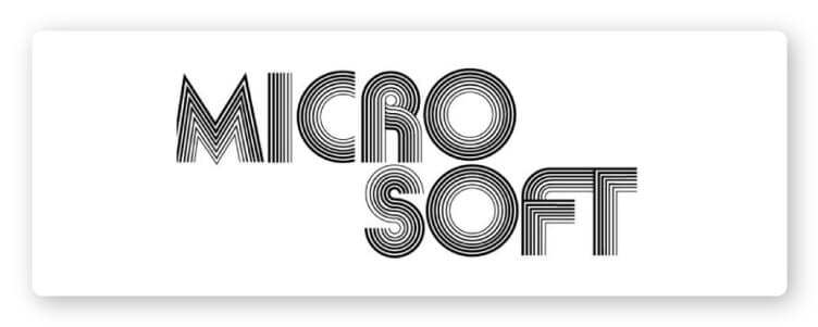
The original logo was created with an early programming language by founders Bill Gates and Paul Allen and designed by Simon Daniels. Originally, the name of the company was split with a hyphen as Micro-Soft, which is why the word takes on two levels in this early logo.
This throwback logo harks back to a time when disco balls were the rage and roller skates were the coolest accessory. Back in the day, this logo gave off youthful vibes with its trendy style. The large, rounded letters feel flexible, without losing technical accuracy or detail. The logo is structured, yet groovy.
The stacked “O”s are slightly distracting without a design purpose, but have nice symmetry. The lines creating the letters aren’t all the same width, which gives it a lot of depth and visual dimension.
The kerning (spacing between letters) in this early version gets a bit wonky around the “C.” The gap before the “R” is much wider than the space between the “R” and “O.”
2. 1980–1982
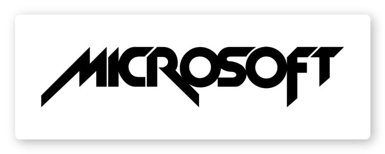
Hello, 1980s, you can take your eyeliner and thrash metal bands back. When Microsoft entered the next decade, they swapped out the soft-souled disco logotype for a logo that rocks.
The edgy Microsoft wordmark logo that lasted all of two years took on a much more intense approach that was reminiscent of arcade games, hardcore music and sci-fi movies.
Only one thing really lasted from this logo: Microsoft shifted to one word and one line of text.
The radical change included slanting lines with sharp edges—no more smooth shapes and line detailing. Simon Daniels chucked that original logo attempt for a much more aggressive approach that looks undeniably similar to the Metallica logo. Oddly enough, the Metallica logo was created after Microsoft was done with theirs. So, who was really trendsetting who?
It’s easy to see Microsoft was starting to feel themselves a little bit during this time. The company had started to take off. By 1978, Micro-Soft had made its first $1 million.
In 1980, Get Report asked Bill Gates to make an operating system that would be featured within their line of computers for the consumer. Thus, MS-DOS was born and a new era was ushered in. MS-DOS replaced IBM’s OS 2 and was the top PC operating system competitor with LINUX and UNIX.
3. 1982–1986
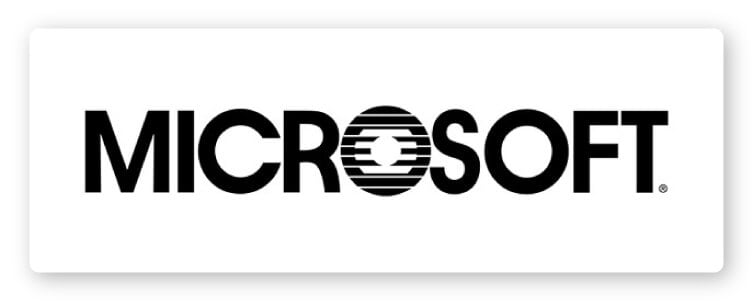
The smooth and simple sans serif typeface looks much more sensible. It’s like Microsoft finally stopped trying to make it big at battle of the bands and finally agreed to put on a tie and work for dad at a real job. Microsoft was becoming the square.
Those first two Microsoft logos should stand as a warning if you are creating your own logo: trendy design choices don’t often age well. If your brand is going to last for the ages, you need to have a design that stands up against the barrage of time. The fast fashion approach will be in one year and out four years later. Who wants to rebrand this often?
Samuel Daniels created logo No. 3 as well. Obviously, he rethought his approach or the logo might have gone more in the way of Iron Maiden and KISS.
This time, he decided to take the brand in a much more straightforward direction. The lines are simple and easy to read.
The only unusual detail in the word is the “O” with the lines ring and lines—almost looking like sunrise on the horizon or a printer glitch. It was meant to look like a CD—albeit a scratched CD that no amount of huffing and gently rubbing with your shirt would fix. And, that “O” became a beloved part of Microsoft brand history as the “Blibbet.” In 1987, there were petitions begging the company to bring the Blibbet back.
4. 1987–2011
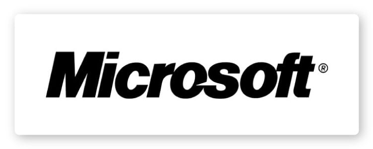
Finally, a Microsoft most of us know and have a love-hate relationship with. The fourth logo for Microsoft takes on a slightly edgier look, but still stays pretty safe. This version was created by Microsoft designer Scott Baker.
It was brought on to mark a new era in computing. Microsoft was releasing OS/2 to OEMs. At this point, the company was the world’s leading producer of personal computing software.
Using the iconic Helvetica font, the logotype has a small slash in the “O” to add some emphasis to the “soft” part of the name. Baker went so far as to say the slash stood for “motion and speed.” The employees referred to it as the “Pac Man” logo.
The confident rebrand found the perfect middle ground between the rock-star era logo of 1980 and the buttoned-down logo of 1982. This logo is going places, but not down any dark alleys. It had a solid run of 24 years.
5. 2012-Present
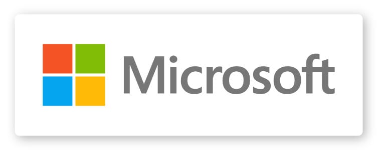
Microsoft shifted back to a more straightforward sans serif font (still no Blibbet) and added an icon in the most recent change. The bright color combination of the square panes is the first time Microsoft shifted away from the B&W look—even the Segoe logotype is in a softer gray.
The symbol of the squares represents all of Microsoft’s diverse products. It offers a very direct callback to the Windows logo—which makes sense because that is Microsoft’s biggest revenue source and a big part of its history.
After 45 years of logo history, it looks like the newest Microsoft logo will be around for a while.
Over to You
Do you need to make your own iconic logo or replace an outdated version with something more professional and relevant? Check out our logo maker and we will help you make the process easy.
