If you’re trying to break into the world of design, you’ll know by now that fonts are a whole new ball game.
And, when brainstorming a design for your brand, it’s natural to focus solely on the colors and images you want to use.
Many people underestimate just how much thought goes into choosing a font. But the truth is that even when you’ve finally nailed your illustration, the work isn’t over until you choose how to appropriately stylize the accompanying text.
Those of you who are new to design have probably found that font selection is unexpectedly time-consuming and exhausting. There are so many cool free fonts out there to choose from, and it can be difficult to grasp which styles go well with your logo and reflect your company’s brand and tone.
To help you get a better grasp on which fonts to use, we’ve compiled a list of the fundamental elements of typefaces, as well as tips and techniques to consider when using fonts.
Anatomy of a Typeface
Typeface anatomy refers to the different elements that make up a font in any given typeface.
Understanding the various stylistic nuances of fonts can help you have a better idea of how to determine which types of fonts work best with your design. Let’s break down a few terms to get you started:
Typeface
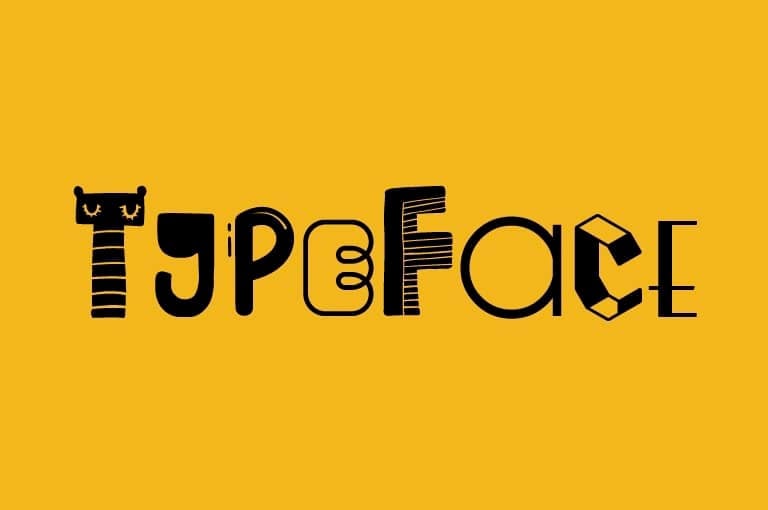
You can think of a typeface as a family of fonts.
Calibri, for example, is an entire font family, or one typeface. By styling this typeface in different ways—such as by making it bigger or smaller, or italic or bold—you get a collection of fonts within that typeface; Calibri Regular, Calibri Italic and Calibri Bold are three different kinds of Calibri fonts.
Weight
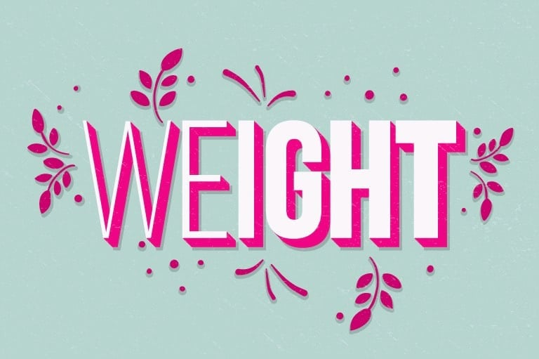
Font weight refers to how thick or thin the characters of a font are, and it’s the element that distinguishes one font from another within a typeface. A heavier font is also known as bold.
This brings us to:
Bold Vs. Italic
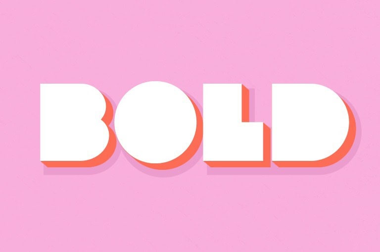
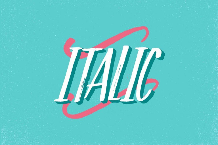
Using a bold or italic font is a common way to emphasize a particular word or phrase.
While bold fonts are heavier, italic fonts are slanted. Use bold fonts for heavier emphasis, and italic fonts for gentler emphasis. Don’t use them together, though; this tends to appear overexaggerated and is annoying to read.
Baseline
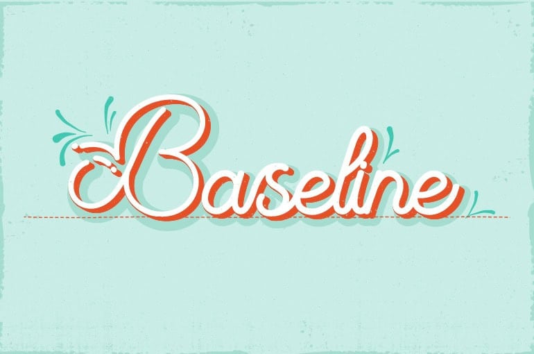
The baseline is the imaginary horizontal line that a line of text rests upon. While some letters rest exactly on the baseline, others, like g and y, dip below the baseline.
Cap Line
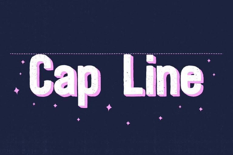
The cap line, like the baseline, is an imaginary horizontal line along a line of text – but marking the height of uppercase letters within a font.
Ascender
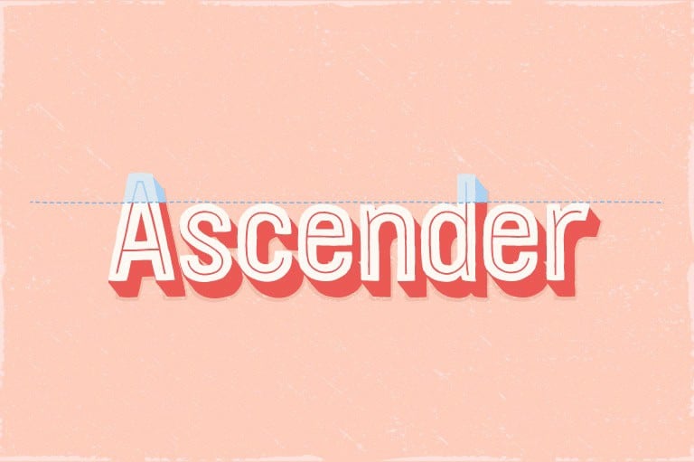
An ascender is when the upstroke of a lowercase letter reaches above the average line of letters, and the ascender line is the imaginary horizontal line across the tops of the ascenders. Note that the ascender line can be higher or lower than the cap line, depending on the typeface.
Descender
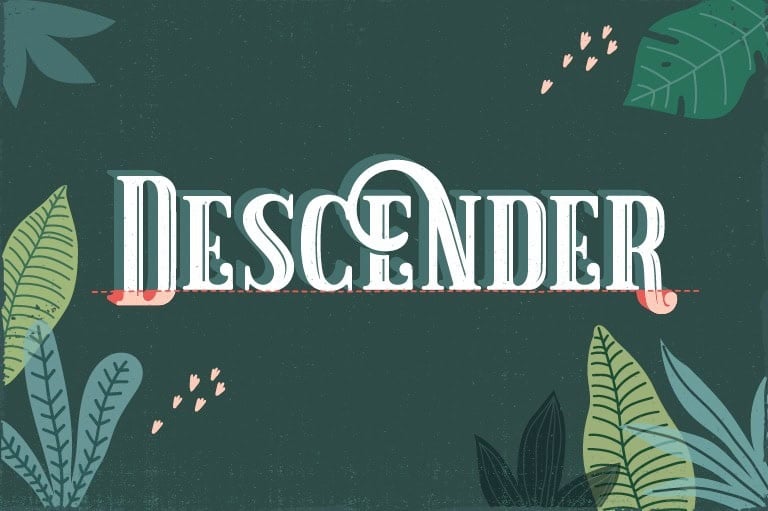
In contrast to ascenders, a descender line marks the lowest point that strokes reach below the baseline. Lowercase letters like g, p, y, and q all have strokes below the baseline.
X-Height
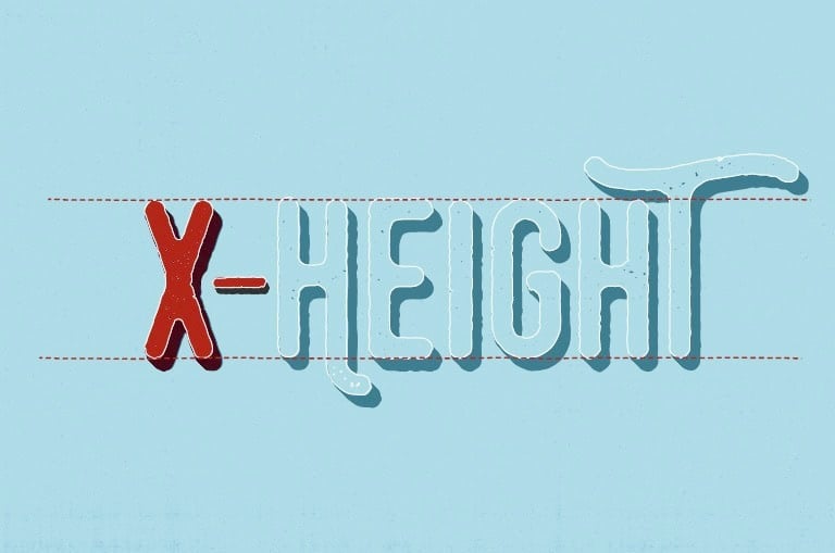
The x-height is the height of lowercase letters like r or x that have neither ascenders nor descenders.
Kerning
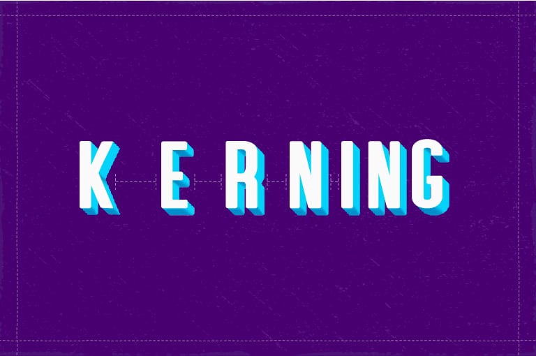
Kerning refers to the amount of spacing between characters. Tight kerning is when the characters are close together, while loose kerning refers to characters that are further apart.
Although spacing may seem to be an insignificant detail, it makes all the difference between clumsy and polished design.
Tracking
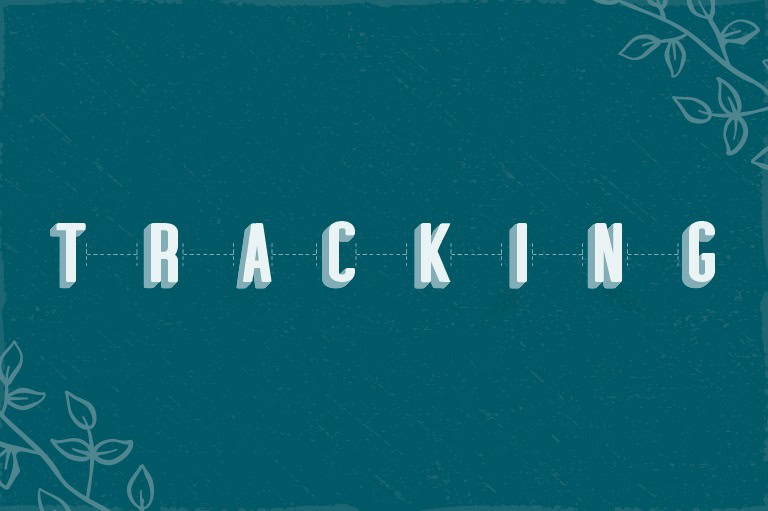
Tracking is also about the spacing between characters, though it is different from kerning.
Once you’ve determined the proper spacing between each letter, you can use tracking to make sure the spacing is equal between every character in the text. Because tracking involves changing the spacing between all letters at once, it keeps the spacing between letters proportional.
Glyph vs. Character
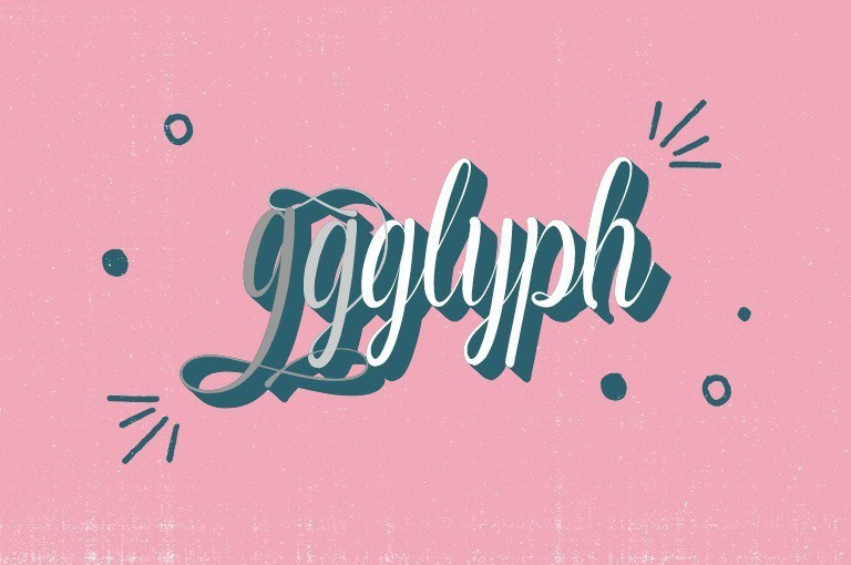
A glyph is a single character represented by a specific shape, design, or typeface. All letters, numbers, and special characters are glyphs. Keep in mind that a glyph is not the same as a character; a single character can take the form of many different glyphs, each in varying typefaces or fonts.
Things to Consider When Using Fonts
Now that you’ve familiarized yourself with the different elements of a font, you can think about how to use these elements to your advantage in your designs. Here are some important things to consider when selecting the right fonts and using them in your designs.
Use fonts that pair well together
There are times when you might want to use two different fonts, like when you’re designing a logo using both a company’s name and tagline. In these cases, it’s important to know which fonts go with which.
Contrast is a really important part of pairing fonts, as it involves making one part of text stand out against another in a visually pleasing way. The general rule for font pairing is that the more contrast, the better.
There are several elements that go into typographic contrast, including size, weight (level of boldness), typeface, and more. Print newspapers, which use drastically varying font sizes to distinguish headlines from body text, are great examples of typographic contrast.
Pair serif fonts (those with little “feet” at the ends of the letter strokes) with sans serif fonts, weighty (bold) fonts with thinner fonts, and fonts full of character with more neutral fonts. That said, make sure your combinations aren’t discordant, by choosing fonts that evoke similar moods and that have similar proportions and x-heights.
Design hierarchy
Visual hierarchy refers to the order in which your audience processes the information in your design. Some parts of your design will immediately grab your viewers’ attention—that is, they will be at the top of the design hierarchy—while other parts will be looked at later.
Using different design techniques, you can influence the way your audience processes and perceives your design.
Words that are large and brightly colored will attract more attention than small fonts and muted tones. White space and contrast are other ways of catching the eye. Consider your design hierarchy when determining the sizes and colors of your fonts.
Evoke the right mood
On that note, different fonts connote different emotions and, as a result, influence your audience’s perception of your design. Cursive fonts are generally perceived as funny, feminine, and casual. Serif fonts, on the other hand, evoke practicality, stability, and maturity—which is why they’re often used in logo design.
Depending on the context, select fonts that reflect the mood you want to achieve with your design.
Coordinate between color and style
Different colors, like different styles, evoke varying moods—according to the rules of color psychology.
Choose font colors that are consistent with the tone evoked by both your font styles and your overall design. Blue, for instance, tends to evoke stability, so it works well to pair a timeless serif font with the color blue. Yellow or orange can convey whimsy and cheer when paired with a playful cursive font.
Proper kerning
Kerning, like we mentioned above, requires a keen eye. Kerning is more complex than simply measuring the distance between characters, since characters often have little embellishments that affect the apparent distance between them. Instead, proper kerning is about achieving the right perceived distance between characters. This infographic is a helpful resource for honing your kerning skills.
Ensure readability
One of the most important aspects of a typeface is how easily your audience is able to read it. If the average onlooker has to do summersaults to piece together what your text says, then the font you chose isn’t doing its job. There are a few ways to ensure readability:
– Backgrounds – If you’re using text that’s in the same color family as the image behind it, try increasing the transparency of the image so that the text comes off the page rather than fading into it.
– Resizing – When choosing a font, you have to consider the medium on which it’s being used. For instance, tiny print is not going to be compatible with the same fonts as a storefront billboard. Keep your surface in mind and the sizing of your letters before you begin using fonts in your design.
Design consistency
Consistency is key when creating multiple designs for a single company or brand.
Once you choose the typeface that best reflects your design, stick to that typeface. By using no more than two to three different typefaces to represent your brand, you help solidify your brand’s message and tone for your audience.
Over to You
When it comes to branding, your font is just as powerful as your image. From kerning to font pairing to use of color, there’s a lot to consider when choosing the right typography for your designs.
If you’re feeling daring, you can always try and customize your own font. Just remember to find a look that represents the feel of your brand and corresponds to the message that you’re aiming to convey with your designs.
Ready to begin designing? Check out these awesome fonts for logos to help you get started!
