1. Pair Two Fonts From the Same Font Family

If you want to make font-pairing easier on yourself, this is the way to go.
Font families (serif, sans serif, slab serif, script, and decorative) were created as a way to classify fonts that are meant to complement each other. Sticking with fonts from the same family not only helps you narrow down your font choices but also ensures you have a cohesive look across your design. The Night Owl logo has the cohesive look nailed down!
Fonts can elicit emotional and psychological reactions, as well as create associations with a brand. That’s why when you choose a font family, you should first understand what each one means and the industry it’s most used in.
You should look out for a font family that has varying style options; look for a range of weights (thickness or thinness of letters), sizes, and cases (uppercase or lowercase).
2. A Chunky Font Pairs Well With a Skinnier One

In general, fonts pair well together when there’s a significant amount of contrast between them. Here, font weight (i.e., thickness or thinness of letters) is the point of contrast. Stout, chunky fonts often work well with tall, skinny ones.
This is because it’s easy for the viewer to distinguish between the 2 fonts, and understand that each plays a different role in the document or project. Both carry their weight (ha!) while serving different purposes – creating a complimentary design overall.
Just like with Bla Bla Bla Podcast logo, you can use a thick and thin font weight to achieve contrast in logo design. Not only does this help draw your eye to the design, but it also helps create a visual hierarchy with the “bla bla bla” part taking prominence over “podcast.” Visual hierarchy is the principle of arranging elements in a design to point out the order of importance.
3. Try Tight Kerning With Looser Kerning

Kerning, in design terms, refers to the spacing between characters in a font. This is another great way to differentiate sections of your text, creating a hierarchy between fonts and showing your readers that they are looking at two distinct parts of a document.
Be creative, but don’t be too creative – a large amount of text with really loose kerning, for example, may cause a reader to lose interest, while too much tight kerning could make the text look like it’s overstuffed. Don’t be afraid to play around with the sizing of the text to help find a good balance.
Choosing font pairs that change up the spacing, on the other hand, will help balance out the piece.
4. Two Fonts With Complementary Moods

While this is more of a subjective call, there’s something rather intuitive about the way fonts feel when we look at them. You know what reads as professional and what comes off as funky or even just plain silly.
For example, the font you’d use for a child’s birthday party invitation (perhaps a rounded, bubbly typeface) isn’t going to have the same feeling as the one used to head a business proposal.
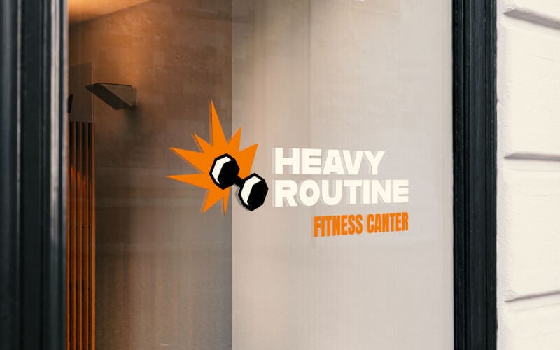
As you think about pairing fonts, pick ones that have similar vibes like Heavy Routine Fitness Center’s logo.
5. Use Serif and Sans Serif Together

Serif fonts like Times New Roman have decorative flourishes or “feet” at the end of strokes. Sans serif fonts, such as Arial, are a category of typefaces without those flourishes.
Pairing serifs and sans serifs is a classic and easy way to create balance in your logo design while having enough contrast to differentiate between the different parts of your logo.
However, you’ll still want to make sure that the serif and sans serif pair you choose have different weights and overall styles, so that the fonts don’t come across as too similar (see tip #9).
In this Book Club logo, the serif gives “book” a refined, sophisticated touch, while the sans serif balances it with a clean and intriguing vibe (bonus points for the perfectly spaced kerning!).
6. Try a Traditional Heading with a Decorative Body

Remember when I talked about visual hierarchy (hint: Tip 2)? Well, in logo design, it’s a good idea to pair fonts according to the role they’ll play or their level in the hierarchy.
Headings are usually meant to attract the most attention and often claim the font with the largest size and most weight. They also set the tone for your brand since it’s usually the first thing the eye is drawn to.
In the case of Mystic Theory Beauty, using a traditional font in the heading tells their audience they’re to expect a reliable, modern brand. By using a script body font, the 2 contrast and create a visually appealing effect.
7. Use a Decorative Heading with a More Traditional Body

If you’re looking to convey fun or lightheartedness through your logo, a decorative heading and traditional body will set that tone. The decorative heading will come off as relaxed, and the traditional body will relay a more professional impression
Not sure if you noticed that this is tip 6 reversed (keeping you on your toes!). The point is that changing up the font between the header and body text can create contrast that takes your logo up a notch. However, if decorative and traditional fonts don’t suit your logo design, no worries—there are plenty of font combinations you should try.
8. Don’t Use Fonts That Are Too Similar

Repeat after me: Contrast, contrast, contrast!
This should always be in the back of your mind when pairing 2 fonts. This is one of the main reasons that serif and sans serif fonts pair well together (see tip 5).
If you’re unsure which elements you should be looking at when choosing font pairs, consider contrasting the following:
- Size
- Weight
- Color
- Spacing
- Style
But, how do you know if your font pairs are too similar?
Well, if you can’t tell where one ends and one begins, you know that you’ve chosen incorrectly. Just look at the logo above to see what I mean.
Fonts that are too similar in style, weight, and size, will lose their roles in the text because the viewer won’t be able to differentiate between them easily. And the overall effect isn’t pleasing to the eye.
9. Avoid Pairing Fonts That Are Too Different

Fonts don’t need to be from the same city, but they do need to be from the same general design planet. While contrast is certainly important (see, well, every tip), too much difference can lead to confused messaging. Like Bebop Games, for example, is throwing off confusing vibes (it looks like a logo for a kids daycare center at a casino, but hey, that’s just me).
So, how do you know which font pairs have the right amount of contrast and which are so different from one another that they’re incompatible?
The easiest way to tell is with your naked eye, but if you like to live by concrete rules, your best bet is to choose typefaces that have a mix of elements in common and elements that contrast.
A great rule of thumb is to check the proportions and x-height (the height of the “x” character in each font). If the x-height is similar but the fonts still look different, it may be a good design choice.
Alternatively, you could pick 2 fonts that both have thin lettering, but differ in terms of their sizing, or choose fonts with distinct weights but similar styles.
10. Three is Key
Limiting a logo to 3 fonts is a general rule that many designers live by because any more than that would lead to a design that’s imbalanced and messy.
And, while some would argue that rules are meant to be broken, I advise you don’t with this one. If your heart is really telling you to use a 4th font, before you do, try tweaking the existing fonts by making them bold, italicized, or underlined.
Take the time to think about the fonts you’re going to use together, and ask yourself why each font you’ve chosen benefits the overall design of the logo. If you can’t convince yourself, you certainly won’t convince your audience!
11. Make Sure They’re Legible
Fonts are meant to enhance a design. They make your logo look visually pleasing and ideally send some sort of message that encourages your audience to form an emotional connection.
With that being said, if your audience can’t make out your text, they’re not going to spend a lot of time struggling to understand it. That’s why it’s so important you make sure your font is legible on a mobile screen and in print. This is especially important for anyone who decides to draw their own logo.
Over to You
Now that you know how to pair fonts, it’s time to get started on your next project. If you’re looking for a new logo for your brand, check out our logo design tool!
It uses the best font pairs for your industry, and you can create cool designs in just a few clicks.
