The most easy-to-spot logos have something in common: They stand out from whatever background they’re on.
That “pop” is known as contrast.
If you’re creating your own logo design, you should pay close attention to how you can harness contrast in your design. It could be just the thing to take your logo to the next level.
Let’s explore 10 ways to include contrast in your design, so you can make a logo that really pops.
What is Contrast in Design?
You might think of contrast as making dark colors blacker and light colors whiter. However, contrast isn’t limited to shades alone, and there are many ways to add contrast to your design.
In design, contrast is a comparison between 2 elements that capture the eye. In many cases, contrast helps our brain identify an image faster.
To clarify this concept, let’s consider the opposite of contrast: What if your logo had a dark, camouflage-patterned background with black type on top? If you stopped and looked closely, you might be able to make out what it is, but from a distance it’d all just blend into one dark blob.
On the flip side, think about one of the most famous logos of all time: The Nike check. It’s so simple you might wonder how it could have become so iconic. But, the singular shape in stark contrast from whatever background it sits on makes the logo hard to ignore. Even if you aren’t actively focused on the logo, your brain sees it subconsciously and “reads” it instantly.
How to Add Contrast to Your Logo Design
Now that we’ve covered what contrast is, here are 10 different ways you can use it to easily create a distinct logo.
1. Contrast with dark and light colors
The most common type of contrast used is varying shades of your logo’s color palette. Using dark and light in your color combinations will give you this kind of contrast in your design. Just make sure the various elements in your logo are either much darker or much lighter than the background.
This doesn’t mean you need to stick with just black or white in your design (although these are the most obvious and extreme forms of light and dark colors). Monochromatic (AKA, black and white) logos have an instant edge on contrast, but they can still get lost in the shuffle if the logo details get too busy and the contrast is lost.
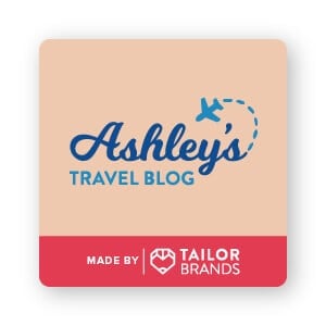
If you take a look at Ashley’s Travel Blog logo, the dark blue color is darker than the tan background. You can see how the lighter blue has far less contrast because it has a similar light value to the tan, causing it to take a backseat in the design. This combination helps the business name stand out.
Don’t know if the colors in your logo contrast enough? Here’s a handy tip! Squint your eyes and if 2 colors almost become one blended shape then they aren’t contrasting strongly enough.
Another way to check value contrast is by changing your full-color logo to a black and white image. Fully desaturating the logo will highlight the amount of contrast in your design.
Many designers do this in their design process to see if the logo layout stands on its own without color. A solid design should be readable, recognizable, and memorable, even when edited to a black and white image.
2. Contrast with color hue opposites
If you’ve ever seen a color wheel, then you know the contrasting colors (complementary colors) are the ones directly across the wheel. You can contrast 2 colors on different parts of the wheel for a “louder” design that demands attention. Complementary colors are:
- Violet/Yellow
- Blue/Orange
- Red/Green
You don’t have to use complementary colors to achieve contrast.
As long as you stay away from the neighboring secondary and tertiary colors on the wheel, you can find color contrast.
For example, 2 different shades of blue or blue and teal aren’t going to offer any color contrast. Yellow paired with lime isn’t a very contrasting combination either.
Imagine how much less contrast-y the logo would be in the Ashley’s Travel Blog logo if the background was a baby blue color and not warm tan?
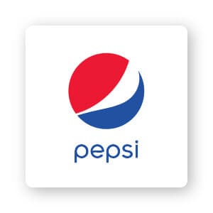
In the Pepsi logo, bright red is paired with a darker blue for a pop of contrasting color hues. This color contrast helps attract the eye to the design.
Pro tip: You can use color psychology to help choose the colors that best communicate and connect to your target audience. In Pepsi’s case, they added blue just to help contrast their brand from Coca-Cola. Shifting from the classic red and white design to red, white, and blue helped Pepsi look fresh, brave and all-American.
3. Contrast with saturation

You can add gray to one of the colors in your logo to make a difference in the color saturation. Saturation is the intensity of color in an image. As saturation increases, the brighter the colors appear; as saturation decreases, the more washed out the colors look.
You can create contrast by pairing a heavily saturated color next to a desaturated one.
The Guardian’s logo is a great example of this. “The” is a light gray-blue color that isn’t extremely eye-catching on its own. But “the” is a common word we really don’t need to notice in the logo. The more prominent (and meaningful) word “Guardian” is more saturated and instantly eye-catching.
4. Contrast with shape

A circle and square may be the most classic example of contrasting shapes. However, ovals and triangles or wavy lines and straight lines are contrasts as well. You can even use the curves or straight lines of your chosen font to contrast with the shapes in your logo.
In the Ashley’s Travel Blog example, the “Ashley” font is full of curves, while the “Travel Blog” font contains a lot of straight lines for contrast.
In Digital Ocean’s logo, the square design interrupting the circle causes stark contrast that draws our eye right to that point. The emblem smartly includes contrast in the lower left-hand corner to pull our eye directly to the start of the name. This contrast works powerfully because it is also paired with hue, value and saturation contrast; the bright royal blue is striking on the plain white background.
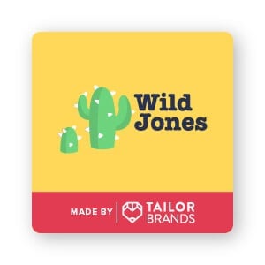
You can also contrast geometric shapes with organic shapes. Look at this example of the Wild Jones logo; the organic shape of the cacti is contrasted by the much brighter and sharper shapes of the triangle prickles. The triangles are much larger and fatter than real-life cacti spines, and this exaggeration helps stylize the logo.
5. Contrast with texture
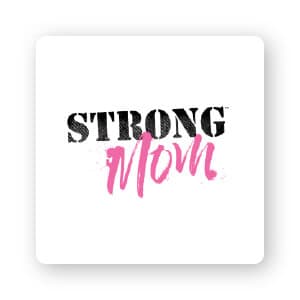
Our eye naturally compares a smooth surface to a rough one. So, by changing the texture, it can increase the contrast between 2 colors or shapes in your logo.
The Strong Mom logo uses the gritty texture of “strong” in contrast to the smoother, brushed look of “Mom.” You might also notice the splatter texture surrounding “Mom,” which serves to create less contrast and tie the 2 design elements together.
While contrast is important, you still want your design to look cohesive. Sometimes, you may need to back off the contrast a little bit to achieve a striking—yet unified—design.
6. Contrast with font combinations
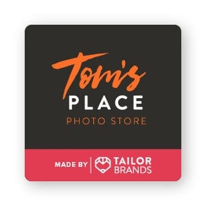
Font choice is a crucial part of good design. You might be tempted to pick multiple fonts that seem exciting or interesting, but make sure that the result isn’t a cluttered and hard-to-read logo.
Just like with Ashley’s Travel Blog, you can use 2 very different typefaces to achieve contrast. In most cases, you’ll want to use a simple sans serif or serif font to complement a more dramatic font, like script or decorative typefaces. (Serif fonts have a small line or stroke attached to the end of a letter, whereas sans-serif fonts do not have any kind of extending features at the end of the letters.)
Not only does this help improve readability, but the contrast of a simple font with a more complex one helps draw your eye to the design.
Tom’s Place uses a bold handwritten brush script (“Tom’s”) contrasted against the bold sans serif all-caps font (“Place”). “Photo store” is included below that in a light sans serif all-caps font that is less eye-catching than the top 2 fonts.
This helps create a visual hierarchy—with the “Tom’s place” part of the design taking prominence over “photo store.” Visual hierarchy is the principle of arranging elements in a design to point out the order of importance. Basically, it helps draw your eye towards what’s more important first.
7. Contrast with typography weight and kerning
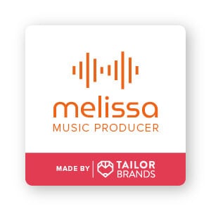
You don’t need to pick dramatically different fonts to create contrast. A subtle contrast can be achieved with a heavier typography weight or change in spacing between the letters (this is called ‘kerning’).
The design for Melissa Music Producer’s logo has 2 very similar fonts: MuseoModerno and Proxima Nova. Using Proxima Nova Light, the logo heightens the contrast between “Music Producer” and the bolder “Melissa.” Melissa is further accentuated with the mirroring line thickness of the overhead sound waves. The sharp lines match the “l” and “I” of Melissa and contrast noticeably with the other (rounded) letters.
8. Contrast with negative space
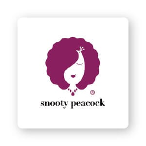
Negative space is a creative use of white space within an image to create a whole new image. It’s a great way to add more depth to your logo and draw the eye to certain areas.
The Snooty Peacock uses white space to its advantage. At first glance, you’ll see the outline of a woman. But take a closer look, and you can see a fanned-out peacock tail that cleverly matches the business’s name is a creative way. (Pretty cool, huh?)
9. Contrast with scale and size
Large shapes that include small details are another way to catch your target audience’s attention. Contrasting sizes create a hierarchy of design, as well.
In the Snooty Peacock logo above, the details simply add interest to the design, contrasting with the much larger fanning shape of the hair.
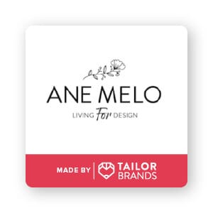
To get a better understanding, take a look at the Ane Melo logo. Rather than use contrasting colors or a heavier font, the design relies on scale to grab your attention. The smaller typeface and flower border the surrounding Ane Melo brand name. If all 3 lines were the same size and line weight, the Ane Melo typeface would get completely lost.
10. Contrast with position and orientation


Don’t be afraid to think outside the box!
Play around with your design by changing the angle to add contrast in your logo. Some emblems, like the Starbucks logo, use this concept with arcing text wrapping around the circle that holds its famous icon.
Baskin Robins uses a playful font that is on a wavy baseline for a lighthearted brand approach. Likewise, Burger King’s logotype sweeps across their emblem right where 2 burger patties would be, encased by golden half circles representing buns on top and bottom.
The letters in the In4mation logo aren’t just set at contrasting angles, they’re also crashing together with negative kerning on the top row. The positioning of the text means something. In this particular logo, the way the letters collide together creates tension that seems to imply it’s a controversial fact-finding firm or a gossip column, rather than a news station or help desk in a mall.
Playing around with the position and orientation of your logo doesn’t just apply to your typeface. Red Bull, for example, uses positioning to contrast the 2 bulls in its logo with a mirror image. The facing pair of inverted bulls creates an exciting contrast, which increases interest in the design.
You can include illustrations or other elements in your design to add intrigue through unexpected positioning. The Xbox logo has 3 triangles in a circular shape, as if an X was going through a button. The Pepsi logo shown toward the top of this list doesn’t just use color for contrast; it also has 2 liquid-like shapes within an implied circle, with the wavy lines contrasting in shape and positioning to create a dynamic design.
Over to You
Contrast is a design tool that you can use to add visual pizzazz to your logo. And now that you have some ways to add contrast to your design, it’s time to try it out for yourself.
With our logo maker tool, you can change up colors, sizing, positioning and more with just the click of a button. Get started on a logo design that really stands out!
