
Characteristics of Black and White Logos
When creating a black and white logo, business owners are often forced to think more about their design elements. That said, black and white logos can be used to convey a strong message about the brand values they represent.
Here are the main messages that a black and white logo can send your audience:
Minimalism


Many company owners make the mistake of wanting their logo to “pop” and then going overboard with the design features. Colorful logos can be difficult to reproduce—especially on t-shirts and other products that limit the color palette.
With black and white logos, a kind of minimalism is already enforced from the start; there are no other color choices. Your logo will be much simpler in a monochromatic color scheme. You can continue to develop the design to simplify the lines and beef up the elements so your logo is a powerful visual, even in the smallest size.
There are so many popular logos that take on a minimalist design to underscore their power with a less-is-more approach. You can see this in brands like Apple, Sony, Nike, etc. When you wear a pair of Nike shoes or a Nike shirt, one tiny swish is all it takes to brand that item. A complex crest doesn’t make it any easier to recognize the brand. The same holds true for the iconic Apple image.
Luxury and Sophistication


There are so many high-end brands that only use a black and white logo. By limiting their color palette, they are making a strong statement of power and value. You will either remember them, or you won’t.
A b&w logo has a simple and uncluttered look. Fashion brands are especially known for simple logos that rarely have more than black letters in a very specific font.
When you think of Bentley, Gucci and Chanel, you think of their sophistication towards product design. These brands all have something in common—their unfussy logo in black and white.
There is a formal and dramatic edge to using black designs on a white canvas. You can establish a kind of exclusivity—like you know a design secret few others know—and like you have a company that’s worth remembering.
Authority

Black and white logos can also provide a clear message of authority. The brands that use b&w designs are commanding you to know who they are. Many news outlets and sites who want to be top in their industry use a b&w logo.
The simple nature of the black and white logo commands respect. When a bold font is used, you’ll see power and not indecision. Many amateur logo designs are overwhelmed with imagery, color and a wispy font that don’t go together—none of which translates well as a logo.
With a black and white logo, you will be forced to make bold decisions and choose the font that really strikes the right tone for your brand.
Brands like Forbes, New York times and Inc. Magazine all use the b&w logo that is simplified down to just their logotype (their names or initials).
Practical
There are practical reasons for creating a simple logo. The fewer colors, the easier it is to print. Not only will it (usually) cost less to print your logo, but there’s also a lower chance of it ending up the wrong color. A lot of brands have to fight hard to keep their brand colors produced in *exactly* the right hue of blue, red, yellow, etc.
Lowes, for example, only allows PMS 280 (or hex color #004990) for their primary blue. They have one other secondary color option (PMS 299 or hex color #15B6E5) or the option for just using black. It’s so easy to accidentally change the blue just slightly in the editing process. When printing, it can be very difficult to get JUST the right hue—especially if you are trying to order it for your shirt color, sign color, etc.
It may seem over the top, but if you accidentally use the wrong color, you can run into a huge branding nightmare. Some brands are extremely rigid about logo standards in an attempt to protect their brand image and create a cohesive experience for the user.
All that is to say: Black and white logos offer a much easier solution.
You will never have trouble finding black and white printing options. They are cheaper and often faster to print.
Classic
It’s worth pointing out how long-lasting many black and white logos are. A b&w logo is easy to size, and it holds a timeless quality that isn’t always true for color-based logos.
While other logos may go through color changes to keep up with the times, black and white logos rarely do the same.
Taco Bell is just one example of a brand that has gone through a LOT of color changes. In 1985, it had very “fiesta” vibes with orange, yellow, green and brown. In 1994, the logo shifted to pink, purple and yellow. More recently (2016), Taco Bell seemed to settle on an even more toned-down logo, with a minimalistic and sophisticated approach—just purple, black and white.
With a black and white logo, you won’t run into feeling like your colors are making you look cheap or outdated, and you minimize the chances that you’ll need to rebrand down the line.
Now that we know what the advantages are of using a black and white logo, let’s dive in to how to create your own!
Black and White Logo Design Tips
When it comes to creating the perfect logo, there are a lot of design elements you will still need to consider. Even though you’re eliminating the color theory part of your design (as in, you’re choosing colors that are associated with a very specific set of emotions), understanding these other aspects of logo design can help you create something powerful and memorable.
Typeface

The right font cannot be underestimated in logo design. Not all brands even choose to include fonts as part of their logo; Nike, for example, has a specific wordmark that it uses to brand their merchandise, as well as a logo (the famous swoosh). The swoosh is able to stand on its own without any fonts near it.
It can be very difficult to find exactly the right font to send your audience the right message. The right typeface for your logo should be:
- Clearly recognizable and easy to read, even very small (avoid thin fonts that don’t scale well)
- Unique to your brand (don’t just use Arial or Times New Roman without any alterations)
- A quality font (do NOT use Comic Sans or Jokerman unless you want to look like amateur hour)
- A font that conveys something about your brand and doesn’t look like the competitor’s font
One of the hardest parts of designing a logo might be choosing the right font. The wrong font is going to make it harder to understand your logo direction. A poor font choice in a logo might be forgettable or—worse—memorable for all the wrong reasons.
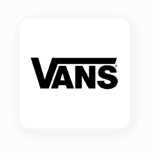
Famous black and white logos that focus on typeface above everything else include Braun, Vans, Shark, Ninja, Walt Disney and more.
Icon
A logo should have an icon that is essentially wrapped up in a neat little package. Many brands use circles or other simplistic shapes to encompass their logo design, creating a logo icon. Some use squares, triangles, or other basic shapes.
Not only will this make it easier to place for printing, but the icon can also be useful for social media profile pictures and app creation.
Icons include things like the Starbucks crest or Apple image of an apple. When it comes to black and white logos, an icon can be a powerful way to create an immediate identifier.
Geometric Shapes
We’ve written before about the psychology of shapes in logo design. You can use shapes to subliminally convey specific messages about your brand.
- Circles: Represent stability, positivity and unity
- Squares or rectangles: Show security, trust and professionalism
- Triangles: Can communicate action, strength or instability
- Horizontal lines: Convey a grounded approach—stable and calm
- Vertical lines: Show action, noise and growth
These are just a few of the shapes you can incorporate into your black and white logo design. Use shapes to help your logo reflect various aspects of your brand. The right design is going to communicate to your audience from the very first glance.

Character Feature

You may choose to utilize a character as a key feature in your logo. Logos like KFC, Wendy’s and Starbucks all have images of people within their designs. Some characters are much more stylized—like the Twitter bird or the CBS eye.
The older logo of PBS (featured from 1984-2019) is a great example of a black and white design, with a character featured central to the logo. (The newer version changed to a monochromatic blue after 2019.)
Ralph Lauren has a great example of a black and white character central to their logo. The polo player on the horse is both detailed and simplified—easy to spot from a distance or very small detail on a shirt.
Negative Space
Because you are designing your logo in only 2 colors (black and white), you should consider how you can make the most use of your negative space. In any design, the background becomes the negative space within the illustration. Most of the time, the subject is simply placed on top of the background and the negative space is the areas that surround the object (like the white areas surrounding the black Nike swoosh on their app button).
However, you can use the negative space to form a different element of your design. A logo that showcases a great use of negative space is the USA Network logo.
The negative space becomes almost like a 3rd color when done right. Your eye will naturally see the blank cutout area as something else. Though not black and white, the peacock NBC logo also shows the use of negative space with the simple center cutout making up the body and head of the bird.
The Pittsburgh Zoo & PPG Aquarium offer a striking example of negative space used within the simple black and white logo. The clear silhouettes of a gorilla and lion form the outline of a tree to make up the design.
Texture
In black and white logos, you can also use lines, dots and other forms of texture to give the illusion of other colors. The older version of the Burberry logo is a great example of texture use in logo design—the lines and dots on the horse’s neck and caparison.
You can use texture to help create focal points and differentiate shapes within your black and white logo. This will help you produce a design that doesn’t just look “busy,” but also has a composition that directs eye movement to keep your attention on the design and clarify the intent.
Popular Black and White Logos and What We Learn from Them
There are already plenty of b&w logos out there. Here are some highly popular companies that have great black and white logo designs.
Uber
There was a lot of buzz when Uber decided to shift away from the black and white “u” to the newer gear on a kind of fabric texture. But, the team felt the initial “u” logo was too cold and didn’t fit the nature of the brand.
Then, in 2018, Uber unveiled a decision to simply use a white “Uber” on a black background for their app logo. The typeface created for this logo is called “Uber Move” and is supposed to echo the sans serif fonts of traffic signage all over the world.

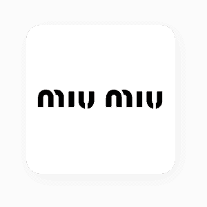
Miu Miu
The Miu Miu logo looks almost like a stencil tag you might see spray-painted on a wall in a European city. The broken “m” and “u” give it the stenciled look, though the words have a certain curve that suggests finesse and demure.
This high-fashion Italian brand is a subsidiary of Prada. It was started in 1993 and is now headquartered in Paris, France. Similar brands like Louis Vuitton and Valentino also sport b&w logos that focus on the logo typeface above everything else.
Mont Blanc
Blocky letters with a singular star in the top right corner make up the logo for Mont Blanc. Not only is the font broken into two stacked words, but the star is also used to symbolize the highest snow-covered peak of the European Mont Blanc.
While the logo has a modern look, the star dates back as far as 1913, after the luxury fountain pen company was established in 1906.

The Guild of Food Writers
The simple and striking head of an ink pen makes up the logo imagery for the Guild of Food Writers. Using negative space, the center of the pen creates a spoon standing against a black backdrop.
This logo represents a group from the UK, with over 550 authors writing about food topics as broadcasters, journalists and columnists.

Vans
Vans are a well-known skater shoe company. The company was started in 1966 by the Van Doren brothers. The logo has stayed nearly identical to the original—which was created by the founder’s son at the age of 13. The design was extremely simple so he could spray paint it on his skateboards. When his father noticed, he added it to the heel of the Style 95 sneakers.
While the original Vans lettering was uneven and hand-drawn, the lettering today is very clean-cut. Throughout the minor logo changes, it has kept the unique design of the upper right tip of the “v” stretching over the “ans” like a square root symbol.
Over to You
If you are ready to create a custom logo for your business, you can do it right here! Our logo maker tool is perfect for testing out ideas and trying different imagery, layouts and colors to see what works.
It’s time to find the perfect symbol to represent your brand. Get started now.