The Meaning Behind Orange Logos
Every color has a significant influence on our behavior, mood, and even physiological reaction. That being said, color associations are strongly dependent on culture, personal experiences, and upbringing—color meaning is not one-size-fits-the-crayon-box.
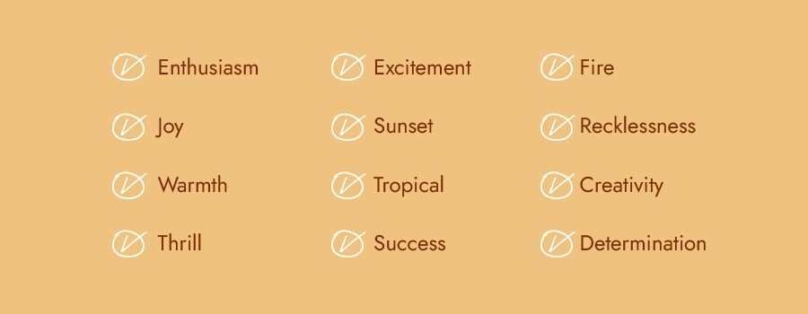
If you’re looking for a logo that’ll express excitement, success, creativity, and determination, orange is the color for you.
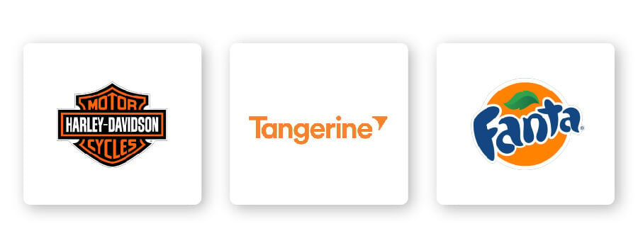
Orange symbolizes thrill and a sense of recklessness, which is why it suits the renowned motorcycle manufacturer Harley Davidson. Interestingly enough, orange can create physical effects like increased hunger. This attribute makes orange a great choice for food brands, such as Fanta and Tangerine.
How to Combine Orange With Other Logo Design Elements
When it comes to orange logos, there are certain design elements that combine well and those that don’t.
Typography
Choosing the right typography in your logo could bolster your overall brand. Review the 5 main font families to determine which one suits your brand best.
Serif –Great choice for brands that want to be seen as trustworthy, established, and reliable. Etsy’s logo is a great example of pairing a serif font with orange. The orange evokes creativity and success, making the traditional font look stunning and memorable.
Sans-serif –Casual, easy to read, and modern, sans-serif is a popular choice among restaurants, start-ups, and tech businesses. Brands that want to bring people together like Eventbrite should pair sans-serif with orange to convey that message.
Slab serif –Bold and impactful, slab serif fonts are frequently used by car and technology companies. When paired with orange, it can create a lasting impression. Consider French luxury design house Hermes’ use of slab serif with orange to create a stand-out effect.
Script –Well-suited for businesses that want to express elegance and add a personal touch, such as photographers, coaches, or any family-owned brand. Pairing a script font with orange would work well when you want to express creativity and warmth.
Decorative – This is a font that’s loud, fun, and entertaining, which pairs perfectly with orange! These fonts are flexible enough to let businesses decide which emotion to focus on.
Of course, these are just general rules, but by no means are they set in stone. Feel free to play around with different font combinations.
Shapes and icons
In your logo design, different shapes can help forge a clearer emotional and psychological connection between your brand and consumers. It’s important to understand what each shape says about your brand and how you can effectively incorporate them into your design.
Circular logos paired with orange are designed to be energizing, symbolizing progress and modernity. Mastercard’s 2 overlapping circles in orange and red, their logo is one of the most well-known in the world.
Even a simple shape of, say, an arrow can make a design stand out. Think about Amazon’s simple logo interrupted with a single splash of orange in the arrow. Yet, the arrow holds the bulk of the logo’s message; it symbolizes that Amazon carries it all—from ‘a’ to ‘z’—and brings a smile to its customers’ faces for that reason!
Abstract shapes also work well with orange in logo designs. Unlike other shapes, abstract logos incorporate recognizable shapes to form a logo with layers of meaning. SoundCloud’s bright yet simple visual identity evokes positive energy and a good mood, the same feeling music gives you. The icon is a cloud divided into 2 parts with the left half composed on vertical lines, which symbolize music beats on an equalizer. And the right part of the emblem is solid.
Is an Orange Logo for You?
Like I mentioned before, colors are subjective and there’s no right or wrong way to use orange in a logo.
That being said, you should use orange if it aligns with one of the messages/values of your brand. Or, you can use orange to differentiate yourself from competitors’ logos.
If your brand falls under one of these industries, here are a few ideas for how to use orange:


Orange logos for retail brands
Retailers aim to provide the best shopping experience for their customers so they leave happy (and make sure to come again). There’s no better color to invite people into their stores and purchase than orange.
Orange logos for food and beverage brands
Orange is in line with red and yellow for stimulating an appetite in people. It’s also a common color found in citrus fruits and is often associated with health. This is why orange is a popular color for food and beverage brands, such as Fanta.
Orange logos for entertainment brands
Orange is a color of joy and creativity, so it’s no wonder it works well in the entertainment industry! It’s a stimulating and vibrant color that pops out at you and demands attention.
The world’s first cable channel dedicated to children, Nickelodeon’s completely orange logo works because of their young audience. Combined with their font, the Nickelodeon logo represents youth, freshness, and joy, which are all things the channel wants to promote.
Orange logos for home decor brands
No other color gets creative juices flowing quite like orange! For home decor brands, expressing who you are as a business is so important for prospective clients. This is why orange could be a great choice if you’re looking to convey fun, youth, and even a tropical vibe.
Orange logos for fashion brands
You might not expect orange to be a popular color for fashion brands, but when executed well, orange can make for a well-designed logo.
You’ll often see darker or more muted tones of orange in fashion brand logos that want to appear timeless, which is what Hermes Paris did. Combined with the horse and buggy imagery and serif font, the logo exudes sophistication and class.
Orange logos for technology brands
Orange should be the color of choice for tech companies because it shows your customers that you’re at the forefront of new and current technology. As mentioned earlier, orange is a progressive color so it would suit a tech brand perfectly!
It’s important to note that no one color fits in a box. Take a look at what competitors in your industry are doing and if the color orange is too commonly used. If it’s overdone, you might think of using an alternative color to stand out. But if it isn’t used enough, ask yourself if the psychology of the color will work for your brand before choosing it.
Color Combinations That Work With Orange
Orange can be pretty versatile depending on the colors you combine it with. Let’s take a look at some examples of orange logo color combinations:
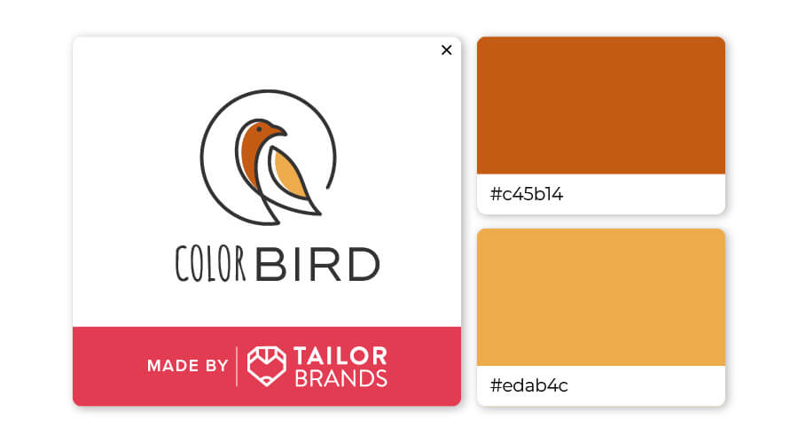
Orange is an incredibly (and surprisingly) complimentary color to brown. Add a brush of tan to muted orange and you’ll have a low-key, earthy look that the modern crowd will flock to.
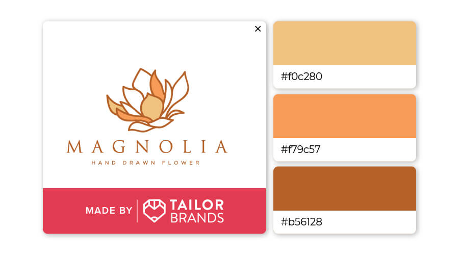
Burnt orange and beige is a charming color combination that’s soft and calming. Orange, white, and brown shades match well together because they’re the natural colors of the earth and seasons. The pop of orange works well for a bit of contrast.
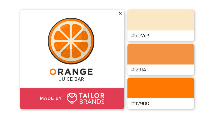
Who knew that pale yellow, orange, and an even deeper shade of orange could work so well together? This trio would look great as a logo for any health or fitness brand, as well as coaches or any business that works closely with their customers.
You can check out this video to learn more about how color psychology affects people and what it means for you when you’re ready to design your own logo (skip ahead to 3:03 to learn about orange).
Over to You
We’ve seen that orange conveys enthusiasm, creativity, and determination, but combining it with other design elements can lead to an impactful and unique logo.
If you are considering orange as a primary color for your brand’s logo, try out Tailor Brands’ logo creator to create yours!
