Make Your Own Tech Logo
tech logo maker header

If you have a technology business, then you need to design a logo that speaks to your audience.

The technology industry is booming, and tech companies need to separate themselves from the crowd more than ever. If you’re looking for a way to tell your audience why your software or service is the best there is, a powerful tech logo is the way to go.
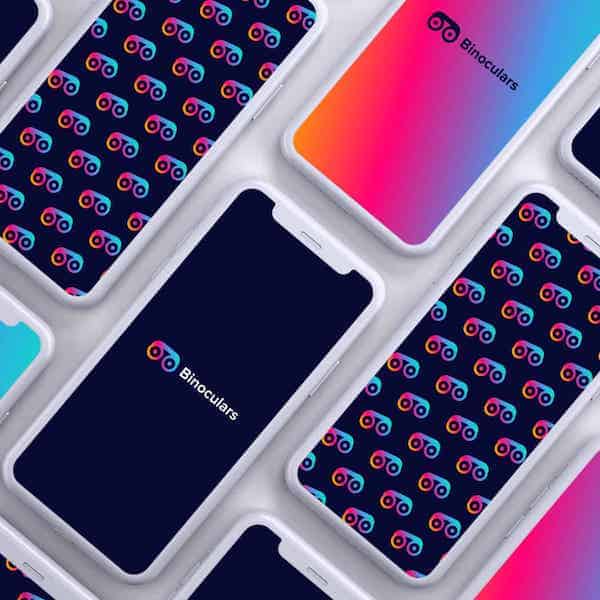
tech logo mockup
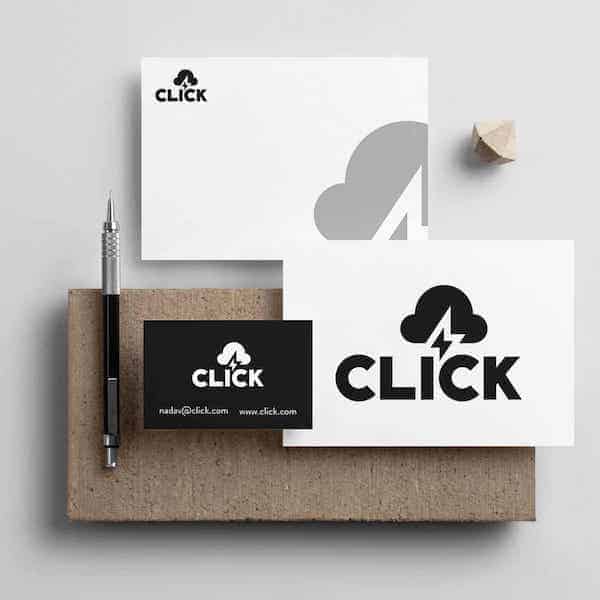
stationary for tech logos

Whether you’re raising your first round of investments or are way past the startup phase, a strong logo will help you send a confident message to the people you want to impress. To get some inspiration, browse through these top tech logos in the industry, all made with our tech logo maker. Then, scroll down for design best practices when you’re ready to start creating!

How to make your own tech logo

Create your tech logo in two minutes, simply by entering your business name and tagline (if relevant) and clicking Design.

Tell us a little about your tech business, select a logo type, and choose the fonts you love, so we can create the perfect logo for your brand!


Make adjustments and tweaks with our logo editor to bring your vision to life. You can play with fonts, colors, and logo layout – no design skills necessary!

Design your custom-made logo instantly

Tech Logos Ideas

Tech Logo Design Tips

1. Pick The Right Icone

The best tech logos often use simple, abstract symbols to convey ideas like forward-thinking and progress. However, you may want to try using an icon that says something about the products or services you offer your users. Technology is a big industry and there are a lot of niches to choose from. Think about where your business falls and what themes are associated with that area.
icons for tech logos
If you produce a piece of hardware that belongs on a motherboard, consider how a drawing of your piece would look – maybe there are wires connecting different nodes. There you have it, a symbol that perfectly represents what you do. Another way you could go is by choosing an icon that is a literal representation of your business name. No frills, and very straightforward, this makes sure that your name and brand is easily recognizable regardless of if a user sees your icon or your name. If your business has to do with location services, consider using an icon that gives that off just through the visual. Think of Google Maps and their pin-drop, or Waze with their cartoon car character.
Now, you can also go the abstract route and choose a symbol that will make you stand out. It doesn’t need to be related to anything in particular, but just takes on a shape. Whether you want to focus on the continuity aspect through a circular icon, or something more structured with a rectangle, choose something unique that will be bold but simple enough to be remembered. As long as what you choose is representative of your brand in some way – feeling, color, exact representation, etc. – you’ll be good to go.

2. Find The Best Colors

Your color palette is where you can mainly differentiate yourself from competitors. Where your biggest rival likely uses blues or blacks, you may want to consider more vibrant colors that speak directly to your audience. Consider if your tech company will also have a space in the app world or not. If it will, then choosing a color that makes a visual impact is key. It’s important to have good logo color combinations regardless of what platform you’re on, so make sure to choose something that will be recognizable.
You’ll need to consider what type of feeling your business wants to evoke which will affect which colors you choose. The tech world lies on a spectrum when it comes to formality – startups are usually pretty laid back and established tech firms are often more rigid and professional. What you choose will depend on the vibe you want to give off to potential customers and investors. If you offer a delivery service, think about how you want to look. Do you want to be laid-back and accessible, or are you trying to be the best in your field and give off the impression that you’re reliable? Any color you choose will tell the user of your service something different.

3. Pick The Perfect Fonts

Minimalism is the name of the tech logo game, so you’ll often see traditional serifs dominating the industry. However, companies going for a more modern look will gravitate towards custom-made fonts that are full of personality. Whichever typeface you choose, make sure your logo is legible.
biones.ai logo
It’s been said before, and we’ll say it again – within your logo design, give yourself a limit of up to 3 fonts, but ideally 2. Any more than that and it can start to look chaotic. Think about it this way: your first font will be used for your brand name and your second font will be your tagline. You don’t need to include your tagline, but if you do, it may be a good idea to separate it from your name, and if you don’t have a tagline, you can forego the second font altogether.

As stated earlier, traditional serifs are the big-hitters in the tech industry. Serifs are your classic professional-looking font. Think of Times New Roman or Baskerville, for example, and how some of the letters have little hats or flicks at the end of them – that’s a serif. It gives off a trustworthy feeling, so if that’s the type of brand you have, choose a serif font to lead your logo design.

If you want your font to give off a more modern vibe, then choose a sans-serif font. This is like Tahoma or Arial – basic fonts without the little hats at the ends of the letters. This can be a great option if your tech company name is an acronym or has initials.

With these elements in play, you’ll need to figure out how you want it to look when it’s put all together.
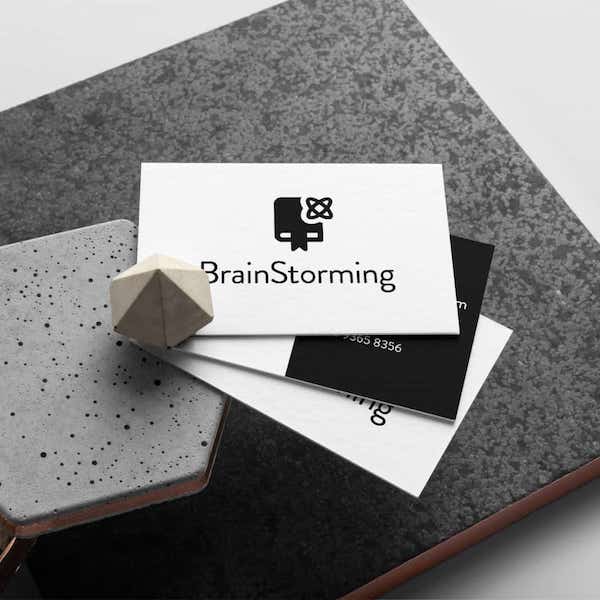
tech logo business card mockup

4. Pick The Right Layout

Where will you do most of your branding? As a tech company, you’ll want to make sure your logo looks perfect on social media and other digital platforms. That said, try to find a logo layout that scales well, so that you can print your logo on business cards and swag. Proportion is important. Think about how each element plays a role in your logo design and scale it appropriately, and make sure to maintain that ratio when you scale your logo. You can also make the decision that on smaller scales you’ll use just your icon, for example, and on printed materials, you’ll do a combination of your icon and text.

Proportion is probably the most important aspect of a good layout, but also consider density. You don’t want your logo to look too cramped or like each element is unrelated. Give your logo design balance so that the first thing people see won’t be related to chaos. Let it speak for itself in a simplistic but effective way.

Your logo will be the first thing customers will see and interact with. Play around with the look and feel by switching the location of your icon and text, and most importantly take the time to evaluate how your logo will be interpreted.

Our AI-powered logo generator takes into account all of your industry’s best practices to produce the best logo for your brand. If you’re ready to begin, try it out here!

Design your custom-made logo instantly

Your logo comes with:
High quality logo files

Website & Domain
Powerful design tools