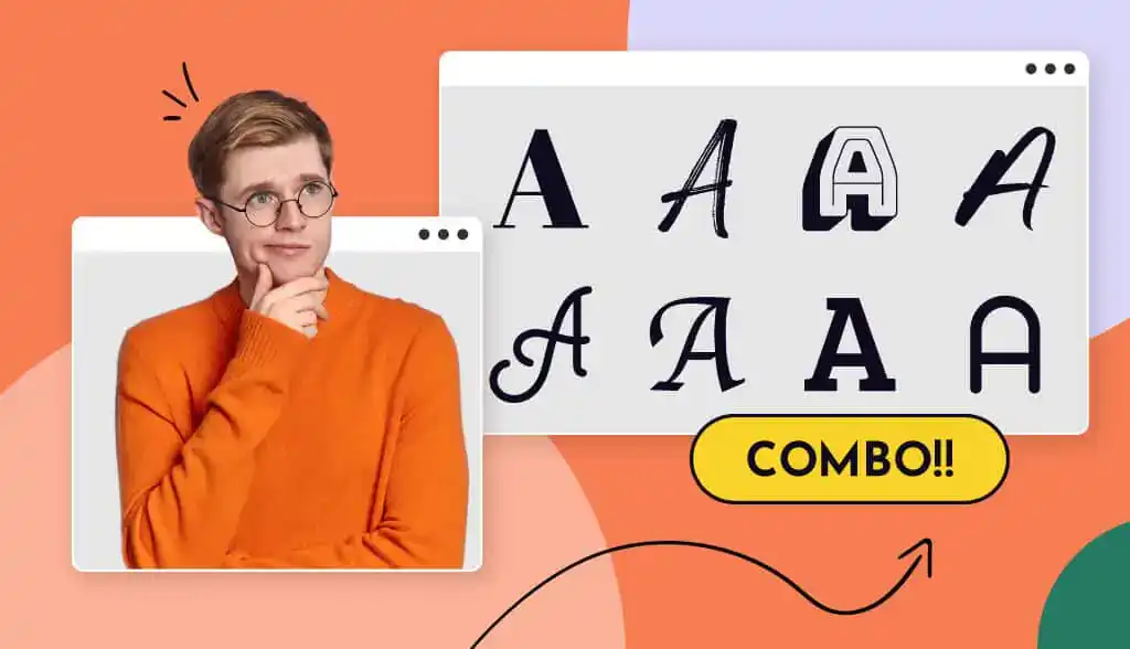
With the help of our logo maker tool, we came up with 15 cool font combinations that anyone can try, depending on your industry and the message you want to send with your logo. As you browse through these designs, make sure that the fonts you pick should complement one another – and that they can be used over and over in your branding.
Let’s take a look!
1. Bungee Shade and Jost
The first thing to know when choosing fonts is that the 2 fonts should balance each other. Bungee Shade is a Google font that’s bold, confident and full of personality, so it stands to reason that the body font – Jost – is cleaner and down-to-earth. This font combination is great for streetwear fashion logos, food brands that want to show they’re full of flavor, or other brands that want to give off an energetic feel.
2. Futura and Avenir Next
Future and Avenir Next are 2 classic sans-serifs (read: fonts without the little “feet” at the edges of the letter strokes) that have the same mood, yet are different enough that there’s visual contrast.
By using Futura Bold for the beginning of the logo name and a Medium weight of Avenir Next for the second half, this construction logo naturally guides the eye down the design. It also helps to reinforce the “Mountain” part of the logo name, highlighting that the brand is sturdy and reliable.
3. Russo One + Proxima Nova
You’re going to see Proxima Nova appear a lot on this list, because it’s such a nice tagline font! It’s known for looking great on digital screens, which is why any brand that has an online presence could consider it.
This font combination may work well for fitness logos like the one above, in addition to brands in media or industries that require a lot of writing (think blogging or law). Russo One has a stylish-yet-casual look, paving the way for brands that want to be perceived as friendly, approachable, and cool.
4. Rockwell and Proxima Nova
Another great way to combine typefaces is by pairing a serif font with a sans serif. This will help you create balance in your logo design while having enough contrast to differentiate between the different parts of your logo.
In this real estate logo, the serif Rockwell gives the monogram ‘HO’ a refined, sophisticated touch, while the Proxima Nova (told you we’d bring it back!) balances it with a clean and reliable look.
5. Impact + Josefin Sans
Another thing to keep in mind when combining fonts is how they interact with additional elements of your logo, such as your shape or icon. Once again, we have 2 sans serif fonts, and their clean lines provide the perfect backdrop to the swish of the mustache – helping to emphasize it.
All of the elements together give off the image of a fun, hip, and confident bartender who will guarantee to give their audience a good time.
6. Yanone Kaffeesatz and Open Sans
Yanone Kaffeesatz – a modern sans-serif – is often used to represent coffee houses and food brands, but you can see that the regular version has a groundedness that works for the wellness industry too.
The elongated lettering can symbolize growth, while the light, stencil-like Open Sans helps to visually balance the design and give it a delicate twist. And, once again, the main typeface has a similar mood to the icon, bringing the logo together in a cohesive way.
7. MuseoModerno and Proxima Nova
One of the most modern-looking logos we’ve seen thus far, this design is clean and clear – thanks to its font combination.
Notice that here, the contrast between MuseoModerno and Proxima Nova stems from the lowercase vs. uppercase lettering, in addition to the weights of each stroke. Combined with the abstract vertical lines, the font pair helps to convey an electric, pulsing vibe, while in line with current design trends and remaining easily digestible.
8. Copperplate and Josefin Sans
Another great serif and sans-serif pair, Copperplate and Josefin Sans (Bold) are a great combination for personal brands that want to come off as official, powerful, and timeless.
Together, these fonts make you want to trust the brand that’s behind them; they tell their audience that this business has been around for a long time (even if it hasn’t), and that this accountant knows what he’s doing.
9. Dancing Script and Proxima Nova
In a slight departure from the other designs we’ve seen so far, this chef uses Dancing Script to highlight the personalization element of his brand. Many script fonts look like a handwritten signature, giving a much more personal feel to the logo and telling its audience what level of service to expect when they hire him.
And, once again, the Proxima Nova in the tagline makes the logo feel professional and clean, reassuring the audience in the process
10. Buffalo and Jost
For those who want a personal signature feel to their logo – like trainers, stylists, or consultants – Buffalo could be a great main font for your design.
Like we’ve been seeing, scripts are a great way to give your logo an overall personal feel. But, you can use scripts to create a variety of messages; for example, in contrast to the previous script font we saw, Buffalo has a much “cuter” and more approachable feel. In this logo, it’s even reminiscent of closet hangers, which is emphasized by the delicate Jost holding it together in the tagline.
11. Big Shoulders and Josefin Sans
This is a font combination that won’t work for every brand but is definitely something to look at if you have a monogram. That’s because Big Shoulders could be too much if used for a long logo name, but used sparingly, it can have a really cool effect.
In fact, the ‘M’ almost looks like an icon itself; this combination is a great way to draw visual attention to a specific letter in your logo, making it look designed and professional while still maintaining an official monogram-like feel.
Brands who are in the self-help space might want to consider this font combination; notice that the ‘M’ contains peaks and valleys, which are both held up – supported – by the Josefin Sans tagline.
12. Rockwell and Source Sans
Sometimes the meaning of fonts change just based on the elements that surround them.
For example, slab serifs – like Rockwell – are typically seen as strong and powerful, but balanced with this abstract bear (cute!) and delicate Source Sans in the tagline, the font becomes more cozy and down-to-earth.
So, though slab serifs are traditionally used by accountants, car companies, and other brands that want to seem dominant, you can play with them to be both visually striking and simultaneously balanced.
13. Amithen and Roboto Condensed
Another logo resembling a personal signature, this font combination draws the eye to the business name – Jason Denilo – in a way that’s impossible to miss.
For photography logos, this can be a great strategy; you yourself are the brand, so it makes sense that your name is what’s emphasized. Amithen itself looks vivacious and creative – a unique logo signature for a unique service provider!
Of course, Roboto Condensed is clean and simple, in order to add an element of professionalism and balance the frisky energy of the header.
14. Library3am and Proxima Nova
This logo has a similar technique to the monogram we saw previously (using a highly-stylized header font). However, here, Library3am gives off a sense of movement, so the onlooker can imagine themselves in action when they come in contact with this fitness brand.
Once again, you don’t need an icon to tell the story of what you do; sometimes an effective font pair will do the work for you.
Here, we used a SemiBold Proxima Nova as opposed to one with regular (thinner) weights, in order to effectively balance its header counterpart. Sometimes, when you have such a unique font in the header, you need a font in the tagline that can also “pull its own weight” while still looking clean and reliable.
15. Kiwami + Nunito
Last but not least: Kiwami and Nunito! Yet again, we have a script font that looks like a personal signature, though this one is better-adjusted to an art-related brand.
The brush strokes in Kiwami help the viewer to imagine someone actually applying makeup, or moving paint on a canvas – perfect for anyone in a creative or art-related industry. And, the contrast between Nunito’s stencil lettering and Kiwami’s thick strokes both makes this combination visually appealing and balances the logo vibe between creativity and professionalism.
Over to You
If there’s one takeaway you get from the above font combinations, it should be that header fonts are those that you want to draw attention to and work well in combination with a toned-down counterpart.
When choosing your own combinations, make sure that you have contrast and balance between the pair, and that you can visually distinguish between them.
Want to play around with your own font combinations? Try out our logo maker! It uses design best practices to pair fonts for you, so you can design a logo that preserves your aesthetic while sending the right message to your audience.