Construction Logo Design Made Easy
Create a unique construction company logo in minutes.
Home » Logo Maker » Ideas » Construction Logos
Those in the construction industry are no strangers to the process of building something from the ground up. And, like with any project you take on, you’ll want to lay the foundations of your business properly from the get-go – which means creating a logo that screams “safety”.
To create a durable brand, you’ll need a construction logo that can hold its own against competitors. But, before you hammer away at your own logo design, it may help to look at other industry logos for ideas and inspiration.
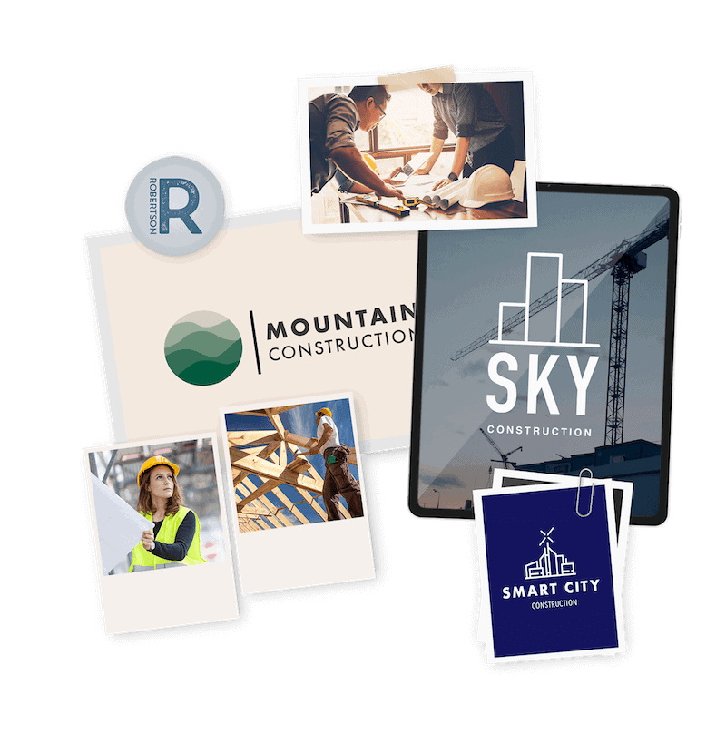
Check out this collection of construction logos that are a mix of our design and logos that are already in the market, and then scroll down for your recommended style guide!
How to make your own construction logo

Create your construction logo in two minutes, simply by entering your business name and tagline (if relevant) and clicking Design.

Tell us a little about your business, select a logo type, and choose the fonts you love, so we can create the perfect logo for you!

Customize and make tweaks with our logo editor to bring your vision to life. You can play with fonts, colors, and logo layout – no design skills necessary!
Design your custom-made logo instantly
Construction Logo Ideas
Construction Logo Design Tips
Icons
Most construction logos overwhelmingly favor abstract icons, often using straight or crooked lines that are reminiscent of structure, tools, roads, and movement.
But you can do better. Separate yourself from the herd and create a unique logo that not only defines what type of construction you do but is also simple, memorable and gives your business character.
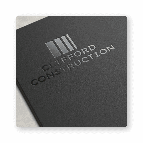
When choosing your icon, make sure that you inject your own trade into it by selecting a symbol that’s easily recognizable and that the general public associates with it. If you’re a bricklaying company, a brick wall perfectly sums up what you do and will reinforce your trade inside your audience’s mind.
You can take it one step further and give your icon movement to make it pop even more—a hammer just before it hits a nail, or a drill creating a perfect hole. By providing your icon an action of some kind, you’ll also reinforce the idea that your company is working and not standing around.
Typography
Construction logos currently tend to be bold, as this font type has a more substantial impact overall and a strong presence. These are character traits construction companies want to show off. But depending on your trade, you may want to use a more refined approach.
If you’re primarily working on garden landscaping or interior renovations, then instead of using bold fonts, use slimmer, more delicate styles to show that your movements are the opposite of brash and brawn. Show that you’re cautious, planned, and methodical with an eye for the small details.
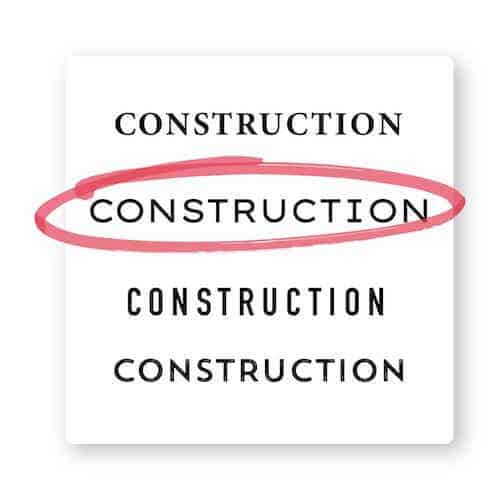
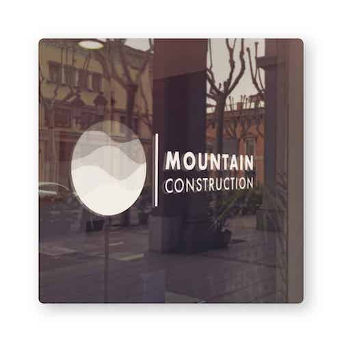
It’s also a good idea to stick to one font only and that the font style matches your icon. Heavy-weighted bold text with a delicate image will look out of place. And, always make sure your font is easily readable.
With a logo creator, you can easily swap font styles in and out to see which works best for you and your trade.
Color palette
Many construction companies use bold colors, such as greens, yellows, oranges, and blues. These colors are often associated with building work, road signs, and safety equipment, and they’re often paired together.
With so many different trades in the construction industry, you can enjoy a bit of freedom when choosing your own color palette. But, don’t use too many colors, or you’ll run the risk of diluting your image.
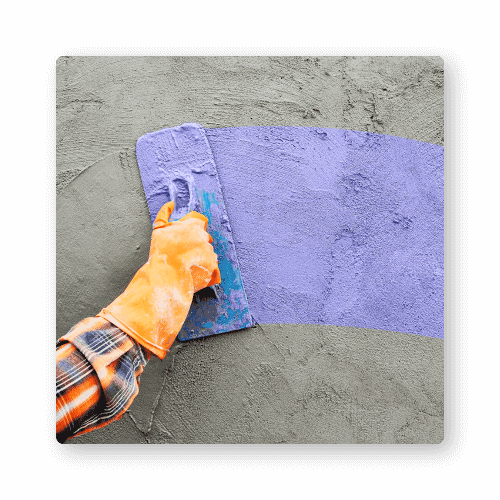
- Green can be used to emphasize your dedication for a clean environment and closeness to nature.
- Orange can be applied to provide a feeling of hope and passion, also for energy, and is closely linked with construction due to orange safety vests.
- Yellow is a bright color often associated with construction because of the high-visibility safety helmets.
- Blue can be utilized to convey trust and good energy, as well as intelligent planning.
- Black signifies sophistication and seriousness.
By mixing colors together with a clear icon, you can create a distinct and strong brand image. But don’t mix too many colors, or your message will be lost on your customers.

Layout
As people often research contractors online, we recommend putting your logo on the top left corner of your website Home Page, because it’s the first place people will look. However, your logo should take center stage in offline branding – particularly on signs or billboards that are showing off a current project.
Design your construction logo instantly
Your logo comes with:
High quality logo files

Website & Domain

Powerful design tools
- Author: Shai Shmarel
- Published Date:
Disclaimer
This portion of our website is for informational or educational purposes only. Tailor Brands is not a law firm, and the information on this website does not constitute legal advice. All statements, opinions, recommendations, and conclusions are solely the expression of the author and provided on an as-is basis. Accordingly, Tailor Brands is not responsible for the information and/or its accuracy or completeness. It also does not indicate any affiliation between Tailor Brands and any other brands, services or logos on this page.