
When you launch your business, you’re going to depend on that first impression you make with your beauty logo to resonate with your audience. And, you’ll need your logo to help keep customers around; it’s not easy to stay loyal to a brand if you forget who they are!
So, check pout some beauty logos designed with our logo maker, get some logo design inspiration, and then scroll down for design tips that will help you capture your customers’ attention.
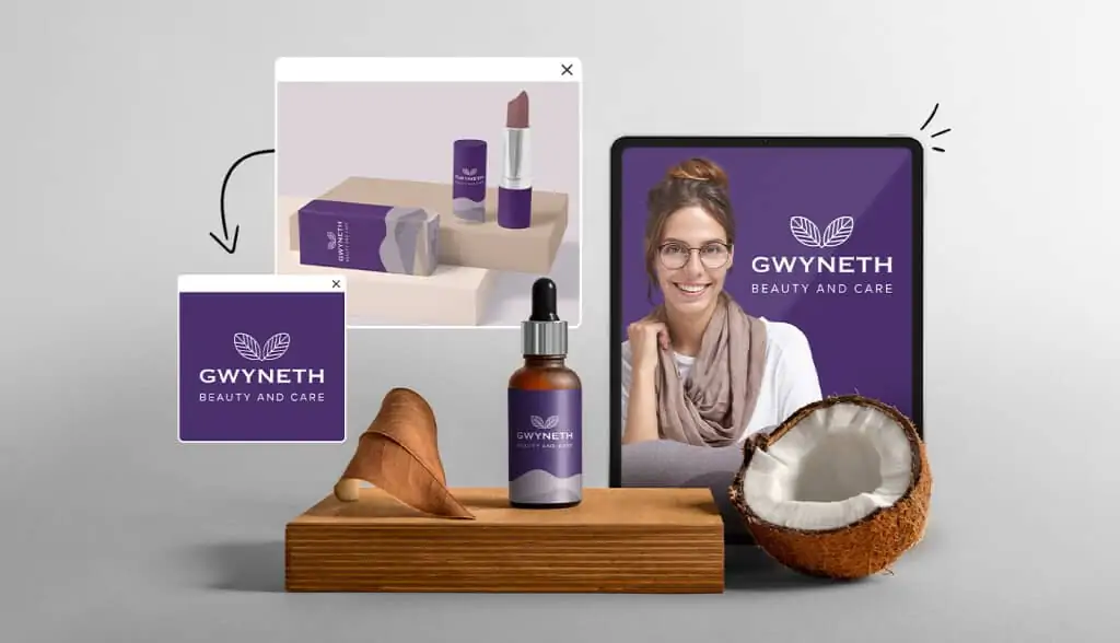
Design a free logo for your cosmetics, makeup artistry, or personal grooming business with Tailor Brands logo maker! We’ll combine your input with our software’s huge database of graphical design elements to create a logo that communicates the beauty of your brand. Your professional logo will be created from scratch in just minutes.

How to make your own beauty or cosmetics logo

Create your beauty or cosmetics logo in two minutes, simply by entering your business name and tagline (if relevant) and clicking Design.

Tell us a little about your business, select a logo type, and choose the fonts you love, so we can create the perfect logo for your brand!

Customize and make tweaks with our logo editor to bring your vision to life. You can play with fonts, colors, and logo layout – no design skills necessary!
Beauty and cosmetics logos for inspiration


Beauty and cosmetics logo design tips
Choose The Right Icon
Your beauty brand doesn’t necessarily need an icon, but it can help your audience instantly align your brand with an image. Beauty logos can include realistic, stylized or abstract icons that evoke a certain feeling or convey a certain message. An icon could include geometric shapes if your brand is somehow based on modern science, or the icon might include more organic shapes—like a smear or splatter—to symbolize makeup.
For example, a nail studio could use hands or polish within the logo. In other words, your icon should help people know that your business does nails as they pass by on the street. Without an icon, it’s possible for your brand to seem like a tanning salon or small boutique based on the name and font alone (depending on the name of your business). So, the icon should make it clear that you are a nail artist and attract new customers who are looking for the services you offer.
An icon can also help a hair salon stand out along a strip or in a shopping mall. For a hair salon or beauty parlor, you might want to use imagery of hair, a blow drier, female silhouettes with striking hair or scissors to help clarify your services based on the logo alone. For a barbershop, it’s smart to use the barber pole somewhere in your design, but you can include other elements that appeal to your target audience.
Finally, using nature in your icon can be a good way to establish your natural or organic beauty brand. You can use a leaf, flowers, celestial elements (moon or stars) and more. Choosing one of these elements with the right color palette can make it clear your brand sources its inspiration from nature. Before you choose an icon, make sure you look at competitors’ logos. Try to go with an icon that tells your audience what you do while staying unique, so your audience will be able to pick your brand out form the crowd.
Here are some aspects to consider when choosing an icon:
- Your logo should be clear and scalable. Logos are placed in a variety of marketing materials and products of varied sizes. Your icon should be designed in a way to make it easy to resize without losing legibility and easy recognition.
- Your icon should work vertically and horizontally, and work by itself. In some cases, you may choose to simply add your icon to your branding without text. In these situations, it’s important to consider if your icon is unique and recognizable enough to achieve the same impact as your full wordmark or emblem.
- You don’t always need an icon. Many cosmetics brands choose to stick with a letter or wordmark exclusively. Sometimes, having a name is more useful than choosing an icon that could distract from your brand or confuse your audiences. Companies like Lancôme, Estee Lauder, and Clinique have built strong identities out of wordmarks.
Pick The Perfect Fonts
Not all beauty brands use an icon; some go with a great font for their primary logo focus. The right front is going to stand out and be easy to read—even at a small size. You don’t want a font that just anyone can use, so most logotype fronts are tweaked in some way. You might adjust the kerning (space between letters) to spread the word out or crunch it all together. You could flip letters, swap out a letter for a small icon, or purchase a font that isn’t common in Word or Canva.
Fonts often convey certain feelings as well, so get a number of perspectives on what your logo says about you. While some fonts seem edgy or scary, others will make people feel soft and comfortable. You want the font you use to make it clear you are a beauty brand and help convey your niche. The font you choose should portray confidence and other key characteristics of your brand.
Makeup brands don’t always use icons, and sometimes rely on their logotype alone. Certain high-end brands will often just use a simple font in black. This understated look can convey luxury and confidence. Some brands use the first initials from their brand name to create a kind of font-based icon. They might use those two letters in a combined image to form an icon that can work on its own, or in conjunction with the rest of the brand name. For a makeup, lotion or fragrance brand, you will want to really consider how your logo will look on packaging before choosing your font.

If you’re designing a logo for a beauty salon, then you need to think about how your logo will look on signage and on business cards. Most high-end beauty salons use a very simple and bold font. You want the font to be easily readable from a distance. Some brands will use script fonts, but those can be harder to read. Picking the right font will help your beauty salon get attention from people passing by. The right logotype can help increase your brand awareness if images of your salon are shared on social media. A clear font will also be memorable inside a beautiful interior, which will help turn first-time visitors into regulars.
Cosmetics and beauty logos generally value fonts that are clean and simple, so they will use fonts that stay closer to the serif and sans serif families, as opposed to formal or even casual scripts. Some common fonts used in cosmetics logos include:
- Gotham/Adobe Garamond: This is one of the more classic serif fonts, featuring a clean aesthetic and slight flourishes.
- Brandon Texts: The soft and narrow lines of this sans serif type provide an understated but timeless look.
- Helvetica Neue: This Helvetica combines the best of both worlds, with slight serifs on letters for a delicate accent and a clean straight look.
- Optima: A delicate sans serif type, Optima gives you a polished and chic look that doesn’t sacrifice practicality.
- Avant Garde Gothic: Another font from the Gothic family, Avant Garde font conveys a sense of understated elegance.
- Univers Narrow: Unlike many cosmetics logo fonts, Univers Narrow focuses on a very thin and spaced look that provides a great balance against negative space. The lines can be made heavier without affecting legibility and still provide an elegant look.
Find The Best Colors
Colors will instantly evoke a feeling from your audience, which is why the choice of color in the use of a logo can be tricky. Use too many colors and the logo starts to look busy, childish or is difficult to print. But, not enough color and your logo may not stand out. While some beauty brands choose to go with a classic black and white color scheme, others use colors to help their beauty brand pop.


Luxury brands often use a simple black and white logo. Some will incorporate gold, silver, navy, burgundy or other rich tones that evoke feelings of value. For a luxury brand, the logo is often understated to show authority. Some will use a bold font, while others might use a seal, crest or emblem to convey this. With a luxury brand, you are trying to appeal to high-end customers, so a minimalist logo is often the way to make a big impact.
On the other hand, skincare brands usually want their product to look comforting. You may be appealing to a value-buy customer, the middle-range audience or the luxury buyer. It’s important to know your audience and create a logo that will help set expectations for your brand. If your skincare leans towards the natural end, use a neutral and nature-inspired color palette (greens, browns, etc.). But, if you have a luxury line, you may want to choose modern colors of soft turquoise, deep royal, violet or other colors that will snag attention.

Black and white can also be used for skincare, but it tends to look more generic. Remember that a black or white logo could always be set against a more colorful background if you choose a bottle, label or tub with a bold color. Some skincare lines or hair care lines will use different-colored labels to help differentiate their product lines, keeping the logo a solid black or white for consistency.
Consider your audience’s age when choosing your logo color scheme. Children’s product lines tend to be much more colorful and bright. Older adults often have more mature colors, like gold, navy or cream. Brands that are targeting younger adults will usually choose highly popular color combinations. It’s important to know your competition and create a color scheme that won’t be confused with other beauty brands offering similar products or services.

Pick The Right Layout
Layout decisions are important because they will keep people looking at your logo longer. The goal of your logo should be memorability, and part of making your logo memorable is creating the kind of logo that people look at and read. The layout will be responsible for creating the eye movement that either pushes the gaze away from the image or keeps focus for longer.
The overall shape of your layout should be based on what you’re doing with it. Do you use your logo more for product packaging, or your website and social media? While a website might use a longer logo for a header, a social media profile works better with a circular image that stays in the cropped area. For smartphone screens, having a taller or square/circle shape logo layout will help keep the logo size larger (rather than being shrunk down to fit a horizontal logo on a small device screen).
A product label may work better with a horizontal logo, depending on the shape of the product. It’s important to know what your primary use will be, and it can be helpful to create a handful of logo variations that are available for different uses.
We read from left to right, so most people will start looking at the logo from the top right side. As the eye travels to the right side of the logo, you will need a curve or line to help push the eye back around to the left side again. Many designers use a kind of spiral layout to keep drawing the eye into the center of the logo. This can be accomplished with curvy fonts, circles, icon subjects and more. Consider the following specific scenarios when considering layouts:
Product packaging: Whether on the side of an eye shadow palette or emblazoned on a bottle of hand cream, your logo needs to scale well across your products and packaging. A large, centered icon directly over your business name could work well for this kind of branding, and you may want to consider just using your icon over some of your smaller products.
Business cards: Having well-designed business cards on hand is key for staying memorable and getting new customers to come back. Here, your logo and business name needs to be clearly visible in small print, so you may want your icon to be smaller than your business name and sit on the side of the text.
Website and social media: Your digital presence is vital as a cosmetics business owner, especially if you want new customers to find you on Google or through social media tags. Because of this, make sure that whichever layout you choose for print looks equally as good across digital channels, and that the resolution isn’t grainy or blurry to the eye.
Whether you are putting your logo on the wall of your salon or printing it on the side of a lip liner pencil, choose a design that will hold attention, so your audience will remember your brand and keep coming back for more.