Design a Stylish Fashion Logo

Fashion logos header image

If you are a fashion designer or starting a business that sells clothing, accessories or shoes, then you need the right logo. Fashion logos help your customer create a connection to your brand.

fashion logo layout
fashion brand tag with logo

Unlike with other industry logos, your logo probably won’t be the first impression you make on your customers— the clothing or accessories are. However, your logo is a key part of creating a brand that brings back returning customers. Let’s check out a few tips for how to make a fashion logo that does exactly that!

How to make your own fashion logo

Create your fashion logo in two minutes, simply by entering your business name and tagline (if relevant) and clicking Design.

Tell us a little about your fashion business, select a logo type,
and choose the fonts you love, so we can create the perfect logo for your brand!


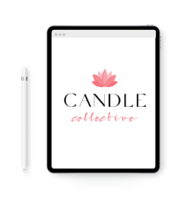
Customize and make tweaks with our logo editor to bring your vision to life. You can play with fonts, colors, and logo layout – no design skills necessary!

Design your custom-made logo instantly

Fashion Logo Ideas

Fashion Logo Design Tips

As you go through each of these tips, think about your individual brand message. What’s the feeling you want your customers to have when they think about your clothes/products? Who is the target audience that you picture wearing your items?

Have that person in mind, and try to create a fashion logo that they’ll connect with, using the different logo design elements. Here’s how:

Choose The Right Icon

There are plenty of fashion brands that depend on type (as in, text) alone to make their mark. However, icons in fashion logos can also add a unique element that helps grab attention and communicate something about your brand.

For example, a retro fashion brand could use a hand-drawn icon to give a throwback look. High-class brands might go with classic imagery—emblems, frames—done in a more refined style. Accessory designers could use an image of an accessory (like jewelry or sunglasses) to tell their audience what they do best. A more modern brand may just use a nondescript, abstract shape that conveys a certain feeling in line with their brand’s direction.

Shapes on their own can create a lot of connection between your brand’s purpose and you’re your audience. While triangles can be used to feel edgy and unpredictable, stars can represent the stellar aspect of your brand. Circles can represent infinity and stability. Curvy lines can represent waves in the water (great for swimwear brands!).

Specific symbols can also carry cultural meaning. A Celtic knot or four-leaf clover will indicate one thing, while a feather or native print will suggest something else. Choosing the right imagery is important to avoid misrepresenting your brand, so make sure you’re aware of the connotations of whichever symbol you use.

When in doubt, go with a very simple shape, and see if it enhances your logo. If you are really struggling to choose the right image, you can even start with the font first and see if an icon speaks to you later.

accessories logo idea

Pick The Perfect Fonts

For the majority of brands, only one font is needed in their logo. Occasionally, a second font is used for the tagline or a second word, but additional fonts are rare. That’s because too many fonts create distraction and make it harder to create a style guide for your brand.

The font is what sets your fashion brand apart from the competition; this is going to help establish your signature style as a designer or brand. Most fashion brands will have a very strong logotype that may or may not go with an icon, so you’ll need to stand out with yours.

Ideally, you want a font that is unique in some way to your brand. You might choose to purchase your own font or have one made specifically for your logo — but this can be very expensive. Instead, smaller brands are more likely to add their own element to the font to make it unique as a logotype. Maybe you add a star in place of the “a”, or you fill in all the open spaces in your letters to create more of a block font.

fashion logo typography

High-fashion brands often choose a no-fuss font and boldly lean on their name alone. More modern brands may go with a san-serif font (the fonts that have no little extra marks hanging off the letters). Some brands go with a handwritten font or cursive for a more personal touch— though you need to make sure those fonts are thick enough to show up when the logo is printed small, for a tag or business card.

fashion logos examples - feminine vs masculine brands

If your fashion products are geared toward women, you might choose a font with more curves or a kind of wispiness. The rounded letters will give off a more feminine vibe. However, you could take it the other way and go with very angular letters for a more edgy approach to women’s fashion.

For masculine brands, choosing something blocky or gritty may help you target the right audience. And, for children’s fashion, a playful font or very simple sans serif may be the right choice.

Find The Best Colors

Colors give off a subliminal message about your brand from the very start. Different colors will create different feelings of excitement (red), positivity (yellow) and more. Green colors or warm neutrals (tan, brown, cream) might be great choices for a brand that focuses on being eco-friendly or creates designs based on nature. Think about your colors as a way to help convey what your brand does.

In most cases, you’re going to need a black-and-white version of your logo for your clothing tag. Even if you are using other colors for your logo, it’s always a good idea to create a black-and-white version, when printing colors are very limited or more expensive than just using black or white ink.

If you do choose other colors, it’s usually best to go with a very limited color palette of up to 3 colors. You want your logo to be easily reproduced on your products, and you don’t want it to look too busy or cluttered.

luxury fashion brand color palette

A luxury brand will often use classic neutrals, like black, white, gold, silver or navy, to convey the value. These brands don’t have to be eye-catching with bright hues; they depend on an understated look that commands authority. By keeping the logo simple, it will have a classic and timeless feel that is consistent with luxury fashion.

For kids’ fashion brands, however, bright colors are often indicative of the energy and excitement of the target audience. While all bright and bold colors can give a youthful vibe, the primary colors are often used to indicate that this is a children’s brand.

When paired together, red, yellow and blue give early elementary vibes. For slightly older children, choosing more subdued and bold colors — like jewel tones — will make your brand look a little more sophisticated and cool.

kids fashion brand color palette

Pick The Right Layout

Layout decisions are important because they will help keep the focus on your logo. A busy or cluttered logo will be ignored because the brain can’t process the meaning quickly. Logos with clear focal points and shapes are easier for people to understand and recognize. The layout should be designed in such a way that the eye is encouraged to stay on the image for a longer period of time.

You can accomplish this by assuming that most of your audience will start looking at the logo from left to right. The composition should then encourage eye movement to the right, back down, and around to the start. This kind of circular viewing motion doesn’t require a literal circle shape — only the composition needs to follow that pattern. You can use a spiral composition to keep drawing the eye into the center of your logo. This is how you will keep focus for longer than just the time it takes to read your brand name.


In most cases, this layout will include a prominent icon above centered text. Some brands and designers will use their text within the logo image or wrapping around it in some way. Most of the time, the logotype is separate from the icon, so you can just use the icon or just use the logotype as applicable. You might choose to only use your icon on the front of a tag or on the clothing item itself (like a shoe or shirt). But, you might use just the logotype in other places — like the clothing instruction tags or pricing display signs.

You can also create a wordmark or monogram in place of an icon. Some brands will use the brand initials — creating a design out of the letters. This can be a really effective logo for a fashion brand. If using your brand initials, you may want to creatively combine them. Use the same font as your logotype to keep your initials consistent, or choose a complementary font to help it stand out more. You can choose a more creative or bold font for the initials, for example, and then a simple sans-serif font for the logotype that goes below.

If you’re a designer with a long name, try initials, or stack the text so it looks good on smaller screens. A very long horizontal logo is going to be difficult to print. You can stack words to help create a slightly taller logo. The goal is to get the logo into a square or circle shape, since that will be much easier to use in places like profile pictures. A square or circular logo that includes both the icon and logotype is easier to view on mobile devices that have a tall screen. You can always create a secondary, non-stacked version if you prefer to have a longer logo on things like a business card or website header.

Ultimately, create a handful of fashion logo versions that remain consistent but offer variations for different practical use situations. You can make your color version, a black-and-white version, a standalone logotype, a standalone icon, and a stacked/unstacked version.

Design your custom-made logo instantly

Your logo comes with:

High quality logo files

Website & Domain

Powerful design tools