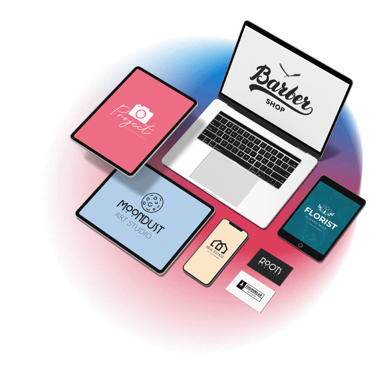

Tailor Brands enables you to make stunning logos designs. No matter what type of industry your business is in, our online logo maker will create a logo that’s a perfect match for your business.
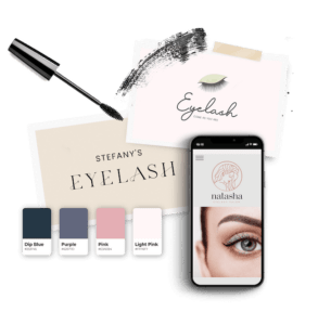
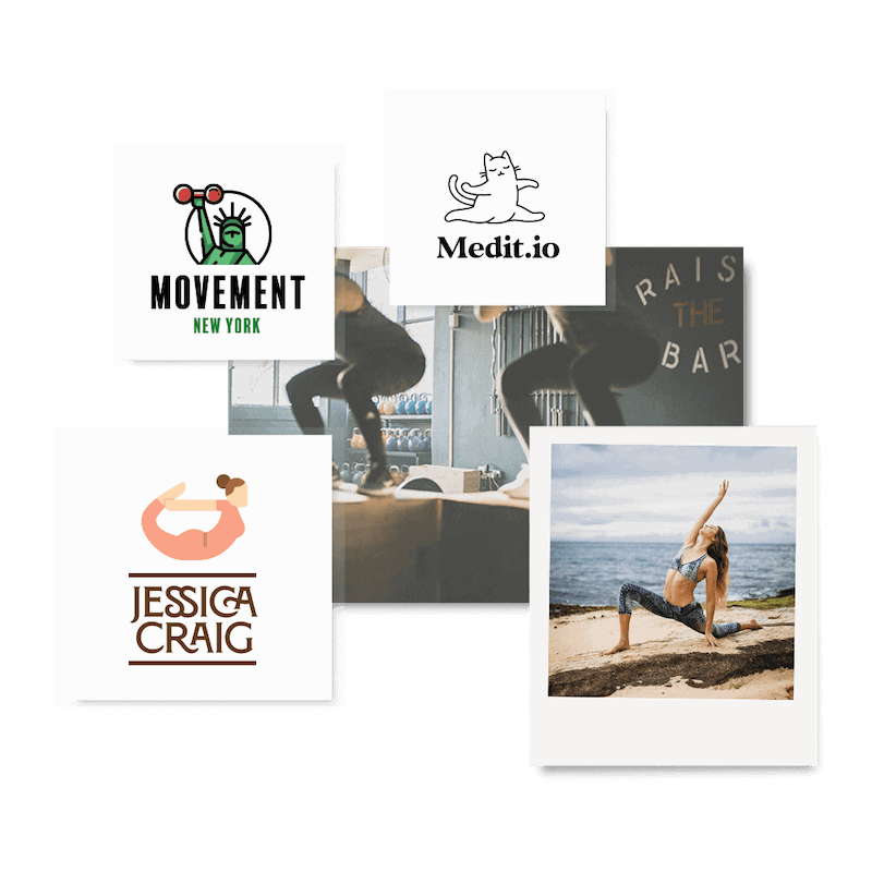
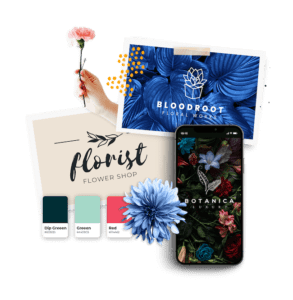
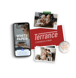
But if you need some inspiration, you can browse through thousands of cool logo ideas from every industry, and find the one that speaks to you most .
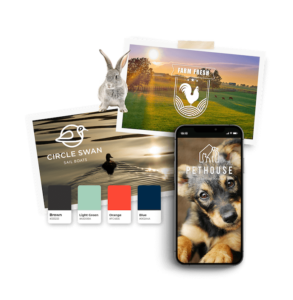
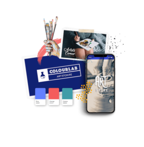
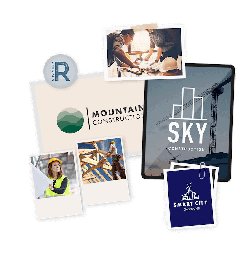
Whether you lead a basement brand or construction company, our logo ideas will help spark your imagination so you can get inspiration for your own logo.
In addition ideas and inspiration, we also provide you with tips for designing logos in each industry .