Production Company Logo Design

Production company logos header

Media, film, animation, and gaming companies have one thing in common: They all need a creative logo to make their mark on the entertainment world. It’s important to put thought and effort into your logo design to make sure your production logo is memorable, timeless, and has enough sparkle to be recognized. 

When creating a logo for your production company, you’ll want to make sure it meets the standards set by other popular logos in the industry. Check out these production logos to get some inspiration, and then scroll down for design best practices to help you make the perfect logo for your brand. 

production company logo example

How to Make Your Own Production Company Logo

Create your production company logo in 2 minutes by entering your business’s name and tagline (if relevant) and clicking ‘Design.’

Tell us a little about your production company, select a logo type, and choose the fonts you love, so we can create the perfect logo for you!


Customize and make tweaks with our logo editor to bring your vision to life. You can play with fonts, colors, and logo layout – no design skills necessary!

Design your custom-made logo instantly

Production Company Logo Ideas

Production Company Logo Design Tips

Choose the Right Icon

Icons for production company logos

You don’t need an icon logo, but it can be more impactful than just your business name alone. An icon can attract people’s attention, evoke emotional reactions, and help you stand out from the crowd. 

There are a few different types of icons, including abstract, geometric, pictorial, crests and emblems, interactive, and custom. Each type has its own meaning and purpose, which you should research to figure out which is best for your business. Consider Warner Bros. Pictures’ emblem icon. As a brand with a long legacy, the shield emblem that encases the text has become easily identifiable on its own. 

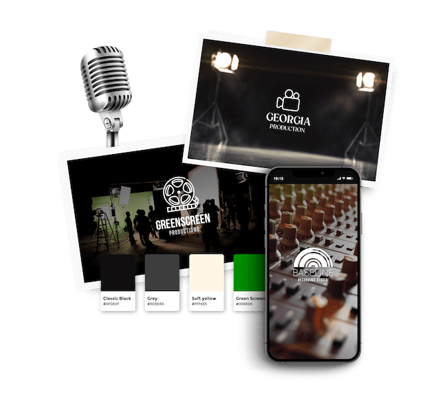
Many production logos have icons to help potential customers understand what product/service they offer and if it’s right for them. You may want to go with an explicit message using a video camera, film reel or clapperboard. Or, try an abstract symbol that packs an emotional punch like Legendary Entertainment’s series of intertwining lines resembling a Celtic knot. 

Some brands choose to make a mascot or animal the face of their business to set themselves apart and encourage customers to come back time after time. Leo the Lion is the mascot for the Hollywood film studio Metro-Goldwyn-Mayer. And Walt Disney Company has their infamous and beloved Mickey Mouse whistling along their logo. As you can see, a mascot logo can suit your production company. 

Last bit of advice: Make sure the icon you choose reflects your brand, doesn’t take up too much of the overall design, and complements all other elements.

Pick the perfect fonts

Fonts for production company logos

Your logo’s typography needs to be both creative and professional, as well as attract your target audience. So, you need to first understand the different font families and what they each mean before you choose the one for you. Choose a typeface that emphasizes your creativity while remaining easily legible.  

You’ll see all kinds of typefaces used in production logos from all-caps serifs, bold sans-serifs to a personalized script that looks like an autograph. Take it from one of the most reputable entertainment corporations in the world, Walt Disney’s whimsical script font is actually based on the founder’s handwriting. Again, personal and timeless. 

Many of the most popular production company logos play around with kerning. Kerning is the spacing between individual letters or characters. Though subtle, kerning can have a huge impact on the look and feel of your logo. Focus Features text and New Line Cinema are both examples of kerning done right. 

It’s important to ensure your font is legible in both small and large print, so it’ll be easy to read no matter where your logo is featured.

Find the Best Colors

Color palette for production company logos

Each color comes with its own personality, eliciting certain emotions and reactions. That’s why you should carefully consider which color palette will suit your production company best. 

What kind of vibe are you trying to convey to your audience? Blue is a popular color as it’s associated with dependability, trustworthiness, professionalism, and modernity. Red is a color that demands attention, which is why it could work well for your production company. Use blue and gray for a professional, timeless logo. Or, consider black and gold for an edgy, modern look. Remember to stick with 2 to 3 colors at most. 

You’ll notice that most production companies use a classic black and white logo, while some use blue to express professionalism and reliability. Netflix, however, went with a bold, energizing red logo to shake things up and stand out. 

As long as you choose a color palette that stands out you should be good to go. Just make sure that your logo colors emphasize the traits of your production company you want to express.

Layout

Take a moment to think about where your logo will appear: Brochures, business cards, websites, social media icons, billboards, equipment and other branded merchandise. That means you’ll need a layout that can be easily resized without ruining the quality of the design. 

If you check out Warner Bros. Television Group’s website, you’ll see on the top left hand corner their initials encased in an emblem. Same goes for their Instagram profile picture. As you can see, it’s easy to scale an emblem up or down depending on where it needs to be used.

Remember that the goal is to make sure your logo looks good everywhere you use it, so aim for a layout that preserves the quality of your logo despite it being resized. 

Design your custom-made logo instantly

Your logo comes with:

High quality logo files

Website & Domain

Powerful design tools