Weed Logo Design
Create your own marijuana logo with our logo maker in minutes!
Home » Logo Maker » Ideas » Weed & Marijuana Logos
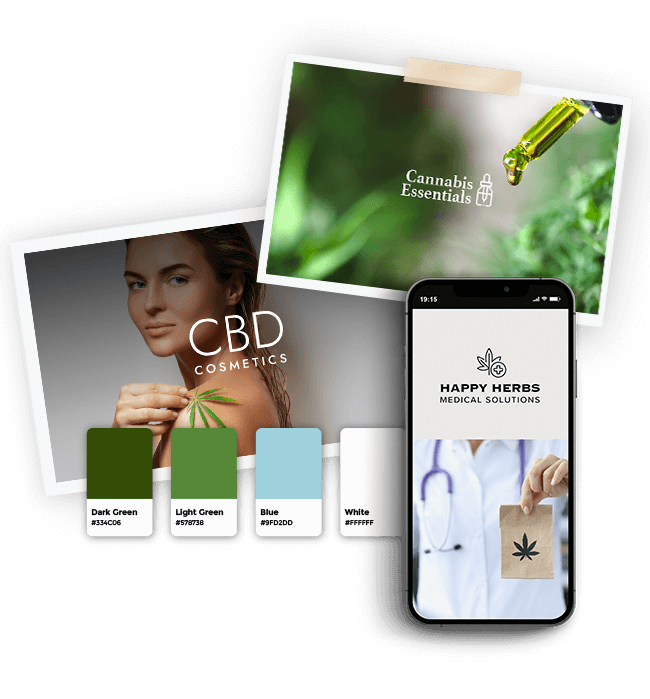
If you’re looking to create a weed logo, you’ve come to the right place. Our weed logo will help you easily design a marijuana logo that will speak to your customers while helping you grow your brand.
Why do you need a good marijuana logo? Because medical marijuana wasn’t always a recreational pastime. Since the laws changed, allowing for legal sales of the herb, thousands of dispensaries and growing houses popped up all over the place to sell their harvested goods.
The health benefits of weed are one of their main selling points, as it helps to combat chronic pain, sleepless nights and even anxiety. But historically, marijuana has had a bad brand. It was often linked to violent gangs and other unlawful activities.

This is why when creating a weed logo, you need to make sure that it helps give your brand an aura of professionalism and lets your audience know that you’re a credible, trustworthy business.
How to make your own weed logo

Create your weed logo in two minutes, simply by entering your company name and tagline (if relevant) and clicking Design.

Tell us a little about your weed business, select a logo type, and choose the fonts you love, so we can create the perfect logo for you!

Customize and make tweaks with our logo editor to bring your vision to life. You can play with fonts, colors, and logo layout – no design skills necessary!
Design your custom-made logo instantly
Weed Logo Ideas
Weed Logo Design Tips
1. Icons
Your logo has two jobs. It needs to sell your products successfully, but it also needs to market your brand personality. Your brand is your identity, and your personality is the character traits that define it.
If your business is a relaxed dispensary catering primarily to non-health needs, then you want your logo to reflect your laid back attitude. And if you’re providing high-quality medicinal herbs, then you want your professionalism and helpful approach to shine through your logo.
Choosing the right icon is critical to setting the right tone. If it’s too serious or too fun, you won’t attract your customers or help boost your brand’s personality. c
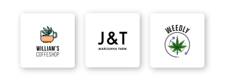
The most common icon used is, of course, the famous green pointed leaf. You can use your creativity, though, to add to it to help define your business. You’re not limited to just one icon, adding another element can boost the impact your logo has on your audience.
For more medical orientated dispensaries, adding a cross or caduceus symbol (medical symbol) can help create instant recognition of your healing service. If your specialty is fast deliveries, you can use a truck icon, with a marijuana leaf painted on the side with lines to show your van in action how fast you can deliver.
2. Typography

Your logo’s font plays a vital role in your logo design, especially when it comes to attracting various types of customers. Different fonts can create completely distinct tones that you need to be aware of. Just like icons, your typography can either help you sell your product or become a hindrance.
If you’re primarily targeting recreational users and college students, then experiment with more cheerful, light-hearted fonts, such as bubble fonts, or blocky lettered fonts. You can also try fonts that mimic handwriting, which works well with boutique businesses.
If you’re catering towards people that need your marijuana’s medical properties, then you should consider professional, clean, modern fonts such as sans-serif. Their lack of additional lines makes the typeface appear more slick and professional.
Experiment with different types and styles of fonts to see the effect it has on your logo. Always keep in mind your target audience as your typeface needs to appear to them and not to you.
3. Color Palette

Color plays an essential role in your logo design, and when choosing your color palette for a weed logo, you may feel as though you’re restricted to using green as your primary color. Which isn’t necessarily a bad thing.
Your logo should create instant recognition of your brand, your services, and your personality.
Because the plant’s green color is what makes it easily identifiable, it’s the perfect color to select for your logo. The real question you should be asking yourself is what shade of green you should.
And for the most significant impact, use a secondary color that combines well with your chosen shade of green to make your logo stand out. If you go with more than three colors, your logo may appear too busy and won’t be easy to understand.
If you’re using a dark shade of green, then consider matching it with purple, creating a feeling of luxury, or an earth-colored brown for a more natural look. You can also use more than one shade of green in your logo if you don’t want to use another primary color.
For lighter shades of green, you can use reds, yellows, and blues, which mesh well.
4. Layout
Layout and scalability are important considerations when designing your weed logo. Scalability means your logo will look good in any size, from a small icon on a pen to a larger sign on your brick and mortar store or billboard. Your weed logo will be used on branding items such as social media posts, business cards, posters, merch, stickers, business proposals, and even billboards, so it needs to be scalable.

You need to make sure that your weed logo looks good in every format for both traditional (like newspapers) and digital branding (like social media). That’s why it’s important you test your weed logo on both small and large scale formats. If there’s too much going on in your weed logo, it’ll be difficult to scale it down to a smaller size. Chances are you’ll have to make multiple versions of your logo for different uses.
Design your custom-made logo instantly
Your logo comes with:
High quality logo files

Website & Domain
Powerful design tools
- Author: Shai Shmarel
- Published Date:
Disclaimer
This portion of our website is for informational or educational purposes only. Tailor Brands is not a law firm, and the information on this website does not constitute legal advice. All statements, opinions, recommendations, and conclusions are solely the expression of the author and provided on an as-is basis. Accordingly, Tailor Brands is not responsible for the information and/or its accuracy or completeness. It also does not indicate any affiliation between Tailor Brands and any other brands, services or logos on this page.