YouTube logo maker
Home » Logo Maker » Ideas » Youtube Logos
Running your very own YouTube channel can be tough! Especially if you’re always creating and uploading fantastic video content for your subscribers, but not getting the results you want.
Why does this happen? Often it’s because your branding isn’t strong enough, and you’ll be glad to know it’s pretty easy to fix.
To take your branding to the next level, you need a professional-looking YouTube logo. Not only does it help to promote your brand by showing your audience who you are and what your channel is like, but it also helps build trust and credibility with your followers.
Not to worry! Our AI YouTube logo maker can create hundreds of amazing designs for you on any topic—from gaming and e-sports to travel and beauty.
Just enter a bit of information about your channel, select a design you love and customize it to your heart’s content. Tweak the size, icon, color, and fonts endlessly until you have a logo that’s tailored just the way you like it.
Before you try it out for yourself, take a look at our YouTube logo design tips below, and we’ll show you how to create the ultimate logo for your YouTube channel.
How to make your own YouTube logo

Create your YouTube logo
in two minutes, simply by entering your channel name and tagline
(if relevant) and clicking Design.

Tell us a little about your YouTube channel, select a logo type, and choose the fonts you love, so we can create the perfect logo for your brand!

Make adjustments and tweaks with our logo editor to bring your vision to life. You can play with fonts, colors, and logo layout – no design skills necessary!
Design your custom-made YouTube logo instantly
YouTube logo ideas
YouTube logo design tips
Beauty
Need to create a beauty logo for your YouTube channel? Then you need a logo that looks just as amazing as your viewers do after watching your videos.
Because the topic of your channel is so focused on the visual perks of beauty, your logo can’t be bland, and it certainly can’t be boring. Otherwise, it may NEGATIVELY affect your channel.
Your viewers need to see your alluring logo and associate you and your brand with its dazzling beauty. Here’s how you do it.
You don’t need to use an icon or symbol with your beauty logo, but it certainly helps with brand recognition.
If you do decide to use an icon, then it has to match your channel’s focus, such as skin-care, nails, or overall feminine beauty. Popular icons include lipstick, scissors, combs, mirrors, and nail polish bottles.
The added advantage of using an icon in your YouTube logo is that you can easily add your branding elsewhere in a very non-intrusive, but effective way due to its smaller profile than text-only logos.
Many of the most popular beauty YouTubers only use fonts in their logos. Don’t believe me? Look no further than Zoella, Yuya, and Nikkie Tutorials.
Zoella uses an elegant script font as her logo, which represents her charming and delicate beauty channel. Where-as Yuya, who is more lively and more animated, uses a simpler font that’s a mix of comic and serif. And finally, Nikkie Tutorials uses a modern-looking, simple sans-serif font, which is a fun and laid-back.
Whichever font you decide to use for your beauty channel, be sure to keep your audience in mind. The best font you can choose is not one that you like, but one that resonates with your viewers’ tastes and helps create the right impression for your brand. Beauty logo colors can come in all different shades and colors. There isn’t a right or wrong one to choose from!
But depending on your YouTube channel’s personality and your audience, you’ll want to stick with a color palette that resonates with them. Many beauty channels use pink to show-off their feminity, or red to show their boldness and often contrast it with black to demonstrate their professional side.
Experiment with different color palettes and see which one fits your YouTube channel the best. Make sure that your color palette is easy on the eyes and is unique – the worst thing you can do is copy another beauty channel’s color palette.
Lifestyle
Are you a lifestyle YouTuber? If you post videos about your personal life, daily activities, discuss current events, and actively engage with your viewers’ interests, such as pop culture, then you’re probably a lifestyle YouTuber.
Creating a logo for your lifestyle vlog can be challenging, as your niche is so varied. So ask yourself, what is it that makes your channel unique, and what is your best personality trait that shines through in your videos and attracts viewers?
Audiences love brands and YouTubers with distinguishable characteristics. It’s why lifestyle vloggers such as Colleen Ballinger and Casey Neistat have millions of subscribers each. They have strong and super distinct personalities that people love to watch.
Because they’re so successful and popular, their name is synonymous with their brand. But if your youtube channel is still growing, you can help communicate your personality and topic of choice with an image or icon that helps boost your profile.
So, determine your channel’s main topics (keywords), such as cooking, families, or health, and use an image that combines your main topic with your personality to create an enchanting logo icon that represents you.
The current trend with popular lifestyle YouTubers is a text-only logo with an eye-catching script font that strays away from the ordinary fonts. Script fonts are excellent at expressing your likeability and the intimate nature of your channel.
Dulce Candy uses a super curvy script font to show-off her fashion skills and personality in her videos. She shares pretty much everything happening in her own life, including her journey with fertility treatments and dealing with pregnancies.
The last piece of your lifestyle logo puzzle is your choice of color. If you want to create a feeling of warmth and fun, you can’t go wrong with shades of yellow. If you’re lively and want to advocate that feeling in your logo, then choose a fiery orange. It’s energetic but still has comfortable energy to it.
If you need to grab attention, choose a bold, bright color such as red, or even violet. Stay away from darker shades. They can lower the mood of your audience, which conflicts with your goal to engage and entertain your viewers.
Comedy
Whether you’re entertaining your audience through stories, sketches, or songs, they won’t see your humor unless they know who you are or click on your videos.
Your mission is to entertain and bring cheer to everyone. So having a boring logo just isn’t good enough. Here’s how to spice up your logo design, so it’s fit for a comedy king or queen.
Choose an icon that targets your audience. Are they kids, teenagers, women, astronauts? Then make sure the style of the icon fits your brand. Casual, playful, serious comedy (similar to John Oliver), or do you fit somewhere in the middle? Popular comedic icons include microphones, smiling mouths, or a TV.
And when it comes to comedy fonts, comic sans might be the best fit for your comedy. It’s a very light-hearted font that’s entertaining.
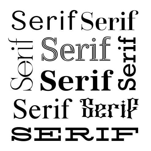
For a more sophisticated approach, consider using a serif font such as Helvetica.
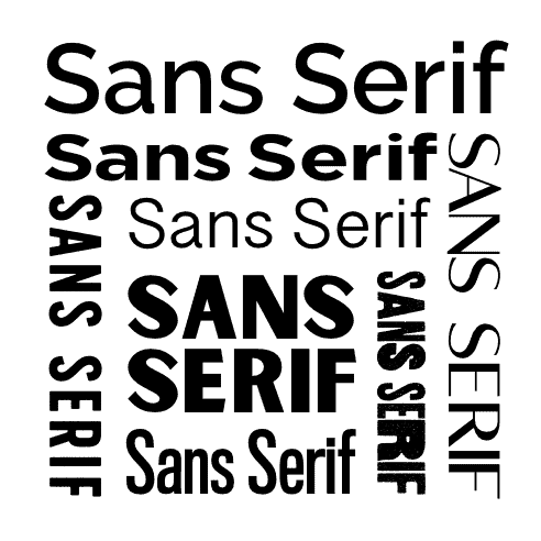
If you want an approachable and personal font, then going with sans-serif is a good choice, especially as it’s very modern.
Lastly, your color palette needs to provoke the right emotions, including your brand personality. Blue is a calm, intelligent color, while yellow is more laid-back and fun.
Luccas Neto is a famous YouTuber whose comedy sketches are aimed at kids, and he’s made it clear with his logo design. A fun blue star shape, with comic sans yellow font. It’s an instantly recognizable logo clearly aimed at younger viewers, so it’s no wonder he currently has 29.5 million subscribers!
Prank / Challenges
Prank and challenge channels are all about having fun, making people laugh, and doing the impossible. When designing a prank or challenge YouTube logo, it needs to be high-energy and attention-grabbing.
Your goal is to entertain people, not put them to sleep.
Some of the biggest prank channels use brilliant icons that convey the nature of their channel. What better image to use than a charming devil (Ownage Pranks) or a cute little monster (Just for Laughs Gags).
For your challenge logo, choose an image that’s heavily related to the types of hurdles you do on your channel, whether they’re physical such as hiking up mountains, or more artistic such as re-creating incredible photos with low-tech cameras.
When it comes to choosing a font and color palette, you can’t go wrong with fun styles, which make people pay attention and smile. Use energetic colors and lively colors, such as orange, green, red, and purple.
And when it comes to picking a font-style, stay away from overly-professional looking serif fonts, and instead choose a sans-serif or script font. They’re more relaxed and cheerful.
Gaming
There’s never been a better time to be a YouTube gamer. E-sports are rapidly gaining popularity, especially as more people are turning to PC and consoles for their entertainment.
And some of the most popular YouTubers are gaming channels or feature gaming massively on them. Look no further than PewDiePie (Felix Arvid Ulf Kjellberg), who has over 100 million subscribers. He reviews games, live streams as he plays, plus releases vlogs and skits.
When deciding what image to use as your logo icon, look to your favorite games or your personal appearance as inspiration. Many live streamers show themselves while playing, so if you always wear a hat or sunglasses, you can use that in your logo to help push your personal branding.
Your gaming font logo needs to be easily legible. It’s easy to fall into the trap of using a cool-looking font that’s not easy to read. And again, match your typeface to the genre of games that you play.
Use bold fonts for action games like first-person shooters and adventure games, or a more relaxing sans-serif font for social games or exploratory games.
The same principle applies to your color palette as well.
You want your brand identity to resonate with your audience and stand out while reflecting on your brand and your favorite gaming titles and genres. But, it’s critical not to look too similar to other popular gaming YouTubers such as Ninja.
His iconic blue ninja logo with yellow headband plays heavily into his personal branding (he often wears a yellow headband and has blue hair). And his custom font is inspired by Japanese calligraphy, which compliments his name, Ninja.
If there’s one thing YouTube audience’s hate, it’s copycats.
DIY
Hosting a DIY YouTube channel? Whether you’re showing your audience how to fix their car, renovate their home, or easy to do hacks and crafts, your logo needs to look as polished as your videos.
When it comes to designing your logo, don’t lavish it with fancy icons, those days are long gone. The most popular logos today are simple and easy to remember. 5-Minute Crafts is one of YouTube’s most popular DIY channels with over 65 million subscribers, and they’ve nailed their logo design.
A lot of their DIY videos require you think outside the box, such as putting a pair of tights over your kitchen faucet?
Their simple yet effective logo is just a yellow bulb on a blue background. The mix of colors, though, really pops out of the screen and perfectly represents their brand. Clever do it yourself crafts and projects.
You, too, can use clever imagery such as a lightbulb or other icons that represent the focus of your DIY channel. Car repair? Use a car icon. Computer repair? Use a circuit board.
We’ve mentioned it a lot on this page, but it’s worth repeating – always make sure that your color scheme and font resonate with your audience.
Travel
Traveling the world is all about sharing those once in a life-time experiences with your viewers. It doesn’t matter if you’re touring popular destinations and staying in 5-star hotels or showing people how to travel on a budget and get the most bang for their buck.
You’re showing your viewers the world through your eyes. And part of the reason why they’re even watching is to see you.
When it comes to designing your logo, there’s the obvious go-to icon that you’ll be tempted to use – an airplane. But be careful, or your logo may have too much of a travel agent vibe.
You’re not looking to create a logo to sell people travel insurance and cheap holidays. Your logo needs to show off your personality and channel.

The Vagabrothers, Alex, and Marko live tor travel the word. Experiencing new cultures and culinary delights. They’re both extremely laid-back, easy-going, and enjoy talking with locals about history and how to get the most out of each location they visit.
And in case you are wondering, they don’t use an airplane icon in their logo. Instead, opting for a hand giving the peace sign. Cool right?
When it comes to choosing your font, you’ll be best served going with one that’s excellent at conveying trust and friendship, such as a sans-serif font.
And you can combine it with a warm color such as dark red or orange if you’re visiting hot climates, and green if you often journey through the jungle or other luscious green landscapes.
Many YouTube channels like to use blue in their logo to help communicate reliability and authenticity, one of the most sought out attributes in YouTube channels.
- Author: Shai Shmarel
- Published Date:
Disclaimer
This portion of our website is for informational or educational purposes only. Tailor Brands is not a law firm, and the information on this website does not constitute legal advice. All statements, opinions, recommendations, and conclusions are solely the expression of the author and provided on an as-is basis. Accordingly, Tailor Brands is not responsible for the information and/or its accuracy or completeness. It also does not indicate any affiliation between Tailor Brands and any other brands, services or logos on this page.