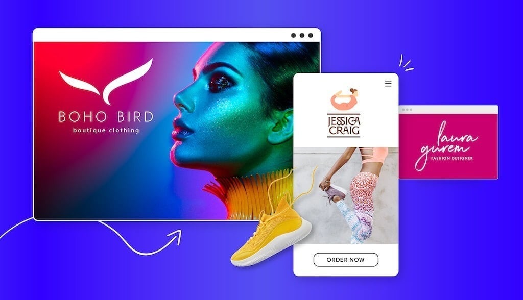
It’s crucial for brand owners in the fashion industry to stand out from the competition and attract customers in this crowded market. One of the best ways of achieving this is through having a strong, unique logo.
If you work in the fashion industry, you know how important design is. While that’s true for clothing, accessories, sportswear, or any other kind of apparel, it’s also true for your brand’s overall aesthetic.
Designing a fashion logo for your fashion brand can instill trust by validating your professionalism, tells clients who you are and what you do, and helps you stand out from the competitive market.
What to Keep in Mind Before Designing a Fashion Logo
Before you jump right in, there are a few key things to keep in mind before designing a fashion logo.
1. Simple
When it comes to logo design, sometimes less is more. A simple logo design allows you to express your brand’s true essence clearly, which is important since your audience will only focus on your logo for a few seconds.
Simple logos highlight the most important aspects of a brand with limited space. This includes relying on color, font, shape, and icons, as well as distilling ideas into their simplest form.
2. Recognizable
Your logo must be instantly recognizable to audiences. Your logo should aim to create a connection with your target audience and garner interest in your brand. Think about Nike’s swoosh mark or Lacoste’s alligator—logos can instantly remind you of a brand.
3. Scalable
You want your logo to look amazing no matter where it’s being showcased. Whether it’s on your price tags, clothing, website, or social media page, consider how your logo design will look displayed across different mediums. Therefore, aim for a layout that preserves the quality of your logo despite its being resized.
4. Original
The number one rule of design is to stay true to who you are. People respond to authenticity and are much more likely to remain loyal customers down the line. If you keep your logo design original to your brand, it’ll set the tone for your overall brand.
Your Fashion Logo Style
In addition to those 4 tips, how you design your fashion logo will depend on other factors such as your target audience and specialty.
Target audience
Your target audience is a specific demographic of society who want or need your product or service. Based on who your target audience is, you’ll want to stick with certain design elements (color combinations, icon, fonts, etc) that will resonate best with them.
Let’s look at a few examples of specific target audiences and fashion logos that suit them.
Feminine
When creating a fashion logo directed towards a feminine target audience, the first design element to consider is color.
According to color psychology, colors help your brand connect with your target audience on a deeper psychological and emotional level. When you choose your logo color palette, you’re also selecting the emotions you’re seeking to evoke.
Let’s look at the 2 logos above, created with our logo maker. The soft purple color used in Anna Wolf’s logo and the deep red in Bell & Tailor’s logo are both great examples of how to use color to reach your target audience.
Masculine
If you’re looking to attract a masculine target audience, an important design element to think about is typography.
Fonts can elicit specific responses and create unique associations with a brand. Each type of font has its own psychological meaning that you should take into account when you create your fashion logo.
For example, slab serif fonts are bold and convey a sense of confidence, dependability, and assurance thanks to their heavy lines and less delicate serifs. You can see how Huckberry’s logo communicates a sense of masculinity through their slab serif font.
Kids
A sure way to attract younger audiences to your fashion logo is through an icon. An icon is a symbol that conveys certain ideas and makes them recognizable.
There are a ton of different types of icons, but pictorial icons like a bee work great! Or, you can choose to do a custom icon like Primary’s green ‘P’ shape. Both of these are great examples of how an icon can attract a younger audience’s attention.
Specialty
Fashion designers specialize in a specific field or category. Based on what specialty you’re in, certain design elements will work better for you than others.
Let’s look at a few examples of fashion designer specialties and logos that suit them.
Athleisure
Athleisure or sportswear fashion brands have a lot of room for creativity with their logo design. Cheeta’s Sportswear logo utilizes both color, typography, and icon to highlight their niche. Everything from the bold red and the running cheetah to the 2 different types of font tells us this is a brand that provides long-lasting, reliable sportswear.
In contrast, Jessica Craig’s logo paints a very different picture! The icon of the woman in bow pose (this is really hard to do IRL) and earth tone colors convey a more relaxed vibe.
Vintage
Vintage clothing brands need to get their message across loud and clear through their logo. This is why so many vintage logos have a weathered appearance, often with a simple color palette and dull or muted colors.
Script fonts work well for vintage brands since it evokes creativity, freedom, and an antiquated feeling.
Designer
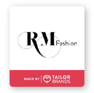
Typographic logos or wordmarks are logos made entirely with a font. Most designer brands use their name or initials as their logo. Just take a look at the 2 examples above of Laura Gurem and RM Fashion at how you can execute your signature style in your logo.
Another style worth noting is minimalism in fashion logos. Minimalist designs hold a power that excessive colors, images, shapes, etc cannot. Strictly using text and font can result in a modern, sophisticated aesthetic.
Streetwear
Urban and modern yet casual and comfortable—streetwear brands need a logo that encompasses all that their style is and more.
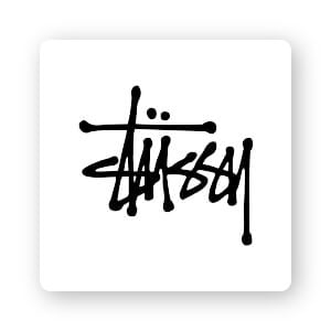
A streetwear brand logo should focus on or highlight one element. So if you’re going to go bold with the font, let that be the sole focus of the logo design. If you check out the example above, you’ll see that the logo looks like graffiti on a city wall.
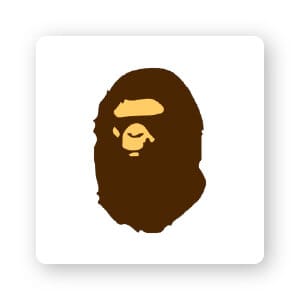
You can also use an icon as your logo, but you would want to create an image with a twist such as a gorilla wearing sunglasses.
Eco-wear
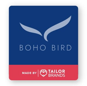
Eco-wear fashion brands aim to make sustainable shopping accessible to everyone. These brands should stick with simple, uncluttered, and clean designs. In terms of color palette, earth tones work best; the rule of thumb is to use 2 colors (3 max).
I really like Boho Bird’s logo because they used their business name to inspire their icon design and color scheme.
Over to you
Now you know what you need to design a logo for your fashion brand. Remember to focus on what makes your brand stand out and what you want to get across to your customers. If you get stuck, check back here for tips and inspiration.
When you’re ready to create a logo, you can easily get started with just a few clicks!
