When in a bind, go back in time. That’s been the mantra of artists in every niche, and it’s worked for as long as we can remember.
The style of clothes we wear? Not new. Music we create? Inspired by the past. Mistakes we make? Not art – but also repeated throughout history.
We tend to look backwards at the decades that preceded us, taking their ideas and molding them into creations of our own.
Don’t get me wrong, it’s not that we’re straight-up copying (or are we?); rather, we gravitate towards time periods whose art seems new and exciting, yet close enough that it doesn’t feel downright foreign. Then, we mimic what we like, while throwing our own modern spin into the mix.
Industries that Love Vintage Logos
Vintage logos can be used effectively in almost every industry, but they tend to dominate in a select few. Let’s take a look at some of the most popular forums for vintage logos, and the qualities they have that speak to their audience in each niche.
Music
From garage band leader to jukebox owner, anyone in the music world could benefit from a vintage logo. Most modern music is based off of the classics in some form or another – whether it’s Miles Davis seeping through an EDM riff or Billy Joel-esque piano improv over a track in production – and using a vintage logo connects your music to some of the greats by default.
However, it’s not just band logo design that should consider going vintage; if you own a bar that swears by its record player or have the coolest sound engineering studio in town, timeless logos are on your side.
Cafes and Restaurants
Remember what it was like to waltz into a diner at any hour of the day, sit on a barstool, crack open a paper and order your favorite milkshake from the counter? Coffee refills were on the house, and grilled cheese was almost always a meal possibility.
These old-school diners were about more than just the breakfast-for-dinner experience; they were familiar, communal, and assured you that you would be taken care of no matter what.
Vintage logos bring that same feeling of familiarity to eateries like cafes and restaurants. As diner-like experiences are shrinking with the emergence of hipster cafes, the places that want to call back that feeling of comfort do so with down-to-earth, retro designs.
Interior Design
Remember how we said that vintage logos give cafes a homey ambiance? Well, the same could be said for interior design firms – and thankfully so, because interior design usually involves entering your clients’ houses and trying to make it feel like a home.
These industry logos typically play off of the script fonts that are characteristic of the vintage world, lending an elegant effect to the brands they represent (and promising your clients to deliver that elegance). You can also take a more straightforward approach, focusing on muted tones and evocative typography to draw your audience in.
Bars and Breweries
Bars often use vintage logos to remind us of a time in which alcohol was forbidden (think Prohibition era, 1920-1930’s). Not only do these logos make us–perhaps subconsciously–feel grateful for the opportunity to pour one out in public, but they also create an air of exclusivity around any bar or speakeasy.
Microbreweries in particular like to take advantage of the retro look, in that it taps into nostalgia. Beer has been around forever, and vintage logos remind us of that connection to the past. Additionally, brew fanatics know that aged beer is quality beer, so connecting your brewery with the past will give the impression that your beer is of the most high-caliber out there.
Apparel
So many famous clothing companies have stood the test of time, and their logos have followed suit (pun intended!). While some apparel lines (like Levi’s or Nike) have done away with their own vintage logo in favor of a more classically modern design, others have embraced their connection with the past – and with it, their legacy as a timeless apparel line.
Types of Vintage Logos
Vintage logos are made in all shapes and sizes, and there’s a lot of room to get creative. That said, retro logo design comes with its own trends and unique characteristics.
If you’re interested in making your own vintage-looking logo, check out the logos below, made with our logo maker. We used different techniques that set vintage logos apart from the standard logos we’re used to seeing on the daily.
The Frame
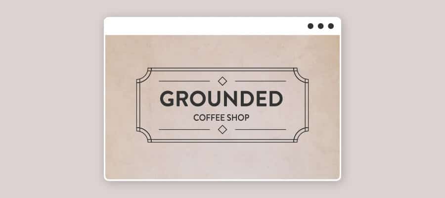
If you’re looking to create a ‘50’s vibe, the frame is your best bet. Simple geometric shapes add a little edge to logos that recall the past, and the inverted edges and corners pictured above bumps the logo up a notch on the class ladder.
These logos are timeless, charming, and versatile; they can be used to represent any product or service that wants to appear reliable.
The Stamp
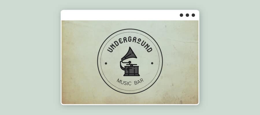
These vintage logos tend to fall into the emblem logo category, or logos that use a badge or insignia to instill trust in their audiences. However, you’ll note that the logo pictured above is specifically disc or stamp-shaped, which is ideal for brands that sell products or use their logo to watermark images or documents.
The beauty of the stamp lies in its simplicity, and the straightforward design gives more room to typography and colors to tell the logo’s story.
The Flourish
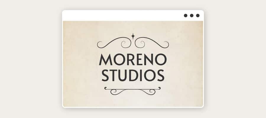
As we saw above, frames make their vintage logo mark – but nothing says retro like a frame with a little extra funk.
Notice how the symmetrical swirls around the frame are delicate and unobtrusive; they are used to accent the typography of the logo rather than overwhelming the design. The flourish appeals to our sense of balance, propriety, and our overall desire to keep things classy.
The Drawing
Handmade items feel authentic and personal, as do designs that were created by hand – a popular trend in logos of the past. The pull of the “hand-drawn” logo is that it makes onlookers feel like the brand they’re interacting with is exclusively for them.
In this vein, this type of retro design is ideal for businesses who are offering high-end service or want to emphasize their attentiveness to their customers.
The Handwritten
Typography is a key element of any logo, and it’s usually what gives logos their personality. Vintage design is no exception, as logo designers of the past used to craft fonts by hand to get the exact type they wanted.
As a result, big, block lettering, expressive serifs, asymmetrical strokes and retro scripts are all vintage logo favorites, with each carrying a different meaning and connection to the past.
The Colorful
Vintage logos tend to work against the minimalism that’s more common of the 21st century logos, because sometimes, more is more. Muted color palettes are a classic vintage logo feature, although sharp contrasts occasionally make an appearance as well.
You may notice that all of the above logos use one color that stands out, but none of them overdo it – something to be conscious of when you’re designing your own vintage logo.
How to Create a Vintage Logo
Now that you have an idea of many of the design techniques that are used to create a vintage feel, let’s get to work on designing your own logo! Here’s how to start:
Think about your audience
We talked a bit about the popular industries that tend to use vintage-style logos, so you should already start to have an idea of whether or not it’s a good fit for your brand in general. However, one of the most important parts of creating a logo is understanding the audience it’s intended to attract.
That’s because your logo should resonate with your audience’s values and desires. For example, if your target audience is all about the newest gadgets and obsessed with modern technology, a vintage logo is probably not going to appeal to them. But, if things like loyalty and traditionalism are important to your audience, then all of that is easily communicable through a timeless design.
Pin down who your audience is, from their age range to their wants and pain points. This will come in handy when you start to choose your logo’s vintage design elements.
Infuse your brand story
Once you know who your logo is trying to communicate with, it’s important to understand how you’re going to reach them. A great logo is one that manages to communicate the story of the brand it represents, and vintage logos are no exception. In fact, vintage is all about storytelling – from recalling scenes like Walden Pond to fostering a sense of exploration via cowboys and pioneers.
So, before you start creating your logo’s overall look and feel, you’ll want to think about the story your logo is supposed to tell. What are the aspects of the past that you’d like to draw attention to? Maybe you want to capture a sense of adventure, or foster a sense of nostalgia in your audience.
Try to write down your brand story in just a sentence or two. Are you serving the neighborhood’s best coffee since 1981? Using a family pizza recipe that goes back to the basics? This story should be oozing from your logo by the time you’re done designing it!
That’s because your logo should resonate with your audience’s values and desires. For example, if your target audience is all about the newest gadgets and obsessed with modern technology, a vintage logo is probably not going to appeal to them. But, if things like loyalty and traditionalism are important to your audience, then all of that is easily communicable through a timeless design.
Pin down who your audience is, from their age range to their wants and pain points. This will come in handy when you start to choose your logo’s vintage design elements.
Explore vintage typography
Now to the fun part of vintage logo creation: Taking your brand story and designing it into reality.
Typography is a huge part of vintage logo design, with different styles containing distinct meanings and varied connections to the past. What’s cool about vintage designs vs. modern logos is that they often had “imperfect” lettering, mostly because they were hand-painted or printed off an unrefined printing press.
As a result, asymmetrical strokes and hand-drawn scripts were par for the course, in addition to the type of block lettering we saw in some of the logos above.
Before you choose your logo’s typography, try to think about the specific time period that you want to evoke. Then, start Googling! Look for old signs, retro photographs, black and white movies – anything that will help you get inspiration and visualize what typography was used in your desired time period.
For example, the early 20th century used worn and stenciled lettering; the seventies sported bubble letters.
Once you know your options, think back to the traits that will most connect your audience to your product or service. Hand-drawn fonts are a great way to add an extra element of personalization, while all-caps serifs seem more traditional and established. Explore different typography before you settle on a font.
Choose vintage color combinations
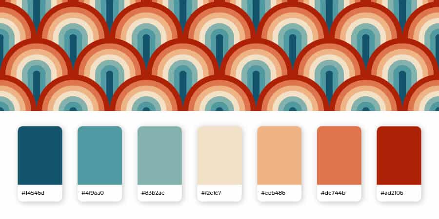
We usually tell people not to use more than 2 or 3 colors in their logo, because it may confuse the message that your brand is trying to send. However, when it comes to vintage logos, you’ll often see color combinations that are a bit more extreme than modern designs (on both ends of the spectrum)
For instance, you’ll come across vibrant, psychedelic color combinations that would be considered too outlandish for most current brands (ringing the ‘60s bell, anyone?), in addition to muted tones that echo the colors that were captured on film cameras back in the day.
The common denominator between most vintage logo color palettes is invoking some sort of contrast to make an aspect of the design pop. For instance, you could use pastel yellows and blues with a brighter accent color, or combine vivid reds, yellows and pinks together with a dark blue.
You can also experiment with earth tones for a more subdued and classic look, which is a good option for logos that incorporate heavily-detailed icons.
Let’s look at that next:
Consider an icon
Finally, icons can do a lot of work for a vintage design.
Unlike the flat, simple logo icons that are only gaining in popularity as the years go on, vintage logos used icons that were richly-detailed.
You’d often see images of wildlife, explorers on a voyage, or other natural scenes depicted, in addition to old-school objects that directly represented what a business offered their clients.
So, again, you should think about the feelings you want to invoke with your logo before you settle on a symbol. Bar owners who want their logo to ooze exclusivity may use imagery that’s reminiscent of Prohibition-era speakeasies; barbershops who’d like to capture the feeling of a 19th-century hair parlor might use a handlebar mustache.
Pore over different symbols that directly relate to your business offering, play on your business name, or convey some sort of message that elicits an emotional response.
Just note that scale may be an issue if your design is too detailed, because it will be difficult to print on small items while remaining visible.
If an icon outright isn’t for you, you can also consider including a frame around your logo like the ones we saw above, to give it an extra, distinguished look.
Over to You
Everything about vintage is cool – and most things that are cool end up being vintage. Luckily, vintage logo designs are yours for the taking, so long as you want your brand to stand out from your competitors’.
You can create your own vintage logo with our logo maker. Play around with colors and typography, try out different retro techniques, and see which type of vintage logo best tells the story of your brand! Try it now for free!
