
1. Tailor Brands
Here at Tailor Brands, you can find all the logo design inspiration you need! Even better, you can explore logo design ideas by industry. So let’s say you’re a yoga instructor who needs a logo for your business, you can head to Tailor Brands’ logo ideas and inspiration page to check out fitness logos. There you’ll find best practices and design tips for various logo elements (color, typography, layout, etc).
2. Pinterest

The beloved social media platform has thousands of resources from which to draw ideas. You can create a board with designs that have inspired you from around the web, or look through other boards to see what logo magic they’ve come up with!
3. Instagram


Social media is not without its inspirational perks! Check out Instagram accounts like @learnlogodesign, @logoinspirations, @logopassion and join the discussion covering topics like color, font, and icon choices. Or, simply search for #logo and you’ll see over 12 million (that’s right—million) posts with logos from every which business that are sure to get the creativity going.
4. Behance

Owned by Adobe, Behance is a social media platform aimed to showcase and discover creative works. A site full of curated galleries, Behance is the place to look if you want the pick of the web’s best design collections without putting in the effort of searching. You can filter your search by logo design or simply scroll through the “Best of Behance” to find all the logo design inspiration you could want!
5. Dribbble

While not focused solely on logo design, Dribbble is a self-promotion and social networking platform for graphic designers, web designers, photographers, and artists. It’s the go-to resource for connecting and discovering designers around the world. It also serves as a design portfolio platform and a job recruiting site.
6. Awwwawards

Awwwards is a website competition that aims to recognize and promote the talent of the best web designers, developers, and agencies around the world. According to their website, Awwwards is a meeting point where digital design professionals can find inspiration and knowledge, as well as connect and share feedback. And if you’re interested, each year Awwwards holds conferences in different cities all over the world to unite the best in digital design.
7. Design Inspiration
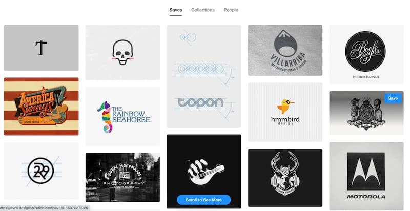
Design Inspiration is a hub for creativity. Not only can you find inspiration, but you can also use the site to create mood boards. You can create a board for a project and add in as many images to use as inspiration. And with the browser extension, you can save links, notes, and screenshots for whenever something catches your eye.
8. Creative Bloq

A website for art and design inspiration, Creative Bloq has a news channel that’s specifically dedicated to logos. From upcoming logo trends to audits of new brand logos to hit the market, this site is a great place to go for all logo-related news.
9. Flickr

Flickr is a popular platform where creatives (professionals and non-professionals alike) upload, organize, and share photos and videos. By joining the Flickr community, you’ll have access to 10’s of billions of photos and over 2 million groups. If you type into the search bar, you’ll find a group for virtually any and everything. Each group has a discussion forum covering topics like “How do I make a stand out logo?” to “What makes a logo iconic: The significance of color, symbol, and typography?”
10. Logopond

Logopond is a site that features a really nice collection of cool logos right on their homepage, coming from a contributing pool of designers worldwide. With a clean layout and simple UI, the site is easy to browse through and find what you’re looking for.
11. Logo Design Love

Good logo design is all about the story being told, which is something that Logo Design Love recognizes. This blog (and book!) is all about the creation of visual brand identities, and the stories behind the world’s most iconic logos. Here you can learn all about how famous logos were created and what to do to join the process.
12. 1000 Logos

If you’re curious about popular symbols and famous company logos, the 1000 Logos site has you covered. You can find well-known logos’ history, symbols, emblems, and fonts in chronological order to see the evolution of a logo as a brand changes. And if you’d like to advertise your brand or website on their site, you can share it there where it’ll be viewed by their 700,000 visitors each month.
13. Logospire

Launched in January 2009, Logospire is a logo inspiration gallery where designers can submit their logos and vote on those they like. Though the gallery is closed for new entries, you can browse the archives where you’ll surely find all the inspiration you’ll need.
15. Logotalkz

New to the web, LogoTalkz is a no-frills logo design inspiration gallery. What’s nice about this collection is that it’s organized by logo category (alphabet logos, combination marks, etc), so if you’re looking for a specific type of logo, you’ll be able to easily find it here. Their only request is that once you find the inspiration to make your own work, you don’t forget to submit it to LogotalkZ.com!
16. Logolounge

LogoLounge is a top logo design research tool, network, and news source. As the name indicates, it’s also a forum for research, discussion, and, of course, inspiration. You can stay updated on what’s trending and scroll through nearly 300,000 logo examples for ideas and suggestions. It’s a great research and networking tool for graphic designers. You can search the database for keywords or by searching for a designer, color, shape, symbol, client, etc.
16. DeviantArt

DeviantArt was founded in August 2000 and is the largest online social network for artists and art enthusiasts, allowing them to exhibit and promote their works. The 61 million registered members (known as deviants) upload thousands of original pieces of art every day. As a supportive community, DeviantArt provides tools, resources, and exposure for artists to become better and more successful.
17. Logo of the Day

Logo of the Day is a high-profile logo design award program aimed to reward the best logos and trademarks around the world. All logos are judged by a professional designer based on design, concept, creativity, scalability, appropriateness, usability, and memorability before being granted the LOTD award. Plus, winners can feature the award on their resume!
As the name suggests, you can come here for logo design inspiration on the daily! It’s also a community to discuss, share, and rate logo designs.
18. LogoMoose

LogoMoose is an online design community where professional logo designers share their work. You can join the LogoMoose community to get involved in discussion forums and learn design tips and tricks. And, of course, get inspired by professional logo designers, whose logos you can find on every corner of the site.
Also, you can submit your own logo designs and get feedback from the community on your work. What better way to showcase your ideas and get inspired?
Over to You
I hope you now have all the logo design inspiration you need to get started creating your own logo. Not only do you have plenty of resources for inspiration, but you’re now armed with design best practices by industry.
Whether you’re rebranding or starting from scratch, spend time checking out these 18 websites to note what you like and what you don’t to make designing your logo that much easier.
Happy designing!