Tailor Brands Logo Maker


Easily create a logo for your brand
Use Tailor Brands’ logo generator to create beautiful custom logo designs in just a few minutes. Head over afterwards to our LLC formation page to officialize your business.
1. Provide business details
Enter your company name and type of business, then tell us a little about what your business does.
2. Choose your logo style
Select the type of logo that best suits your business; you can choose from a wordmark (logotype), monogram, or icon logo.
3. Select your favorite fonts
Choose your favorite font styles to help our logo creator understand your brand personality better.
4. Sit back and wait
Our logo generator will go to work and create a selection of unique logos. It takes less than 1 minute.
5. Customize your logo design
Pick your favorite logo and then customize it. You can change the fonts, icons, and colors.
6. Download your logo
Download a high-resolution file of your design – we provide Vector EPS, SVG, and PNG logo files.
Get your business started with a great logo!

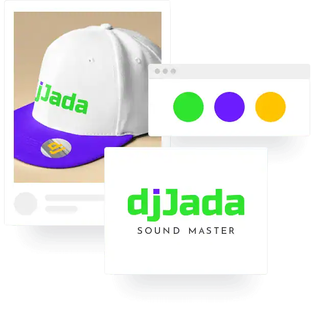
Designs created with our logo maker


Your in-house logo designer
Once you create a logo with our logo creator you get access to a full design studio. Here you will find a host of logo resources. It’s like having your own professional designer.
Here is what you will find inside:
100’s of design varations
100s of different logos for you to choose from. With our logo maker you can customize and tweak all of the designs to get them just right for your brand.
High-resolution logo files
Vector EPS, SVG with a transparent background. With these files, you can use your logo anywhere – your website, billboards, vehicle signage, and more.
Social media formats
We provide you with 21 resized versions of
your logo that you can use across all the major social media platforms. No need for a resize tool.
Branded assets
When you design a logo, we also create a suite of branded assets (for free). You get a brand book, branded letterheads, seasonal logos, business cards, and more, to make your business look professional.
Customer support
If you have any questions about your account or need some technical help, our friendly and super knowledgeable customer service agents are ready and on hand to assist you.
Additional business tools
After you design a logo, you can build a beautiful website, create digital business cards, print branded merchandise, and even form an LLC all from your Tailor Brands studio.
Why choose Tailor Brands’ Logo Maker
At Tailor Brands, we love nothing more than seeing people bring their logo idea to life. And in the last five years, this passion has helped us become the leading automated logo design tool for side-hustlers, individuals, and small business owners.
Here’s why people love making logos with us:
Unique designs
We don’t use pre-made logo templates. Our logos are uniquely designed by our AI algorithm to match your business and brand identity perfectly.
Easy and intuitive
Our products are user friendly, you don’t need any design skills to create your own logo. Just follow 6 steps to bring your brand to life with an awesome logo.
Fully customizable
You have complete control when it comes to customizing your logo design. In the logo editor you can change all of the elements such as colors, fonts, and icons.
Loved by businesses
We are the go-to logo generator for millions of businesses. Our algorithm matches fonts and colors and analyzes current design trends to create beautiful logos.

Brent Martin

makemoneywithbrent
An exceptional, easy to use logo creator, that can build you the perfect logo in a matter of seconds.

Michael Berner
Tycoonist.co
As someone who agonized endlessly over logos for my brands, just do yourself a favor and take 5 minutes to use Tailor Brands.

Paul Mendes
Profitable Freelancer
The Tailor Brands logo maker is easy to use and makes the entire process fun! It helped me bring my business idea to life.

Temera Stallworth
616 Mink Studios
I needed a new logo and Tailor Brands’ logo tool was amazing. It’s really easy, so I really do love it. I used their logo maker to edit and see what other logos I can create.

La’Stephanie Brandon
@creaLAtive
Tailorbrands is an intuitive artificial intelligence software that understands what you are looking for in a logo/brand. And it has all the necessary business tools you need to succeed.

Daniela Schrittenlocher
ELAS Marketing Services LLC
Tailor Brands is such an easy-to-use tool, anyone can create their own logo and branding with it. Best part, it incorporates current trends in their designs and gives great inspiration. It took me less than 15 minutes to find what I like.

Tiara Skiner
Barre Level Fitness
I created my brand with Tailor Brands and I am
very satisfied with everything that they’ve done
for me – creating my logo, as well as creating my website, and I recommend them to anyone and everyone.
FAQs
Yes. If you want to trademark your logo, Tailor Brands provides this service for all of our customers. Please note that this is an additional cost.
Yes, you can customize your logo. After it’s created, you will get access to the editor studio, where you can easily change all elements just like a professional designer.
Straightaway! Once you design your logo it’s available for immediate use. Simply go to your design studio dashboard in your Tailor Brands account and download.
Yes, once you have Tailor Brands account, you will have access your editing studio. Your logo designs are stored here, and you can edit and change them at any time.
Yes, you have full commercial rights. Once you make a logo (and purchase) it’s 100% yours to do as you please.
You can make a logo for free and download a low-resolution version. However, if you want a high-res Vector file, you will need to pay. But, only if you are 100% happy!
How to Make a Logo
The beauty of an automated logo generator is that you don’t need any skills to design a logo. However, understanding some logo design basics will enable you to customize and tweak your logo if you choose to do so.
1. Know Your Brand Personality
You should have a clear idea of the brand personality you want to convey before you start designing a company logo. Your personality will inform every element of your logo design.
2. Analyze Your Competition
Look to your competitors and other businesses that target the same audience as you. See if you can spot patterns in colors, font types, icons, etc.; the aim is not to copy but to gain inspiration and insights.
3. Choose a Design Style
There are different logo styles: classic or vintage, fun and quirky, modern and minimal, or handcrafted. No one style is right or wrong. It depends on the brand personality your want to convey.
4. Decide on a Type of Logo
Logo designs usually fall under two categories – icon-based logos and wordmark logos. Many people prefer a simple wordmark logo consisting of words only, while others add an icon plus words.
5. Pick Your Fonts Carefully
There are different logo styles: classic or vintage, fun and quirky, modern and minimal, or handcrafted. No one style is right or wrong. It depends on the brand personality your want to convey.
6. Choose Your Colors Wisely
Color plays a significant role in conveying your brand personality – they have meaning. For example, red conveys energy, warmth, romance, passion, excitement. So, like fonts, choose colors that match your brand image.
7. Keep it Simple
When it comes to creating a professional logo, less is more. Keep the design simple. Don’t use too many colors or fonts, and make sure the elements that you use complement each other.
8. Ask for Feedback
You should always create multiple iterations of your logo design and ask your friends, family, and audience (if possible) for feedback. This will help determine which of your final designs is the winner.
Logo design resources & tips
What is a Logo?
When it comes to creating a professional logo, less is more. Keep the design simple. Don’t use too many colors or fonts, and make sure the elements that you use complement each other.
Why is a logo important?
Legitimate question! Learn how your logo design can have a positive (or negative) impact on your business, and what you should look out for in the logo creation process.
What makes a good logo?
This quick read will give you the 5 main attributes that make up a strong logo, so you can learn how to create a logo that uses best practices.
Colors in logo design
The colors you choose can make or break the success of your company logo. Read about color psychology so you make informed decisions before you start designing.
Different types of logos
There are different types of logos – word mark logos, initial-based logos or icon-based logo. Here’s a breakdown of what that means and how to make the best choice for you.
How to trademark a logo
Protect your logo design from copycats! Here’s how to trademark your design and start your business on the right foot.
Logo mistakes to avoid
Learn about the main logo design mistakes people when designing a logo and how to avoid them.
Logo Color Combinations
Inspiration alert! Check out over 50 logo color combinations that will help you get an idea of what your own logo could look like.
How to make a logo
Use this step-by-step walkthrough to help you feel confident about designing your logo when you’re ready.


