There are many different elements that combine to make a great logo. However, you have to ensure that you don’t go overboard and with colors, fonts, shapes etc. This results in a logo that looks like it was designed by a child.
The truth is, a simple logo can cut through all the noise and show off your brand’s true essence—which is super important to the growth of your business.
Today, people are interacting with brands more than ever before, even if they don’t realize it. Whether on social media networks, TV, radio ads, or emails in inboxes, brands are everywhere.
That’s why having a strong brand is crucial if you want to survive. A great, simple logo design that resonates with your audience and forms a connection with them will help separate you from the competition.
And, a simple logo allows you to make more of an impact than a logo that’s jam-packed with imagery and color, because it allows you to quickly communicate your brand’s message and character.
So, let’s talk about what goes into a simple logo design, some examples of famous brands with simple logos, and some actionable tips for creating your own!
What Goes Into a Simple Logo
When it comes to logo design, sometimes less is more. Think of design concepts like minimalism and negative space; minimalist logos, like flat logo design, use a single, versatile design that can be applied across backgrounds and mediums.
Simple logos are often just wordmarks (i.e. a business name without any imagery), or designs that use a very simple icon. By stripping away any “extra” elements, you’re left with a logo that looks good in all contexts.
That said, if you want your logo to make an impact, there are other fundamental principles you need to follow:
- It should be memorable, so your audience won’t forget your brand in a hurry
- It should resonate with your audience, meaning it has a specific style that THEY find attractive
- It can be used it in a wide range of formats, like digital advertising or printed out on physical items
- It should reinforce your brand’s character and message to help make a connection with your audience
On that note, let’s take a look at some examples of world-leading brands that use simple logo designs to great effect.
Famous Brands With Simple Logos
Today, people are bombarded with ads, notifications, and a million other things that drain away our energy on the daily.
This means you want your logo to have an impact on your audience while taking up as little of their mental energy as possible.
Successful companies realize this, which is why their logos have such a powerful subconscious effect—while keeping their design simple and unique.
Here are just a few companies that have it down:
1. Coca-Cola
Logos don’t have to include images and icons. Many famous brand use wordmark logos, like we mentioned above, with no extras.
Coca-Cola is an old brand with worldwide recognition. Their name is known in every country, and their logo stands out thanks to its unique font.
The font style used is a custom cursive script—created by Frank Mason Robinson in 1885—called Spencerian script. It has very distinctive curves, and when paired with a bold red , itcreates an eye-catching and memorable logo. If you see the logo, even at a glance, you’ll instantly recognize it.
2. London Underground
While the London Underground sign may not be the first simple logo to come to your mind, we can learn a lot from it.
For starters, the red circle represents inclusiveness and completeness, both of which are very relevant for a public transport company.
They want everyone to feel welcome to enter the station and hop on a train. The circle also represents the ability to travel anywhere from start to finish.

A big challenge this logo managed to overcome is high visibility. A logo’s no good if you can’t find it easily while walking around London’s streets. The combination of a blue bar on a red circle is an excellent contrast of colors, and it’s easy to see even when it’s foggy outside or raining.
3. Nike
Nike’s famous swoosh looks basic. You might even say it seems overly simplistic. But this little tick packs a massive punch.
Its streamlined shape heavily implies movement, which is great for a sports brand. A check mark is also a positive image, inspiring audiences to improve themselves.
Nike’s swoosh is also unique, and instantly recognizable no matter where you see it. This logo has played a huge part in the company’s success and continues to help Nike grow its brand worldwide.
4. Apple
Another company, that surely needs no introduction, is Apple. If you want an example of a simple, yet effective, logo, you don’t need to look any further.
This piece of fruit has become synonymous with sleek computers and fun gadgets, thanks to Apple’s incredible branding. Whenever you see their icon slapped on an item, you know it’s going to be a great experience.
The Apple logo wasn’t always the way it is now. In fact, at the very beginning, it was a detailed image of Isaac Newton sitting under an apple tree. Over the years, as Apple’s brand became more and more defined, its logo became simpler.
Now, their logo is entirely flat and comes in 3 simple colors. This logo’s beauty and simplicity allow it to be used almost anywhere and create instant brand recognition, whether it’s on a bag or mobile phone.
As we said before, a simple logo can be super effective when done right.
5. FedEx
The FedEx logo is another simple wordmark that uses a relaxing and trusting purple with a youthful and energetic orange. Both colors contrast nicely, which means the public can see it easily—even at great distances.
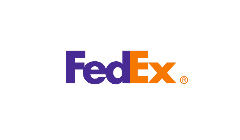
The FedEx logo also uses negative space to create an arrow between the E and X – see it? Once you see it, you can’t unsee it!
Tips for Creating a Simple Logo
Ready to try creating your own simple logo? Check out our top tips before you do:
A wordmark is the easiest way
Creating a wordmark like Google or Coca-Cola places all of the focus on the text. This means you only need to worry about using an appropriate font and color scheme. With so many choices available, it’s easy to create something eye-catching, that resonates with your audience, and is also unique.
Other impressive wordmark logos include Disney, Philips, and The New York Times.
Use shapes to make your point
Geometric shapes like circles and squares are a great way to push your brand message with a logo. It can help highlight your values and set the scene for your brand’s character.
Circles – These round shapes are associated with movement and transformation. It’s also a great shape for brands that want to promote unity.
Square – If you want to convey a feeling of professionalism and reliability, you can’t go wrong with a square shape. Its shape is inherently solid, and audiences view squares as stable and as a strong foundation.
Triangle – Triangles are more agile than squares and circles. You can point your triangle in different directions, which creates different meanings or places the focus somewhere specific. For example, a triangle on its side represents the ‘play’ button, or ‘go’.
Also, triangles are often associated with inspiration and movement.
Don’t be afraid to explore other geometric shapes like octagons and hexagons. Just remember to keep your overall design clean and simple.
Limit your use of colors
When it comes to creating a color scheme for your simple logo, remember that less is more.
Stick to 1-2 colors, and ensure that each one has a specific meaning and use in your logo. Ensure your logo is easy to see—like the London Underground logo—with bold contrasts or eye-catching complements.
Over to You
To quickly recap, there are many great benefits if you choose to use a simple logo for your business. Instead of creating a complex design that is hard to see and understand, go for a simple logo that can be memorable, eye-catching, and impactful.
Before you design a logo, especially a simple logo, it’s crucial to research your target audience and market. Then, when it’s time to bring your logo to life, you can hire a graphic designer, or use a logo design tool like our online logo creator to make the magic happen.