If you think back to the ‘90’s, which iconic artists, games, or styles spring to mind?
For you, it might be The Notorious B.I.G, Sonic the Hedgehog, animal print, crop tops, or red pleather pants… (hey, we’re not judging!)
Whatever it is, they all had something in common.
They were big, bold, and unashamedly in your face—and their logos were no different.
Filled with vibrant colors, abstract shapes, and handwritten fonts, these 90’s logos were similar to the graffiti that lit up the otherwise drab and dreary subways.
In comparison, today’s logos are reserved (much like Geoffrey, the butler in The Fresh Prince of Bel-Air).
That’s because our modern-day, less-is-more approach to logo design is driven by the need for logos to work equally well both on and off the screen.
But that wasn’t the case when Super Mario ruled the world, as we’ll soon see.
15 Famous ’90’s Logos
Join us as we step “back to the future” and relive 15 of the most iconic logos from the ‘90’s.
1. The Fresh Prince of Bel-Air
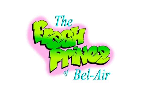
This wordmark logo brought two different worlds together and broke down barriers along the way by being one of the first graffiti-styled logos to represent a hit TV show.
It’s a great example of how a graffiti-inspired typeface (representing Will Smith) and a Serif font (representing the wealthy family) could work in perfect harmony. Opposing fonts and colors were cleverly used to highlight the two worlds living side by side, and the spray-can style, pink bleed background was in keeping with the overall vibe of the show.
2. Cartoon Network
At first glance, and due to the lack of bright color, it might seem like an odd choice for a kid’s animated TV channel.
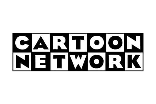
But the black and white 7×2 grid featuring the company’s name in Eagle bold font has become a truly iconic logo. It was in use up until 2004 and adorned their merchandize until 2017!
A brave choice by the founder Hanna-Barbara and designer Corey McPherson to use only contrast and font to get their playful message across—and somehow, it worked.
3. Baby Bottle Pop
The Topps company used several design trends to create their logo when they introduced their candy in 1998.
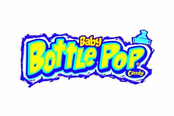
A wordmark logotype with a bubble neon yellow typeface, the words “Baby” and “Candy” were set in a matching playful font, topped off with a graffiti-styled baby bottle top.
The chalk-like drawn border brings the logo together and communicates the spirit of the brand, which is a playful candy with an explosive taste experience.
4. Toys “R” Us
They may have gone out of business in 2018 after 70 years of providing a vast range of much-loved toys—but their logo still lives on.
TOYS “R” US used colors and a playful font to connect with their young demographic audience, and the backward-facing “R” served to enhance the connection by mimicking how a child might have written it. This helped to communicate their youthful approach.
5. MTV
This was a classic logo that encapsulated the vibe of the time and the dawn of a new era of music television.
By using a graffiti-styled logo (are you spotting a trend yet?) with an oversized M that shouted their affiliation to music, MTV was unashamed in their evident rebellious approach to the antiquated music scene and, by doing so, connected deeply with their target audience.
So much so that Dire Straits, who were the first band to release a music video on MTV, wrote a song based solely upon the new and ground-breaking music TV station.
6. Saved by the Bell
An unusual mix of design elements by today’s standards, the Saved by the Bell circular logo consists of 3 non-related palette colors and typefaces that successfully communicate the show’s joyful nature.
The word “bell” has been emphasized by the larger-sized font, an intense yellow, and the slanted overlapping letters symbolizing a ringing bell in action.
7. Hot Wheels
Mattel’s logo was ahead of its time.
Mattel even managed to add their name without being too intrusive.
Two colors and a flat design helped keep the logo simple, while the intense red and yellow catch the eye and convey a message of fire, speed, and excitement. The font matches the style of the time by being playful and graffiti-orientated.
8. Super Nintendo
Nintendo’s combination logo was designed to do what every logo should do: Grab your attention.
The bold red catches your eye, and their vibrant 4-color Super Famicon emblem corresponds to the ABXY buttons on the console, no doubt resonating with all that used it.
The italicized font was quite a modern approach in the day and stood out firmly amongst its competitors.
9. Nerf
Nerf created an energetic logo that suited its audience’s age of 8 to 17, with contrasting colors, an all-caps typeface that leaned to the right (conveying the sense of moving forward), and the pink dot pattern resembling having arrived at great speed.
It’s bold, playful, and an authentic ‘90’s logo design.
10. Bubble Tape
This was designed when throwing everything, including the kitchen sink into your logo, was considered the right approach!
Wrigley’s combination logo left nothing to the imagination.
Multiple typefaces that were all relevant to the time, the bright colors outlined by blue represented youth, fun, and enjoyment. And, the extended “E” wrapping itself around the logo was to show the length of the tape style gum.
11. Friends
We can’t revisit the ‘90’s without talking about Friends; it’s still the most played re-run on the planet!
A simple wordmark logotype in a handwritten style typeface, it successfully emphasized the program’s playfulness, and the 6-dotted colors between each letter—matching the umbrellas used by each friend in the program intro—highlighted the individualism of each character. Well, maybe!
Whatever the designer’s intent, you can’t argue with the result.
12. Nickelodeon
A classic splat still to this day.
Here we see orange coming into play, a color now favored by the fitness and youth-related markets.
Nickelodeon brought energy and fun to their logo and their viewers. Their straightforward approach of using only 2 colors and a playful, rounded, sans-serif typeface was a giant step away from the typical design trends of the time and towards today’s more simplistic approach.
13. Walkman
Was there anything more cool than a Sony Walkman?
The freedom to listen to music anywhere and at any time was a giant leap forward.
The logo reflected this by the use of an abstract “W.” and a modern, custom typeface. The “L” was left detached to represent how their product gave you the freedom to listen to music your way, and perhaps how individualistic you were by doing so.
14. Microsoft Windows
A window that gave us a glimpse into the future.
The original design was just a pane of glass, OK, makes sense. However, Windows quickly changed this to the iconic logo we see here.
A wave effect provided motion (moving forward) and its 4-color signature-brand, making it and the company instantly recognizable.
15. Seinfeld
A show about nothing, that had everything!
A classic show and a classic logo. The yellow highlighted that the spotlight was firmly on Jerry, and the italicized font represented the quirky-yet-mature nature of the cast and show.
It was a very creative use of shape, color, and font. Just like the show itself!
Over to You
Overlapping fashion trends and music genres heavily influenced the designs and elements of the ‘90’s logos.
It was a medley of the underground rave scene, pop, grunge, punk, and the skateboarding and graffiti cultures. One constant they all had was their abandonment for the rule books and a willingness to experiment.
Many of the logos that were born in that era are still with us today, albeit in a 2-dimensional watered-down version, but their influence lives. If you ever need inspiration, you now know where to look!
