
Are you talking into a mic and building an online audience with your audio content? You may excel at storytelling, have a unique perspective on life, or bring in all kinds of guests to help you dive into different topics. Whatever topic your podcast covers, it should first and foremost have a beautiful logo to stand out.
While podcasting isn’t quite as saturated as some of the other platforms (like YouTube and TikTok), there are still a lot of competitors out there vying for an audience.
That begs the question: How do you make your podcast- from all the others- stand out?
You need a unique, eye-catching logo that will get you noticed. In this post, I will cover why you need a podcast logo, and then go over 15 examples of podcast logos to get your creative juices flowing.
Why You Need a Podcast Logo
As the saying goes, first impressions are important. A podcast logo is important. It’s the first thing potential listeners see when they are scrolling to find new podcasts.
A logo will help you:
- Look professional, building trust with your audience
- Illustrate what your podcast covers to attract the right crowd
- Create a memorable brand that people will identify with
- Catch the eye of people browsing for a new podcast
And, you must have an image for your podcast in order to publish it on various streaming platforms.
15 Successful Podcast Logos
Researching other successful podcast logos allows you to identify current trends, as well as provide you with logo design inspiration. You should never try to copy another logo, but looking at what other strong podcasts are doing will help you get ideas about coloring, imagery, style, and shape for your own logo.
1. Today in Focus

This logo is a great example of how the perfect font can help tell your story. This particular font brings to mind the news, which is exactly what this podcast is about. The host takes the listener behind the headlines to provide clarity on a range of current issues. The logo is a combination of logo shapes: cityscape and soundbar are encapsulated in a dome representing the globe. The illustration expresses these concepts perfectly, alluding that this is a talk show covering a range of hot topics making the headlines of major news platforms.
2. Dear me

Hosting a new guest each week, the creators of this podcast invite the guest to talk about their childhood stories and current successes. The logo design is simplistic, almost childfish, harkening back to the days of youth. The colors are eye-catching and juvenile as well, furthering this concept (in a good way, of course).
3. The First Mile

This adventure podcast explores all things travel— from cultural tourism ethics to making a living from travel. The simple logo uses bright colors that are exciting and youthful, paired with a quirky directional placard to hold the podcast title. The fun imagery clearly indicates this podcast is all about travel, which you might have gotten from the name of the podcast as well.
4. Getting Emotional

Getting Emotional relies primarily on logo color and font for its logo. The design for this podcast is incredibly simple, with a textured pink background and blocky sans serif font. Pink is often a color typically associated with emotions, which is exactly the topic of Getting Emotional. There are some obscure emotions that you and I don’t realize have been defined and named. For instance, I don’t know the words vemödalen, presque vu, and mudita, but they are the names of emotions I have felt.
5. Script Apart

Mixing two different fonts in a logo is bold design. The font for “SCRIPT” is a slab sans serif that is bold and firm. The “APART” font is slashy and feels like something jotted down to note a change. Yellow provides a great contrast for the red and black words, creating the feeling of immediacy or importance. All of which contributes to the overall idea behind the podcast, which is to look at first-drafts of great movies with the screenwriter behind the work.
6. Wild Thing

Interested in the strange things of this world? This podcast explores stories that don’t have good explanations, starting with Sasquatch. The background of the logo for Wild Thing Season 1 shows a stylized nature scene with clouds and the very edges of some plants. Front and center, we can see the shadow of Bigfoot’s footprint, and, as if comparing foot size, someone is standing inside its huge shadow.
In Season 2, the show swapped out the Bigfoot illustration for a circle depicting a UFO beaming up a girl into its spaceship. From the wilderness to a splotchy blue gradient spotted with stars, the logo design changed to indicate what unusual phenomenon they are going to dig into that season.
7. Home Cooking

Home Cooking started right when quarantine did for most Americans— March 2020. The premise of this podcast is to offer cooking ideas and keep people company during their stay-at-home orders. The DIY, no frills logo looks like a sketch someone drew in their home.
Each episode features a new recipe, and with it a new logo design. To add some extra spice, it’ll include some more subtle creative elements such as drawing in podcast creators Samin and Hrishi on the Morton’s salt container instead of the little girl.
It is a lot of work to make a new logo for every podcast, but the effect is brilliant and sets them apart from other cooking podcasts.
8. Lifers

There are fans and then there are mega fans. This podcast looks at the heavy metal fans who are dedicated enough to earn the title “Lifers.” If you notice, this logo might feel like you’re looking at an album cover. The retro vibe, bright red background, and flaming guitar tattoo are all tell-tale signs that this podcast is going to talk about music.
9. Switched on Pop

If you ever wondered about the process of making music, this podcast might be for you. It looks at the formulas that make certain songs so catchy and primed for the pop genre. The very bright and energetic colors emulate the music style of choice. The title is cleverly placed on the bars of a music sheet. “POP” is in a slab serif font with a shadow to further pop it from the page visually. All in all, the logo design clearly feels like an album cover for the greatest pop hits of the year.
10. Out of Hours

Except for the lucky few, most people’s 9 to 5 is not necessarily the dream job they had in mind (amiright?). Out of Hours sets out to explore what motivates people to pursue passion projects, and those who even turn their side gig into something much bigger. The guys over at Out of Hours know that big ideas need out of the box thinking, which they ingeniously incorporated into their logo design. The computer caricature appears as if it is about to walk right off the bright yellow box running after its big ideas.
11. Beautiful Anonymous

Started by comedian Chris Gethard, the Beautiful Anonymous concept is unusual. He Tweets a phone number, answers a call at random,and has an hour-long conversation with that stranger. The resulting conversations includes strange stories running the gamut from murder, painful memories of cheating spouses, and people with all kinds of odd jobs talking about their life experiences.
To further create the air of mystery and intrigue, an inverted shadow is the only fixed, permanent thing on the logo. Both the title and the hosts’ name is fading white, while the gradient orange to deep blue background plays with light and dark, temporary and permanent.
Beautiful Anonymous hit 250 episodes in 2021, and the logo has continued to serve as the face to the series.
12. The Birth Hour

Inspirational birth stories can be captivating and surprisingly hard to find. When you are pregnant, most people end up telling you horror stories. This podcast sticks with stories about pregnancy, conception, breastfeeding, and early motherhood centered around inspirational women who have a moving story to tell. A pregnant woman’s silhouette within a circle expresses unity and hints at the circle of life. Fitting, the font is light and airy with a gentle touch inviting moms-to-be in the inner-circle.
13. Forever35

A podcast on everything you need to know when you are hitting your 30s and trying to stay young without looking like a washed-up wanna-be. As you can see, the illustration shows some of the topics covered, like beauty, exercise, and night creams to start fighting wrinkles. The coloring of the original logo is a toss back to the 80s. At 427 episodes in, their new logo got a more of a 90s magazine cover makeover using the same color scheme and adding illustrations of the creators.
14. The Rewatchables
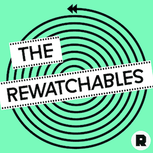
Movie lovers, this one’s for you. The Rewatchables is a film podcast discussing movies they just can’t stop going back to no matter how many times they’re seen it.
Front and center, the hypnotic swirl is dizzying- the same feeling as when you’ve been on a Netflix binge for too long (been there, done that). Now that’s what I call creative genius.
15. The Sporkful

“Not for foodies, it’s for eaters” is the tagline for this podcast. The spork is the perfect representation of someone who likes to eat but doesn’t take themselves very seriously. Red radiant lines show the tongue-in-cheek “glory” of the spork as it represents eating whatever tempts your appetite.
Over to you
As the saying goes, form follows function. That is to say, your podcast logo tells your potential audience what you are and what distinguishes you from others. Now that you understand what goes into successful podcast logos, you are ready to make one on your own.
Try our logo maker (for free!) to see just how easy it is to create a professional, memorable logo for your podcast!