
What makes a band logo different from a regular business logo?
While company logos tend to be sleek and minimalistic, when it comes to bands there’s a unique opportunity to get creative. You can experiment with typeface, go crazy with color—anything you want to try is on the table.
If you’re ready to go to the logo maker and start designing one for your band or music business, or if you’re just looking for some logo design inspiration as a starting point, check out these famous band logos for a much-needed creativity boost.
First, we’ll show you the best band logos of all time to demonstrate how bold, experimental design can make a brand—and band—pop.
Afterwards, we’ll discuss some of the band logos that could use, well, a little help, and how you can avoid making the same logo design mistakes.
The Best Band Logos in History
Unlike company logos, the best band logos don’t always connote professionalism. Instead, they’re edgy, provocative, psychedelic, and bold—a reflection of 60’s and 70’s classic and progressive rock. From The Rolling Stones’ “Hot Lips” to Nirvana’s neon yellow smiley face, here are some of our favorite band logos:
1. The Rolling Stones

The English rock band’s “Hot Lips” logo is perhaps the most iconic band logo in all of rock history. The logo is both a reflection of the goddess Kali—the Hindu goddess of energy portrayed with a large mouth and tongue—and an amplified depiction of Mick Jagger’s own mouth.
2. The Doors
The American rock band’s logo includes bold, geometric typeface with mirroring double-O’s. The logo screams 1960s; O’s are split down the middle, resembling pills, while the tiny but essential “THE” is written in backwards slanting, psychedelic typeface.
3. The Monkees
American rock and pop band The Monkees, founded in 1966, use a guitar-shaped logotype for their band logo. The distinct curvature of the text gives it a psychedelic feel, while the heart-shaped tuning keys sing of peace and love.
4. AC/DC
AC/DC’s band name is an abbreviation of alternative current/direct current electricity, and its logo reflects just that. The lightning bolt and bold, angular typeface represent the raw energy of the band’s music and performances.
5. Bon Jovi
Bon Jovi’s emblem logo represents one of the most popular musical themes—the pain of heartbreak. The combination of the heart and bloody dagger evokes sensitivity and gothic undertones.
6. Red Hot Chili Peppers

The logo of American rock band Red Hot Chili Peppers has, at its focal point, an eight-pronged asterisk, known as the “Star of Affinity,” that is said to represent both the cardinal directions and the chaos and choices in one’s life. The logo’s bold shapes and red, black, and white color palette symbolize the band’s passion and dominance.
7. Yes

The rock band’s bubbly logo is represented in a variety of bright colors and fills, from the red and yellow pictured here to a light blue and even a rainbow option. The versatility of color and the logo’s curved, organic lines are a visual representation of the band’s genre: Progressive rock.
8. New York Dolls
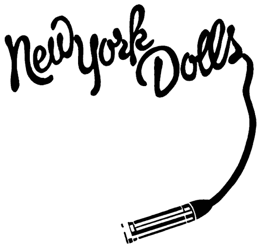
The New York Dolls was one of the first early punk rock bands. The logo’s glamorous script and microphone imagery, which are often portrayed in the brand’s signature pink color, are suggestive of the band’s influences on the glam metal movement.
9. Aerosmith
The rock band’s logo is all about freedom: The central icon appears to be in motion, spreading its wings, while the circle around the letter “A” resembles the anarchy symbol.
10. The Beatles

The Beatles’s logo is understated compared to the band’s fame and popularity, but it’s timeless and effective. The famous drop-T design was originally created by instrument retailer Ivor Arbiter in 1963 and was a perfect fit against the face of Ringo’s drums.
11. Nirvana

The dark-yet-playful smiley face logo is the epitome of grunge, an alternative rock genre pioneered by the band Nirvana. The crooked mouth, stuck-out tongue, and X-shaped eyes are a gritty, provocative take on the classic smiley.
12. Emerson, Lake & Palmer
ELP cleverly uses the band name’s acronym to create a clean yet interesting stamp-like logo. The logo is compact and pleasingly asymmetrical. The mirroring curvature of the “E” and “P” and the subtle overlap of the “L” add visual interest and depth.
13. Led Zeppelin
Led Zeppelin included four images beneath the typeface that are inspired by ancient symbols and mythology, and represent each of the four band members. Robert Plant’s symbol on the far right, for example, portrays the feather of Ma’at, the Ancient Egyptian goddess of justice.
14. The Who

The Who’s famous target logo depicts an upward-pointing arrow, symbolizing both masculinity and the uplifting power of the band’s music. At the same time, the interlocking “h”s create a feeling of unity.
15. Guns N’ Roses
The band’s logo is a direct reflection of its name, which is a combination of the last names of Tracii Guns and Axl Rose. The gun and rose imagery is both dark and romantic, giving the logo a simultaneously edgy and pensive tone.
The Worst Band Logos in History
While band logos are often among the best examples of beautiful and effective logo design, some just don’t make the cut.
When band logos fail, it’s usually because they feel amateurish and poorly executed, indecipherable and overly complex, or uninspired and dull.
Take a look at these less-than-great band logos to get inspired about what NOT to do as you design your own logo:
16. Borknagar

While bands can generally get away with complex logos, Borknagar’s overly complex logo design is a giant question mark—i.e. difficult to decipher.
17. Phish

Phish’s band logo falls a little flat; its rainbow gradient fill is a little too reminiscent of second-grade WordArt, and the logo seems to read “His” at first glance.
18. Death
Although a creative take on design, the overwhelming number of details makes this band’s logo difficult to read – and resize.
19. Staind
The primary vowel here, “A”, lacks prominence. This, combined with the name’s deliberate misspelling, makes the logo harsh on the eyes and difficult to read.
20. Dave Matthews Band

While the image is original and clearly depicts the brand name, the symbol of the headless dancer is difficult to connect with and doesn’t bear much relevance to the band.
21. Gay Dad
This band’s logo—essentially a copy of the standard pedestrian symbol—is dull and inspiring.
22. Helloween
The band’s name already sounds like the title of a B horror film, and its jack-o-lantern visual takes the cheesiness to the next level.
23. Tokio Hotel

Between the Japanese-inspired “T” visual, the angel wings, and the paint splatters, there are too many disconnected elements in this logo for Tokio Hotel.
24. Klaxons

English band Klaxons’ logo attempts to be edgy by looking like a badly drawn logo in Paint, but all it really achieves is looking like a badly drawn logo…in Paint.
25. Party Cannon
The death metal band’s colorful, bubbly font is deliberately ironic, but its resemblance to the Toys “R” Us Logo seems irrelevant and uninspired.
26. 311

Lacking both words and images, 311’s band logo is boring and unmemorable.
27. Sushi Roll

Chicago-based band Sushi Roll, which portrays the letter “S” as lightning bolts, missed an opportunity to create a logo that had more relevance to its name.
28. WHAM!
Wham’s logo makes us nostalgic for the 1980s, but the bland typeface doesn’t cut it for today’s logos.
29. The Knack
While The Knack’s logo isn’t hard on the eyes, the band missed an opportunity to create a logo that truly stands out.
30. A-ha

It’s unclear what motivated the designers to mix italic and roman lettering, but they certainly could have chosen a more creative way to represent the band’s name.
Over to You
Now that you’ve checked out what not to do when creating a band logo, take another look at the list of top band logos to see how they can inform your own design.
From playing with color to experimenting with typefaces, you can apply creative approaches to your logo that are inspired by the designs of bands. As you start to design your logo, look for a balance between complex logo design and readability.
Musicians use creativity to speak their truth, build connections with their audience, and communicate their personal values. When you harness creativity in your logo design, you can do the same with your brand.