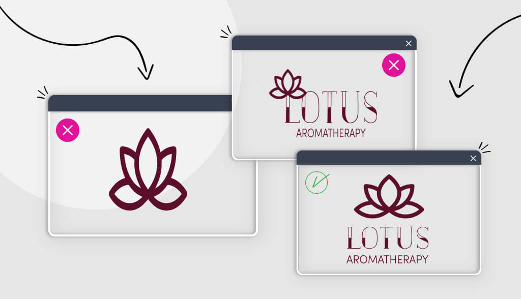
The same goes when you design a logo. After all, it speaks for your business, it serves as customers’ first introduction to your brand, and it represents what your company does. And, just like you’d want the best lawyer representing you at trial, you’re going to want to get your logo right the first time.
While many of us may not have had the unfortunate experience of sweating it out in a courtroom, we all know what it’s like to make a first impression and try to get people to like us.
When you design a logo, there are 10 things you should avoid in order to make that first impression a good one!
1. Going in Blind
You’re a small business owner; nobody expects you to also be an artist. That said, you need to do your homework before you start creating your logo.
The first thing you should do is research the competition in your industry. A top-quality photography logo will have different design best practices than a construction company logo, as will a freelance writer from a finance corporation. If you don’t look at what your competitors are doing, you’ll miss out on both the industry norms and potential ideas for your own designs.
Checking out other logo designs just might help spark creative ideas for your own logo. If you don’t know where to start, check out the top places to find logo design inspiration.
2. Only Thinking About the Trends
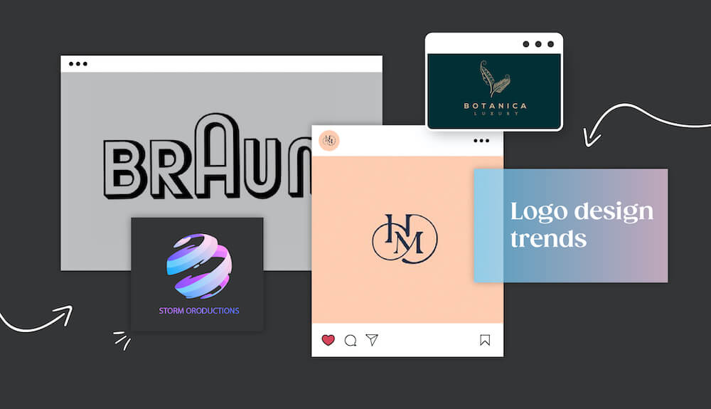
As you do your research, you’re going to discover design trends that will seem super exciting, and you may be tempted to apply all of them to your new logo.
This would be a huge mistake.
Trends tend to turn into cliches over the years, and the last association you want people to have with your business is that it’s outdated and tacky. On the flip side, your business’s logo should be timeless because a logo that looks current tells your audience that your business is relevant.
This isn’t to say that you should avoid trends altogether; there are certainly logo design trends that will help your logo stand out and make a unique mark on the world. However, many of the trends that populate the design industry are quick to fade after their 15 minutes of fame, so try to evaluate what’s a phase and what’s here to stay before becoming trend-friendly.
How do you avoid following trends?
While designing your logo, keep in the back of your mind these 2 words: Unique and timeless. By definition, trends are never either of those things. Remember to stay true to your brand so that you can easily connect with your target audience.
3. Embracing Clutter
While you’re browsing the world of logo design elements, you may get attached to a palette full of colors or an entire family of fonts—and that’s great! However, they don’t all belong in your logo.
A cluttered logo only leads to confusion for your target audience. And if that happens, 9 times out of 10 you’ll lose their attention and business. Remember that if a logo is too busy, it’ll detract from its point and turn customers away.
You can avoid a cluttered logo by choosing simplicity. When it comes to a simple logo design, the less “stuff”, the better. So what needs to be included in your logo? It should feature the name or initials of your business, an icon, a font or 2, and 3 colors at most.
That’s it.
4. Forgetting Your Audience

What does your audience have to do with designing your logo, you ask?
Everything.
Your logo is supposed to intrigue your audience and get them to see you in the best possible light. Failing to consider them when making your logo is like forgetting to include the grapes in a bottle of wine—you’ll end up with nothing usable.
Does this sound extreme?
Well, imagine you want to hire an entertainment company for your child’s birthday party. You’ve heard great things about them, so you go to look them up online and find that their logo sports a tombstone on a black background. What are the chances you’re still going to take them?
That’s what I thought.
You can avoid forgetting your audience during the logo design process by doing thorough target audience research and understanding who they are.
Always have them in mind for every part of the logo design process, so you can create a logo that will draw them in rather than chase them away.
5. Choosing Fonts at Random
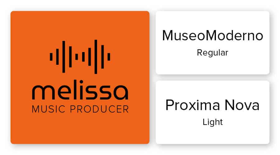
If your logo doesn’t have an icon, it means the first thing your audience is sure to look at (and judge) is the text.
One of the biggest mistakes people make with their text is to choose the first font they see, without putting any real thought behind it. Just consider Dunkin’ Donuts cartoonish, bubble font, or Walt Disney’s iconic script text. These fonts were not chosen at random.
Fonts carry meaning, and you want that meaning to translate to your customers, whether you’re telling them your business is elegant and sophisticated or friendly and down-to-earth. You can avoid choosing a random font by learning what each font family represents and selecting the one(s) that align best with your brand.
Also, you may choose to include a tagline in your logo that uses a different font than your main text and that’s fine. However, there are several ways not to go about pairing fonts, so make sure to familiarize yourself with fonts that belong together before deciding on a team of typefaces.
6. Throwing Colors at the Canvas
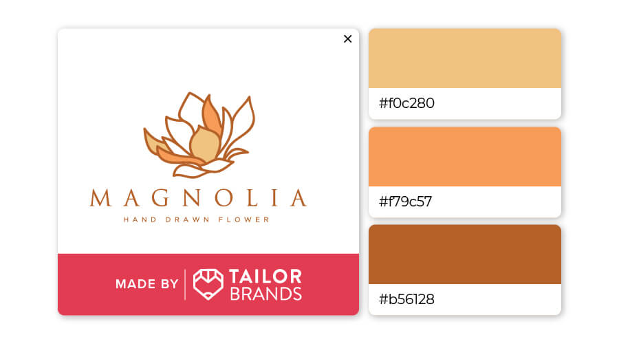
Like with fonts, the colors in your logo are going to send your audience a message about your brand. Even if your favorite color is purple, that’s not enough of a reason to apply it to your logo.
Let’s circle back to our audience mistake #4: Why did the thought of a black logo for a children’s entertainment company immediately put you off?
The answer is that colors have their own psychology, whether we’re consciously aware of it or not. Blue conveys serenity and sophistication, whereas red expresses passion and energy, while black certainly doesn’t emit cheerful-terrific-fun vibes.
Also, as mentioned above, you should limit your color combinations to 3 at the most (such as black, white, and a third color that stands out). Too many colors will make for a messy logo, while 2 or 3 will make for a clean, crisp design.
To make sure you choose the right colors for your logo, research color psychology to see what best suits your brand. Also, consider looking at your competitors to see which colors are the most common. If you notice a lot of logos are, let’s say, green, you don’t want to blend into the crowd by choosing the same color, but you can find a way to make it pop (maybe add a splash of gold or brown).
7. Generic Image Selection

The images you use in your logo can hold a lot of meaning. As the main focal point of your logo, an icon can highlight certain traits about your brand you’d like to be known for. It can also represent who you are as a business and what you do. That’s why a generic image just won’t cut it.
Consider some of the most iconic icons in the world: Starbucks’ siren, Nike’s swoosh, Google’s multi-colored ‘G’. None of these companies chose their icons at random; there was a lot of talk of symbolism going on at the drawing board.
Keep in mind that you can also create an icon by utilizing negative space, which is the unused space in an image. That’s misleading, though, because negative space is purposeful and plays an important role in the overall design.
You can avoid generic images by brainstorming what symbols best represent or align with your brand values. For example, if you run a local coffee shop, the obvious icon might be a steaming coffee mug. Overdone? Maybe. Let’s dig deeper; it was your grandpa’s love for coffee that inspired you to open your coffee shop. So you decide to use a sketch of his favorite cracked, beat-up mug. Now your image has a story and will connect well with your audience.
8. Not Thinking About Scale
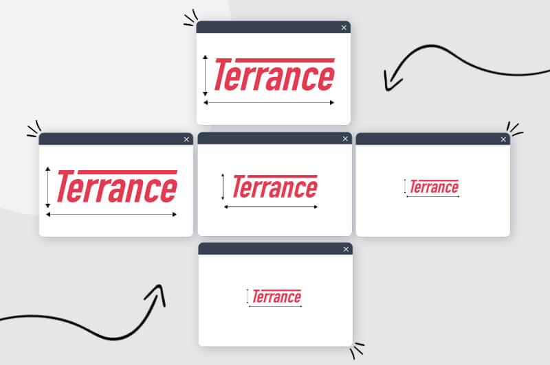
You’ll want to put your logo everywhere once you have it, which will often mean resizing it to fit the context in which it’s found. Unfortunately, pixelated images and JPEGs aren’t going to cut it, as resizing these files will render your logo illegible and useless.
A vector file, on the other hand, will allow you to resize your logo however many times you want while preserving its quality, including when you want to print it on merchandise or business documents. You can also use a vector if you ever want to edit your logo in Adobe Illustrator or other design software.
Scaling your logo is important to keep in mind during the design process because it could be difficult to fix later on.
9. Poor Placement
While this is a post-design mistake, you can avoid it altogether by planning beforehand.
You’re going to want your logo everywhere that concerns your business, whether that’s on the homepage of your website or your printed merchandise. However, many people brand carelessly with their logo, without thinking about how it looks—an obvious mistake.
For example, logos in the center of a webpage appear awkward, as do logos that take up the whole width of a business card. (The top-left corner of your website, however, is the ideal place for a logo, as is displaying it in the center of your business card.)
Before you begin branding with your logo, picture it everywhere. Try different positions, sizes, and layouts and only then commit to its placement.
10. Being Inconsistent
After you have designed your logo and begun to use it, you might be tempted to play around with the way it looks. Don’t.
Once you start branding with your logo, you need to stick to your design. As your audience gets to know your brand, they’ll come to associate your logo with your business and look out for it in the future. Not only that, but they’ll also come to trust you to deliver what they expect from you; your logo will stand as a symbol of how reliable you are.
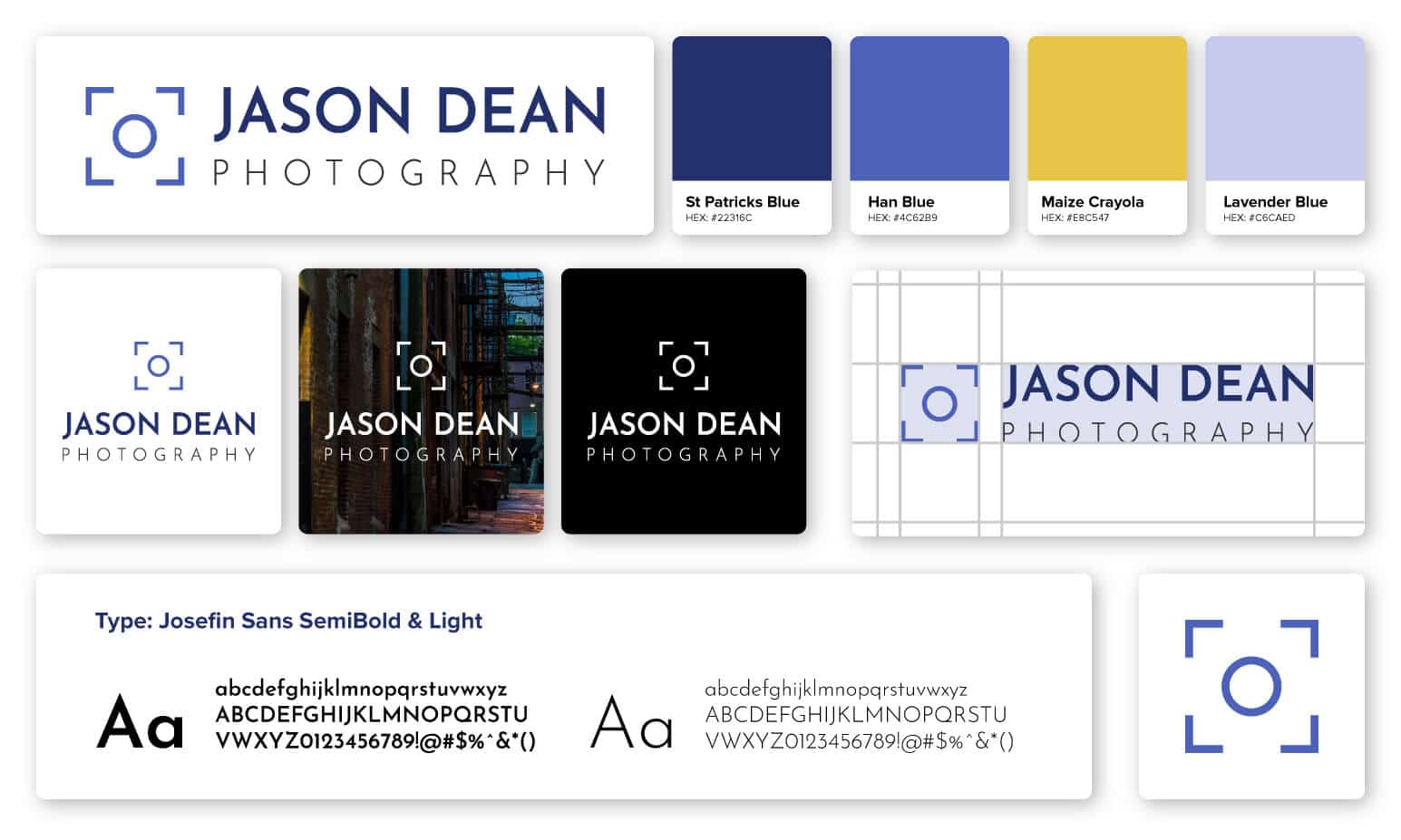
So, how can you avoid inconsistency? The answer is by using a logo usage guideline. That sounds intimidating and like a lot of work, but trust me, it’s well worth the effort. A logo usage guideline is a document you write for future reference that includes different versions of your logo design and how they are to be used. These guidelines will ensure you use your logo consistently no matter where and how it’s used.
Over to You
Making mistakes is how we learn, but your logo will be more effective if you keep them to a minimum. Now that you know what not to do, have you thought about what your logo looks like yet? If you still aren’t sure, don’t worry; check out this list of logo design inspiration and the ideas will start flowing!
