
Running your own YouTube channel is hard work. You need to pump out engaging videos that keep your viewers coming back for more. Plus, YouTube rewards channels that viewers interact with; the more people that like, subscribe, comment and watch your videos, the better you’ll perform!
But with so many videos available on the platform, it can be tricky getting those clicks and keeping people engaged. How do you separate yourself from the YouTube herd and get more clicks and views than anyone else?
Create excellent content, whip up a cool thumbnail, write an intriguing title, and most importantly, create an eye-catching logo!
In this post, we’re going to tell you why you need a YouTube logo, show you 17 breathtaking examples to get your creative juices flowing, and follow it up with some tips so you can make a logo of your very own.
Ready? Let’s go!
Why You Need a YouTube Logo
There’s more to a successful YouTube channel than making great videos; you need great branding too. Branding is your unique set of traits and characteristics that make you stand out from everyone else while also getting your message across
When done correctly, it can have some powerful effects on your channel, such as:
- Boost your credibility, as people will trust and believe in youz
- Help audiences understand what your videos are about at a glance
- Make it easier to build a following with people who identify with your brand
- Increase your visibility by catching their eye

As you can see, having a tip-top logo is vital to your YouTube channel’s success.
17 Awesome YouTube Logos
Let’s look at 17 cool YouTube logos and what makes them so successful.
1. Cocomelon
Ever searched for kids’ videos on YouTube to keep your little ones entertained? It can be a nightmare. There are thousands, if not millions, of videos available, and some of them are pretty bad.
A professional logo goes a long way in helping people trust you enough to click on your videos. The Cocomelon team knows that children are their target audience and went with a design that would appeal to them, with a fun and colorful font and mascot that’s easy to spot!

2. 5-Minute Crafts

In most cultures, a lightbulb illustrates a new idea, and what better way to brand your channel as the place to come and watch videos with fabulous DIY ideas?
The blue and yellow color scheme helps create a vibrant logo and catch your eye at the same time.
3. PewDiePie
Love him or hate him, PewDiePie is one of the most successful YouTube channel personalities ever. For those of you who don’t know him, Felix (the man behind the channel) is famous for the fist bump gesture.
Creating an icon and putting it inside the letter “P” lets audiences know straight away who this channel is and what they’re in store for when they click on one of his videos.

4. Justin Bieber

Justin Bieber was a massive hit in the late 2000s, and his YouTube channel has billions of views and millions of followers.
The sharp edges and strokes in his logo’s font represent his style as an artist. When choosing a font, always ensure it embodies your brand.
5. Marshmello
This famous DJ makes use of a distinctive Marshmellow to hide his face. It only made sense for the artist to use the same marshmallow as his YouTube channel logo.
If you have a brand icon or mascot that’s well known or represents your brand, think about including it in your logo too!

6. Like Nastya

Like Nastya is another kid-oriented YouTube channel that uses many of the same design themes as Cocolmelon, such as friendly-looking fonts and lots of bright, primary colors.
The added glow to the initials “LN” lets audiences know who the main star of the show is.
7. Dude Perfect
These guys are a funny and sporty group of people whose videos feature whacky trick shots and crazy stunts.
Their logo looks like it’s ready to jump off the page, and turquoise is an excellent choice of color due to its lighter shade, making it appear more relaxed and fun. Does the logo remind you of some other famous sports brands?

8. Fandango Movie Clips

If you want to see trailers for the latest movies and clips from your favorite films, you’ve probably seen them on the Fandango Movie Clips channel.
Their logo includes a torn movie ticket with an F on it, along with their channel name. When using text in your logo, it’s vital that people can see it. Here, the white font is visibly clear on the blue background. Overall, it’s a simple yet clean and effective logo.
9. Pinkfong
This South Korean educational entertainment company took the world by storm when they released Baby Shark.
To date, it has over 8 billion views, and its channel has more than 43 million subscribers. Their logo uses their pink fox character, which is super cute and attractive.

10. Bright Side

Another knowledge-based channel, Bright Side uploads fun trivia and history for viewers to sink their teeth into.
Like 5-Minute Crafts, they also use a lightbulb to represent their channel’s theme, but with a very different color scheme. Which one do you think is more effective?
11. FitnessBlender
FitnessBlender is the husband-and-wife fitness team providing at-home workout programs for their followers, with hundreds of videos and millions of subscribers.
To represent the brand, this fitness logo combines a unique play button icon along with its channel and website name. You’ll notice it uses multiple shades of blue, which is a trustworthy color that promotes positive attributes like strength and intelligence.

12. Binging with Babish

Babish is the star of a very successful cooking channel that focuses on recreating iconic foods from popular movies and tv shows. The bald, bearded chef with glasses is the main star of the channel, so it makes perfect sense to use himself in the logo.
It’s easy for YouTube watchers to find and follow Babish’s videos by the logo alone with such distinctive features! If you have an interesting or specific look, you can use it to help brand yourself and your YouTube channel.
13. XHIT Daily
There are many workout channels on YouTube, and standing out when you’re relatively new to the scene can be challenging.
We like XHIT Daily’s logo; the simple wordmark logo has a unique X that almost looks like it’s sprinting. Combined with a contrasting blue/pink/white color scheme, this logo pops right out of the screen.

14. PopSugar

Another workout channel, POPSUGAR features fun exercise videos with a bubbly presenter bursting with energy and charisma. Their bright logo and color scheme perfectly matches their lively brand.
15. SmarterEveryDay
This science-based YouTube channel covers all kinds of topics, from flying to the moon to escaping a sinking helicopter.
Because this channel aims to teach something new, it makes sense to include some brain imagery in their logo. Using red and a slight glow effect makes it look like the logo is alive, with blood pulsing through it.

16. IGN

IGN brings you game reviews, exclusive interviews, and trailers for all things video-game related. Their YouTube logo mimics the directional pad from a game controller. It lets anyone who isn’t familiar with the channel know what their videos are all about it.
17. Ninja
The blue-haired video game streamer Ninja is famous for his energetic personality and goofiness while playing games.
Using a blue ninja as his channel icon helps promote his channel and brand name, in addition to the cool, sword-like font that reinforces the message. In general, gaming logos tend to have “ferocious” icons (think skull and crossbones, teeth-bearing animals, etc.) which is something to consider if you’re creating one for your own channel.

Tips For Designing Your Own YouTube Logo
Before putting your pen to paper, take a look at our must-know tips for designing a cool YouTube logo.
Choose your type of logo
Before going any further, it’s essential to understand the different types of logos you can use. It’s ok to change and improve your logo, but doing it too often may make it harder for your brand to gain traction. We recommend picking one type of logo by weighing the pros and cons, and sticking to it.
Icon
A logo where the icon is the only design element used, such as Apple or Twitter’s famous bird. Using an icon grants valuable advantages, such as saving space and giving you a considerable amount of flexibility in how you use your logo. The downside is that if you’re just kicking off your channel, you may struggle to get your name out there with just an icon.


Choosing an icon can be tricky. Try to think of something that represents you, primarily if you’re featured in your videos. Remember Binging with Babish’s logo? Using your features is a great way to brand yourself and your channel. Another idea is to take a leaf out of Ninja’s book and use an icon that directly represents your brand name.
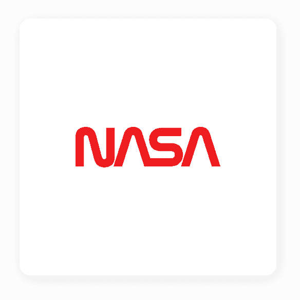
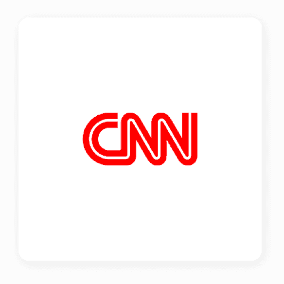
Lettermark
This type of logo uses letters that usually consist of the brand’s initials, like IBM, CNN, and NASA. It’s a great logo type for brands with long names. If you use your personal name on YouTube, or your channel name is hard to fit into the small space available for logos, using a lettermark gives you more freedom and helps ensure your logo is viewable. Remember that many people are watching videos on their smartphones and not large PC screens or laptops.

Wordmark
This is just like a lettermark, but it uses the full brand name, like Google and Coca-Cola. With this type of logo, the font style is incredibly important, as you’ll use it to convey as much as you can about your brand, like your personality, style, and theme. If your name is a bit of a mouthful, hard to read or pronounce, you may want to switch to a lettermark instead.
Combination mark
You can use one or more types of logo, such as an icon with your brand’s initials. This is a great way to start promoting your brand and your icon at the same time. When you’ve raised enough awareness and gained enough subscribers, you can think about losing the initials and sticking with just the icon.
Pick the right color palette
Picking the right colors for your logo is vital. Color psychology plays a huge role, and when choosing a color scheme for your YouTube logo, you shouldn’t ignore it.
Are there any emotions you want to bring out in your audience? Does your color selection resonate with your subscribers? And does a particular shade showcase your character and personality the way you want it to?
You don’t have to use more than one color in your logo if you don’t want to, but using at least 2 gives you the chance to create contrast and make your logo pop.
The most important thing is to choose a color that captures your channel’s soul and evokes the emotions you want it to. You can check out this video to learn more about different color combinations and what they mean:
Choose a font for your logo
Fonts are often the most overlooked part of logo design—but that’s a mistake. In fact, fonts can be the most crucial part of your logo!
Only use a font that matches these criteria:
- Easy to read when scaled down (like on smartphones)
- Simple enough that they’re readable (avoid overly cursive or abstract fonts!)
- Remains consistent with your brand personality

Over to You
We hope you’re feeling energized and ready to go out there and create your own cool YouTube logo for your channel. With the Tailor Brands Logo Maker, you can get a professionally designed logo in as little as 5 minutes! Click below to try it out for free