The perfect logo should be simple and unique, with a clear brand identity and design. Plus, it should be flexible to use everywhere, both online and offline (think of business cards, letters, menus, etc.).
Read through our 8-step logo design guide, and by the end, you’ll learn how to design a logo that makes your business stand out.
1. Unlock the DNA of Your Company

What does your company do? And who for?
Answer these 2 questions, and you’ll unlock the building blocks of your Brand’s DNA. Without understanding them first, you’ll end up shooting in the dark, trying to create a logo. And, knowing the answers to these questions will help you reach your target audience and help them identify your business quickly and easily.
The next step is to dig a little deeper and understand your brand’s personality and vibe. Is it a serious financial firm or a fun coffee shop with free WiFi?
Put all 3 together, and you now have your business’s DNA. It will help you create a logo that represents who you are, what you do, and who for. You can even print it out and put it up on your wall as a reminder.
Check out the Apple logo as an example:
The logo doesn’t feature a computer, laptop, phone, or a tech device of any kind – but their iconic apple has a ‘byte’ taken out of it (a computer term). Their logo is also incredibly lean, with no fancy bells and whistles, and the bite mark portrays action. The sleek and clean designs of their products are also manifested in the smoothness of the bite.
2. Simple is Best

Professional designers know this, and it’s a great piece of advice. Keep things simple. It’s easy to go overboard and include a rainbow of colors and multiple icons – each with a hidden meaning that represents something, or just because they’re pretty.
But simplicity makes a good logo – one that’s memorable, easy to understand, and beautiful.
Check out this simple design. It’s just one line, and it’s one of the most recognizable logos in the world (Nike, for those of you who don’t leave the house).
Nike’s iconic logo symbolizes speed, power, and movement. It’s one of the most straightforward, clean, and potent brand logos ever created. It can shrink down to fit on the head of a pin or be blown up onto massive billboards (but we’ll get to that below).
3. Learn Color Psychology
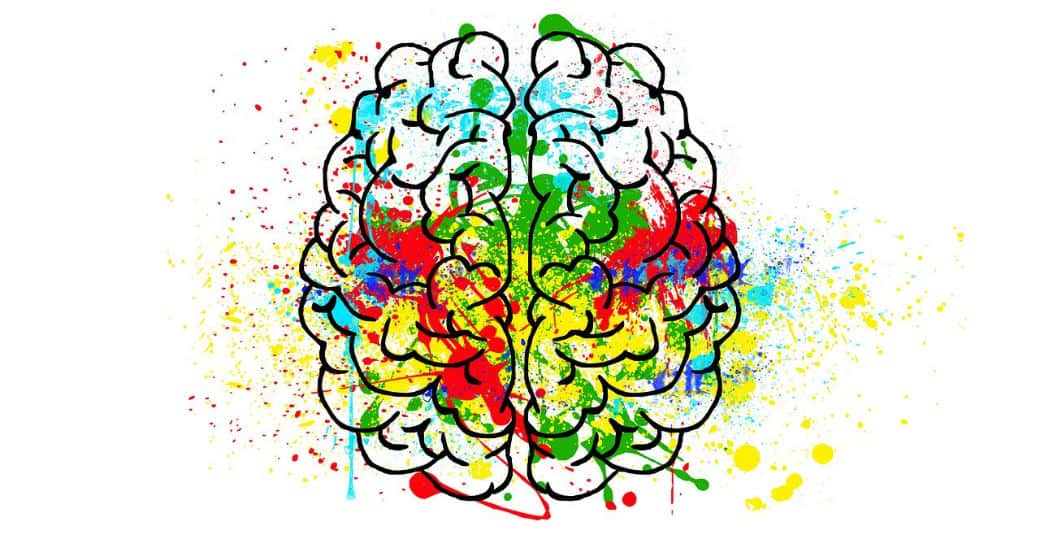
Your use of color will play a massive part in the design of your logo. It will set the mood, and depending on your chosen colors, it will portray a message to the audience.
Look at some of the essential meanings behind these colors; which ones resonate with your business? What do you think happens when you combine them?
| Black | Strength, power, precision, credible |
| Green | Excitement, hungry, urgent, romantic |
| Blue | Credible, professional, safe, trusted |
| Orange | Creative, fun, energetic, friendly |
| Yellow | Dynamic, youthful, charming, positive |
| Purple | Magical, imaginative, wise, mysterious |
| Brown | Historical, earthly, reliable, stead |
| White | Clean, simple, fresh, easy |
If you combine more than one, you’ll need to make sure your colors work well together and don’t clash, as clashes will turn people off from your logo. To make sure your colors mesh well, use a color wheel that matches complementary colors together for you.
A single-color logo may seem boring, but look at McDonalds’ logo to realize why that’s not the case.
Their golden arches are famous worldwide and instantly recognizable by kids and grownups. They use one color, symbolizing energy and youth, and their yellow M has transcended language to become recognizable as the place to eat fast food.
4. Trigger an Emotion

You’ve made it this far, but now you need to take it to the next level and firmly grab your audience’s attention. One of the best ways to do this is to trigger an emotion from them.
Health companies use positive colors in their logos – usually with lots of green and light blues, as it helps to convey a feeling of well-being and goodness. But when you add positive imagery, you’ll also bring out feelings of joy and delight in your audience. Strong, positive emotions that help connect you and your audience in the blink of an eye.
What emotion do you want to trigger? Love? Power? Security? Excitement?
Unlike Apple and Nike, Amazon used their name as the main focus of their logo.
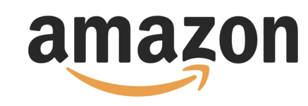
But, the clever use of an arrow shows that Amazon has everything from A to Z, and the curve of the arrow is similar to a smile, which helps to evoke a happy feeling.
5. Don’t Ignore Your Font
Every type of font has a different “personality,” one that will convey a certain set of feelings to your audience.
It’s important to choose a typeface with the personality that best represents your brand, but in order to do that, you need to get inside your ideal customer’s head.
This also goes back to what we spoke about before – about your brand having personality. You have to ask yourself: Which type of font is the most compatible with your brand? Is it a traditional and high-class serif? What about a slab serif, with jagged edges and a more modern feel?
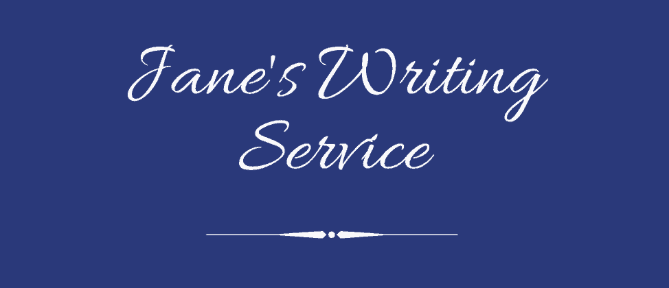
For example, a freelance writer may use a script font that mimics handwriting; it’s a great way to show the audience that you write, and they’ll understand it in the blink of an eye.
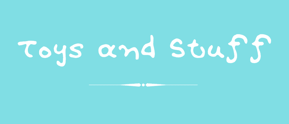
A company geared toward children, on the other hand, may use a modern or custom “squiggly” font to show they’re child-friendly and know how to have fun and enjoy themselves. You can achieve the same effect of conveying a message without an icon if you can tap into the hidden power of fonts.
The worst thing you can do is create a mismatch between your font and your brand’s personality. Make sure you’re sending the right signals to your audience with the correct font.
And, try to be unique. Everyone has seen Times New Roman and Comic Sans before; don’t settle for a font because it’s well-known. Try to find the typeface that adds spice to your brand, (but make sure it’s legible and can easily be resized without compromising your logo’s design).
6. Give it Heart and Make it Move
Logos are stationary. They don’t move and jump around the page by themselves (unless you use an animated logo, but the majority of small business owners don’t have the resources to create one).
But, you can create the feeling of movement. Giving your logo a sense of movement and motion is an excellent way to provide it with a visual boost.
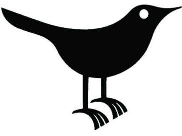
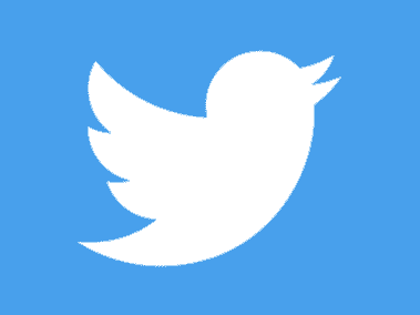
On the left is Twitter’s old logo, and on the right is their new one. See the difference in the movement of the bird? One is perfectly still, but the other, newer one is in flight, aiming upwards as if climbing towards the sky.
Let’s think of a brand new logo design for a brewery. Your first thought might be, “Easy! I’ll add an icon of a beer bottle, so that it’s really clear what I sell.”
But look at the beer glass on the left. It’s not doing anything. You can’t see the foam of the beer or imagine pouring it into a glass. Compare that to the image on the right. You can almost taste it!


Let’s take another one for a fishing company. Here’s a perfectly good fish on the left; it’s a nice-looking fish, but it’s not in motion:


What do you think of the image on the right? It’s filled with action and excitement. The implied movement isn’t really happening, but the effect is that your logo is now alive and will grab the attention of your audience.
7. Make it Scalable
“Scalable” means your logo can easily be resized.
Why is that important? Because your logo is probably going to be used in more places than you think. It needs to look great on social media, on your business cards, in your email signature, printed on a t-shirt, or even splashed across a massive billboard.
But, your logo also needs to be able to scale down. Maybe you’ll want to print it on merchandise, like a pen or other small items, and you’ll want your logo to still look good despite the resize.
However, low-quality logos will become unreadable when scaled down; if this happens to you, then you’ll need to redesign it. So, make sure that from the get-go, you can blow your logo up nice and big and shrink it down, without compromising the quality or legibility of the design.
8. Keep Tinkering

After all, Rome wasn’t built in a day.
Take a look at the evolution of the world’s most famous logos. At some point in time, these brands were pleased with their original logos, but as time went on and they evolved as a business, their logo evolved with them.
While no one wants to rebrand if they can help it, sometimes it’s inevitable for the success of your business and brand. So, keep tweaking your logo, and make sure you get the design just right before you commit to it.
If you’re unsure about what you’ve created, test it out in different places; put it on the corner of your website, add it to your social media pages, and try to place it on mockups to see what it will look like in print. The more you test it out, the higher the chance you won’t need to redesign your logo from scratch later on.
Over to You
By focusing on these 8 tips, you can create a logo that captures your audience’s attention and separates you from the pack. Ready to put what you’ve learned to the test? Head to Tailor Brands and start designing your own logo!
