G’day, mates!
(Too cringe? Let’s move on.)
If you’re looking to build an Australia-centered brand, you’ve come to the right place. To help you come up with your vision, we’ve gathered 13 of the best Australian logos of all time. Some of them are iconic, and others are innovative and thoughtful.
Most importantly: Each of them has a story and a vital logo design tip for you to use when creating your own logo.
So, whether you’re just looking for inspiration or you’re trying to create a logo that appeals to an Aussie crowd, let’s take a look at some of the most popular Australian logos and see what we can learn from them.
Ready to head Down Under?
13 Best AU Logos
1. Qantas
In a sky filled with airplane companies, Qantas Airlines has one of the most iconic logo designs. Their kangaroo symbol has gone through many changes over the years to stay up-to-date. In its latest form, it still keeps two essential elements – the kangaroo and the red and white color combination. Both are two vital identifiers in the brand.
If you’re changing up your logo, which are the most important design elements to consider keeping?
2. ABC
The Australian Broadcasting Commission based their logo on the waveform of an oscilloscope. A what, you ask? An oscilloscope is a piece of lab equipment able to analyze and display the waveform of electronic signals (don’t worry, we also had to look it up).
It may look like an abstract design if you’re not familiar with the science behind it, but the icon is still pleasing to the eye and memorable.
Instead of writing their full name, ABC stuck with their initials to create a lettermark logo, which is a good idea if your company name is too long for a logo.
3. Commonwealth Bank
The Commonwealth Bank logo is instantly recognizable, thanks to its bold color contrast between yellow and black and the unique diamond design. They based their design shape on the Southern Cross constellation, and in doing so, created a logo that stands out in a sea of boring bank designs.
4. Melbourne
While not Australia’s capital city (Canberra is), Melbourne is its cultural capital. And as such, it needs a top-notch logo to represent it. After a failed attempt in 2009, the designers came up with the shards-of-glass “M” design. They wanted the design to be daring, controversial, and representative of the city’s multiculturalism.
Combining a unique abstract design with their letter mark led the designers to create a stunning symbol for the city of Melbourne.
Fun fact: In 2011, a Chinese website discovered a Mall in Shenzhen, China, with an identical logo. Imitation is the highest form of flattery, after all.

5. Woolworths
Woolworths is the largest supermarket chain down under and has nearly 1000 stores across Australia. Their logo contains three smart elements that together form a powerful and memorable logo. Often, however, only the icon is used to represent the brand.
The unique apple design represents the freshness of their food, while the modern and straightforward font clearly announces the brand name. And finally, their tagline is short (and makes excellent use of alliteration that rolls off the tongue).
In 2009, they came under fire from Apple, who filed a complaint that the Woolworths apple resembled their own—a reminder that copying a brand’s logo too closely has consequences.
6. Woolmark
Woolmark exports high-quality wool around the globe and their icon wonderfully showcases the brand’s softness, elegance, and modernity.
The 5 black lines form a skein-shape, which is another name for a coiled length of thread. (Perfect for a wool company!) In other words, the brand’s icon is a visual representation of their product.
Can you think of an icon that represents your brand?
7. Nine Network

The free-to-air TV network, Nine Network, cleverly uses their name to drive home their brand. The nine dots mimic a network, and the number 9 represents a TV on a stand. The brand experimented with different colors and styles until finally settling on blue, a shade of trust and sincerity.
8. Australia Post
Ever wondered why most post service companies use red? Pieter Huveneers, the designer behind Australia’s Post logo, carried out his own research. He quickly discovered that the public automatically links the color red to the post service, unlike America, where the post-service color is blue.
With his newfound knowledge, Pieter came up with the present design. The P inside the circle represents the company’s ability to deliver post around the world.
It’s important to remember how cultural differences can impact the meaning of your logo.
9. SBS
The Special Broadcasting Service icon is a two-dimensional representation of the world. It’s even tilted at 23 degrees to mimic the angle of the Earth. In previous designs, the SBS initials were inside of the icon, but they were separated so the brand could resize the logo with no issues.
Remember that if you crowd your logo elements together, you may have trouble sizing down your logo later.
10. Quiksilver
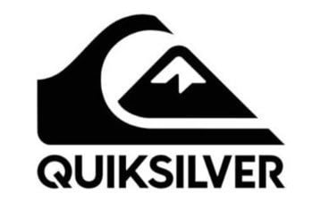
Quiksilver’s snow-capped mountain and cresting wave symbolizes the quality and genuineness of the clothing and surfwear brand. The nature elements also represent the outdoor lifestyle of the company and its audience.
11. Kathmandu

Kathmandu is an outdoor activity and camping store with a modern-looking logo. The mountain icon identifies and targets Kathmandu’s audience of hikers, campers, and mountaineers, and lets them know their lineup of products is a good fit.
12. Landcare Australia

Landcare Australia is a group of farmers who want to make a difference to the land. The two cupping hands are a symbol for teamwork, and together they make use of negative space to create the shape of Australia.
13. Yoga Australia

Another company logo that uses negative space effectively is Yoga Australia. The yoga pose combined with the Australian outline is a simple but smart way to inform viewers who the brand is, what they’re offering, and to whom.
Over to You
What essential tips and lessons did you learn from these Australian logos? Here are 4 that we think were especially important:
1. Use simple shapes and icons. Your logo needs to be easy to remember and understand.
2. Use one or two colors with your logo design to make the biggest impact.
3. Using negative space or implying movement will add an interesting element to your logo.
4. Keep the design simple, so you can use it for both digital and print.
Remember, it’s always good to take a hard look at your logo design and see what you can learn from other popular companies in order to make yours better.
Once your ready to make your new Australian logo – try our logo creator tool and start designing your logo today.
