
Logos make your business stand out, help spread brand recognition, and become the first thing your audience associates with your brand.
That being said, small business owners make logo design mistakes right and left, and a logo that’s a total fail can hurt – rather than help – your brand. Once a logo is out there, anyone can see it, spread it, and criticize it, and you wouldn’t want an unsightly or embarrassing company logo to be permanently ingrained in public memory.
But, what makes a great logo? The answer is to know common mistakes to avoid. And to help you, we have compiled 15 examples of where designing a business logo went wrong.
1. Sherwin Williams

In the current era of environmentalism, Sherwin Williams’s “Cover the Earth” logo gets an earful of criticism.
The paint company has already been met with controversy for contributing to both lead poisoning and contamination, and their logo—which depicts the earth being coated in unnatural, blood-red paint—conjures up images of the poisoning or polluting of the planet.
What we learned: Control the story of your brand; don’t create a logo that emphasizes your weak points.
2. British Petroleum

In 2000, major oil company British Petroleum replaced its already-strong shield logo that they’d had for seventy years. While the sunshine-y new logo isn’t terrible per se, it likely causes some design challenges, because it takes up more space than the previous, is shaped rather awkwardly, and has a relatively small font size.
What we learned: Consider scalability before committing to a logo design.
3. Pepsi

Pepsi’s design team claims that the white stripe—now tilted upwards rather than laying horizontally—kind of looks like a smile, but most people don’t buy it. This renders the expensive (read: $1M) design change rather pointless, for what is ultimately just a shift in the angle and curvature of the white stripe.
What we learned: Don’t overthink it, and don’t impose meaning on a design that isn’t there.
4. Gap

American clothing company Gap made the design world cringe when it released a bland, re-designed version of its logo without notice. The updated logo seemed to forsake its fashion-forward identity in favor of something corporate, irrelevant, and uninspired. Luckily for us, the timeless original logo was reinstated shortly after.
What we learned: If it isn’t broken, don’t fix it.
5. Hilton

Hilton’s logo is a tragic tale of misalignment. While the logo is built on clean, straight lines, the horizontal line separating the gold and silver image doesn’t quite line up with the text. A better use of white space and alignment would have made the Hilton logo easier on the eyes.
What we learned: Every element in a logo needs to work together, in order to create a unified, cohesive experience for the audience.
6. The Cleveland Browns

The Cleveland Browns are—you guessed it—an American football team. The team’s very literal logo isn’t only uncreative—it’s also too generic. By adopting a logo that could easily belong to any other American football team, the Browns virtually made themselves invisible and lost an important opportunity to spread brand recognition among sports fans.
What we learned: Regardless if you need a fitness logo or a business logo, you should always try to separate your design from others in your niche.
7. Pathmark

US-based supermarket chain Pathmark doesn’t have a particularly bad logo, but it also doesn’t have one that stands out in the slightest. For a major supermarket, the company could have invested in something more creative or relevant. The lack of imagination makes the logo rather forgettable and does nothing to enhance the company’s brand identity.
What we learned: Don’t be hasty in choosing a logo; explore logo design ideas from your industry but also from other industries before you commit.
8. Microsoft

When Microsoft updated their logo, it was clear that the colorful, minimalistic update was little more than an attempt to channel Apple’s own branding design. Not only was this motive overly transparent, but the design itself appears half-hearted, risk-averse, and corporate, with little creativity, originality, or inspiration.
What we learned: There will always be logo design trends in your industry, but that doesn’t mean you need to follow them.
9. British Telecom

This is one of British Telecom’s many logo redesign fails. First, the color palette is unsatisfying and seems somewhat random. Even more importantly, the logo doesn’t indicate, or even hint at, what BT does. The lack of relevance makes the logo difficult to grasp, separating the logo from the company’s products and services and alienating the company’s audience.
What we learned: When it comes to color, less is more.
10. Kraft Foods
It’s bright, colorful, and largely resembles a circus; no wonder this Kraft Foods logo was temporary. Although the food company deserves points for freshness and creativity, the design is just too cluttered with color to be taken seriously.
What we learned: Stick to logo color combinations of two or three tops, or your message is going to get lost.
11. Consistel

OMGtel is a subsidiary company of Consistel, a software company, and its logo brings back unfortunate memories of middle school WordArt. The rainbow gradient logo looks cheap and outdated, making OMGtel appear unprofessional.
While OMGtel is aiming to look as fun and carefree as its name, a dose of professionalism and credibility—as well as a sleeker, more modern design that appeals to its millennial audience—is also important.
What we learned: There can be a fine line between “fun” and “childish”, and if your audience is made up of adults, you’ll want to stay on the former side of it.
12. Animal Planet

Animal Planet’s former logo incorporated an elephant into its design, which was relevant to the TV network’s mission, purpose, and audience. The new logo, however, ditches the elephant in favor of a sideways M, a choice that seems arbitrary in comparison to the elephant and does nothing to indicate the network’s purpose or appeal to interested viewers.
What we learned: Go with the typeface that’s legible over the typeface that seems “interesting.”
13. Bing
Microsoft’s search engine, Bing, has never been able to compete with Google, and its old drab, uninspired logo design certainly doesn’t help. The logo lacks a strong visual concept, which does little to attract prospective users – probably the reason they rebranded in 2013.
What we learned: If you’re in an industry saturated with competition, your logo needs to top your competitors – not fall flat against theirs.
14. The Huffington Post
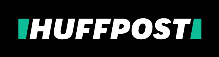
The Huffington Post’s recent rebranding isn’t bad, but the new logo changes the implications of the brand in an important way.
Its less-professional name and bold, casual look might be more relatable for tabloid readers, but they also undermine the quality and credibility of the content – emphasizing loud headlines over serious, professional journalism.
What we learned: Always consider your audience and what kind of design will best speak to them.
15. Career Builder

With its haphazard mix of colors, fonts, shapes, and ideas, Career Builder has been accused of trying to cram too many elements into its new logo. Because of the distracting design, you’d never know the company is a world-wide employment website – one with so much to offer its users.
What we learned: Your logo should always stick to the story of your brand. Aim to convey a single message or theme, rather than many at once.
Over to You
Remember that your logo will help to create an impression about your brand – and you want it to be a good one.
Try to design a logo that’s relevant to your company and your audience, won’t send the wrong message, and is neither complex nor overly generic. By using the logos above as examples of what not to do, you can better understand the best practices for creating your own company logo.